Data Visualization in Python with Matplotlib and Seaborn
Most Python plotting tutorials start with plt.plot(x, y) and plt.show(), and that works right up until you need two charts side by side, a legend that doesn't cover your data, or a figure you can drop into a report without fiddling. At that point the shortcuts stop helping and you need to understand how Matplotlib actually thinks about a chart.
Seaborn sits on top of Matplotlib and handles the statistical side: grouping by category, coloring by a column, drawing distributions and confidence intervals. It saves a lot of code, but every Seaborn chart is still a Matplotlib figure underneath, so the two skills go together.
This guide covers Matplotlib's figure and axes model, the core chart types, customization that matters, saving figures, and then Seaborn's axes-level and figure-level functions, with a clear picture of when to use which.
Installing the Libraries
Install both into a virtual environment. Seaborn pulls in pandas and NumPy, which you'll want anyway.
python -m pip install matplotlib seaborn
If you're new to installing packages, see what pip is and how to use it. The examples here were run with Matplotlib 3.11 and Seaborn 0.13, but everything shown uses long-stable APIs.
Matplotlib's Mental Model: Figure and Axes
A Matplotlib chart has two main objects:
- Figure: the whole canvas. It holds one or more plots, a title, and controls size and resolution.
- Axes: a single plot area with its own x-axis, y-axis, title, and data. Despite the name, an
Axesis a plot, not an axis.
There are two ways to drive Matplotlib. The pyplot style (plt.plot, plt.title) acts on whatever the "current" axes happens to be. The object-oriented style creates the figure and axes explicitly and calls methods on them. The official docs recommend the object-oriented style for anything beyond a quick look, and it's the style used throughout this post because it stays predictable once you have more than one plot.
# line_chart.py
import matplotlib.pyplot as plt

months = ["Jan", "Feb", "Mar", "Apr", "May", "Jun"]
revenue = [12.4, 13.1, 15.8, 14.9, 17.2, 19.5]
costs = [9.8, 10.2, 11.0, 11.4, 12.1, 12.9]

fig, ax = plt.subplots(figsize=(8, 4.5), layout="constrained")
ax.plot(months, revenue, marker="o", label="Revenue")
ax.plot(months, costs, marker="s", linestyle="--", label="Costs")
ax.set_title("Revenue vs costs, H1 2026")
ax.set_xlabel("Month")
ax.set_ylabel("USD (thousands)")
ax.legend()
ax.grid(alpha=0.3)

fig.savefig("revenue.png", dpi=150)
plt.subplots() returns a Figure and an Axes. Everything about the plot itself goes through ax: ax.plot draws the lines, the set_* methods label things, and ax.legend() builds a legend from each line's label. figsize is in inches, and dpi on save controls pixel density, so (8, 4.5) at 150 dpi gives a 1200 by 675 pixel image.
layout="constrained" turns on Matplotlib's constrained layout engine, which adjusts spacing so titles, labels, and legends don't overlap or get clipped. It's the modern replacement for calling fig.tight_layout() at the end, and it's worth using by default.
Showing vs Saving
In a script, plt.show() opens a window and blocks until you close it. In Jupyter, figures render inline automatically. For anything automated (a report, a cron job, a server), skip show() and call fig.savefig(). On a headless machine you can force the non-interactive backend before importing pyplot:
import matplotlib

matplotlib.use("Agg")
import matplotlib.pyplot as plt
When a script generates many figures in a loop, close them with plt.close(fig) (or plt.close("all")). pyplot keeps references to every figure it created, and they'll pile up in memory otherwise.
The Core Chart Types
Most charts you'll need are a single method on an Axes. Here are four of the most common in one figure, which also shows how to work with a grid of subplots.
# chart_types.py
import matplotlib.pyplot as plt
import numpy as np

months = ["Jan", "Feb", "Mar", "Apr", "May", "Jun"]
revenue = [12.4, 13.1, 15.8, 14.9, 17.2, 19.5]
rng = np.random.default_rng(42)

fig, axes = plt.subplots(2, 2, figsize=(10, 7), layout="constrained")

axes[0, 0].bar(months, revenue, color="tab:blue")
axes[0, 0].set_title("Bar")

axes[0, 1].scatter(rng.normal(size=200), rng.normal(size=200), alpha=0.6, s=15)
axes[0, 1].set_title("Scatter")

axes[1, 0].hist(rng.normal(loc=50, scale=10, size=1000), bins=30, edgecolor="white")
axes[1, 0].set_title("Histogram")

axes[1, 1].barh(["A", "B", "C"], [5, 9, 3], color="tab:orange")
axes[1, 1].set_title("Horizontal bar")

fig.suptitle("Four common chart types")
fig.savefig("grid.png", dpi=150)
With plt.subplots(2, 2), axes is a 2 by 2 NumPy array of Axes objects, so you index it as axes[row, col]. With a single row or column (plt.subplots(1, 3)) it's a 1-D array, and with no arguments it's a single Axes. fig.suptitle() puts a title over the whole figure, while each set_title() labels one subplot.
A quick reference for picking a method:
| You want to show | Method | Notes |
|---|---|---|
| A trend over time or order | ax.plot | Add marker= for few points |
| Comparison across categories | ax.bar / ax.barh | Use barh for long labels |
| Relationship between two numbers | ax.scatter | alpha helps with overlap |
| Distribution of one variable | ax.hist | Try a few bins values |
| Spread and outliers by group | ax.boxplot | Seaborn's version is easier |
| Part of a whole | ax.pie | A sorted bar chart is usually clearer |
| A 2-D grid of values | ax.imshow | Seaborn's heatmap adds labels |
s in scatter is marker area in points squared, and alpha (0 to 1) sets transparency. Both matter more than people expect: a scatter of 10,000 opaque points is just a blob.
Customizing Charts
Defaults get you a readable chart. A few targeted changes make it a good one.
Annotations, Spines, and Tick Formatting
# customize.py
import matplotlib.pyplot as plt

months = ["Jan", "Feb", "Mar", "Apr", "May", "Jun"]
revenue = [12.4, 13.1, 15.8, 14.9, 17.2, 19.5]

fig, ax = plt.subplots(layout="constrained")
ax.plot(months, revenue)

best = max(range(len(revenue)), key=revenue.__getitem__)
ax.annotate(
    f"Peak: {revenue[best]}k",
    xy=(best, revenue[best]),
    xytext=(best - 2, revenue[best] - 1),
    arrowprops={"arrowstyle": "->"},
)

ax.spines[["top", "right"]].set_visible(False)
ax.yaxis.set_major_formatter("${x:,.0f}k")

fig.savefig("annotated.png")
annotate places text at xytext with an arrow pointing to xy. When the x-values are category strings, Matplotlib plots them at positions 0, 1, 2 and so on, which is why the index best works as an x coordinate.
ax.spines gives you the four border lines. Hiding the top and right ones is a small change that makes most charts look less cluttered. set_major_formatter accepts a format string where x is the tick value, so "${x:,.0f}k" turns 15.0 into $15k. It uses the same mini-language as f-strings.
Two Y-Axes
When two series share an x-axis but have very different scales, twinx() creates a second Axes that shares the x-axis and gets its own y-axis on the right:
import matplotlib.pyplot as plt

months = ["Jan", "Feb", "Mar", "Apr", "May", "Jun"]
revenue = [12.4, 13.1, 15.8, 14.9, 17.2, 19.5]
signups = [3, 4, 2, 5, 6, 7]

fig, ax1 = plt.subplots(layout="constrained")
ax2 = ax1.twinx()

ax1.bar(months, revenue, alpha=0.5, label="Revenue")
ax2.plot(months, signups, color="tab:red", marker="o", label="Signups")
ax1.set_ylabel("Revenue (k)")
ax2.set_ylabel("Signups")

fig.savefig("twin.png")
Use this sparingly. Dual axes make it easy to imply a correlation just by choosing the scales, so label both axes clearly.
Styles
Matplotlib ships with style sheets that change colors, fonts, and grids in one go. plt.style.available lists them. Apply one globally with plt.style.use("ggplot"), or temporarily with a context manager:
import matplotlib.pyplot as plt

with plt.style.context("ggplot"):
    fig, ax = plt.subplots()
    ax.plot([1, 3, 2, 4])
    fig.savefig("styled.png")
Saving for Different Destinations
The file extension picks the format:
fig.savefig("chart.png", dpi=200)          # raster, for web and slides
fig.savefig("chart.svg")                   # vector, for web pages that scale
fig.savefig("chart.pdf")                   # vector, for print and LaTeX
fig.savefig("chart.png", transparent=True) # no background fill
Use PNG for screenshots and dashboards, SVG or PDF when the chart needs to stay sharp at any size. If parts of a label get cut off and you aren't using constrained layout, bbox_inches="tight" trims the saved image to its contents.
Seaborn: Statistical Plots from DataFrames
Matplotlib works with arrays. Seaborn works with tidy DataFrames: one row per observation, one column per variable. You name columns instead of passing arrays, and Seaborn handles the grouping, coloring, and legends.
The examples below use a synthetic usage dataset so they run without a network connection. (Seaborn's sns.load_dataset() is handy for practice, but it downloads data from GitHub on first use.)
# data.py
import numpy as np
import pandas as pd

rng = np.random.default_rng(7)
n = 300
df = pd.DataFrame(
    {
        "plan": rng.choice(["free", "pro", "team"], size=n, p=[0.5, 0.3, 0.2]),
        "region": rng.choice(["EU", "US"], size=n),
        "sessions": rng.poisson(12, size=n),
    }
)
df["minutes"] = (df["sessions"] * rng.uniform(2, 6, size=n)).round(1)
df.loc[df["plan"] == "team", "minutes"] *= 1.5

if __name__ == "__main__":
    print(df.groupby("plan")["minutes"].mean().round(1))
Running python data.py prints the average minutes per plan. The other scripts import df from this module, and the __main__ guard keeps them from printing it too.
plan
free    47.7
pro     50.3
team    72.8
Name: minutes, dtype: float64
If you need a refresher on building and grouping DataFrames like this, see using Python for data analysis.
Setting a Theme
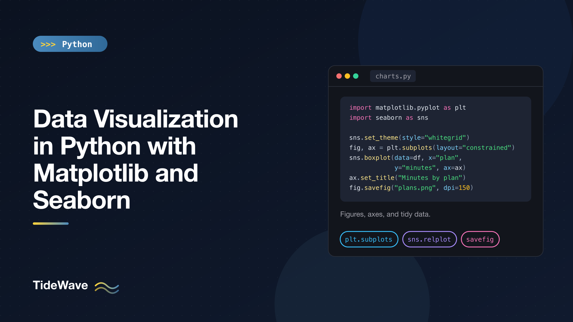
sns.set_theme() applies Seaborn's styling to all Matplotlib figures in the session, including ones you draw with plain Matplotlib:
import seaborn as sns

sns.set_theme(style="whitegrid", palette="deep")
Styles include "darkgrid" (the default), "whitegrid", "dark", "white", and "ticks". You can also pass context="talk" or context="paper" to scale fonts and line widths for slides or print.
Axes-Level Functions
Most Seaborn functions draw onto a single Matplotlib Axes and accept an ax= argument. That means they slot straight into the figure and subplot code you already know.
# seaborn_scatter.py
import matplotlib.pyplot as plt
import seaborn as sns

from data import df

sns.set_theme(style="whitegrid")

fig, ax = plt.subplots(figsize=(7, 4), layout="constrained")
sns.scatterplot(data=df, x="sessions", y="minutes", hue="plan", style="region", ax=ax)
ax.set_title("Sessions vs minutes")
fig.savefig("seaborn_scatter.png", dpi=150)
Two lines of Seaborn did what would take a loop in Matplotlib: hue="plan" colors points by plan, style="region" changes marker shape by region, and the legend is built for you. After that, ax is a normal Axes, so ax.set_title() and every customization from earlier still apply.
Distribution and comparison charts are where Seaborn saves the most work:
# seaborn_distributions.py
import matplotlib.pyplot as plt
import seaborn as sns

from data import df

sns.set_theme(style="whitegrid")
fig, axes = plt.subplots(1, 3, figsize=(13, 4), layout="constrained")

sns.histplot(data=df, x="minutes", hue="plan", kde=True, element="step", ax=axes[0])
sns.boxplot(data=df, x="plan", y="minutes", order=["free", "pro", "team"], ax=axes[1])
sns.barplot(data=df, x="plan", y="minutes", hue="region", errorbar="sd", ax=axes[2])

fig.savefig("distributions.png")
histplotdraws a histogram per plan, andkde=Trueoverlays a smoothed density curve.element="step"draws outlines instead of filled bars so overlapping groups stay readable.boxplotshows median, quartiles, and outliers per group.order=fixes the category order instead of using the order of first appearance.barplotdoesn't plot raw values. It aggregates (mean by default) and draws an error bar.errorbar="sd"shows one standard deviation; the default is a 95% bootstrapped confidence interval.
That last point trips people up: if your data is already aggregated, one row per bar, barplot still works, but the error bars disappear because there's nothing to estimate.
Here's a quick map of the most useful axes-level functions:
| Purpose | Functions |
|---|---|
| Relationships | scatterplot, lineplot, regplot |
| Distributions | histplot, kdeplot, ecdfplot |
| Categorical comparisons | boxplot, violinplot, stripplot, barplot, countplot |
| Matrices | heatmap |
lineplot deserves a mention: if your data has several y-values per x-value, it plots the mean and shades a confidence band automatically, which is exactly what you want for repeated measurements.
Figure-Level Functions and Faceting
Figure-level functions create their own figure and can split the data into a grid of subplots by column values. This is called faceting, and it's often clearer than cramming every group into one chart.
# seaborn_facets.py
import seaborn as sns

from data import df

sns.set_theme(style="whitegrid")

g = sns.relplot(
    data=df, x="sessions", y="minutes", hue="plan", col="region", kind="scatter", height=4
)
g.set_axis_labels("Sessions", "Minutes")
g.figure.suptitle("Usage by region", y=1.03)
g.savefig("by_region.png")

g = sns.catplot(data=df, x="plan", y="minutes", col="region", kind="violin", height=4)
g.savefig("violins.png")
col="region" makes one subplot per region, side by side; row= stacks them vertically, and you can use both. The return value is a FacetGrid, not an Axes, so you customize it through its own methods (set_axis_labels, set_titles) or reach into g.figure and g.axes for Matplotlib-level control.
The three figure-level functions map onto the axes-level families:
| Figure-level | kind= options |
|---|---|
relplot | "scatter", "line" |
displot | "hist", "kde", "ecdf" |
catplot | "strip", "swarm", "box", "violin", "bar", "point", "count" |
The rule of thumb: use an axes-level function when you're placing a chart into a layout you control, and a figure-level function when you want Seaborn to build the layout from your data. Don't pass ax= to a figure-level function; it creates its own figure.
Heatmaps and Pair Plots
A heatmap is a good fit for a pivot table or correlation matrix:
# seaborn_heatmap.py
import matplotlib.pyplot as plt
import seaborn as sns

from data import df

pivot = df.pivot_table(index="plan", columns="region", values="minutes", aggfunc="mean")

fig, ax = plt.subplots(figsize=(5, 4), layout="constrained")
sns.heatmap(pivot, annot=True, fmt=".1f", cmap="viridis", ax=ax)
ax.set_title("Mean minutes by plan and region")
fig.savefig("heatmap.png")
annot=True writes each value in its cell and fmt controls the number format. Seaborn uses the DataFrame's index and columns as tick labels, which is the main advantage over ax.imshow.
For a quick look at how several numeric columns relate, pairplot draws a scatter for every pair and a distribution on the diagonal:
import seaborn as sns

from data import df

g = sns.pairplot(df, hue="plan", vars=["sessions", "minutes"])
g.savefig("pairs.png")
It gets slow and unreadable with many columns, so pass vars= to choose a handful.
Plotting Straight from pandas
pandas has a .plot accessor that calls Matplotlib for you and returns an Axes. It's the fastest route from a groupby to a chart:
from data import df

ax = df.groupby("plan")["minutes"].mean().plot(kind="bar", rot=0, title="Mean minutes by plan")
ax.set_ylabel("Minutes")
ax.figure.savefig("pandas_bar.png")
Since you get an Axes back, you can keep customizing with the same methods. For exploratory work, pandas plotting and Seaborn cover most needs; drop to raw Matplotlib when you need precise control.
Choosing Between Matplotlib and Seaborn
You rarely choose one or the other. A practical split:
- Reach for Seaborn when your data is in a DataFrame and you want to compare groups, show distributions, or facet by category. It handles colors, legends, and aggregation for you.
- Reach for Matplotlib for layout (subplots, figure size, saving), fine-grained styling, annotations, unusual chart types, and anything that isn't a statistical summary.
- Combine them by creating the figure with
plt.subplots(), drawing with Seaborn usingax=, and finishing with Matplotlib methods on that sameax.
A few habits that consistently improve charts:
- Label axes with units, and give each chart a title that states what it shows.
- Start bar charts at zero. Line charts don't have to.
- Sort categorical bars by value unless the categories have a natural order.
- Use color to encode something. If every bar is a different color for no reason, it's noise.
- Pick perceptually uniform colormaps like
"viridis"for continuous values, and a diverging one like"vlag"when values are centered on zero.
Conclusion
Matplotlib's object-oriented API is the foundation: create a figure and axes with plt.subplots(), draw with methods on the axes, and save with fig.savefig(). Once that model clicks, Seaborn becomes a set of shortcuts that turn a tidy DataFrame into grouped, colored, statistically summarized charts in one call, while still handing you a normal Axes to polish.
Start with constrained layout and a Seaborn theme, use axes-level functions inside layouts you control, use figure-level functions when you want faceting, and close your figures when you generate them in bulk. That covers the large majority of real-world charting in Python.