Blog
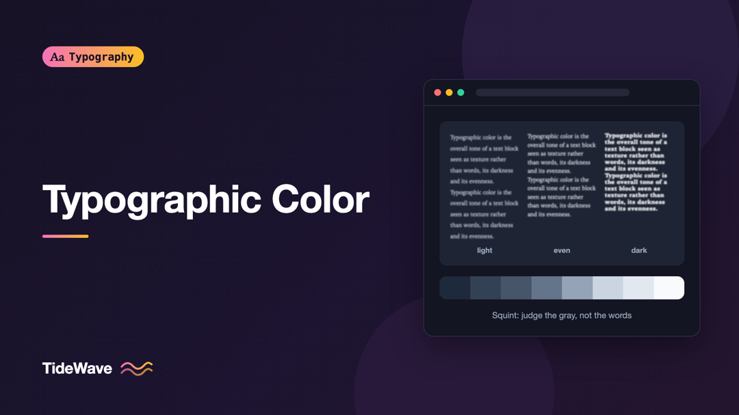
Typographic Color: Judging the Gray Value of a Text Block
- Maria
- Typography
- 23 Oct, 2026
Step back from your screen until you can't read the words on a page, or squint until the letters blur. What's left is a pattern of gray shapes: parag
Continue Reading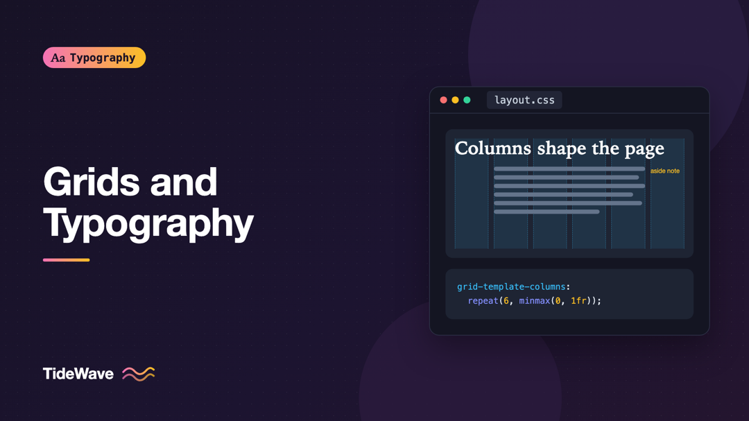
Grids and Typography: How Column Systems Shape Text Layout
- Maria
- Typography
- 23 Oct, 2026
Look at a well-designed magazine page and then at a cluttered web page with the same amount of content. The difference often isn't the fonts or the c
Continue Reading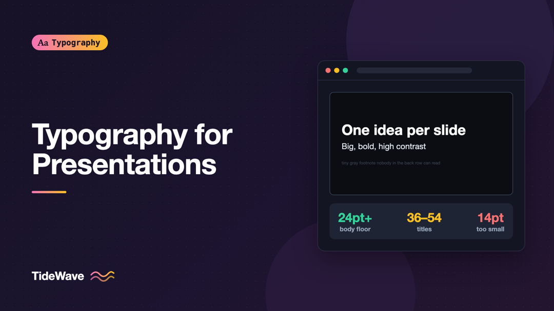
Typography for Presentations: Making Slides Readable from the Back of the Room
- Maria
- Typography
- 23 Oct, 2026
You've been in the audience for this: the speaker says "as you can see here," and the slide shows a 14-point bullet list in light gray on white, proj
Continue Reading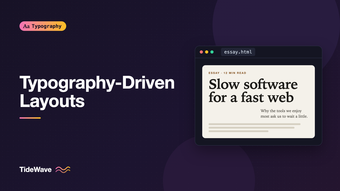
Typography-Driven Layouts: When Text Is the Design
- Maria
- Typography
- 23 Oct, 2026
Picture a page with no hero image, no illustration, no gradient blob. Just a large headline, a short introduction, and well-spaced sections of text.
Continue Reading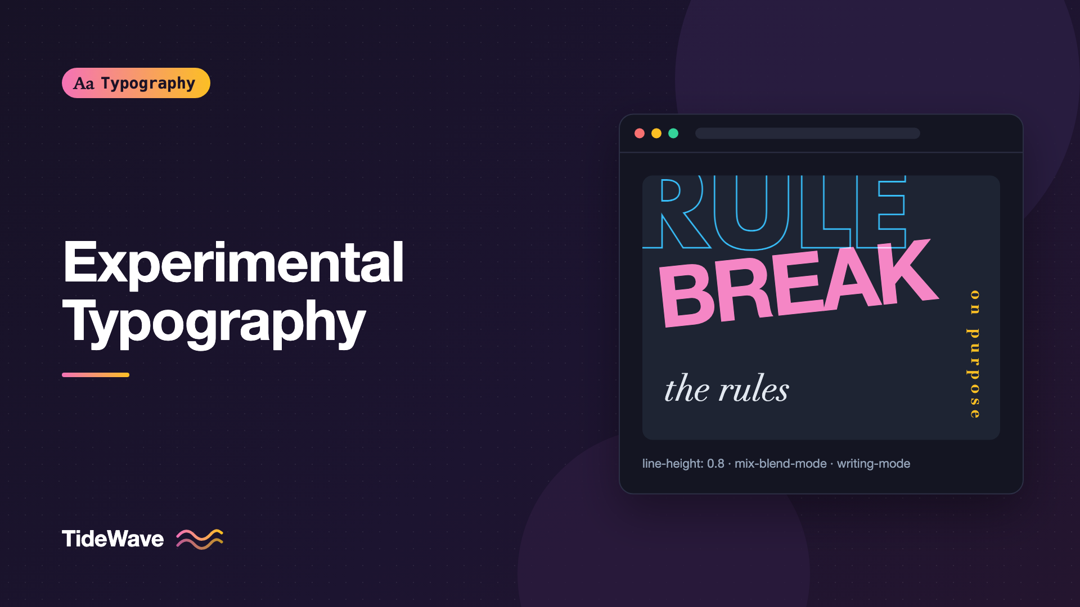
Experimental Typography: Breaking the Rules on Purpose
- Maria
- Typography
- 23 Oct, 2026
Most typography advice is about restraint. Keep lines between 45 and 75 characters. Use two fonts at most. Don't center long paragraphs. Leave enough
Continue Reading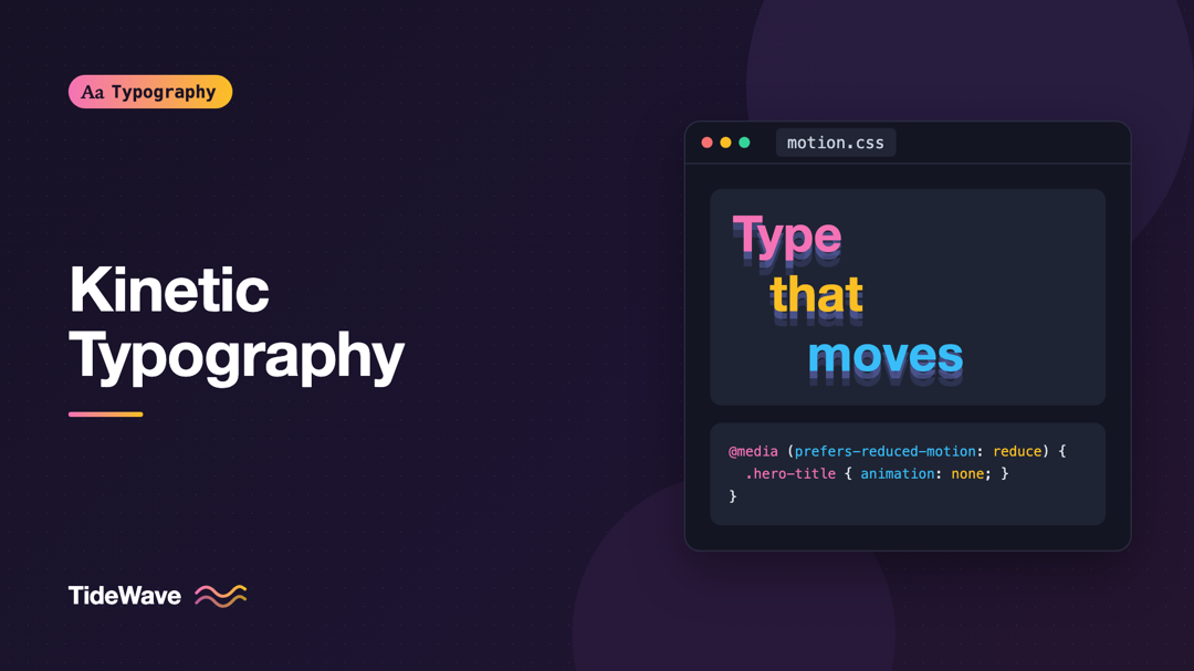
Kinetic Typography: Animating Text Without Hurting Usability
- Maria
- Typography
- 23 Oct, 2026
You've probably landed on a page where the headline types itself out one letter at a time, then deletes itself, then types a different word. It's cha
Continue Reading