Typography
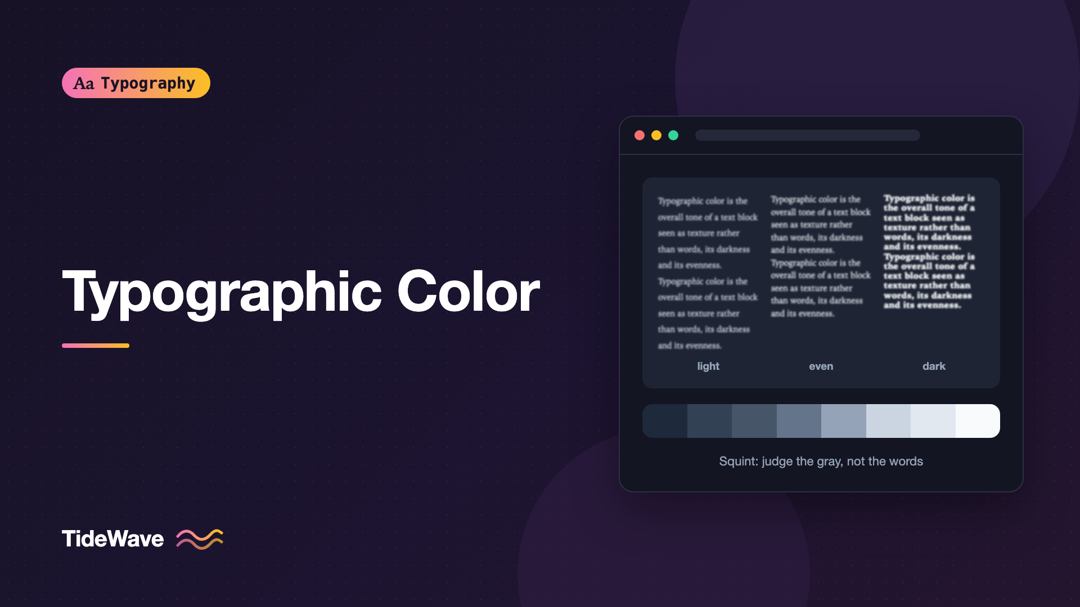
Typographic Color: Judging the Gray Value of a Text Block
- Maria
- Typography
- 23 Oct, 2026
Step back from your screen until you can't read the words on a page, or squint until the letters blur. What's left is a pattern of gray shapes: parag
Continue Reading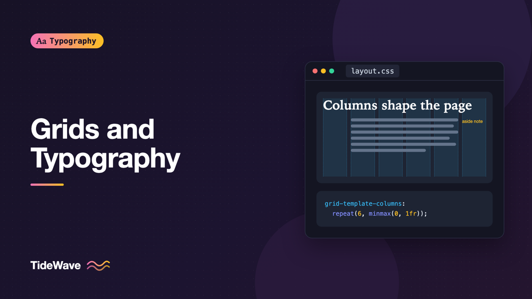
Grids and Typography: How Column Systems Shape Text Layout
- Maria
- Typography
- 23 Oct, 2026
Look at a well-designed magazine page and then at a cluttered web page with the same amount of content. The difference often isn't the fonts or the c
Continue Reading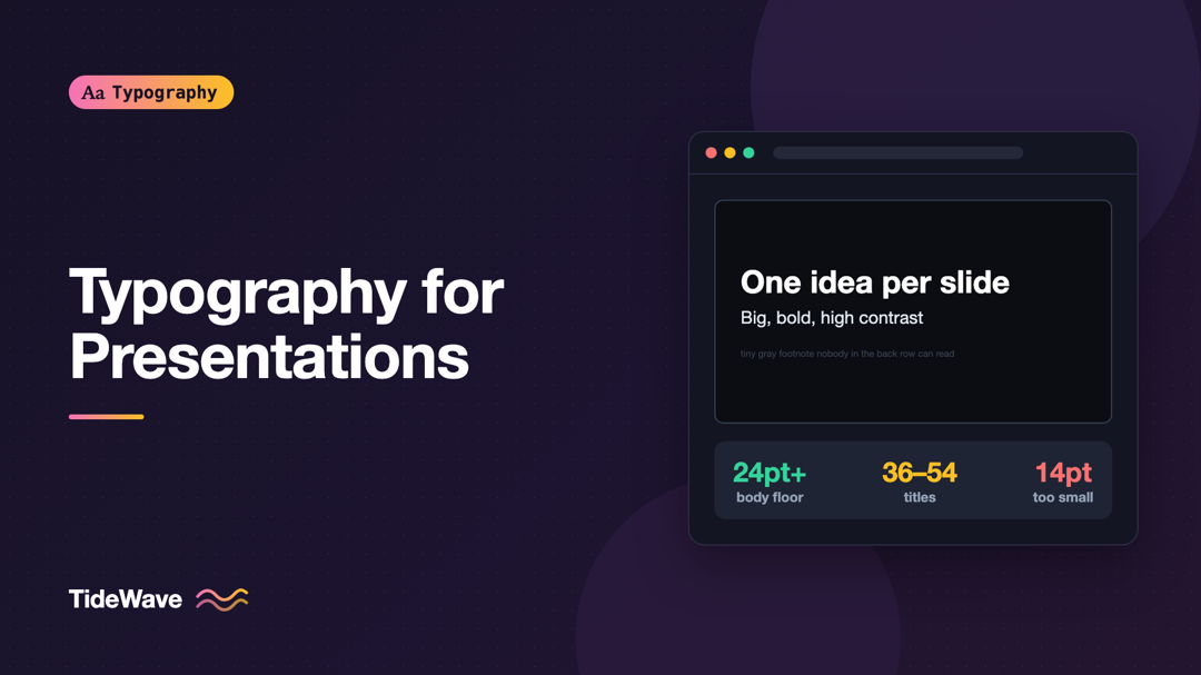
Typography for Presentations: Making Slides Readable from the Back of the Room
- Maria
- Typography
- 23 Oct, 2026
You've been in the audience for this: the speaker says "as you can see here," and the slide shows a 14-point bullet list in light gray on white, proj
Continue Reading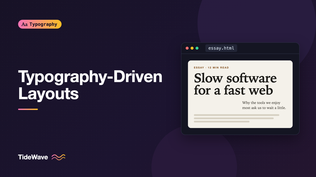
Typography-Driven Layouts: When Text Is the Design
- Maria
- Typography
- 23 Oct, 2026
Picture a page with no hero image, no illustration, no gradient blob. Just a large headline, a short introduction, and well-spaced sections of text.
Continue Reading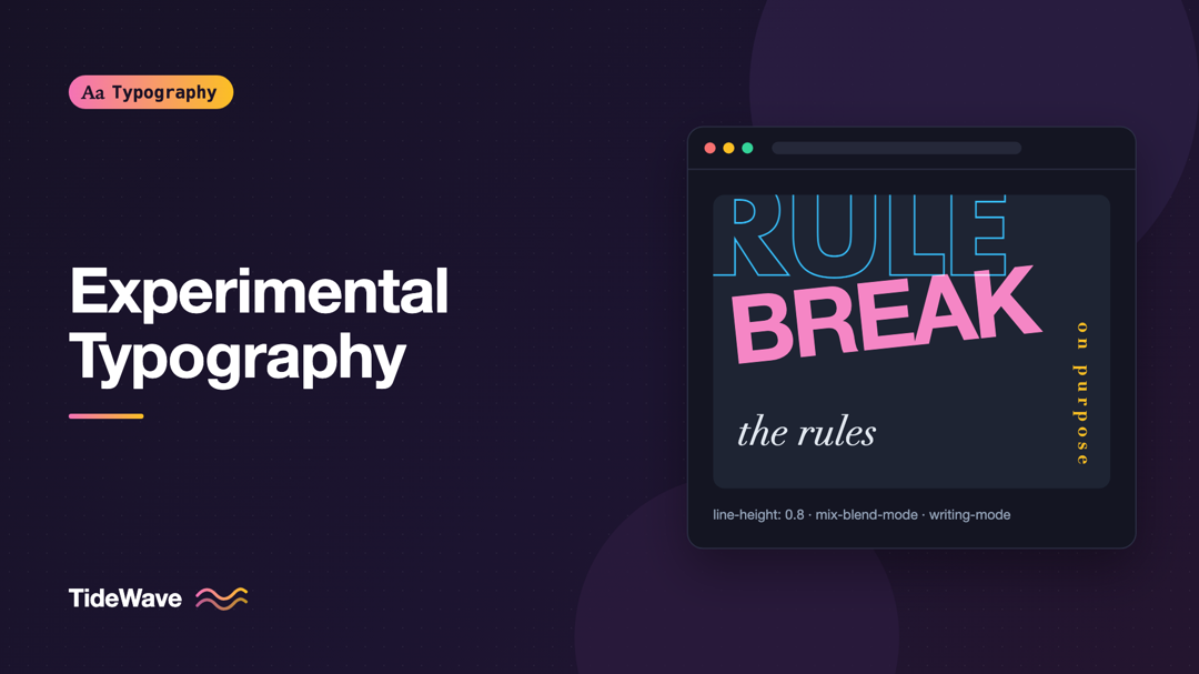
Experimental Typography: Breaking the Rules on Purpose
- Maria
- Typography
- 23 Oct, 2026
Most typography advice is about restraint. Keep lines between 45 and 75 characters. Use two fonts at most. Don't center long paragraphs. Leave enough
Continue Reading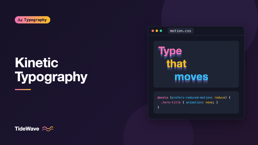
Kinetic Typography: Animating Text Without Hurting Usability
- Maria
- Typography
- 23 Oct, 2026
You've probably landed on a page where the headline types itself out one letter at a time, then deletes itself, then types a different word. It's cha
Continue Reading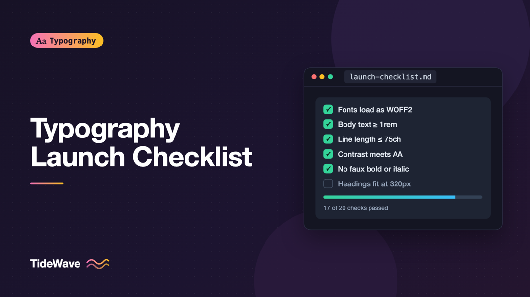
Typography Checklist: 20 Things to Review Before You Launch
- Maria
- Typography
- 23 Oct, 2026
The week before launch is when typography gets the least attention. Everyone is chasing broken forms, missing images, and analytics tags, and the tex
Continue Reading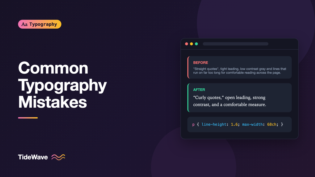
Common Typography Mistakes and How to Fix Them
- Maria
- Typography
- 23 Oct, 2026
Most typography problems on the web aren't dramatic. Nobody sets a whole site in a novelty script anymore. The problems are quieter: paragraphs that
Continue Reading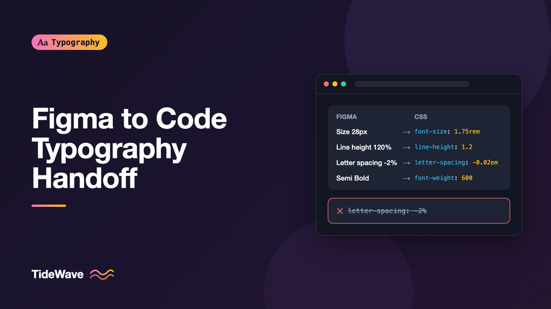
Handing Off Typography from Figma to Code Without Losing Detail
- Maria
- Typography
- 23 Oct, 2026
A designer shares a Figma file. The headings look tight and confident, the body text breathes, the labels have just the right amount of tracking. Two
Continue Reading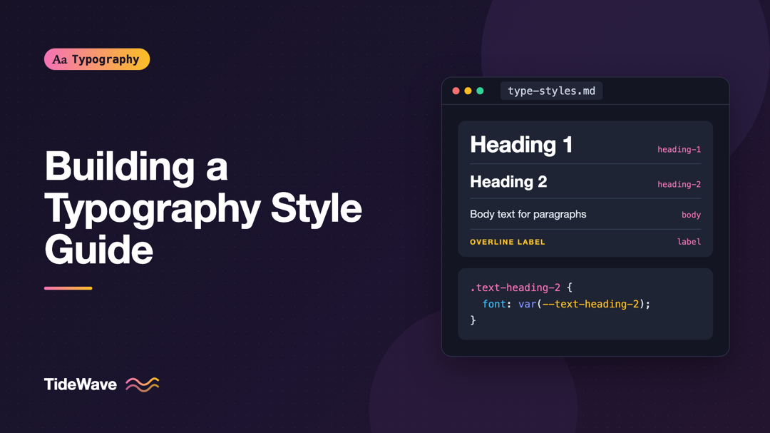
Building a Typography Style Guide for Your Team
- Maria
- Typography
- 23 Oct, 2026
Open any product that has been worked on by more than a handful of people and you'll find it: three slightly different heading sizes, body text at 15
Continue Reading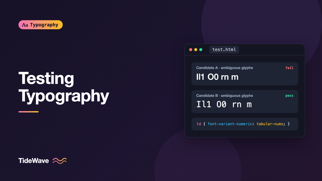
Testing Typography: How to Evaluate Fonts Before You Commit
- Maria
- Typography
- 23 Oct, 2026
Picking a typeface from a specimen page is easy. The specimen shows a beautiful headline, a perfect paragraph, and a carefully chosen word in a huge
Continue Reading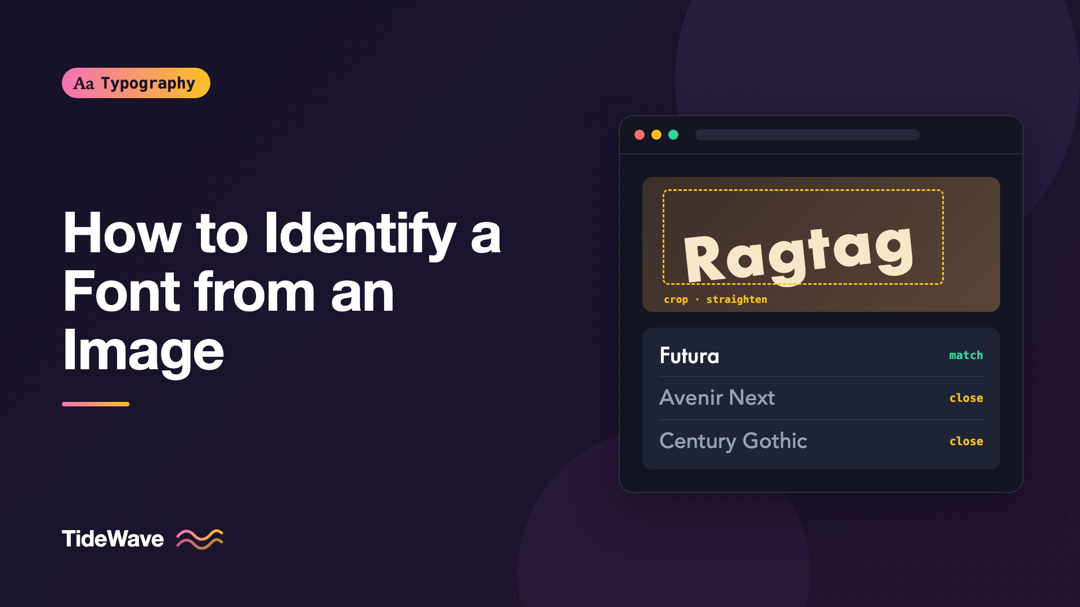
How to Identify a Font from an Image
- Maria
- Typography
- 23 Oct, 2026
A client sends a photo of a shop sign and says, "We want our logo to feel like this." A colleague shares a screenshot of a competitor's landing page.
Continue Reading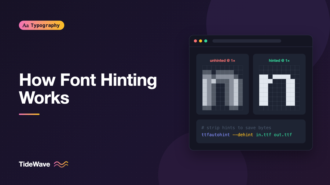
How Font Hinting Works and Why It Matters Less Than It Used To
- Maria
- Typography
- 23 Oct, 2026
Open the same web page on a modern laptop and on an older office monitor running Windows, and the text can look surprisingly different. On the laptop
Continue Reading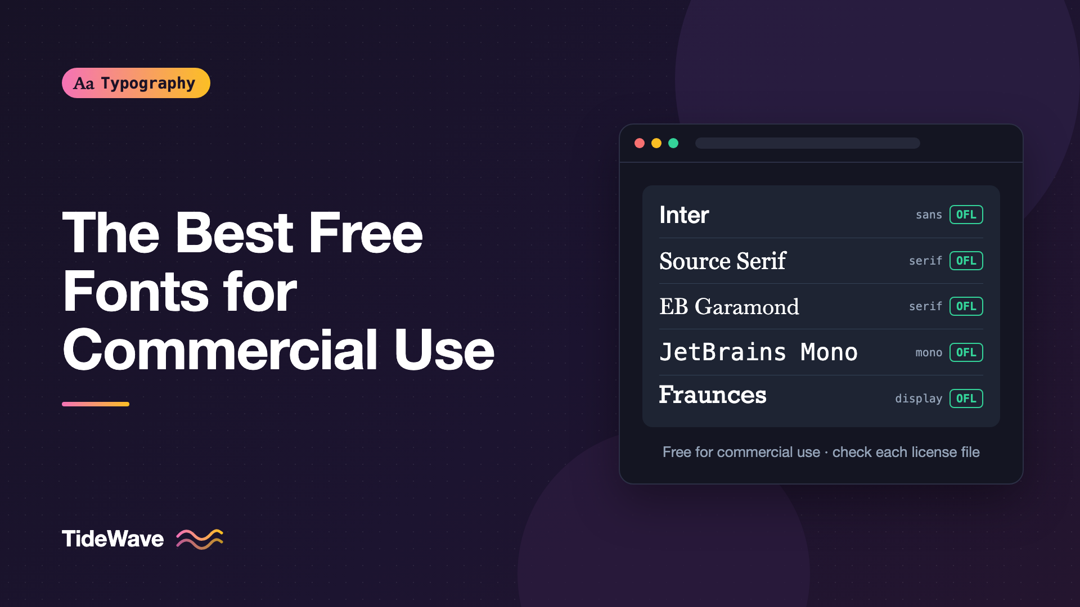
The Best Free and Open-Source Fonts for Commercial Projects
- Maria
- Typography
- 23 Oct, 2026
You need a typeface for a client site, a SaaS product, or a startup's brand, and the budget doesn't stretch to a commercial family. A search for "fre
Continue Reading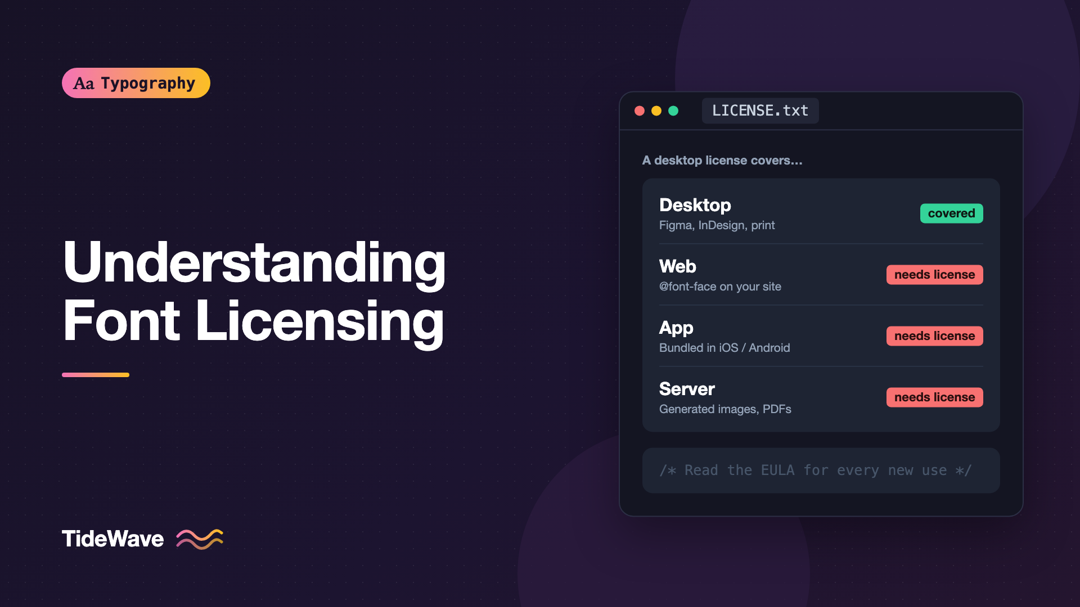
Understanding Font Licensing: Desktop, Web, and App Licenses Explained
- Maria
- Typography
- 23 Oct, 2026
A designer buys a typeface for a brand project, installs it, and builds the logo, the slides, and the website mockups. Then a developer converts the
Continue Reading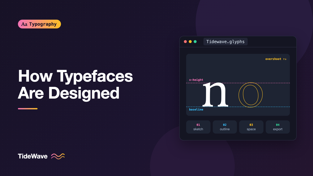
How Typefaces Are Designed: From Sketch to Font File
- Maria
- Typography
- 23 Oct, 2026
You pick fonts from a menu, load them with @font-face, and set them with a few lines of CSS. It's easy to forget that every one of those fonts is t
Continue Reading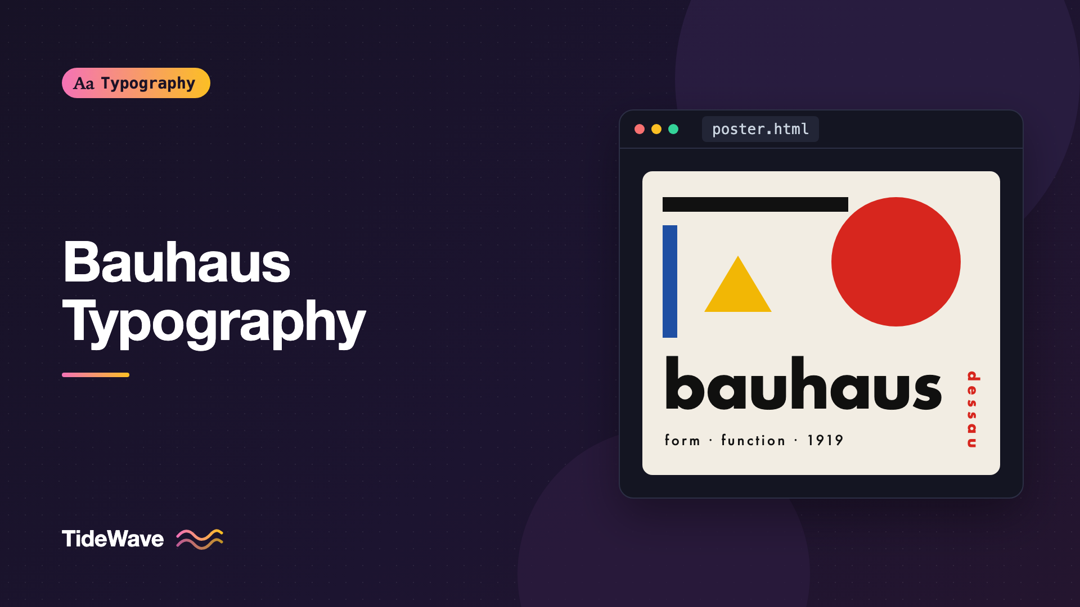
Bauhaus Typography and Its Influence on Modern Design
- Maria
- Typography
- 23 Oct, 2026
Bold sans-serif type, thick black bars, red accents, text running at an angle, and lowercase-only headlines. If a poster or website uses that combina
Continue Reading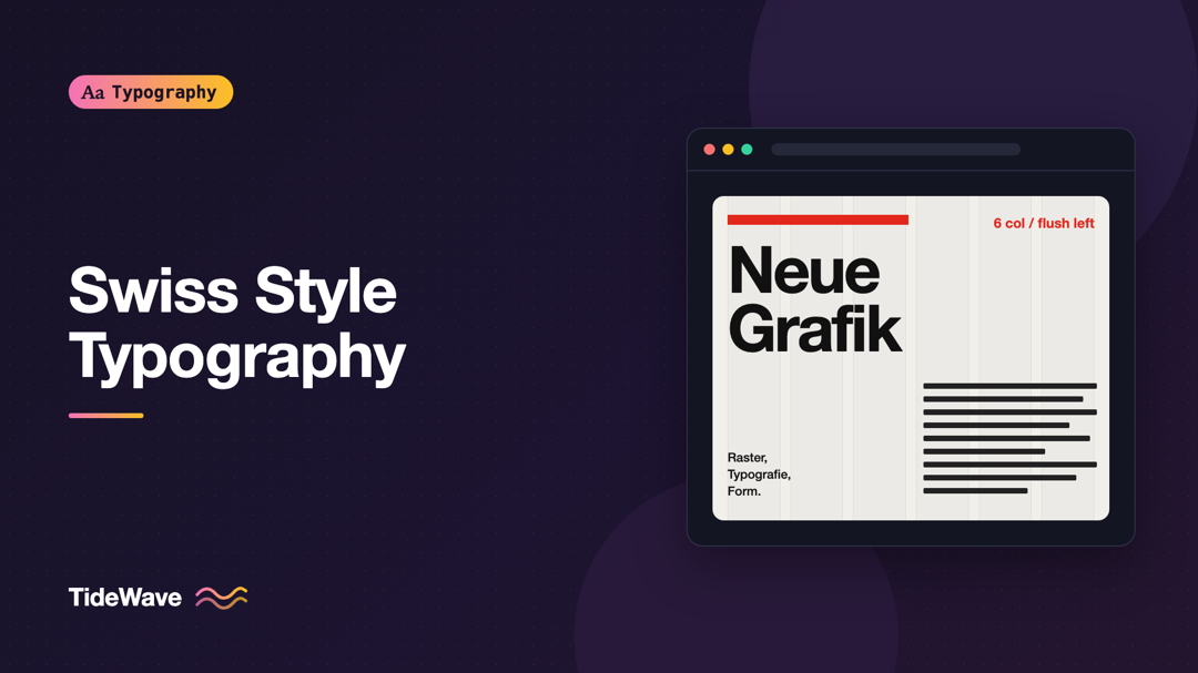
Swiss Style Typography: Principles of the International Typographic Style
- Maria
- Typography
- 23 Oct, 2026
If you've ever designed a page with a strict column grid, a single sans-serif family, flush-left text, and lots of deliberate empty space, you've bor
Continue Reading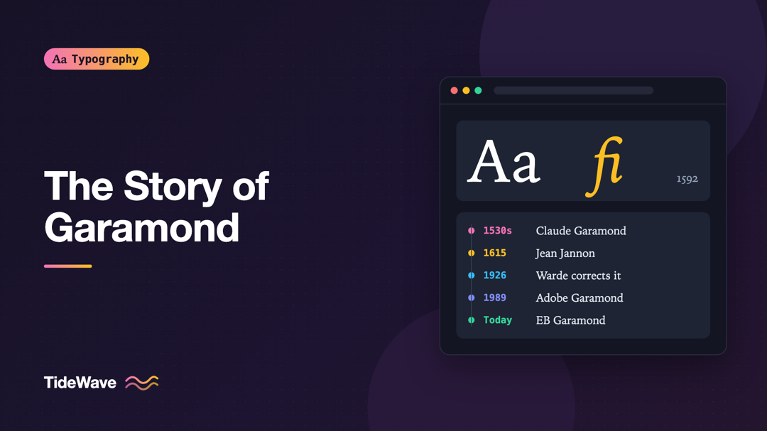
The Story of Garamond and Its Many Revivals
- Maria
- Typography
- 23 Oct, 2026
Open the font menu on almost any computer and you'll find something called Garamond. Open a different computer and you'll find another Garamond that
Continue Reading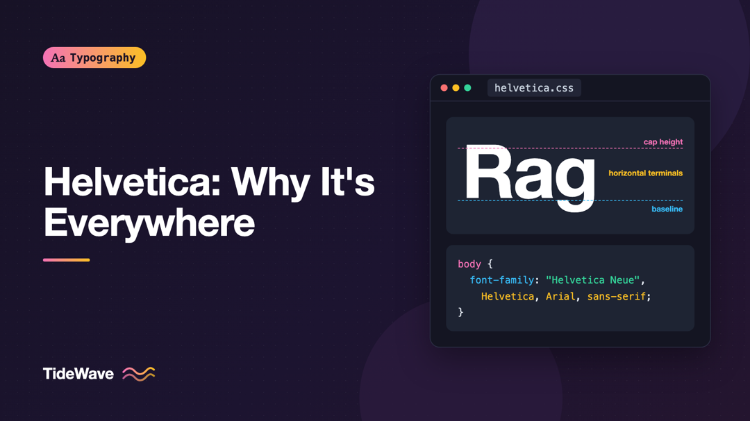
Helvetica: Why One Typeface Ended Up Everywhere
- Maria
- Typography
- 23 Oct, 2026
Walk through an airport, read the tax form on your desk, or look at the logos on half the products in your kitchen, and there's a good chance you're
Continue Reading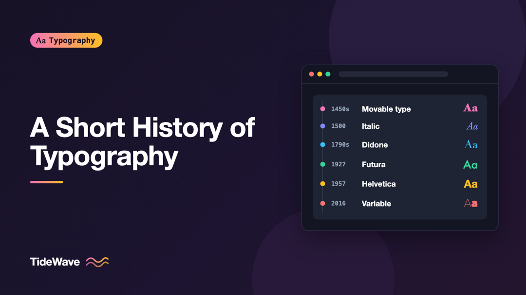
A Short History of Typography: From Gutenberg to Variable Fonts
- Maria
- Typography
- 23 Oct, 2026
When you write font-weight: 600 or font-style: italic, you're using vocabulary that is hundreds of years old. "Italic" comes from Renaissance Ita
Continue Reading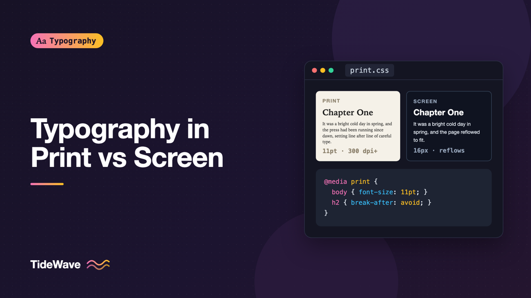
Typography in Print vs Screen: What Changes and What Doesn't
- Maria
- Typography
- 23 Oct, 2026
A designer with years of print experience moves to web work and finds that some of their instincts are perfect and others backfire. The careful atten
Continue Reading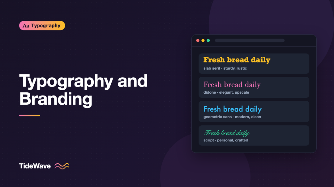
Typography and Branding: How Typefaces Shape Brand Personality
- Maria
- Typography
- 23 Oct, 2026
Put the same sentence, "Fresh bread every morning," in three typefaces: a chunky slab serif, a delicate high-contrast Didone, and a rounded geometric
Continue Reading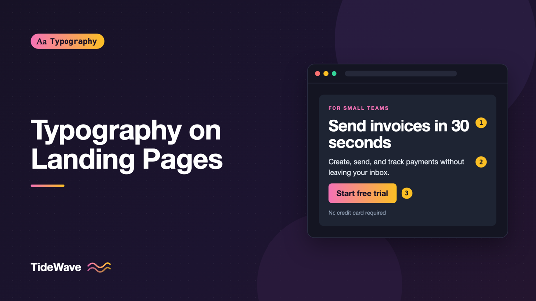
Typography on Landing Pages: How Type Drives Conversions
- Maria
- Typography
- 23 Oct, 2026
A visitor lands on your page from an ad or a search result. In the first few seconds they decide whether this is what they were looking for. They don
Continue Reading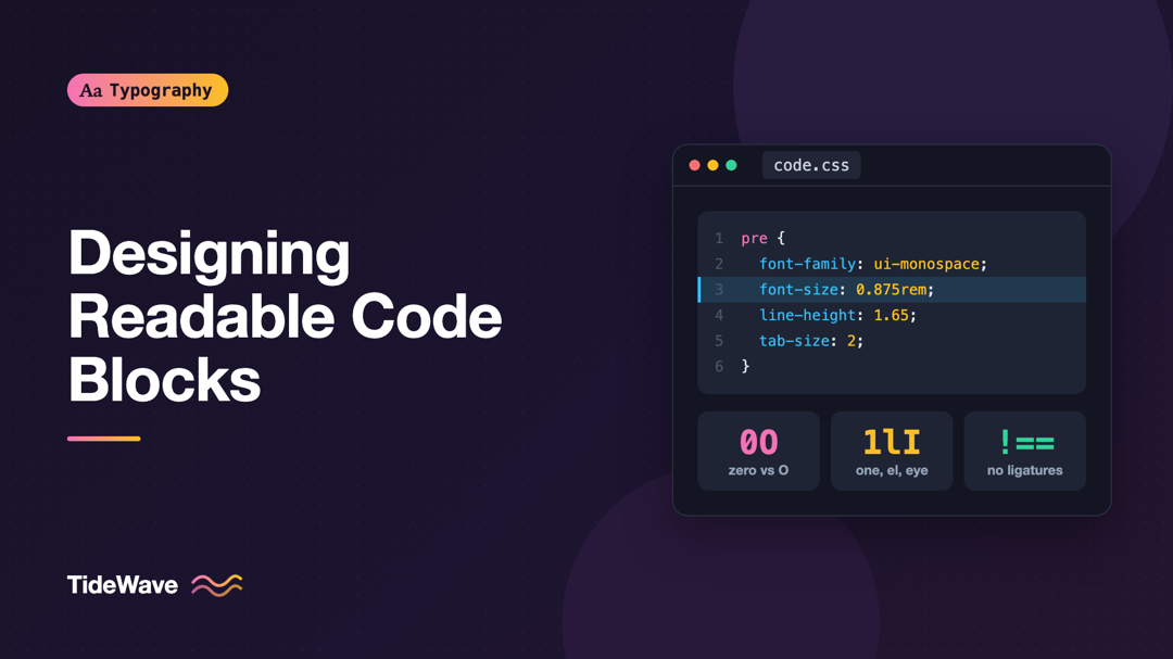
Designing Readable Code Blocks: Fonts, Sizes, and Spacing for Developers
- Maria
- Typography
- 23 Oct, 2026
Developers spend hours tuning the font, size, and theme in their editor, then publish documentation with code blocks set in 12-pixel Courier, cramped
Continue Reading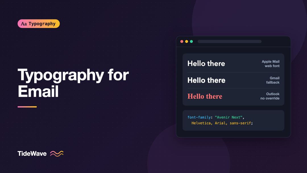
Typography for Email: Fonts That Survive Every Inbox
- Maria
- Typography
- 23 Oct, 2026
You design a newsletter with a lovely custom typeface, send a test to yourself, and it looks perfect in Apple Mail. Then a colleague forwards a scree
Continue Reading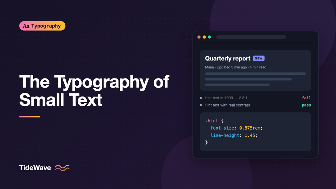
Writing and Styling Microcopy: The Typography of Small Text
- Maria
- Typography
- 23 Oct, 2026
Look at a sign-up form and count the pieces of text that aren't headings or body copy. "Must be at least 8 characters." "We'll never share your email
Continue Reading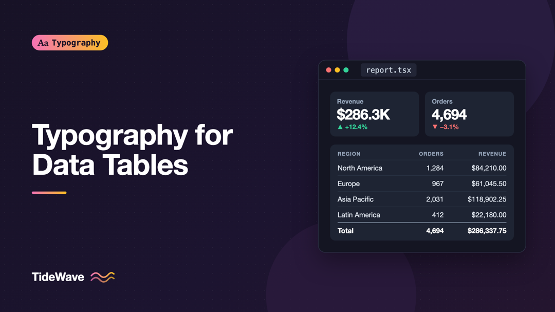
Typography for Data Tables and Dashboards
- Maria
- Typography
- 23 Oct, 2026
Open almost any admin panel and you'll find the same problems: numbers in a column that don't line up, a revenue figure that jitters every time it up
Continue Reading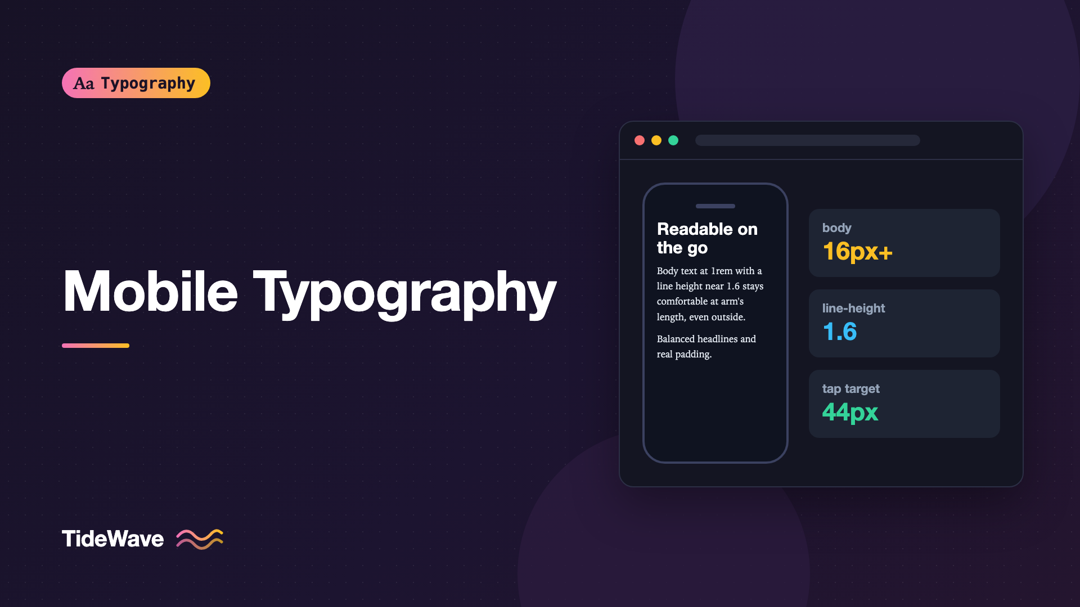
Mobile Typography: Designing Readable Text for Small Screens
- Maria
- Typography
- 23 Oct, 2026
You design a page on a 27-inch monitor, check it in the browser's device toolbar, and it looks fine. Then you open it on an actual phone on a sunny a
Continue Reading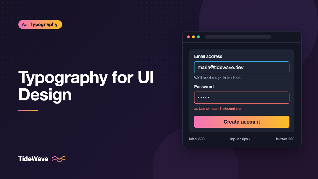
Typography for UI Design: Choosing Fonts for Buttons, Labels, and Forms
- Maria
- Typography
- 23 Oct, 2026
Most typography advice is written for paragraphs: line length, leading, rhythm, the feel of a long column of text. Then you open a settings screen or
Continue Reading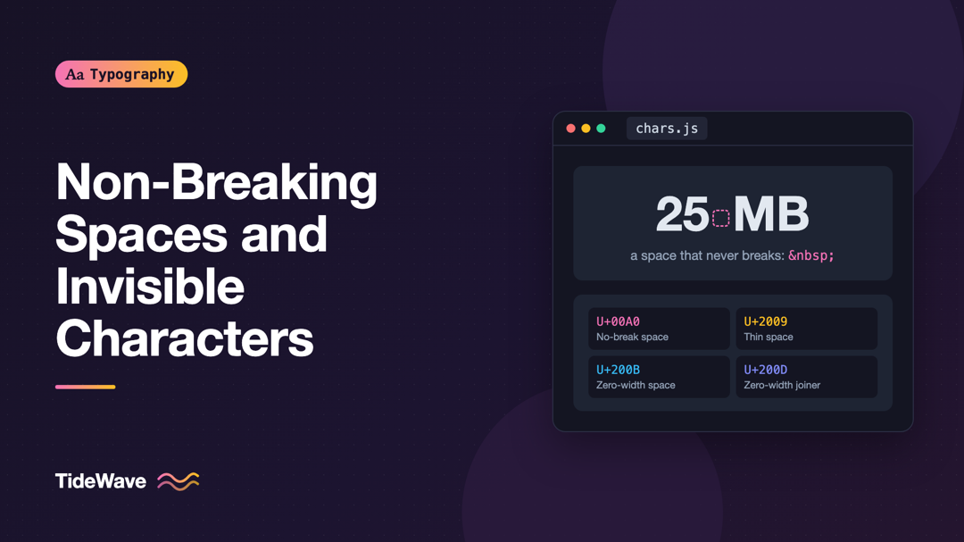
Non-Breaking Spaces and Other Invisible Characters Typographers Use
- Maria
- Typography
- 23 Oct, 2026
A price on your site wraps so that "$" sits at the end of one line and "1,299" starts the next. A long URL in a narrow sidebar overflows its containe
Continue Reading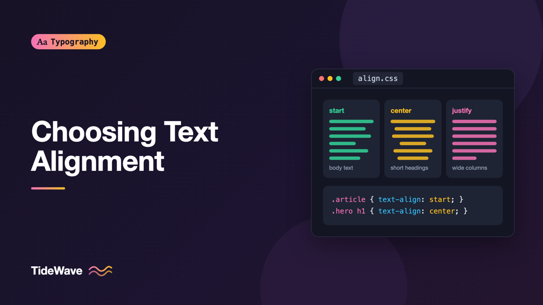
Left-Aligned, Centered, or Justified: Choosing Text Alignment
- Maria
- Typography
- 23 Oct, 2026
A designer centers everything on a landing page because it feels balanced: the headline, the intro, the feature descriptions, the list of benefits, e
Continue Reading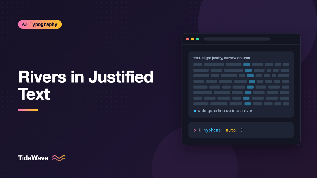
Rivers in Justified Text: Why They Appear and How to Prevent Them
- Maria
- Typography
- 23 Oct, 2026
You set an article to text-align: justify because you want the clean, bookish look of straight edges on both sides. On a wide desktop screen, it lo
Continue Reading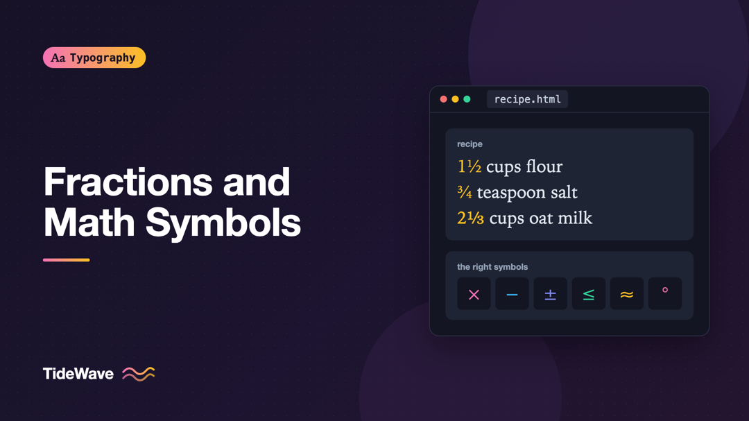
Typesetting Fractions and Math Symbols on the Web
- Maria
- Typography
- 23 Oct, 2026
A recipe calls for "1 1/2 cups flour". A product page lists a screen size as "6 x 4 in". A pricing table shows a discount as "-15%". Each one is read
Continue Reading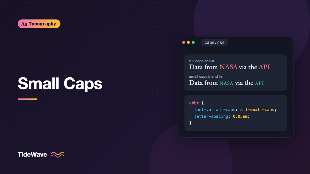
Small Caps: When to Use Them and How to Set Them Properly
- Maria
- Typography
- 23 Oct, 2026
Read a paragraph full of acronyms like NASA, HTML, CSS, and API, and you'll notice how loud they are. Each one is a block of full-height capitals tha
Continue Reading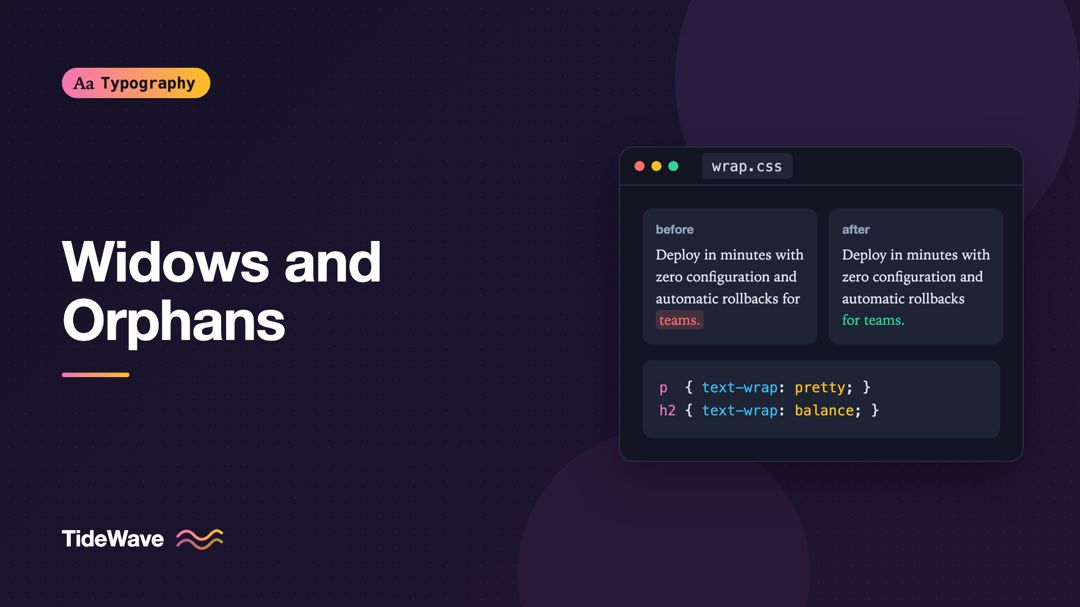
Widows and Orphans: How to Fix Awkward Line Breaks
- Maria
- Typography
- 23 Oct, 2026
You've just finished a landing page. The hero paragraph looks great on your monitor, but on a phone it ends with a single word sitting alone on the l
Continue Reading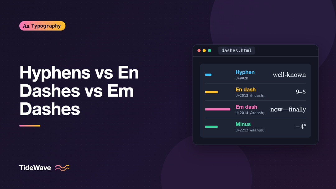
Hyphens vs En Dashes vs Em Dashes: When to Use Each
- Maria
- Typography
- 23 Oct, 2026
Your keyboard has one key that looks like a dash. Typography has at least five characters that do. A pricing page that says "Open 9-5" or a temperatu
Continue Reading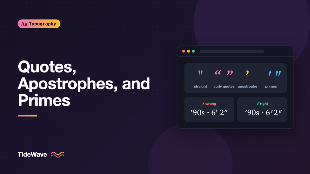
Quotes, Apostrophes, and Primes: Getting Punctuation Right
- Maria
- Typography
- 23 Oct, 2026
Look closely at a carefully typeset book and then at a typical web page. In the book, quotation marks curl around the words they enclose, like little
Continue Reading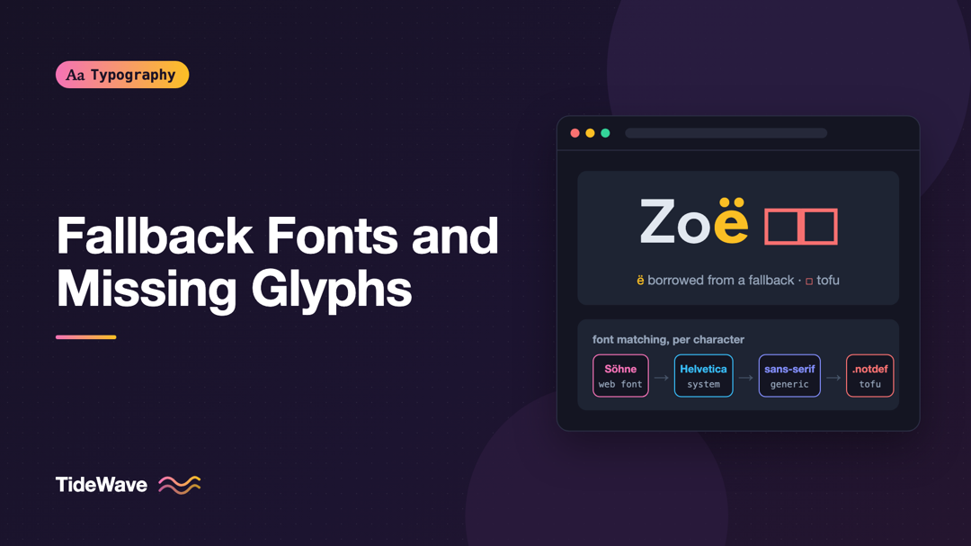
Fallback Fonts and Missing Glyphs: What Happens When a Character Isn't Supported
- Maria
- Typography
- 23 Oct, 2026
A customer named Zoë signs up, and her name appears on her profile page in your brand font, except for the "ë", which looks slightly heavier and a li
Continue Reading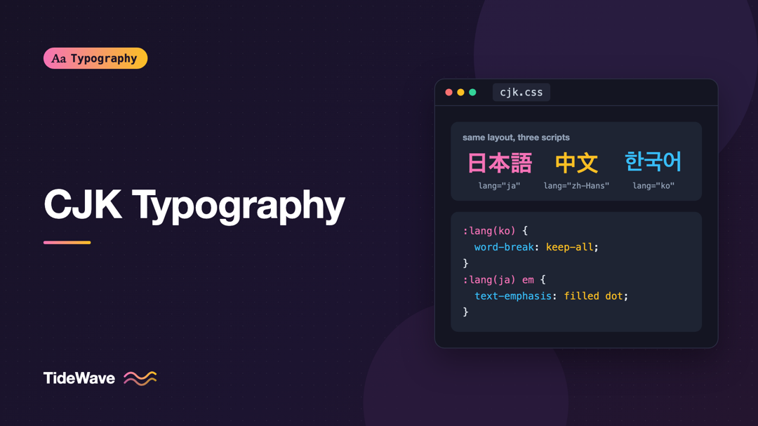
CJK Typography: Setting Chinese, Japanese, and Korean Text on the Web
- Maria
- Typography
- 23 Oct, 2026
You localize a product into Japanese, ship it, and a native speaker sends you a screenshot. Some characters look subtly wrong, as if they were drawn
Continue Reading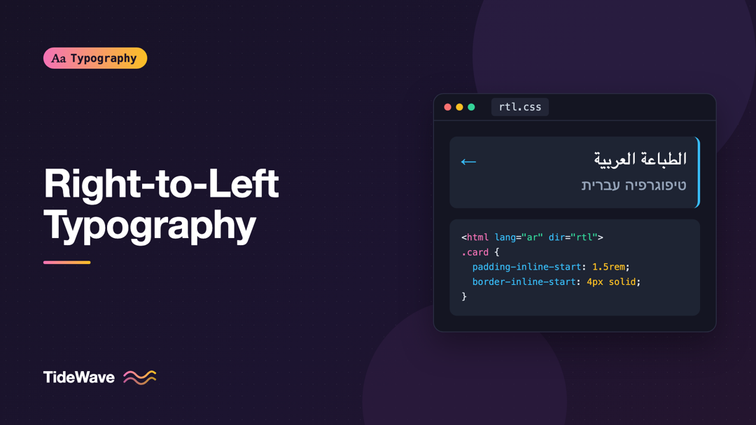
Right-to-Left Typography: Designing for Arabic and Hebrew Text
- Maria
- Typography
- 23 Oct, 2026
The first attempt at an Arabic or Hebrew version of a site often goes the same way. Someone adds direction: rtl to the body, the text moves to the
Continue Reading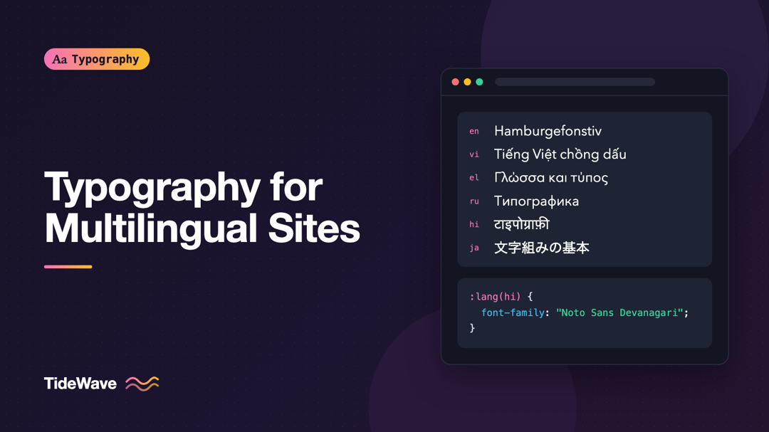
Typography for Multilingual Websites: Choosing Fonts with Wide Language Support
- Maria
- Typography
- 23 Oct, 2026
You pick a beautiful typeface for your product's marketing site, and it looks great in English. Then the site launches in Polish, and a few letters w
Continue Reading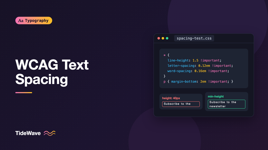
Meeting WCAG Text Spacing Requirements
- Maria
- Typography
- 23 Oct, 2026
A user with low vision or dyslexia installs a browser extension that adds extra space between letters, words, and lines. On most sites, articles refl
Continue Reading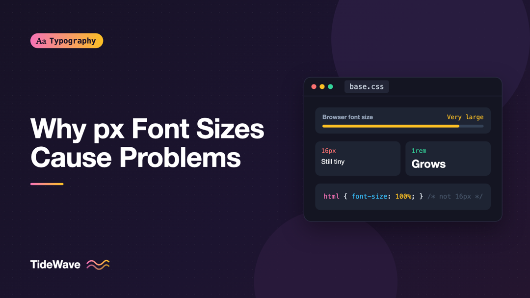
Respecting User Font Size Preferences: Why px Font Sizes Cause Problems
- Maria
- Typography
- 23 Oct, 2026
Open your browser's settings and look for the font size option. In Chrome it's under Appearance, in Firefox under Fonts. It's set to "Medium" or 16 b
Continue Reading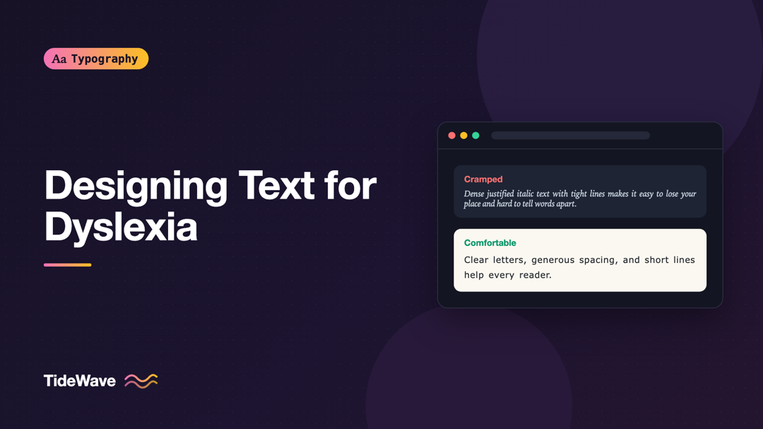
Designing Text for Users with Dyslexia
- Maria
- Typography
- 23 Oct, 2026
Picture a dense block of justified text, set in a light italic font, with tight line spacing and long lines, on a bright white background. Most reade
Continue Reading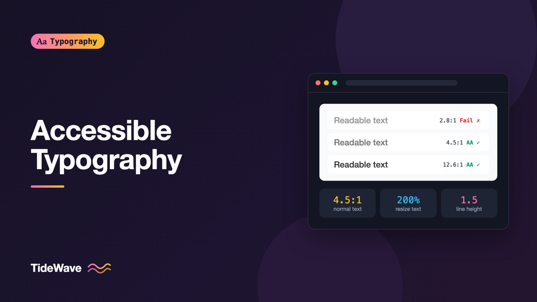
Accessible Typography: Font Size, Contrast, and Spacing Guidelines
- Maria
- Typography
- 23 Oct, 2026
Most accessibility work on a website involves text. Navigation labels, form instructions, error messages, article bodies, button captions: if people
Continue Reading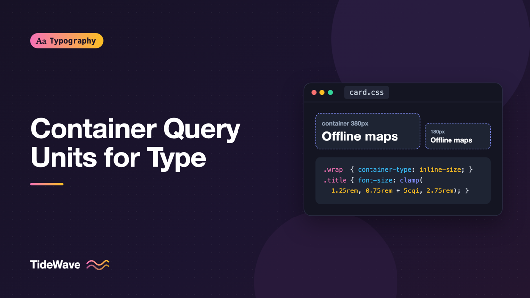
Using CSS Container Query Units for Component-Level Typography
- Maria
- Typography
- 23 Oct, 2026
Fluid typography built on viewport units has a blind spot. A card title sized with clamp(1.25rem, 1rem + 1.5vw, 2rem) looks great when the card spa
Continue Reading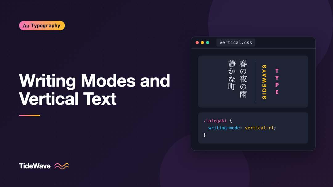
Writing Modes and Vertical Text in CSS
- Maria
- Typography
- 23 Oct, 2026
Most web layouts assume text runs left to right and lines stack from top to bottom. That assumption is so deep that properties like margin-left and
Continue Reading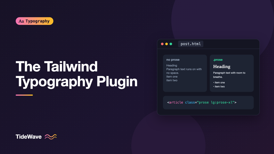
Styling Long-Form Content with the Tailwind Typography Plugin
- Maria
- Typography
- 23 Oct, 2026
The first time you render a Markdown post in a Tailwind project, it looks broken. Headings are the same size as paragraphs, lists have no bullets, li
Continue Reading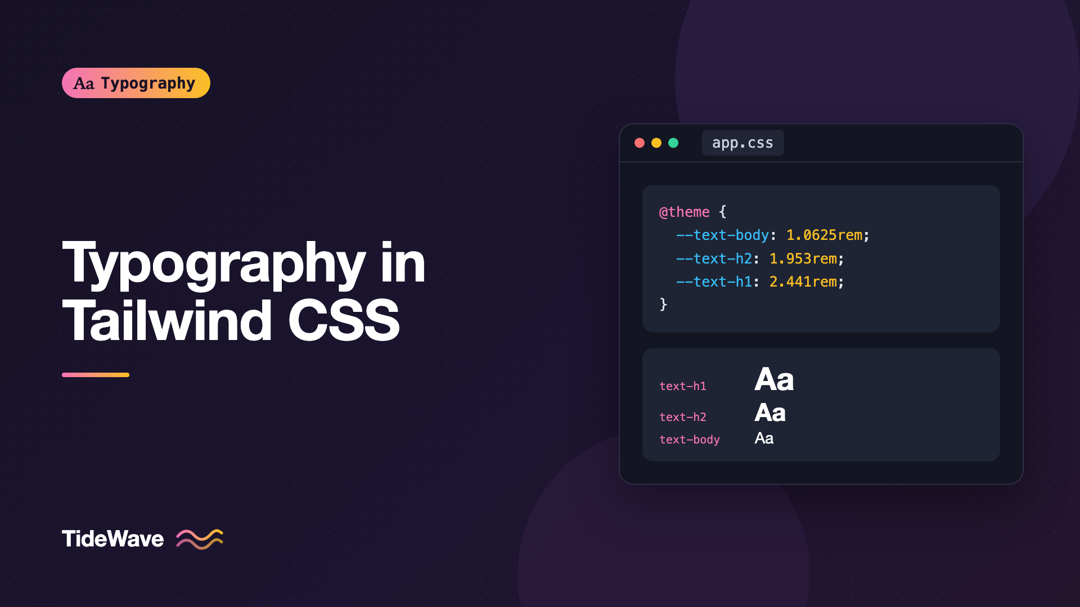
Typography in Tailwind CSS: Configuring a Custom Type Scale
- Maria
- Typography
- 23 Oct, 2026
Tailwind ships with a sensible set of font sizes, from text-xs to text-9xl, and for a prototype they're all you need. Then a designer hands you a
Continue Reading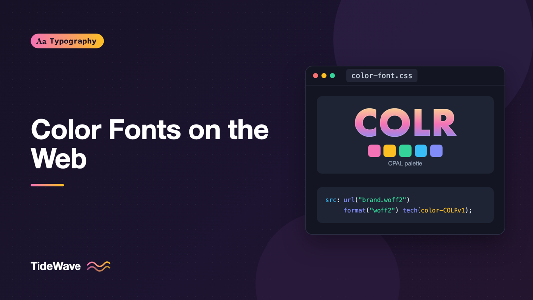
Color Fonts on the Web: COLRv1, SVG, and What Browsers Support
- Maria
- Typography
- 23 Oct, 2026
Every emoji you've ever typed is a color font at work. The smiley faces and flags on your phone aren't images inserted into text. They're glyphs in a
Continue Reading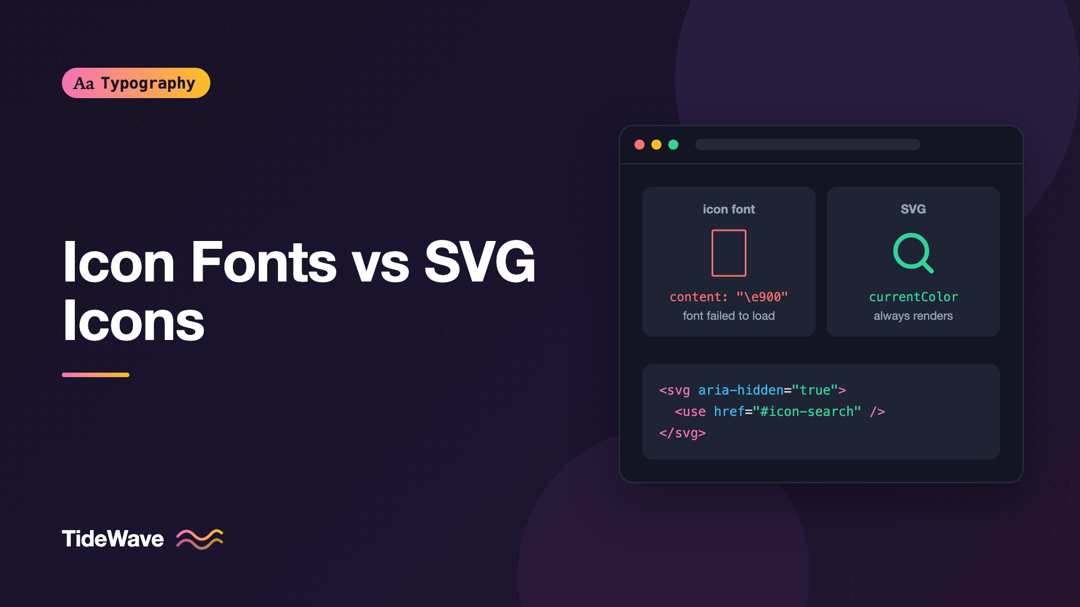
Icon Fonts vs SVG Icons: Why Most Teams Moved On
- Maria
- Typography
- 23 Oct, 2026
If you built websites in the early 2010s, you probably shipped an icon font. One file, one CSS class per icon, and suddenly you had hundreds of c
Continue Reading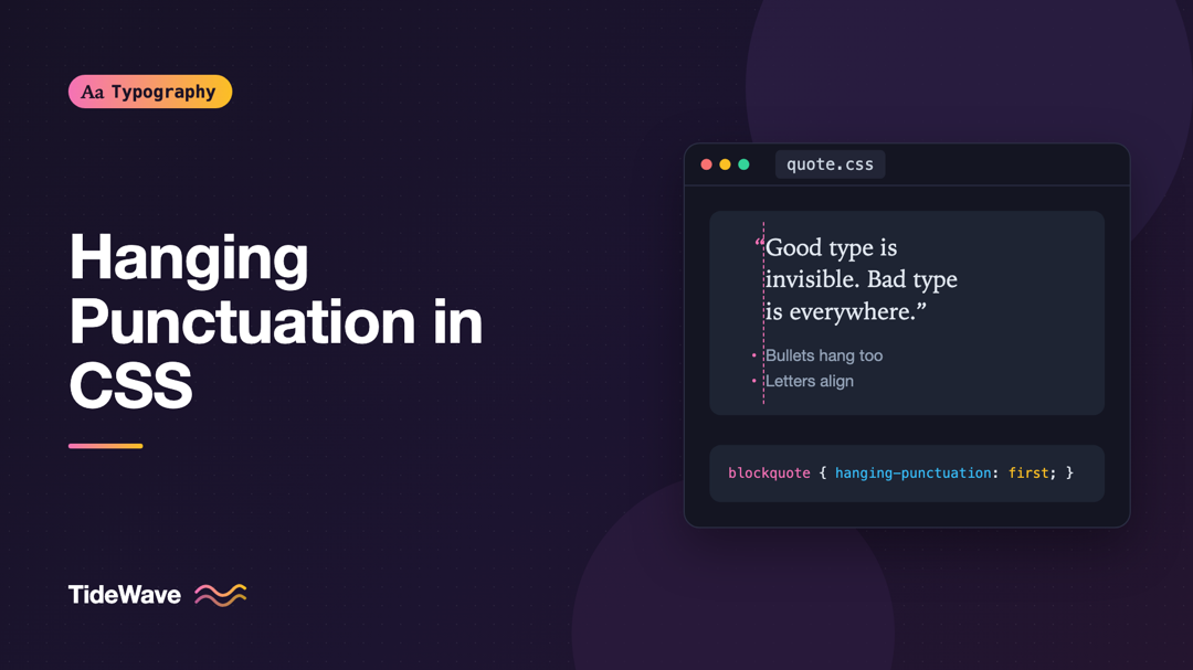
Hanging Punctuation in CSS: Aligning Quotes and Bullets Optically
- Maria
- Typography
- 23 Oct, 2026
Look closely at a pull quote that starts with a quotation mark. The quote mark sits flush with the left edge, and the first letter of the text is pus
Continue Reading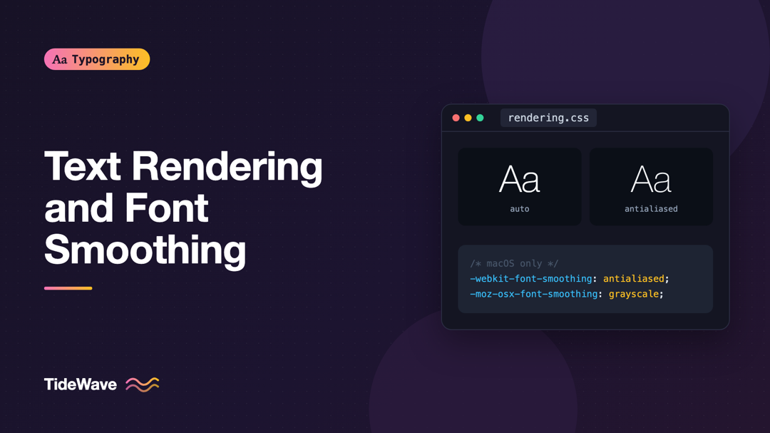
Text Rendering and Font Smoothing: What Actually Works Across Browsers
- Maria
- Typography
- 23 Oct, 2026
Open almost any CSS reset or starter template and you'll find something like this near the top: -webkit-font-smoothing: antialiased, `-moz-osx-font
Continue Reading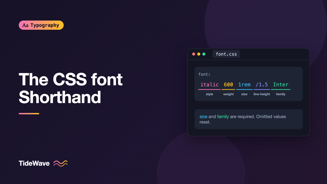
The CSS font Shorthand: Every Value Explained
- Maria
- Typography
- 23 Oct, 2026
You write font: bold 18px Inter and nothing happens. Or you write font: 1rem/1.5 system-ui on a card and suddenly the tabular figures you set on
Continue Reading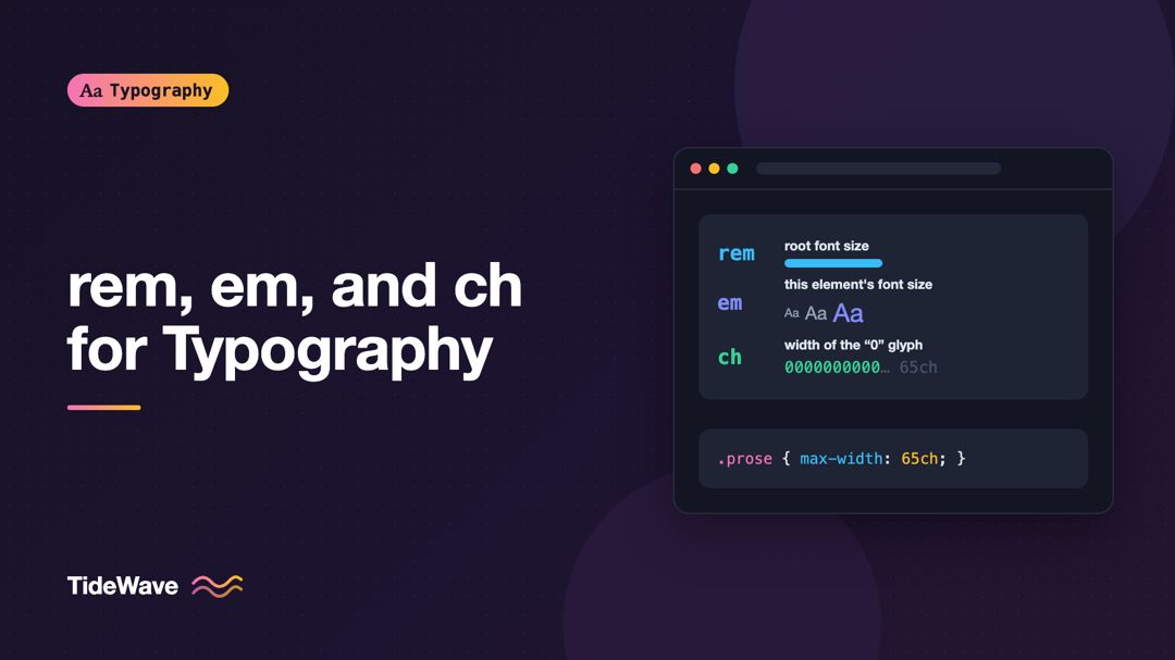
Using rem, em, and ch Units for Typography in CSS
- Maria
- Typography
- 23 Oct, 2026
Most of us learned CSS sizing in pixels. A heading is 32px, body text is 16px, the margin under a paragraph is 24px. It's predictable and easy
Continue Reading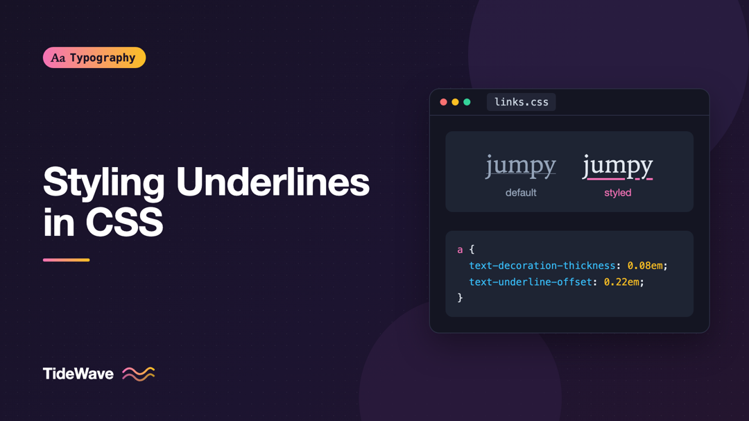
Styling Underlines with text-decoration-thickness and text-underline-offset
- Maria
- Typography
- 23 Oct, 2026
For a long time, designers removed link underlines because the browser's default looked bad. The line was thin, it sat too close to the text, it cut
Continue Reading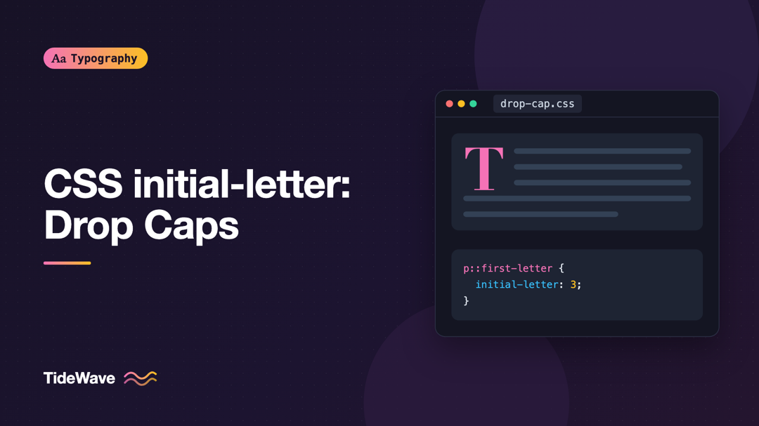
CSS initial-letter: Creating Drop Caps the Modern Way
- Maria
- Typography
- 23 Oct, 2026
If you've ever built a drop cap in CSS, you know the routine. Float the first letter, set its font-size to something like 4.2em, nudge the `line-
Continue Reading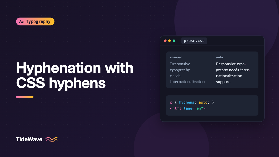
Hyphenation on the Web: Using the CSS hyphens Property
- Maria
- Typography
- 23 Oct, 2026
Open a news article on your phone and look at the right edge of the text. In a narrow column, a single long word like "internationalization" or "resp
Continue Reading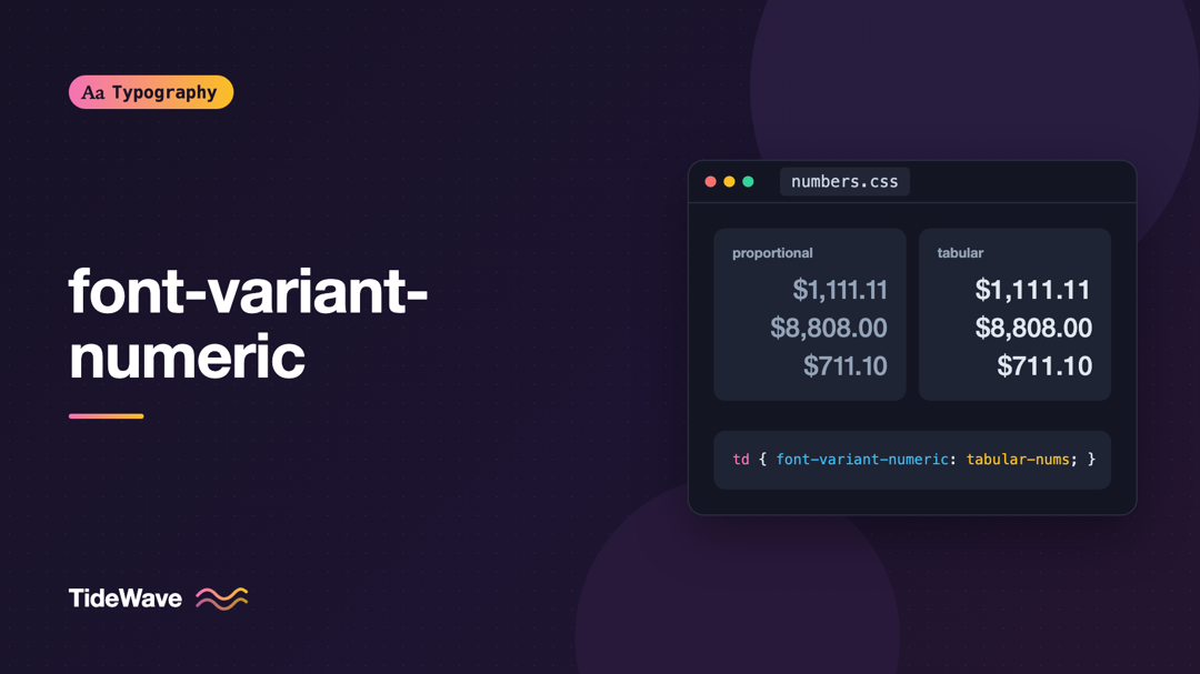
font-variant-numeric: Tabular, Oldstyle, and Proportional Figures in CSS
- Maria
- Typography
- 23 Oct, 2026
You build a pricing table, right-align the numbers, and the totals still don't line up. A countdown timer wobbles left and right every second because
Continue Reading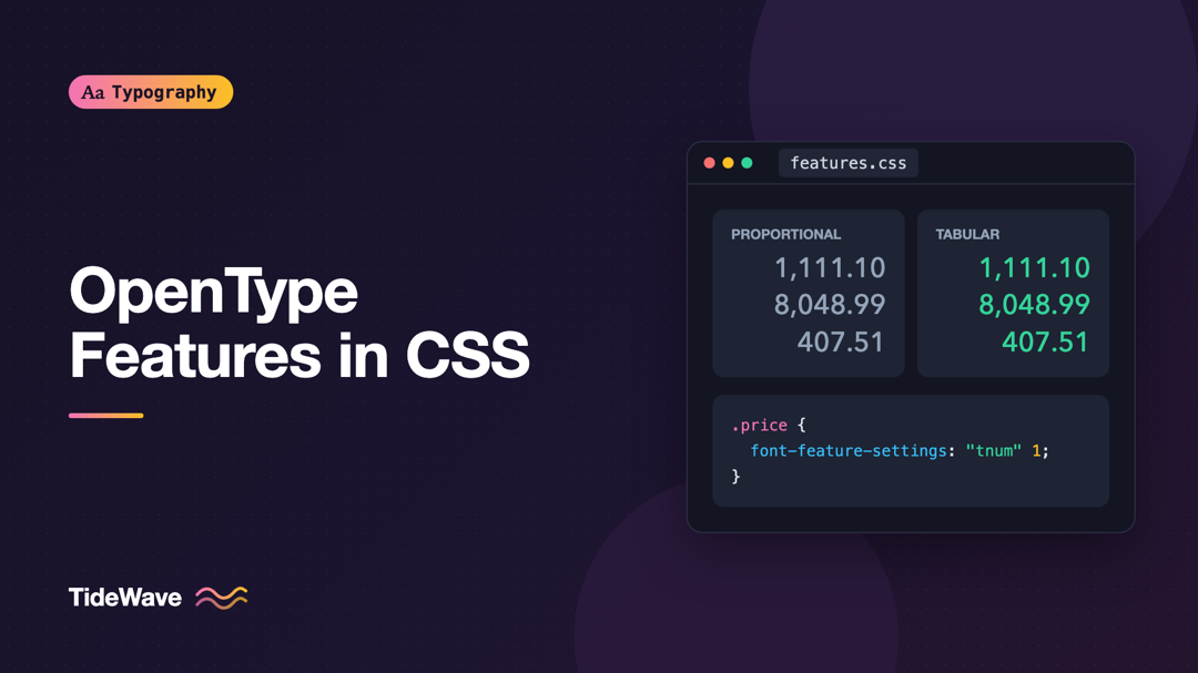
Using OpenType Features in CSS with font-feature-settings
- Maria
- Typography
- 23 Oct, 2026
You've built a pricing table and the numbers won't line up. The "1" in $119 is narrower than the "8" in $189, so every column looks slightly ragged.
Continue Reading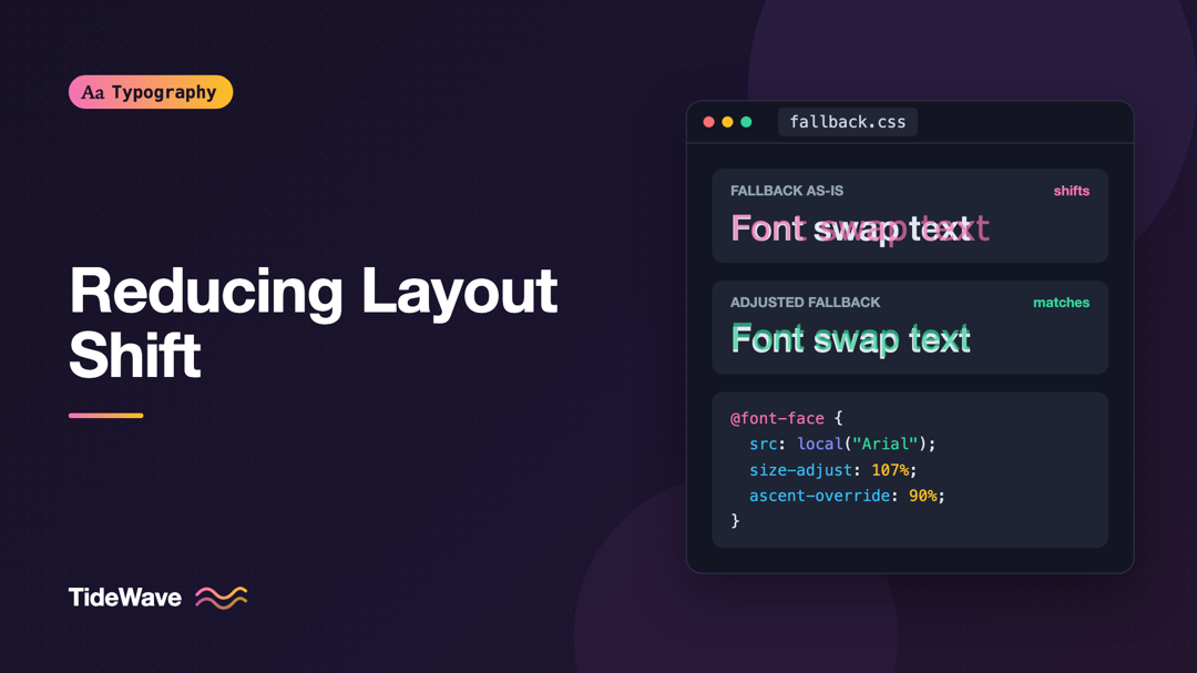
Reducing Layout Shift with size-adjust and Font Metric Overrides
- Maria
- Typography
- 23 Oct, 2026
You load an article on a phone. The headline and first paragraph appear right away in a fallback font, which is exactly what font-display: swap pro
Continue Reading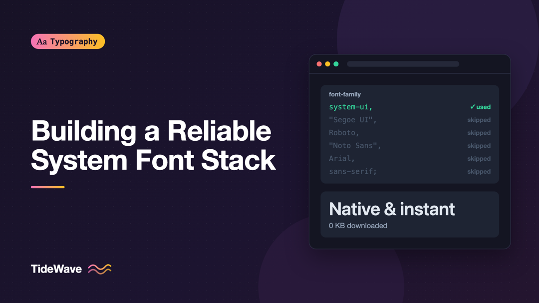
Building a Reliable System Font Stack
- Maria
- Typography
- 23 Oct, 2026
The fastest font on the web is the one that's already on the reader's device. No download, no @font-face, no flash of invisible text, no layout shi
Continue Reading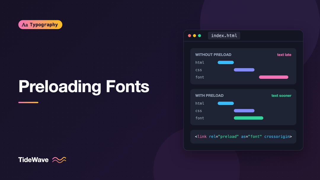
Preloading Fonts: When It Helps and When It Hurts
- Maria
- Typography
- 23 Oct, 2026
Run a performance audit on almost any site with custom fonts and you'll likely see the suggestion to "preload key requests," with your font files lis
Continue Reading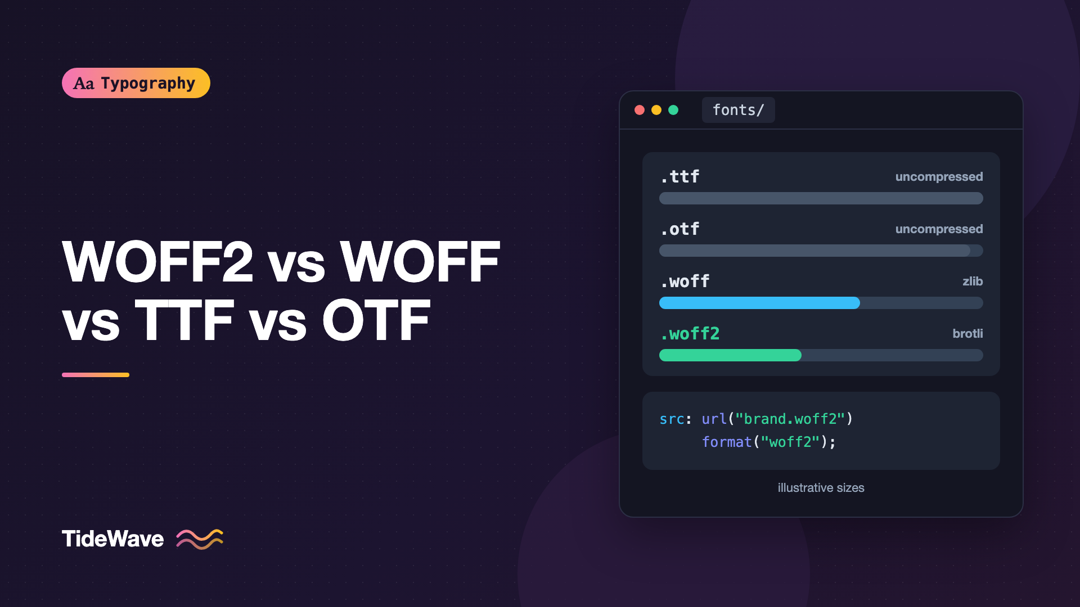
WOFF2 vs WOFF vs TTF vs OTF: Font Formats for the Web Explained
- Maria
- Typography
- 23 Oct, 2026
Download a font family and you might get a folder with .ttf files, another with .otf files, and a "web" folder with .woff and .woff2. Copy an
Continue Reading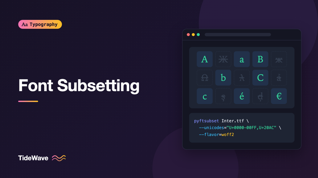
Font Subsetting: Shrinking Web Font Files Without Losing Characters
- Maria
- Typography
- 23 Oct, 2026
A modern open-source font can support hundreds of languages. Noto Sans, Inter, and Source Sans all cover Latin, Cyrillic, Greek, and often Vietnamese
Continue Reading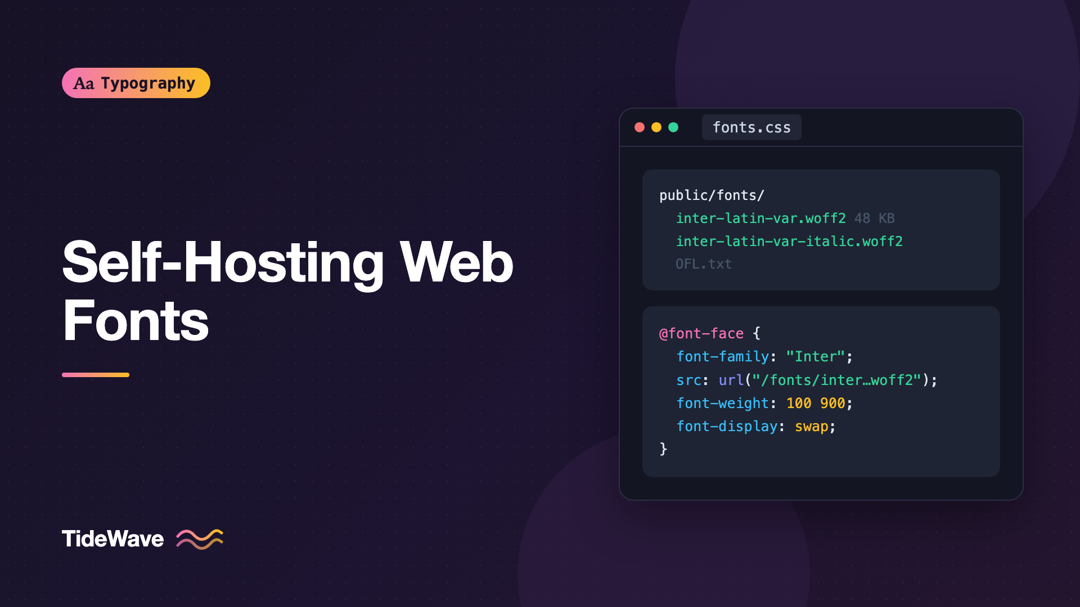
Self-Hosting Web Fonts: A Step-by-Step Guide
- Maria
- Typography
- 23 Oct, 2026
Adding a font from a hosted service takes one <link> tag, which is why so many sites do it. But that tag pulls in a stylesheet from another domain,
Continue Reading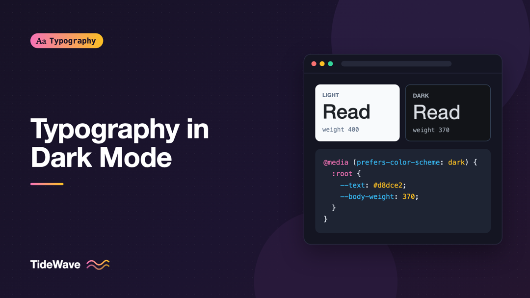
Typography in Dark Mode: Adjusting Weight, Contrast, and Spacing
- Maria
- Typography
- 23 Oct, 2026
Most dark themes start the same way: swap the background to near-black, swap the text to white, and ship. Then someone reads a long article in it and
Continue Reading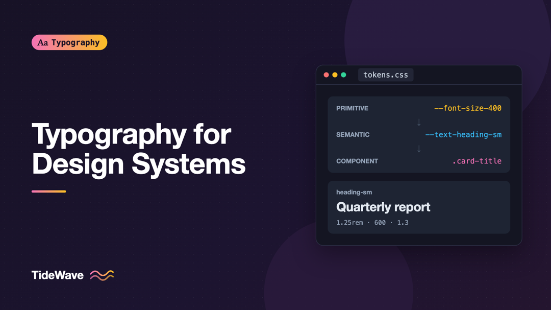
Typography for Design Systems: Defining Tokens for Type
- Maria
- Typography
- 23 Oct, 2026
Search a mature codebase for font-size and you'll often find something like forty distinct values: 14px, 0.875rem, 15px, 0.9em, 13.5px, a
Continue Reading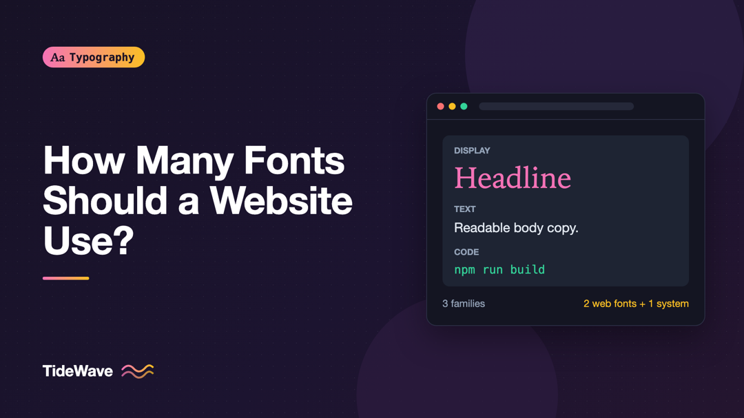
How Many Fonts Should a Website Use?
- Maria
- Typography
- 23 Oct, 2026
Open the network panel on a typical marketing site and filter by font. It's common to find a dozen files: a display face for the hero, a sans-serif f
Continue Reading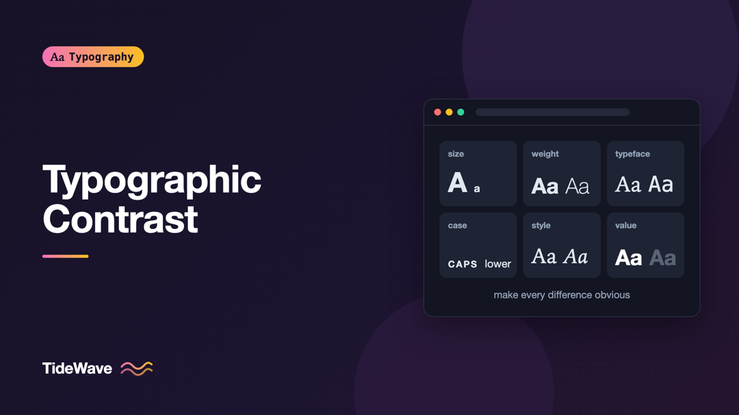
Typographic Contrast: Making Text Elements Stand Apart
- Maria
- Typography
- 23 Oct, 2026
You've probably seen a page where the designer clearly tried to make the subheadings stand out, but they don't. They're a little bigger, a little bol
Continue Reading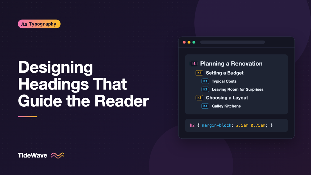
Designing Headings That Guide the Reader Through a Page
- Maria
- Typography
- 23 Oct, 2026
Most people don't read a long web page from top to bottom. They land, scroll quickly, and look for the part that answers their question. If the page
Continue Reading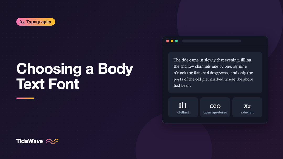
Choosing a Body Text Font for Long-Form Reading
- Maria
- Typography
- 23 Oct, 2026
A font that looks stunning in a specimen can be exhausting after ten minutes of reading. Specimens show a few large words and a pangram. A long-form
Continue Reading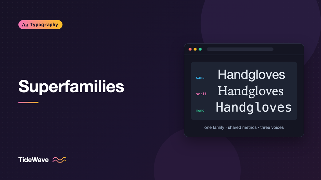
Superfamilies: Building a Whole Design System from One Type Family
- Maria
- Typography
- 23 Oct, 2026
Most design systems need more than one kind of type. Marketing pages want an editorial serif for long reads. The product UI needs a clean sans for la
Continue Reading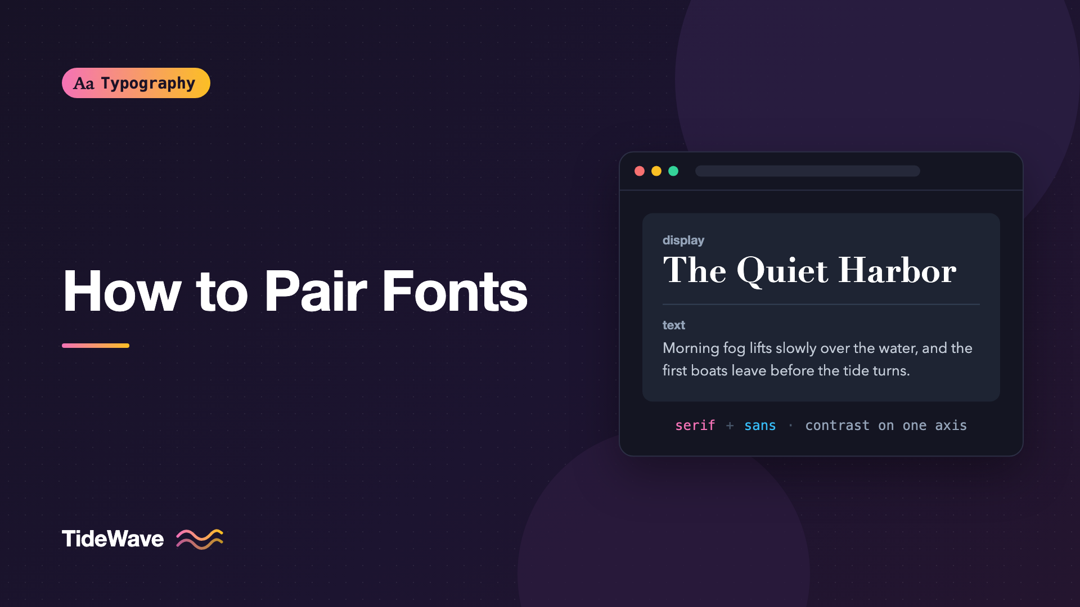
How to Pair Fonts: Rules for Combining Typefaces That Work
- Maria
- Typography
- 23 Oct, 2026
You've found a headline font you love. It has personality, it fits the brand, and it looks great at 64px. Then you try it for body text and it falls
Continue Reading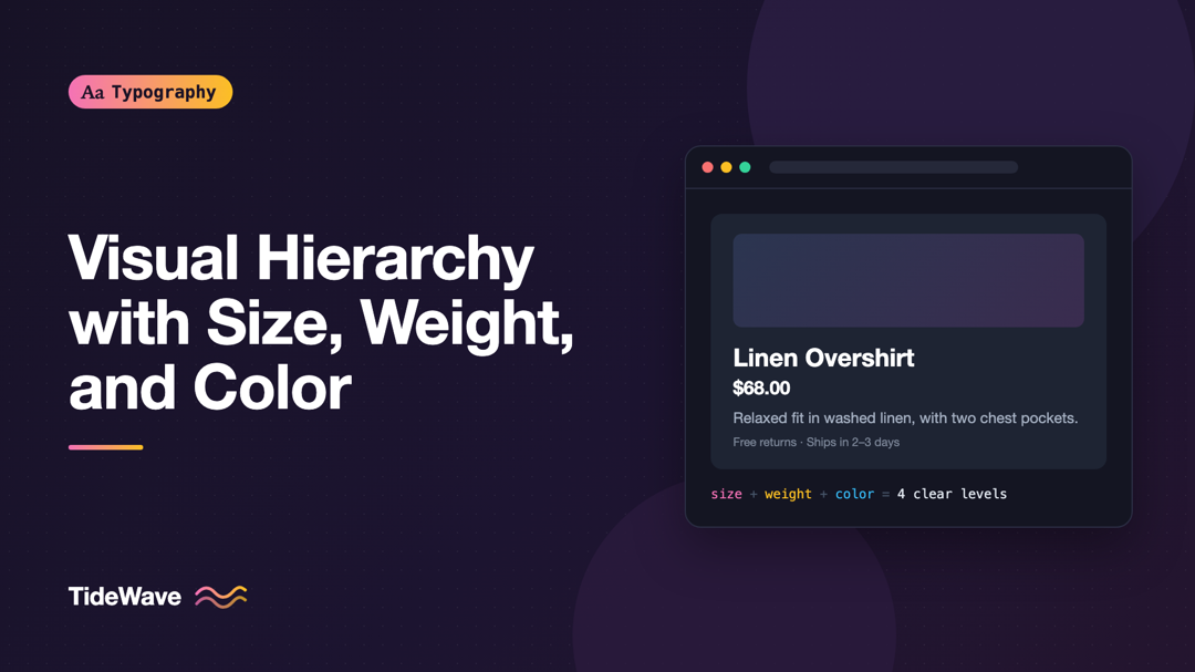
Creating Visual Hierarchy with Size, Weight, and Color
- Maria
- Typography
- 23 Oct, 2026
Picture a product card where the name, price, rating, description, and button label are all 16px, regular weight, and dark gray. Every piece of infor
Continue Reading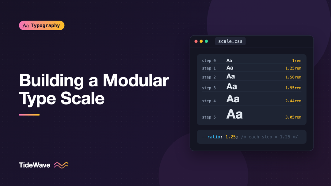
How to Build a Modular Type Scale for Consistent Hierarchy
- Maria
- Typography
- 23 Oct, 2026
Look through the CSS of a project that's been around for a few years and count the distinct font sizes. It's common to find a dozen or more: 13px, 14
Continue Reading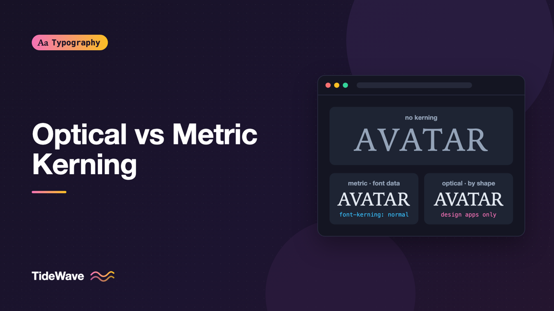
Optical Kerning vs Metric Kerning: Which Should You Use?
- Maria
- Typography
- 23 Oct, 2026
Set the word "AVATAR" in a large headline and look at the gaps. Between the A and the V, the diagonals lean toward each other and leave a wide we
Continue Reading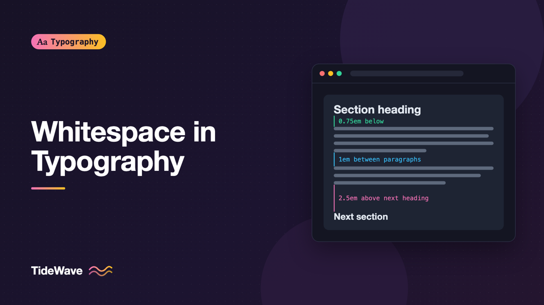
Whitespace in Typography: How Empty Space Improves Reading
- Maria
- Typography
- 23 Oct, 2026
You've probably had this experience: a page uses a perfectly good font at a sensible size, yet it still feels hard to read. The lines seem to crowd e
Continue Reading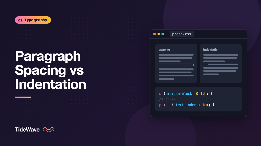
Paragraph Spacing vs Indentation: Choosing How to Separate Paragraphs
- Maria
- Typography
- 23 Oct, 2026
Open a novel and the paragraphs run together, each one marked only by a small indent on its first line. Open almost any website and the paragraphs ar
Continue Reading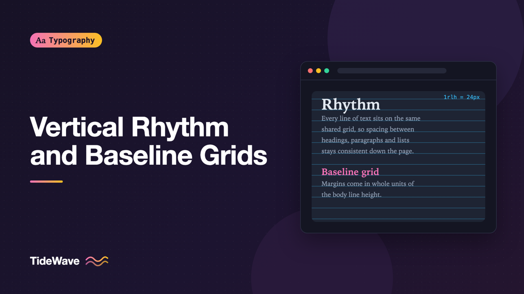
Vertical Rhythm in Web Design: Aligning Text to a Baseline Grid
- Maria
- Typography
- 23 Oct, 2026
Some pages feel calm and orderly even before you read a word. Headings sit at a consistent distance from the paragraphs below them, lists and quotes
Continue Reading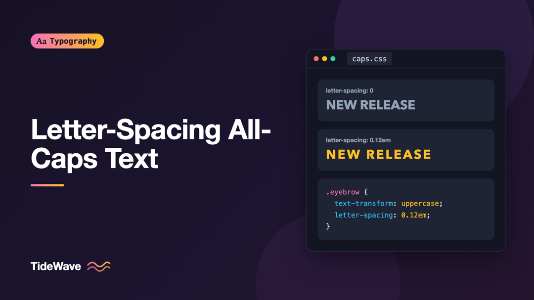
Letter-Spacing All-Caps Text: Why and How Much
- Maria
- Typography
- 23 Oct, 2026
Small uppercase labels are everywhere in interfaces: section eyebrows above headings, table headers, button text, navigation items, badges. Set them
Continue Reading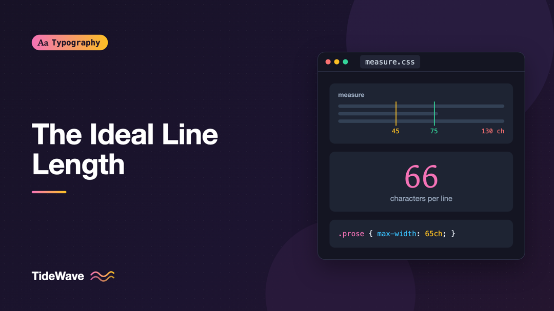
The Ideal Line Length: Why 45 to 75 Characters Works
- Maria
- Typography
- 23 Oct, 2026
Open an old blog theme on a wide monitor and you'll often see paragraphs that stretch the full width of the screen: 150 or more characters per line.
Continue Reading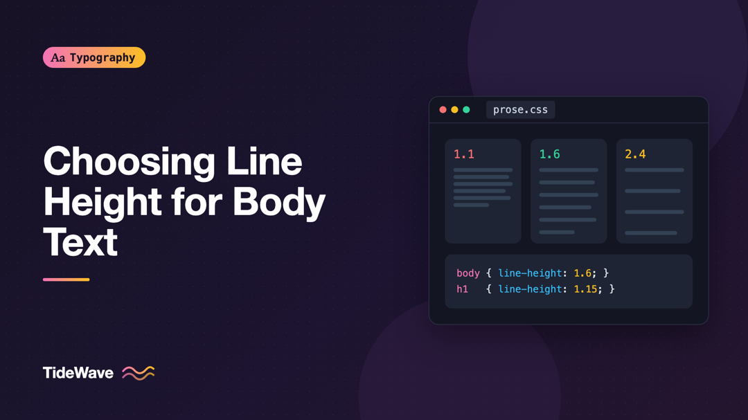
How to Choose the Right Line Height for Body Text
- Maria
- Typography
- 23 Oct, 2026
Most stylesheets have a line like line-height: 1.5 on the body, and most of the time nobody touches it again. Then you switch to a font with a ta
Continue Reading
Kerning, Tracking, and Leading: The Three Spacing Controls Every Designer Needs
- Maria
- Typography
- 23 Oct, 2026
You pick a great typeface, set the right size, and the text still looks off. The headline "WAVE TOYS" has a gap between the "A" and the "V" big enoug
Continue Reading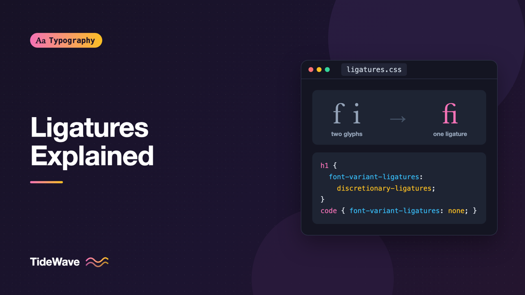
Ligatures Explained: Standard, Discretionary, and Contextual
- Maria
- Typography
- 23 Oct, 2026
Look closely at the word "office" in a well-set serif font. The "f" and the "i" often aren't two separate letters. The hook of the "f" and the dot of
Continue Reading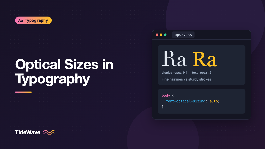
What Are Optical Sizes and How Do They Improve Type at Every Size?
- Maria
- Typography
- 23 Oct, 2026
Take an elegant, high-contrast serif that looks stunning in a 72px headline and use it for 12px captions. The fine hairlines nearly disappear, the ti
Continue Reading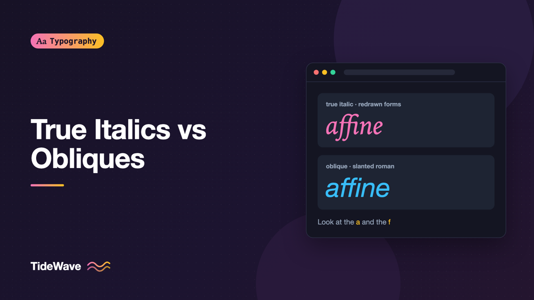
True Italics vs Obliques: Why the Difference Matters
- Maria
- Typography
- 23 Oct, 2026
Put a word in <em> and the browser slants it. Most people call the result "italic" and never think about it again. But if you look closely at two f
Continue Reading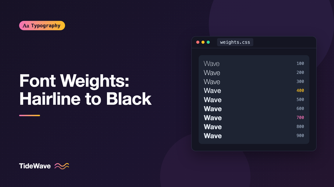
Font Weights Explained: From Hairline to Black
- Maria
- Typography
- 23 Oct, 2026
You set a heading to font-weight: 600, and it renders exactly as bold as 700. Or you load a font from a CDN, set font-weight: 300, and get regu
Continue Reading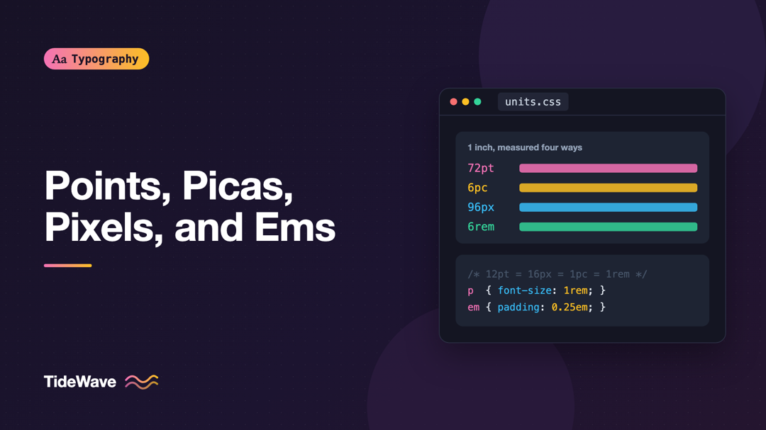
Points, Picas, Pixels, and Ems: Typographic Units Explained
- Maria
- Typography
- 23 Oct, 2026
A designer hands you a spec that says body text is 12pt with 18pt leading. Your stylesheet uses 16px and line-height: 1.5. A print vendor asks fo
Continue Reading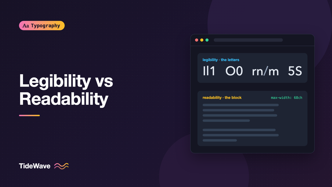
Legibility vs Readability: Two Different Goals in Typography
- Maria
- Typography
- 23 Oct, 2026
A designer picks a beautiful, highly legible sans-serif for a documentation site. Every letter is crisp and distinct. Yet users still complain the do
Continue Reading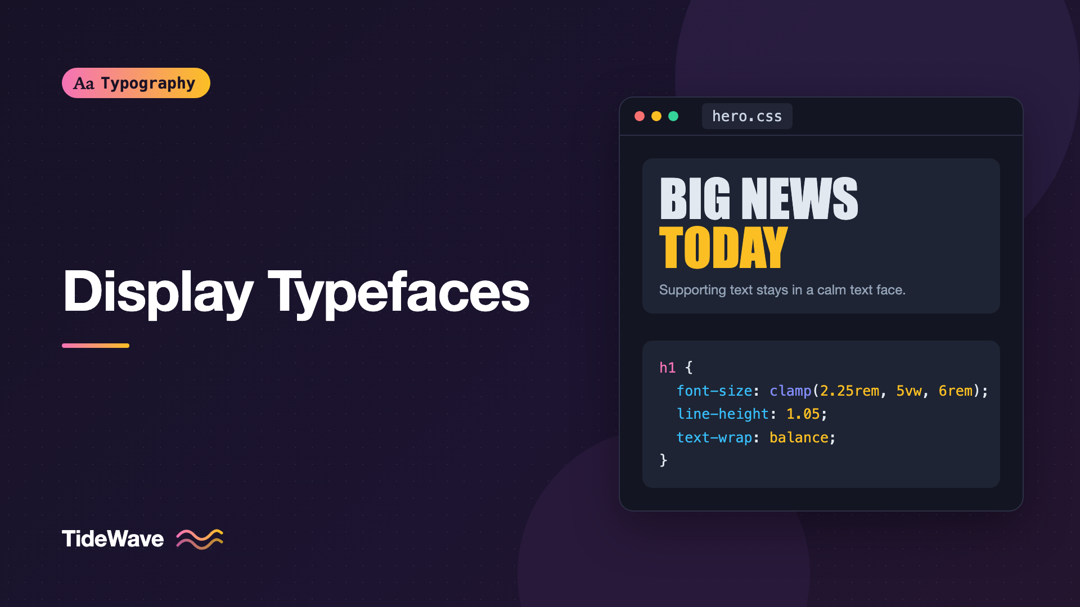
Display Typefaces: Making Headlines Without Sacrificing Clarity
- Maria
- Typography
- 23 Oct, 2026
The landing page mockup looks fantastic: a towering condensed headline, tightly spaced, in a typeface with real attitude. Then you build it. On a pho
Continue Reading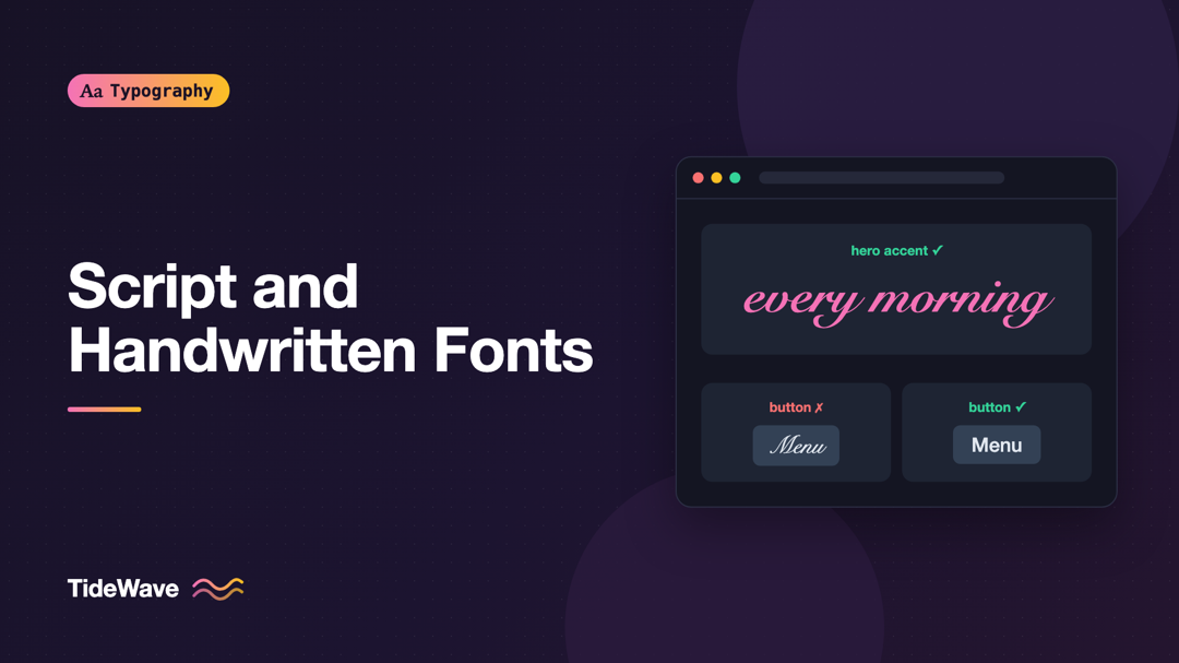
Script and Handwritten Fonts: How to Use Them Without Hurting Legibility
- Maria
- Typography
- 23 Oct, 2026
A wedding site, a bakery, a personal portfolio: some projects seem to call for a font that looks written by hand. You find a gorgeous brush script, s
Continue Reading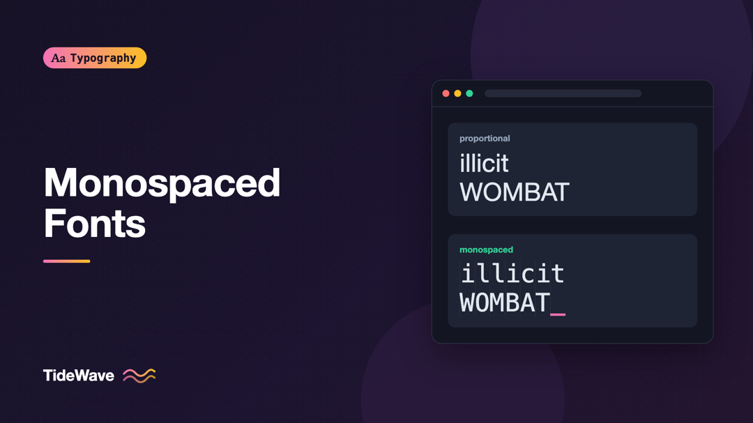
Monospaced Fonts: When Fixed-Width Type Is the Right Choice
- Maria
- Typography
- 23 Oct, 2026
You paste a code snippet into a proportional font and the indentation falls apart. A column of prices in your dashboard jiggles every time the number
Continue Reading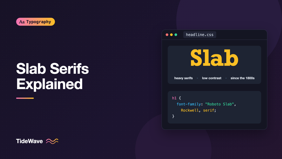
Slab Serifs Explained: History, Characteristics, and Modern Uses
- Maria
- Typography
- 23 Oct, 2026
You want a headline font that feels sturdy and confident, a bit editorial but not stiff. A Didone looks too fashion-magazine, a grotesque too corpora
Continue Reading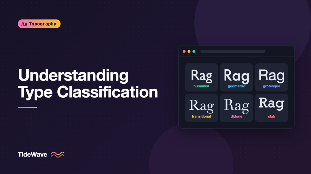
Understanding Type Classification: Humanist, Geometric, Grotesque, and Beyond
- Maria
- Typography
- 23 Oct, 2026
A client asks for a font that's "like Futura but warmer." Another wants "something more neutral than Helvetica." If you think of fonts as an endless
Continue Reading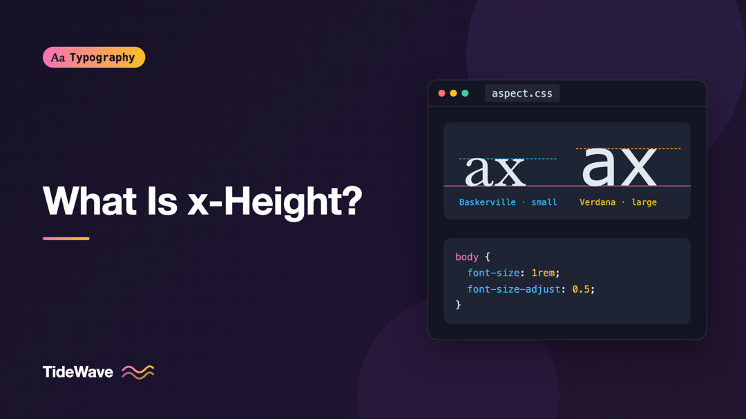
What Is x-Height and Why Does It Affect Readability?
- Maria
- Typography
- 23 Oct, 2026
You swap your body font from one sans-serif to another, keep font-size: 16px, and suddenly the whole page looks smaller. Nothing in the CSS changed
Continue Reading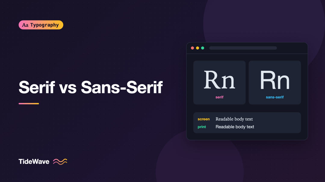
Serif vs Sans-Serif: How to Choose for Screen and Print
- Maria
- Typography
- 23 Oct, 2026
You're starting a new site and need a body font. Someone says, "Serifs are more readable in print, sans-serifs are better on screens," and it sounds
Continue Reading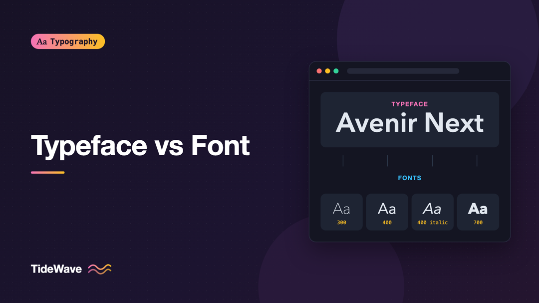
Typeface vs Font: What's the Difference?
- Maria
- Typography
- 23 Oct, 2026
Someone on your team asks, "What font are we using?" and you answer "Inter." Nobody blinks. But when the licensing page asks how many fonts you're in
Continue Reading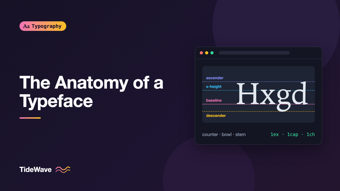
The Anatomy of a Typeface: Ascenders, Descenders, Counters, and More
- Maria
- Typography
- 23 Oct, 2026
You're comparing two sans-serif fonts for a product UI. They look almost identical at a glance, yet one feels cramped at 14px and the other reads com
Continue Reading