Understanding Type Classification: Humanist, Geometric, Grotesque, and Beyond
- Maria
- Typography
- 23 Oct, 2026
A client asks for a font that's "like Futura but warmer." Another wants "something more neutral than Helvetica." If you think of fonts as an endless flat list, both requests are guesswork. If you know how typefaces are grouped, you know exactly where to look: the first client wants a geometric sans with humanist touches, and the second probably wants a neo-grotesque with less character, or a humanist sans.
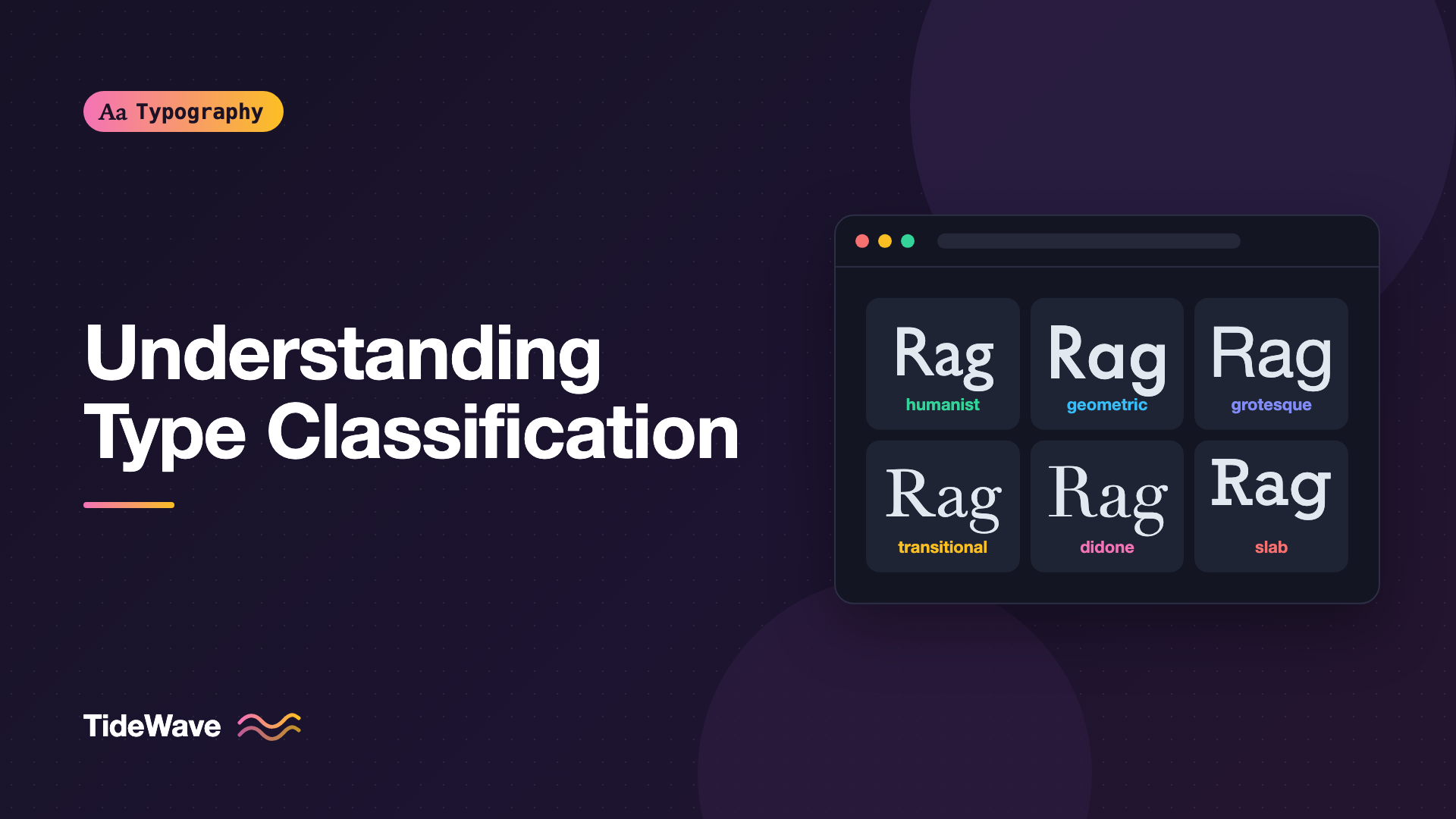
Type classification sorts typefaces into groups based on their structure and historical origins. No system is perfect, and many fonts sit between categories. But knowing the major groups makes it much faster to find alternatives, pair fonts, and explain design choices.
This guide covers the main serif and sans-serif classes, a few other categories, and how to use classification when you're choosing type for a project.
Why Classify Type at All?
Classification is a vocabulary, not a set of rules. It's useful because typefaces in the same group share structural traits:
- Where the stress falls in round letters.
- How much contrast there is between thick and thin strokes.
- How open the apertures are in letters like
c,e, anda. - The underlying skeleton: whether letters are based on the pen, on drawn geometry, or on 19th-century signwriting.
Those traits predict a lot about how a font will look and read. Two humanist sans-serifs will feel more alike than a humanist and a geometric sans, even if they all look "clean."
A Note on Systems
Several formal systems exist. The Vox-ATypI classification, proposed by Maximilien Vox in the 1950s and later adopted by the Association Typographique Internationale, was the best known for decades. ATypI formally retired it in 2021, but its category names are still widely used. The British Standards classification and various foundry schemes are similar. This guide uses the commonly used names rather than following any single system strictly.
If you want the vocabulary for stress, contrast, and apertures first, The Anatomy of a Typeface covers it.
Serif Classifications
Serif classes roughly follow history, from typefaces that imitate pen writing to designs that come from engraving and industrial printing.
Humanist (Venetian)
The earliest roman typefaces, cut in Venice in the late 15th century, are close to handwriting. Features:
- Strong diagonal stress, as if drawn with a broad nib held at an angle.
- Low contrast.
- The crossbar of
eis often slanted. - Relatively small x-height.
Examples include Jenson-inspired revivals like Adobe Jenson and Centaur.
Old-Style (Garalde)
Refined during the 16th and 17th centuries, old-style faces are slightly more regular than Venetian ones:
- Diagonal stress, but less pronounced.
- Moderate contrast.
- Horizontal
ecrossbar. - Bracketed serifs (curving smoothly into the stem).
Garamond and its many revivals are the archetype, along with Bembo and Sabon. They remain classic book faces.
Transitional
In the 18th century, type moved away from the pen toward more rational, engraved forms:
- Stress becomes nearly vertical.
- Higher contrast.
- Sharper, more defined serifs.
Baskerville is the classic example. Times New Roman and Georgia are often described as transitional or as having transitional traits.
Didone (Modern)
By the late 18th and early 19th centuries, Bodoni and Didot pushed contrast to the extreme:
- Strictly vertical stress.
- Very thick stems with hairline thin strokes.
- Thin, flat, unbracketed serifs.
- Ball terminals.
Didones are elegant at large sizes and associated with fashion magazines, but the hairlines break down at small sizes, especially on screens.
Slab Serif (Egyptian, Mechanistic)
Slab serifs arrived in the early 19th century, largely for advertising:
- Heavy, rectangular serifs.
- Low contrast.
- Strong, sturdy presence.
Rockwell, Clarendon, Courier, and Roboto Slab are slab or slab-related faces. They deserve their own post: Slab Serifs Explained.
Serif Overview
| Class | Stress | Contrast | Serifs | Example |
|---|---|---|---|---|
| Humanist | Strong diagonal | Low | Bracketed, heavy | Centaur |
| Old-style | Diagonal | Moderate | Bracketed | Garamond |
| Transitional | Near vertical | Higher | Bracketed, sharper | Baskerville |
| Didone | Vertical | Extreme | Hairline, unbracketed | Bodoni, Didot |
| Slab | Varies | Low | Heavy, rectangular | Rockwell |
Sans-Serif Classifications
Sans-serifs appeared in the early 19th century and became dominant in the 20th. The main groups are defined by their skeleton.
Grotesque
The earliest commercial sans-serifs were called grotesques (or grotesks), possibly because they seemed crude next to refined serifs. Late 19th and early 20th century grotesques like Akzidenz-Grotesk and Franklin Gothic share:
- Some stroke contrast.
- Slight irregularities and quirks, like a spurred
Gor a double-storyg. - Fairly closed apertures.
Neo-Grotesque
In the 1950s, Swiss designers refined the grotesque into something more uniform and neutral. Helvetica and Univers are the famous neo-grotesques. They have:
- Very uniform stroke weight.
- Horizontal or near-horizontal terminals that make apertures fairly closed.
- A large x-height and tight, even spacing.
They're known for neutrality, which is both their strength and their criticism. Helvetica's spread is its own story in Helvetica: Why One Typeface Ended Up Everywhere. Many contemporary UI fonts, including Inter and Roboto, draw heavily on the neo-grotesque model, though both mix in other influences.
Geometric
Geometric sans-serifs are built from simple shapes: near-perfect circles, straight lines, and triangles. Emerging in 1920s Germany alongside the Bauhaus, they include Futura, Avenir, and newer fonts like Poppins and Montserrat:
- Circular
oand round bowls. - Often a single-story
aandg. - Low contrast, sharp apexes on letters like
A,M, andN.
They look clean and modern, but the pure circles can make text feel wide, and letters like a and o can look similar at small sizes.
Humanist Sans
Humanist sans-serifs bring the proportions and stroke modulation of handwriting and old-style serifs into a sans design:
- Open apertures.
- Some contrast and variable stroke width.
- Classical proportions, with a narrow
eandsand widero. - Often a true italic rather than a slanted roman.
Gill Sans, Frutiger, Myriad, Fira Sans, Source Sans, and Open Sans are humanist or strongly humanist-influenced. Because of their open forms, they're common in signage, UI, and small text.
Sans Overview
| Class | Skeleton | Apertures | Feel | Examples |
|---|---|---|---|---|
| Grotesque | Early industrial | Fairly closed | Sturdy, quirky | Akzidenz, Franklin Gothic |
| Neo-grotesque | Rationalized grotesque | Closed | Neutral, uniform | Helvetica, Univers |
| Geometric | Circles and lines | Varies | Modern, clean, wide | Futura, Avenir, Poppins |
| Humanist | Handwriting | Open | Warm, readable | Frutiger, Source Sans |
Other Categories
Many typefaces fall outside the serif and sans groups, or straddle them.
- Script: based on handwriting or calligraphy, from formal copperplate to casual brush. See Script and Handwritten Fonts.
- Blackletter: Gothic scripts from medieval Europe, like Fraktur and Textura.
- Display (decorative): designed for headlines and large sizes, from art deco to grunge.
- Monospaced: every glyph has the same width. These can be serif, slab, or sans, but they're grouped by spacing, not style.
- Glyphic and incised: inspired by carved inscriptions, with flared strokes. Optima is often classed here.
Seeing Classification in Real Fonts
You can see the differences in your own browser using fonts that ship with most operating systems:
<div class="specimen">
  <p style="font-family: 'Didot', 'Bodoni 72', serif">Rhythm and Grace</p>
  <p style="font-family: 'Baskerville', 'Times New Roman', serif">Rhythm and Grace</p>
  <p style="font-family: 'Futura', 'Century Gothic', sans-serif">Rhythm and Grace</p>
  <p style="font-family: 'Gill Sans', 'Trebuchet MS', sans-serif">Rhythm and Grace</p>
  <p style="font-family: 'Helvetica Neue', Arial, sans-serif">Rhythm and Grace</p>
</div>
.specimen p {
  margin: 0 0 0.5rem;
  font-size: 3rem;
  line-height: 1.1;
}
Look at the R leg, the shape of a and g, the openness of e and c, and the stroke contrast. Each group handles them differently.
Using Classification in Practice
Finding Alternatives
If a font is too expensive, unavailable for the web, or overused, look in the same class. Need something like Helvetica? Look at other neo-grotesques. Like Futura's shapes but need better small-size performance? Try a geometric with larger x-height and more open forms, or move toward a humanist-geometric hybrid.
Pairing Fonts
Classification gives you a starting point for pairings:
- Contrast categories: a humanist sans with an old-style serif often works because both come from the pen.
- Avoid near-misses: two fonts from the same class but slightly different usually look like a mistake.
The full set of rules is in How to Pair Fonts.
Writing Font Stacks
Classification also helps you choose sensible fallbacks. If your web font is a humanist sans, fall back to another humanist or humanist-leaning system font rather than a generic geometric:
.body-humanist {
  font-family: "Source Sans 3", "Segoe UI", "Trebuchet MS", sans-serif;
}

.body-old-style {
  font-family: "EB Garamond", Garamond, "Palatino Linotype", Palatino, serif;
}
The fallback won't match exactly, but staying in the same class keeps the page's character during loading.
Note
Classifications are approximate. Many modern typefaces are deliberately hybrids, mixing geometric and humanist traits or adding grotesque quirks to a neutral skeleton. Use the categories as a map, not a fence.
Common Mistakes
- Treating classes as strict boxes. Many fonts are hybrids, and arguing over the "correct" category rarely helps the design.
- Using Didones at small sizes. Extreme contrast is for display. Hairlines vanish at body sizes on screens.
- Pairing two similar sans-serifs. A geometric and a neo-grotesque next to each other often look like an accident, not a choice.
- Picking fallbacks from a different class. A geometric fallback for a humanist web font changes the page's texture and widths during load.
- Assuming "sans" means "modern." Grotesques date to the early 1800s, and humanist sans-serifs borrow from Renaissance writing.
Conclusion
Type classification groups typefaces by structure and history. Serifs run from pen-based humanist and old-style designs, through transitional and high-contrast Didone faces, to heavy slabs. Sans-serifs split into grotesques, neutral neo-grotesques, circle-based geometrics, and open, calligraphic humanist designs. Scripts, blackletter, display, and monospaced faces round out the picture.
Use those groups as a working vocabulary. When you need an alternative, look in the same class. When you need contrast, look across classes. When you write a font stack, keep the fallback in the same family of shapes. It's the fastest way to turn "warmer than Futura" into a short list of real candidates.