A Short History of Typography: From Gutenberg to Variable Fonts
- Maria
- Typography
- 23 Oct, 2026
When you write font-weight: 600 or font-style: italic, you're using vocabulary that is hundreds of years old. "Italic" comes from Renaissance Italy. "Leading" comes from strips of lead that printers placed between lines of metal type. "Upper case" and "lower case" were literally the cases where compositors kept capital and small letters. Typography has changed its tools again and again, from hand-cut metal to hot metal machines, film, PostScript, and now variable fonts, but each new technology has carried the old ideas forward.
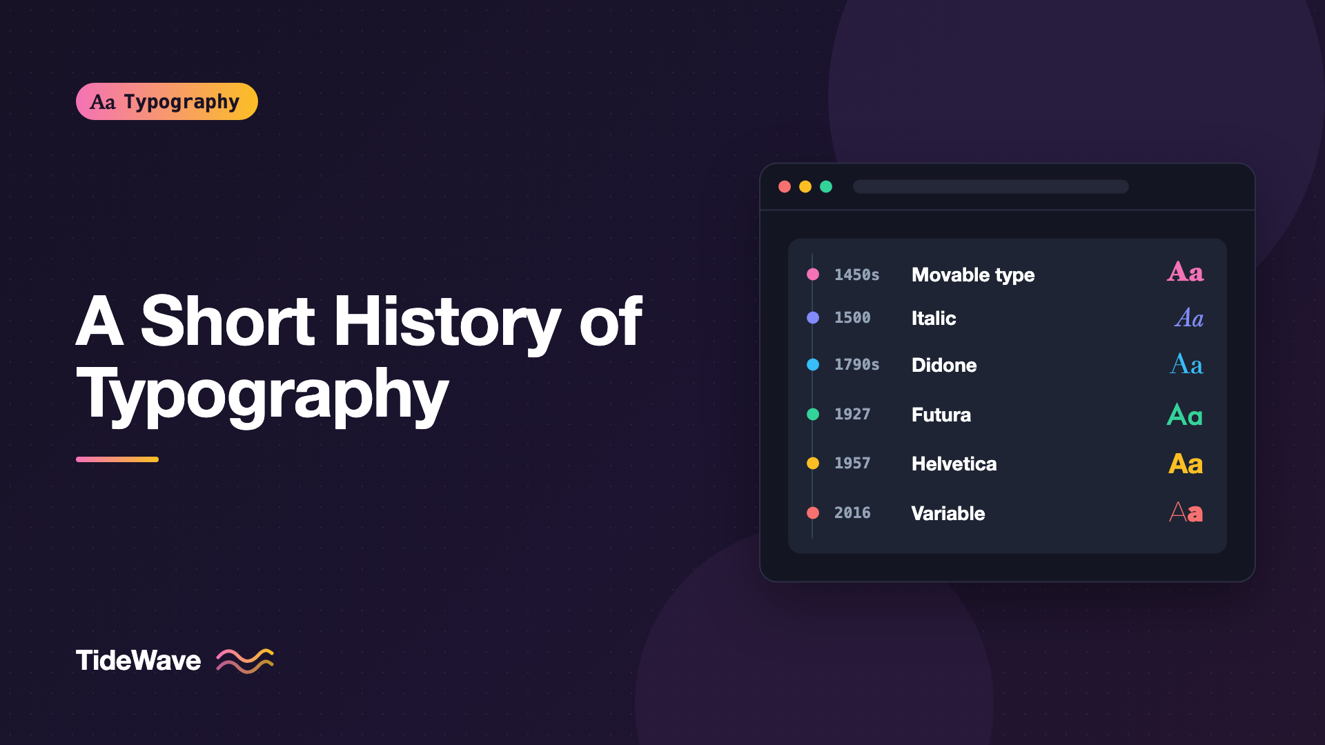
This post is a short tour, not a complete history. It covers the major turning points from Gutenberg's press to the variable font, focusing on the moments that still shape how we set type on screens today. Along the way, you'll see where many familiar typefaces and terms came from.
Before Print: Letters by Hand
Before movable type, every book in Europe was written by hand. Scribes developed distinct styles of lettering over centuries, and those hands became the models for the first typefaces.
Two traditions matter most for what came later:
- Blackletter, dense and angular, used widely in Northern Europe in the late Middle Ages. It's what most people picture when they think of medieval manuscripts.
- Humanist minuscule, a rounder, more open hand developed by Italian scholars in the 15th century, based on earlier Carolingian writing. Its lowercase letters are the ancestors of the lowercase you're reading right now.
The capital letters we use come from a different source: inscriptions carved in stone in ancient Rome. The combination of Roman capitals and humanist lowercase became the basis of the "roman" typefaces that still dominate Western type.
Gutenberg and Movable Type
Around the middle of the 15th century in Mainz, Johannes Gutenberg developed a system for printing with movable metal type. Each letter was cast as a separate piece of metal from a mold, so letters could be arranged into lines, printed, and reused. Combined with a press and an oil-based ink suited to metal type, it made mass production of books practical in Europe.
Gutenberg's famous Bible, completed in the 1450s, was set in a blackletter type that imitated the manuscripts of the day. That's a pattern you'll see throughout this history: new technology first imitates the old, then develops its own forms.
Much of the vocabulary of typesetting comes from this era of metal type:
| Term | Original meaning | Meaning today |
|---|---|---|
| Font | A complete set of metal type in one size and style | A digital file or a single style |
| Leading | Strips of lead placed between lines of type | Line spacing, line-height in CSS |
| Upper case | The upper drawer holding capital letters | Capital letters |
| Lower case | The lower drawer holding small letters | Small letters |
| Kerning | Trimming metal so letters could sit closer together | Adjusting space between letter pairs |
| Point | A unit for measuring type size | 1/72 of an inch in digital type |
Roman Type and Italic in Venice
Printing spread quickly across Europe, and Venice became one of its great centers. Printers there developed roman typefaces based on the humanist hand rather than blackletter. Nicolas Jenson, a French printer working in Venice, produced a roman type around 1470 that is still admired and has been revived many times.
The Venetian publisher Aldus Manutius and his punchcutter Francesco Griffo pushed things further. They cut a roman type that later inspired the typeface Bembo, and around 1500 they introduced italic type, based on a slanted, compact handwriting style. Italic was originally used on its own for whole books, in small, portable editions. Only later did it become a companion style used for emphasis within roman text.
That's why true italics have different letter shapes from their roman counterparts. They come from a different hand. The post on true italics vs obliques explains why that matters on the web.
The Old-Style Era
In 16th-century France, Claude Garamond and other punchcutters refined roman type into the elegant, readable faces now called old-style. Their influence lasted for centuries, and "Garamond" today refers to a whole family of revivals of varying faithfulness. The story is told in Garamond and its many revivals.
In 18th-century England, William Caslon cut typefaces that became standard in the English-speaking world. Caslon's types were widely used in the American colonies.
Old-style typefaces share some features: moderate contrast between thick and thin strokes, a diagonal stress (the thinnest parts of round letters are at an angle), and bracketed serifs. They still make excellent text faces.
Transitional and Modern Type
In the mid-18th century, John Baskerville, working in Birmingham, produced typefaces with sharper contrast and more vertical stress. He also improved paper and ink so his fine strokes would print well. His work is now called transitional, sitting between old-style and what came next.
At the end of the 18th century, Giambattista Bodoni in Italy and the Didot family in France took contrast to its extreme. Their typefaces have hairline serifs, strong vertical stress, and dramatic differences between thick and thin strokes. These are called Didone or modern faces, and they still define the look of fashion magazines.
/* Didone faces shine at large sizes, where hairlines survive */
.masthead {
  font-family: "Bodoni Moda", Didot, "Bodoni 72", serif;
  font-size: clamp(3rem, 2rem + 6vw, 7rem);
  font-weight: 500;
  letter-spacing: -0.01em;
}
Those same hairlines are why Didones are risky for body text on screens. Thin strokes can break up at small sizes.
The Industrial 19th Century
The Industrial Revolution brought posters, handbills, and advertising, and with them a demand for type that shouted. Typefounders responded with new kinds of letters designed for display:
- Fat faces: extremely heavy versions of Didone type.
- Slab serifs, often called "Egyptians" at the time, with thick, square serifs. See slab serifs explained.
- Sans serifs, first appearing in the early 19th century and initially regarded as crude. They were sometimes called "grotesques."
- Wood type for very large poster lettering, which was cheaper than metal at big sizes.
Late in the century, mechanical typesetting arrived. The Linotype machine, invented by Ottmar Mergenthaler in the 1880s, cast entire lines of type from molten metal. The Monotype system cast individual letters. Both made typesetting dramatically faster and dominated newspaper and book production for much of the 20th century.
The 20th Century: Modernism and Sans Serifs
The early 20th century saw sans serifs move from advertising into serious design. Edward Johnston designed a sans serif for the London Underground in 1916. In Germany, Paul Renner's Futura, released in the late 1920s, built letters from geometric shapes. In England, Eric Gill's Gill Sans offered a more humanist take.
At the same time, the newspaper The Times commissioned Times New Roman, introduced in 1932, under the direction of Stanley Morison. It became one of the most widely used typefaces in the world.
After the Second World War, Swiss designers developed the International Typographic Style, built on grids, asymmetric layouts, and neutral sans serifs. Two typefaces released in 1957 became its emblems: Univers, designed by Adrian Frutiger, and Neue Haas Grotesk by Max Miedinger and Eduard Hoffmann, soon renamed Helvetica.
Phototypesetting
In the middle of the century, phototypesetting began replacing metal. Letters were stored as film negatives and exposed onto photographic paper. Type no longer had to be cast, sizes could be scaled from a single master, and spacing could be tighter than metal allowed. Phototype made new design possibilities cheap, and it also produced some poorly made copies of classic faces.
Desktop Publishing and Digital Fonts
The 1980s put typesetting on the desk. The Apple Macintosh arrived in 1984 with multiple fonts and a graphical interface. Adobe's PostScript language described pages and letters as mathematical outlines that printers could render at any size. Combined with the Apple LaserWriter printer and page layout software, it launched desktop publishing in the mid-1980s.
Digital font formats followed:
- PostScript Type 1, from Adobe, became the professional standard.
- TrueType, developed by Apple and adopted by Microsoft, arrived around 1990 to 1991.
- OpenType, developed jointly by Microsoft and Adobe in the late 1990s, merged the two approaches and added support for large character sets and advanced features like ligatures, small caps, and alternate figures.
OpenType features are still how you access those typographic refinements in CSS:
.body-text {
  font-variant-ligatures: common-ligatures;
  font-variant-numeric: oldstyle-nums;
  font-kerning: normal;
}

.abbr {
  font-variant-caps: all-small-caps;
}
Type for the Screen
Early screens had very low resolution, and type had to be designed pixel by pixel or carefully hinted to snap to the pixel grid. In 1996, Microsoft released Verdana and Georgia, both designed by Matthew Carter specifically for screen reading. Along with Arial, Times New Roman, and a few others, they formed the "web-safe" fonts that web designers relied on for more than a decade.
That's why Georgia and Verdana still appear in font stacks today, and why they remain good choices for email, where web fonts often don't load.
Web Fonts
@font-face was part of CSS early on, but practical, cross-browser web fonts arrived around 2009 to 2010. The WOFF format, a compressed wrapper for fonts on the web, was developed around that time and later became a W3C Recommendation. Google Fonts launched in 2010 with a free library of open-source fonts. WOFF2, with better compression, followed and is now the standard format.
@font-face {
  font-family: "Source Serif 4";
  src: url("/fonts/source-serif-4.woff2") format("woff2");
  font-weight: 400;
  font-style: normal;
  font-display: swap;
}
Suddenly, web designers had access to thousands of typefaces. The challenge shifted from "which fonts are safe" to "how do I load these efficiently," a problem covered in loading web fonts efficiently.
Variable Fonts
In 2016, Apple, Google, Microsoft, and Adobe jointly announced OpenType Font Variations, better known as variable fonts. A variable font holds a continuous design space in one file. Instead of separate files for regular, medium, bold, and condensed, one font can produce any weight or width within its range.
@font-face {
  font-family: "Inter";
  src: url("/fonts/InterVariable.woff2") format("woff2");
  font-weight: 100 900;
  font-display: swap;
}

h1 {
  font-family: "Inter", system-ui, sans-serif;
  font-weight: 720;
}
Variable fonts also revived an idea from the metal era. Punchcutters adjusted letter designs for each size, making small type sturdier and large type more refined. That practice faded with phototype and early digital type, which scaled one master to every size. The optical size axis brings it back, letting a font adapt its design to the size it's set at. The variable fonts guide covers the CSS in detail.
What the History Teaches
A few patterns repeat throughout this story:
- New technology imitates the old first. Gutenberg imitated manuscripts, early digital fonts imitated metal ones, and early web fonts imitated print.
- Constraints shape design. Metal, film, pixels, and bandwidth have each pushed type in particular directions.
- Good ideas come back. Optical sizes, true small caps, and careful spacing faded and returned as tools improved.
- The goal stays the same. Every era has tried to make text readable, structured, and expressive.
Conclusion
Typography moved from hand lettering to Gutenberg's metal type, through Venice's roman and italic faces, old-style and Didone types, industrial display faces, modernist sans serifs, phototype, PostScript, OpenType, web fonts, and now variable fonts. Each technology changed what was possible, but the core concerns of legibility, hierarchy, and voice carried through.
Knowing this history makes you a better typographer on the web. It explains why italics look the way they do, why Didones need large sizes, why Georgia is still in your font stack, and why a variable font's optical size axis feels like a return to something old. The next time you set line-height, remember you're adjusting the strips of lead a compositor once slid between lines of type.