Slab Serifs Explained: History, Characteristics, and Modern Uses
- Maria
- Typography
- 23 Oct, 2026
You want a headline font that feels sturdy and confident, a bit editorial but not stiff. A Didone looks too fashion-magazine, a grotesque too corporate, and a geometric sans too much like every startup homepage. This is often where a slab serif fits: a typeface with thick, block-shaped serifs that has been doing the loud, dependable jobs of typography for about two centuries.
Slab serifs are easy to recognize and easy to misuse. Used well, they bring warmth and weight to headlines, give interfaces a distinctive voice, and can even make solid body text. Used carelessly, they make a page feel heavy and dated.
This guide covers where slab serifs came from, what defines them, the main sub-styles, and how to use them in modern web design, with CSS for pairing and loading.
What Is a Slab Serif?
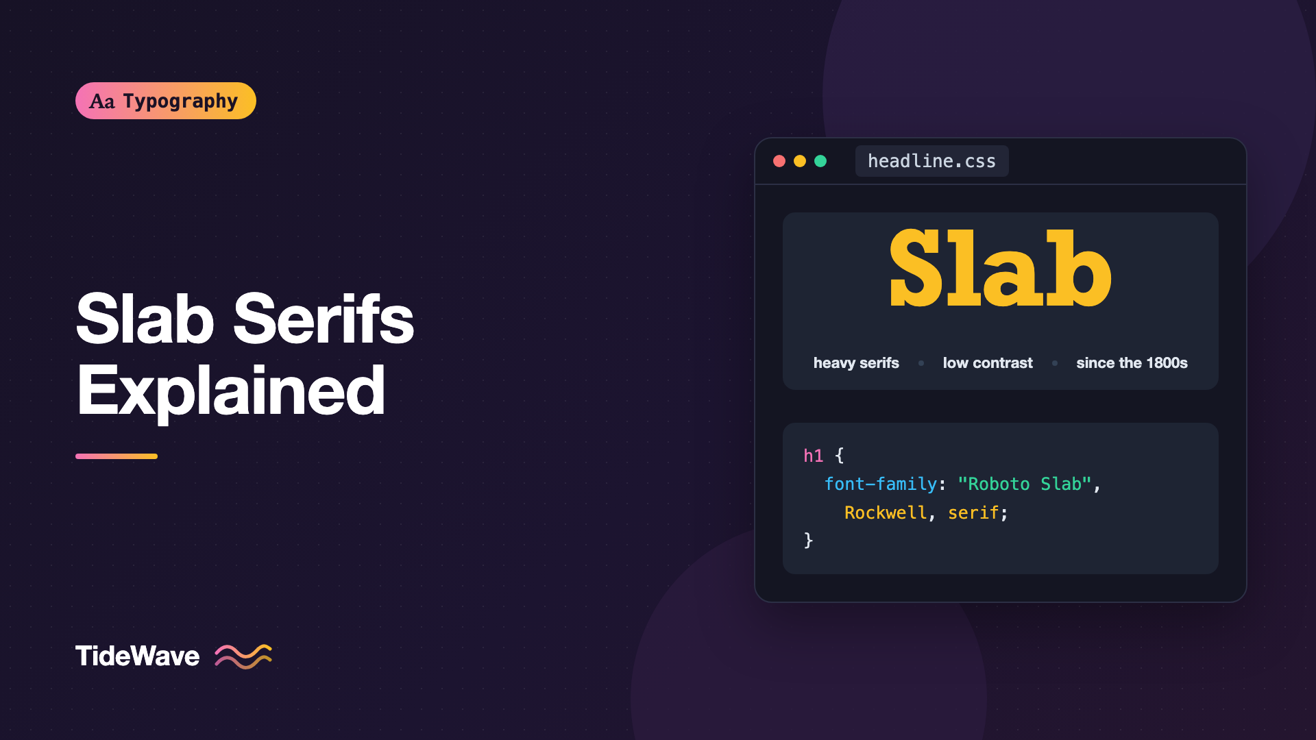
A slab serif is a serif typeface whose serifs are thick and usually rectangular, often close to the weight of the main strokes. Instead of the tapered, bracketed serifs of a book face like Garamond, slabs end strokes with heavy blocks.
Typical traits:
- Heavy serifs, often as thick as the stems or nearly so.
- Low stroke contrast, so the letters look even in weight.
- Little or no bracketing in many designs, though some have soft curved brackets.
- Sturdy, often geometric skeletons, with relatively large x-heights in many modern examples.
In type classification systems, slabs are sometimes called Egyptian or mechanistic (the Vox-ATypI system used "Mécane"). For how slabs fit among other categories, see Understanding Type Classification.
How to Spot One
When you're not sure whether a font counts as a slab, look at a few letters closely:
- The foot of
nandm. Slab feet are flat blocks. Book serifs taper and curve into the stem. - The top of
TandE. Slabs end arms with vertical blocks, often as thick as the stem. - The
iandl. Many slabs add a slab on both sides at the base, plus a flag at the top. - The thickness of horizontal strokes. If the crossbar of
His nearly as thick as the stems, you're looking at the low contrast typical of slabs.
Some typefaces sit on the border. Clarendons with soft brackets can look like heavy old-style serifs, and some sans-serifs add small slab-like spurs. Treat the label as a description, not a test with a right answer.
A Short History
Posters and the Industrial Age
Slab serifs emerged in early 19th-century Britain, when printing shifted from books toward advertising. Posters, handbills, and broadsides needed type that could be seen from across the street, and printers wanted something bolder than the elegant book faces of the previous century. Thick, square serifs and heavy strokes delivered that impact.
The name Egyptian came from the same period, during a wave of popular fascination with ancient Egypt. It's a marketing label, not a description of anything Egyptian about the letters.
Clarendons
Later in the 19th century, the Clarendon style appeared: slab serifs with bracketed serifs and some stroke contrast. Clarendon type was widely used for dictionary headwords and emphasis in text, and it's still associated with old wanted posters and Western imagery.
Typewriters
Typewriters gave slab serifs a second life. Fixed-width typewriter fonts needed strong serifs to fill the space of narrow letters like i and l, and heavy, even strokes survived the impact of the typebar on paper. Courier, designed for IBM in the 1950s, is the best-known typewriter slab and remains the default monospaced font in many contexts.
20th-Century Geometric Slabs
In the early 20th century, slab serifs were rebuilt on geometric skeletons, in step with the geometric sans-serifs of the time. Memphis and Rockwell are examples: circular bowls, uniform stroke weight, and unbracketed rectangular serifs.
The Screen Era
Low-contrast, sturdy shapes made slabs good candidates for screens, and many modern slab serifs were drawn with digital use in mind. Roboto Slab, Zilla Slab, Arvo, Bitter, and Josefin Slab are widely available on Google Fonts, and many superfamilies include a slab member alongside the sans and serif.
The Main Kinds of Slab Serif
| Style | Serifs | Contrast | Feel | Examples |
|---|---|---|---|---|
| Clarendon | Bracketed | Moderate | Warm, old-fashioned, sturdy | Clarendon, Sentinel |
| Geometric slab | Unbracketed, square | Very low | Bold, mechanical | Rockwell, Memphis, Arvo |
| Typewriter slab | Thin to medium, square | Very low | Plain, documentary | Courier, American Typewriter |
| Humanist slab | Varied, softer | Low | Friendly, readable | Zilla Slab, Bitter |
These groups overlap, but they cover most of what you'll find. Note that typewriter slabs are often monospaced, a separate topic covered in Monospaced Fonts.
Why Slabs Work So Well at Large Sizes
Slab serifs read as bold and stable. The heavy serifs anchor each letter to the baseline and the x-height, which creates strong horizontal lines through a word. At display sizes, that structure gives headlines presence without needing extreme weight or condensed widths.
.hero-title {
  font-family: "Zilla Slab", Rockwell, "Courier New", serif;
  font-weight: 700;
  font-size: clamp(2.5rem, 1.5rem + 4vw, 5rem);
  line-height: 1.05;
  letter-spacing: -0.01em;
  text-wrap: balance;
}
Heavy slabs at large sizes often benefit from slightly tighter letter spacing, because the serifs already fill the gaps between letters. Go easy, though. Slabs collide sooner than sans-serifs when you tighten them.
Can You Use Slabs for Body Text?
Yes, with the right font. Low contrast and sturdy serifs make many modern slabs perfectly readable at text sizes, and some were designed specifically for that, especially on screens. Bitter, for example, was designed for comfortable reading on screen.
What to check:
- Text weight. Use a Regular or Light weight. Bold slabs as body text feel heavy.
- Spacing. Slabs need enough letter spacing that serifs don't touch. Use the font as designed; don't tighten.
- Line height. Heavy horizontal serifs create dense lines, so give body text room.
- Text versus display cuts. Some slabs are display-only. Look at the font's intended use.
.article-body {
  font-family: "Bitter", Georgia, serif;
  font-weight: 400;
  font-size: 1.0625rem;
  line-height: 1.65;
  max-width: 66ch;
}
If you're deciding between a slab and a traditional serif for long reading, the considerations in Serif vs Sans-Serif apply here too: x-height, contrast, apertures, and spacing matter more than category.
Modern Uses of Slab Serifs
Headlines and Editorial Design
Slabs are a common choice for news, magazine, and blog headlines that need authority without looking formal. A slab headline with a clean sans body is a classic combination.
Brand Identities
Slabs suggest reliability, craft, and a bit of personality. You'll see them in brands for outdoor gear, food and drink, publishing, and tools. A slab can make a brand feel established without the formality of a traditional serif.
Interfaces and Product Design
Some products use a slab for headings or numbers to stand apart from the sea of neutral sans-serifs. Slabs also work well for large numerals in dashboards because the serifs make digits like 1 and 7 very distinct.
Numbers and Data Displays
Large slab numerals are easy to read at a glance, which makes them a good fit for scoreboards, stats, and pricing. Pair the slab numerals with tabular figures if values update or need to line up:
.stat-value {
  font-family: "Zilla Slab", Rockwell, Georgia, serif;
  font-weight: 600;
  font-size: clamp(2rem, 1.5rem + 2vw, 3.5rem);
  font-variant-numeric: tabular-nums lining-nums;
  line-height: 1;
}
Not every slab includes tabular figures. If tabular-nums has no visible effect, the font doesn't support it, and you may want a different face for data that changes.
Code and Data
Monospaced slab and slab-influenced fonts are common in code editors and terminals. Courier is the classic, and several programming fonts use slab serifs on i, l, and 1 to make them unmistakable.
Signage and Wayfinding
Slab serifs' even weight and sturdy serifs make them legible at a distance, which is why they show up on signs, labels, and packaging.
Pairing Slab Serifs
Slabs have strong personalities, so pair them with something calmer.
- Slab headline, sans body: the most common and safest. A slab with a humanist or neo-grotesque sans body gives clear contrast.
- Slab from a superfamily: if your sans has a matching slab (like Roboto and Roboto Slab), you get harmony for free.
- Avoid two slabs or a slab with a heavy display serif. They compete.
:root {
  --font-heading: "Roboto Slab", Rockwell, Georgia, serif;
  --font-body: "Roboto", system-ui, -apple-system, "Segoe UI", sans-serif;
}

h1,
h2,
h3 {
  font-family: var(--font-heading);
  font-weight: 700;
}

body {
  font-family: var(--font-body);
  font-weight: 400;
}
There's more on finding compatible typefaces in How to Pair Fonts.
Loading Slab Serifs on the Web
Most popular web slabs are on Google Fonts, and several are variable. Request only the weights you need:
<link rel="preconnect" href="https://fonts.googleapis.com" />
<link rel="preconnect" href="https://fonts.gstatic.com" crossorigin />
<link
  href="https://fonts.googleapis.com/css2?family=Roboto+Slab:[email protected]&display=swap"
  rel="stylesheet"
/>
Or self-host and declare the family with a weight range:
@font-face {
  font-family: "Roboto Slab";
  src: url("/fonts/roboto-slab-variable.woff2") format("woff2");
  font-weight: 100 900;
  font-style: normal;
  font-display: swap;
}
For fallbacks, Rockwell is installed on many Macs and Windows machines, and Georgia is a reasonable serif fallback with sturdy shapes. Avoid falling back to a thin, high-contrast serif, which changes the character of the page while fonts load. For loading strategies, see How to Load Web Fonts Efficiently with font-display.
Tip
Slabs often look heavier on dark backgrounds. If your headings use a 700 weight on light mode, try 600 in dark mode.
Common Mistakes
- Using a heavy display slab for paragraphs. Bold geometric slabs are built for headlines. Body text needs a slab designed for reading.
- Tightening letter spacing too much. Slab serifs collide quickly. Small negative tracking on huge headlines only.
- Pairing a slab with another loud face. Two strong personalities fight. Keep the partner quiet.
- Ignoring the fallback. A thin serif fallback for a sturdy slab makes the loading state look like a different site.
- Reaching for a slab to look "vintage" by default. Slabs can feel very current. Choose a modern design if you don't want Western-poster nostalgia.
Conclusion
Slab serifs grew out of 19th-century advertising, picked up their Egyptian name from a period of popular fascination, carried on through typewriters, and were rebuilt in geometric form in the 20th century. Today they range from bracketed Clarendons to mechanical geometric slabs and friendly humanist designs built for screens.
Use a slab when you want type that feels solid and distinctive. It's a strong choice for headlines, brands, numerals, and signage, and a readable body face when you pick one designed for text. Pair it with a calm sans, load only the weights you need, and keep the letter spacing generous enough for those heavy serifs to breathe.