Bauhaus Typography and Its Influence on Modern Design
- Maria
- Typography
- 23 Oct, 2026
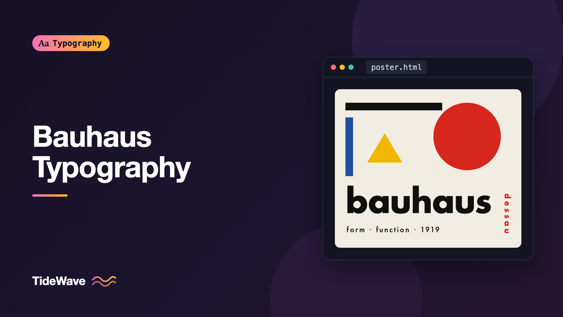
Bold sans-serif type, thick black bars, red accents, text running at an angle, and lowercase-only headlines. If a poster or website uses that combination, someone will call it "Bauhaus." The label is used so loosely today that it can mean almost any geometric, modernist look. But the real Bauhaus was a specific school with a specific set of ideas, and its approach to typography had a much bigger impact than the visual clichés suggest.
The Bauhaus existed for only fourteen years, from 1919 to 1933. In that time, its teachers and students questioned nearly every typographic convention they'd inherited: centered layouts, ornamental type, the use of two alphabets, and the idea that a printed page should look like a classical book.
This post covers what the Bauhaus was, the typographic ideas it developed, the people behind them, and how those ideas still shape the design work you do on the web today.
What the Bauhaus Was
The Bauhaus was a German school of art, design, and architecture founded by the architect Walter Gropius in Weimar in 1919. Its aim was to unite art and craft, and later art and industry, by training designers who could create well-made, functional objects for modern life.
The school moved to Dessau in 1925, into a building designed by Gropius that became an icon of modernist architecture. It moved again to Berlin in 1932 and closed in 1933 under pressure from the Nazi government. Many of its teachers and students emigrated, which spread Bauhaus ideas across Europe and the United States.
Typography wasn't the school's main focus at first. The early Bauhaus was more concerned with crafts, painting, and a mystical, expressive approach to art. That changed in the mid-1920s, as the school shifted toward industrial design and practical communication. Typography and advertising became part of that shift.
The People Behind Bauhaus Typography
László Moholy-Nagy
The Hungarian artist László Moholy-Nagy joined the Bauhaus in 1923 and became one of the strongest voices for a new kind of typography. He argued that typography should be communication first and that the designer should use every available tool, including photography, to communicate clearly and with impact. He called the combination of type and photography typofoto.
Moholy-Nagy also designed many of the Bauhausbücher, a series of books published by the school, which became showcases for its approach to layout.
Herbert Bayer
Herbert Bayer studied at the Bauhaus and later ran its printing and advertising workshop in Dessau. He's the figure most closely associated with Bauhaus typography today, largely because of two things:
- The Universal alphabet: In 1925 Bayer designed an experimental alphabet built from simple geometric forms, circles, straight lines, and right angles, and containing only lowercase letters. It was never released as a commercial typeface during the Bauhaus years, but it became one of the school's best-known typographic experiments.
- Lowercase-only typography: Bayer and others argued that capital letters were unnecessary. Why use two alphabets, they asked, when one would do? From around 1925, the Bauhaus used lowercase-only letterheads and publications.
Joost Schmidt
Joost Schmidt took over typography and advertising teaching later in the Dessau years. His work, including the famous poster for the 1923 Bauhaus exhibition, used bold geometric shapes and type arranged as part of a larger composition.
Jan Tschichold
Jan Tschichold wasn't a member of the Bauhaus, but he visited the 1923 Bauhaus exhibition in Weimar and was deeply influenced by it. His 1928 book Die neue Typographie (The New Typography) organized many Bauhaus-era ideas into a clear set of rules for asymmetric, functional typography. Ironically, Tschichold later rejected the strictness of these rules and returned to classical, centered book typography.
The Typographic Ideas of the Bauhaus
Function Over Tradition
The central Bauhaus idea was that form should follow function. In typography, that meant every typographic decision should serve communication. Decorative borders, ornate initials, and historical styles that didn't help the reader were removed.
Asymmetry
Traditional book typography was centered. The Bauhaus favored asymmetric layouts, where text and images are placed off-center and balanced by their relationships to each other and to empty space. Asymmetry was seen as more dynamic and more honest about the content's actual structure.
Sans-Serif Type
Bauhaus designers preferred sans-serif type, which they saw as modern, rational, and free of historical association. In Germany, this also had a political edge: many traditionalists favored blackletter, and choosing a sans-serif was a deliberate break with that tradition.
The most famous geometric sans-serif of the era, Futura, wasn't a Bauhaus typeface. Paul Renner designed it independently and released it through the Bauer foundry starting in 1927. But Futura's construction from circles, triangles, and squares captured the same spirit, and it's often associated with the Bauhaus today. For more on geometric sans-serifs and their relatives, see understanding type classification.
Lowercase Letters
Bayer's argument against capitals was partly practical: one alphabet would be simpler to typeset, learn, and write. It also had a symbolic dimension in German, where all nouns are capitalized. Dropping capitals rejected a convention that many modernists saw as needlessly hierarchical.
Type as Image
Bauhaus designers treated type as a visual element, not just a vehicle for words. Letters could be enlarged, rotated, stacked, and combined with bars, rules, and blocks of color. A word could be the main image of a poster.
A Limited Palette
Many Bauhaus printed works used black and red on white or off-white paper, sometimes with yellow or blue. The limited palette made printing cheaper and gave the work a strong, consistent visual identity.
From the Bauhaus to Swiss Style and Beyond
The Bauhaus closed in 1933, but its ideas didn't. They traveled in several directions:
- To Switzerland, where they were refined into the International Typographic Style, a more systematic and grid-driven approach. Read more in Swiss Style typography.
- To the United States, where former Bauhaus figures taught and practiced. Moholy-Nagy founded the New Bauhaus in Chicago in 1937, and Bayer worked as a designer and art director in America.
- To corporate identity and advertising, where asymmetric layouts and sans-serif type became standard for modern companies.
The Bauhaus look also became a style in its own right, separated from its original reasoning. ITC Bauhaus, released in the 1970s, is a commercial typeface based loosely on Bayer's Universal alphabet. It has rounded, geometric shapes that people now associate with the school, though it's a much later interpretation.
Bauhaus Ideas in Modern Web Design
You use Bauhaus ideas every time you build a web page, even if you've never thought of it that way:
| Bauhaus idea | Modern web equivalent |
|---|---|
| Form follows function | Content-first design, removing decoration that doesn't help users |
| Asymmetric layouts | Off-center grid layouts and editorial page designs |
| Sans-serif type | Sans-serif defaults for interfaces and system font stacks |
| Type as image | Large display headlines that act as the hero visual |
| Limited palette | Design tokens with a small set of brand colors |
| One alphabet | Lowercase brand wordmarks and lowercase UI conventions |
Many brands use lowercase wordmarks today for the same reasons Bayer gave: they feel approachable, modern, and less formal.
Building a Bauhaus-Inspired Layout with CSS
Here's a small Bauhaus-inspired poster section. It uses an asymmetric grid, a geometric sans-serif, lowercase text, a limited palette, and rotated type.
<section class="poster" aria-labelledby="poster-title">
  <div class="poster__bar"></div>
  <h2 class="poster__title" id="poster-title">form follows function</h2>
  <p class="poster__meta">exhibition · dessau · 1926</p>
  <p class="poster__side">bauhaus</p>
  <div class="poster__circle" aria-hidden="true"></div>
</section>
.poster {
  --ink: #111111;
  --paper: #f2ede3;
  --red: #d7261e;

  position: relative;
  display: grid;
  grid-template-columns: repeat(6, minmax(0, 1fr));
  grid-template-rows: auto 1fr auto;
  gap: 1.5rem;
  min-height: 36rem;
  padding: clamp(1.5rem, 4vw, 3rem);
  overflow: hidden;
  background: var(--paper);
  color: var(--ink);
  font-family: Futura, "Century Gothic", "Jost", "Avenir Next", sans-serif;
}

.poster__bar {
  grid-column: 1 / span 4;
  height: 1.25rem;
  background: var(--ink);
}

.poster__title {
  grid-column: 1 / span 5;
  align-self: end;
  margin: 0;
  font-size: clamp(2.75rem, 8vw, 6.5rem);
  font-weight: 700;
  line-height: 0.9;
  letter-spacing: -0.02em;
  text-transform: lowercase;
}

.poster__meta {
  grid-column: 1 / span 3;
  margin: 0;
  font-size: 1rem;
  letter-spacing: 0.08em;
}

.poster__side {
  position: absolute;
  inset-block-start: 3rem;
  inset-inline-end: 1.5rem;
  margin: 0;
  writing-mode: vertical-rl;
  font-size: 1.5rem;
  font-weight: 700;
  letter-spacing: 0.3em;
  color: var(--red);
}

.poster__circle {
  position: absolute;
  inset-block-start: 4rem;
  inset-inline-end: 4rem;
  width: clamp(8rem, 20vw, 14rem);
  aspect-ratio: 1;
  border-radius: 50%;
  background: var(--red);
  mix-blend-mode: multiply;
}
A few details are worth calling out:
- The font stack asks for Futura, which is installed on Apple devices, and falls back to Century Gothic, Jost (an open-source geometric sans inspired by Futura), and Avenir Next.
- The text is written in lowercase in the HTML, not just transformed with CSS.
text-transform: lowercaseacts as a safeguard if a CMS editor adds capitals, but writing it lowercase means screen readers and copied text match what users see. - The vertical label uses
writing-mode: vertical-rlinstead of a rotation transform, so it stays real text that flows naturally. Writing modes and vertical text in CSS explains the details. - The red circle uses
mix-blend-mode: multiply, so it reads like overprinted ink where it overlaps the title.
Accessibility Considerations
Bauhaus-inspired layouts can create accessibility issues if you copy the look without care:
- Rotated or vertical text is harder to read. Keep it to short labels, and never put essential information only in rotated text.
- All-lowercase text is fine for headlines and labels, but proper nouns and sentence starts carry meaning. Long passages in lowercase only can slow readers down.
- Red on off-white can have weaker contrast than you'd expect. Check text color contrast against the background, especially for small text.
- Decorative shapes should be hidden from assistive technology with
aria-hidden="true", as in the example above.
Common Mistakes
- Treating "Bauhaus" as just a color scheme: Red, yellow, blue, and black shapes don't make a design Bauhaus. The original work was about function and clear communication.
- Calling Futura a Bauhaus typeface: Futura shares the school's spirit, but it was designed independently by Paul Renner. Get the history right if you're writing about it.
- Overusing rotated text: One rotated label adds energy. Several make a page hard to read.
- Sacrificing readability for geometry: Purely geometric typefaces can have ambiguous letters and small apertures. Use them for display and pair them with a more readable face for body text.
- Forgetting responsive behavior: Absolute-positioned shapes and huge headlines need to adapt on small screens. Test the layout at narrow widths.
Conclusion
The Bauhaus rethought typography from first principles. Teachers and students like Moholy-Nagy, Bayer, and Schmidt promoted asymmetric layouts, sans-serif type, lowercase letters, type as image, and a limited palette, all in the service of clear, functional communication. Those ideas passed through Tschichold's New Typography into Swiss Style and corporate design, and from there into modern web and interface design.
When you use Bauhaus ideas today, start from the reasoning, not the clichés. Ask what serves the content, use asymmetry and contrast to create structure, and keep the result readable. The aesthetic follows naturally from that discipline.