Swiss Style Typography: Principles of the International Typographic Style
- Maria
- Typography
- 23 Oct, 2026
If you've ever designed a page with a strict column grid, a single sans-serif family, flush-left text, and lots of deliberate empty space, you've borrowed from a movement that took shape in Switzerland in the 1950s. The International Typographic Style, usually called Swiss Style, became one of the most influential approaches to graphic design of the 20th century. Its fingerprints are on corporate identities, transit signage, editorial layouts, and a large share of modern web and interface design.
Swiss Style is often reduced to "use Helvetica and a grid." That's not wrong, but it misses the reasoning that made the style work. The designers behind it had a clear set of beliefs about clarity, objectivity, and the relationship between content and form.
This post covers where the style came from, its core principles, the people and typefaces associated with it, and how to apply those principles with CSS today.
Where Swiss Style Came From
The roots go back to the 1920s. Designers associated with the Bauhaus and with the "New Typography" movement in Germany argued that typography should be functional, asymmetric, and free of decorative tradition. Jan Tschichold's 1928 book Die neue Typographie set out many of these ideas. If you want that earlier chapter, see Bauhaus typography and its influence on modern design.
After the Second World War, those ideas were refined and systematized in Switzerland, which had stayed neutral and kept its design schools and printing industry intact. Two schools were especially important:
- The Basel School of Design, where Emil Ruder taught typography and Armin Hofmann taught graphic design.
- The Zurich School of Arts and Crafts, associated with Josef Müller-Brockmann and earlier with Ernst Keller.
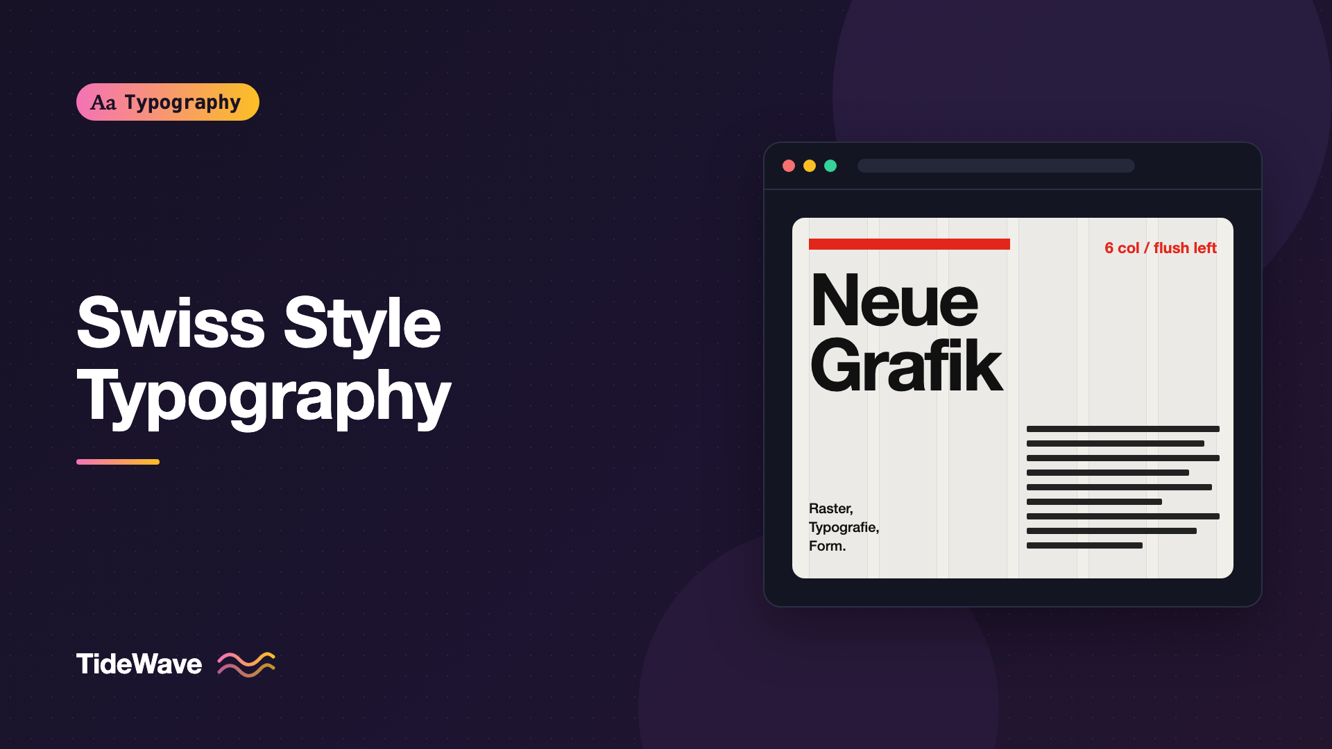
Between 1958 and 1965, the journal Neue Grafik, edited by Müller-Brockmann, Richard Paul Lohse, Hans Neuburg, and Carlo Vivarelli, spread the approach internationally. The journal itself was a demonstration of the style: a strict grid, sans-serif type, and text in multiple languages set side by side.
Books by the movement's teachers carried the ideas further. Emil Ruder's Typographie and Josef Müller-Brockmann's Grid Systems in Graphic Design are still widely read, and they're worth tracking down if this approach interests you.
The Core Principles
Swiss Style isn't a list of visual tricks. It's a set of priorities. Here are the principles that show up again and again in the work.
1. Objectivity Over Self-Expression
The designer's job was to communicate the content clearly, not to decorate it or impose personal style. Ornament, illustration for its own sake, and expressive lettering were set aside in favor of a neutral presentation that let the information speak.
In practice, this meant asking what a piece of content needed to be understood, and removing anything that didn't serve that goal.
2. The Grid as the Foundation
Every layout was built on a modular grid: a system of columns, rows, margins, and gutters that determined where every element could go. The grid created consistency across pages and gave layouts a calm, rational structure.
A grid wasn't meant to make every page look the same. It was meant to provide a set of proportions so that variety would still feel related. Müller-Brockmann described the grid as a tool for bringing order to the designer's thinking, not just to the page.
3. Sans-Serif Type
Swiss designers favored sans-serif typefaces, especially Akzidenz-Grotesk, and later Univers and Helvetica, both released in 1957. Sans-serifs were seen as more neutral and modern than serif faces, which carried associations with older traditions. The story of how one of those typefaces became ubiquitous is in Helvetica: why one typeface ended up everywhere.
Often a single type family was used for an entire design, with hierarchy created through size, weight, and position rather than by mixing typefaces.
4. Flush-Left, Ragged-Right Text
Swiss Style typography almost always aligned text to the left with a ragged right edge. Justified text was avoided because it creates uneven word spacing, and centered text was seen as static and symmetrical. Flush-left text keeps word spacing consistent and gives each line a clean starting point.
The broader trade-offs between alignment choices are covered in left-aligned, centered, or justified.
5. Asymmetric Layouts
Instead of centering elements on a page's axis, Swiss designers built asymmetric compositions. A headline might sit in the top-left, a block of text in a narrow column on the right, and a photograph spanning several columns below. Balance came from the relationship between elements and empty space, not from mirror symmetry.
6. Active Use of White Space
Empty space was treated as a structural element, not leftover area. Large margins, open columns, and deliberate gaps directed attention and separated groups of information.
7. Objective Photography Instead of Illustration
When imagery was used, it was usually photography, often in black and white, cropped and placed according to the grid. Photography was seen as factual, while illustration was seen as subjective.
8. Clear, Structured Hierarchy
Hierarchy came from a small number of controlled differences: a larger size, a heavier weight, a change in position, or a rule line. Typographers limited the number of sizes in a design and used them consistently.
Typefaces Associated with Swiss Style
| Typeface | Origin | Notes |
|---|---|---|
| Akzidenz-Grotesk | Berthold, late 19th century | The workhorse of early Swiss Style before Helvetica and Univers |
| Univers | Adrian Frutiger, Deberny & Peignot, 1957 | A systematic family with numbered weights and widths |
| Helvetica | Max Miedinger and Eduard Hoffmann, Haas, 1957 | Released as Neue Haas Grotesk, renamed Helvetica in 1960 |
Univers is worth singling out because it reflects Swiss Style thinking in its structure. Frutiger designed the family as a planned system, with weights and widths identified by two-digit numbers instead of names like "Bold Condensed." That kind of systematic thinking is closely related to how modern design systems define type scales.
For a web project, open-source sans-serifs with a neutral grotesque or neo-grotesque feel, like Inter, Public Sans, Work Sans, or Instrument Sans, can carry the same spirit.
Applying Swiss Style Principles with CSS
The good news for web designers is that CSS now has the tools that Swiss designers worked out by hand. Here's how the core principles map onto modern CSS.
Build a Real Grid
CSS Grid lets you define a modular grid once and place everything on it.
.page {
  --columns: 12;
  --gutter: clamp(1rem, 2vw, 2rem);
  --margin: clamp(1.25rem, 5vw, 5rem);

  display: grid;
  grid-template-columns: repeat(var(--columns), minmax(0, 1fr));
  column-gap: var(--gutter);
  padding-inline: var(--margin);
}

.page__title {
  grid-column: 1 / span 8;
}

.page__intro {
  grid-column: 1 / span 5;
}

.page__body {
  grid-column: 7 / span 5;
}

.page__image {
  grid-column: 4 / -1;
}

@media (max-width: 48rem) {
  .page__title,
  .page__intro,
  .page__body,
  .page__image {
    grid-column: 1 / -1;
  }
}
This creates the asymmetry that defines the style: the intro sits on the left, the body text in a separate column on the right, and the image spans part of the grid instead of the full width. On small screens, everything collapses into a single column. Column systems in general are covered in more depth in grids and typography.
Use One Family and a Limited Scale
Swiss Style designs used few sizes. A modular scale with four or five steps is usually plenty:
:root {
  --font-sans: "Inter", "Helvetica Neue", Arial, sans-serif;

  --step-0: 1rem;
  --step-1: 1.25rem;
  --step-2: 1.953rem;
  --step-3: 3.052rem;
  --step-4: clamp(3.5rem, 2rem + 6vw, 6rem);
}

body {
  font-family: var(--font-sans);
  font-size: var(--step-0);
  line-height: 1.5;
}

.page__title {
  font-size: var(--step-4);
  font-weight: 700;
  line-height: 0.95;
  letter-spacing: -0.03em;
}

.page__intro {
  font-size: var(--step-1);
  line-height: 1.4;
}

.label {
  font-size: var(--step-0);
  font-weight: 600;
}
Notice the large jump between the body size and the headline. Swiss layouts often used dramatic size contrast, a huge headline next to modest body text, instead of many intermediate sizes. If you want to build your own scale, see how to build a modular type scale.
Keep Text Flush Left
Browsers already default to left-aligned text in left-to-right languages, so the main job is to avoid overriding it. Use logical properties so the layout works in right-to-left languages too:
.page__body p {
  text-align: start;
  max-width: 34em;
  hyphens: manual;
  text-wrap: pretty;
}
text-wrap: pretty helps reduce awkward short last lines, which keeps the ragged edge looking intentional.
Create Hierarchy with Rules and Position
Swiss layouts often used thin rule lines and small labels to structure information.
<section class="spec">
  <h2 class="spec__label">Exhibition</h2>
  <p class="spec__value">Konstruktive Grafik</p>
  <h2 class="spec__label">Dates</h2>
  <p class="spec__value">12 March to 30 April</p>
  <h2 class="spec__label">Location</h2>
  <p class="spec__value">Kunstgewerbemuseum Zürich</p>
</section>
.spec {
  display: grid;
  grid-template-columns: 10rem 1fr;
  border-top: 2px solid currentColor;
}

.spec__label,
.spec__value {
  margin: 0;
  padding-block: 0.75rem;
  border-bottom: 1px solid color-mix(in srgb, currentColor 25%, transparent);
  font-size: 1rem;
}

.spec__label {
  font-weight: 600;
}
No color, no icons, no extra fonts. Position, weight, and rule lines do the work.
Use White Space as a Tool
Instead of filling empty grid cells, leave them empty on purpose. Larger margins above major sections and generous padding around headlines give the composition room.
.page__section {
  margin-block-start: clamp(4rem, 10vw, 10rem);
}
Swiss Style in Modern Web and UI Design
Many of the conventions of modern interface design trace back to Swiss Style:
- Design systems with fixed type scales, spacing tokens, and grids echo the systematic approach of Univers and the modular grid.
- Flat design, which rejected skeuomorphic textures and gradients, shares the Swiss rejection of ornament.
- Editorial websites with large sans-serif headlines, asymmetrical layouts, and clear typographic hierarchy draw directly on Swiss poster and magazine design.
The difference is that the web is fluid. Swiss designers worked on fixed formats like posters and printed pages. Web layouts must adapt to many widths, so the grid has to collapse and reflow. The principles still work, as long as you treat the grid as a set of relationships rather than fixed coordinates.
Common Mistakes
- Copying the look without the structure: Helvetica and red accents don't make a design Swiss. Without a consistent grid and a disciplined hierarchy, it's just a style imitation.
- Using too many type sizes: Swiss layouts relied on a few sizes used consistently. A dozen slightly different sizes undermines the clarity the style depends on.
- Justifying text: Justified text on the web produces uneven word spacing and rivers. Keep body text flush left.
- Filling every grid cell: Empty columns are part of the composition. Resist the urge to stretch every element to full width.
- Forgetting small screens: An asymmetric 12-column layout must still collapse cleanly to one column on mobile. Plan the narrow layout alongside the wide one.
- Sacrificing readability for minimalism: Very light weights, tiny labels, and low-contrast gray text look elegant but can fail accessibility requirements. Objectivity means making text easy to read.
Conclusion
Swiss Style typography rests on a few connected ideas: objective communication, a modular grid, sans-serif type in a single family, flush-left text, asymmetric composition, deliberate white space, and a disciplined hierarchy. It grew from the New Typography of the 1920s, was refined in the schools of Basel and Zurich, and spread through journals like Neue Grafik and the work of designers like Müller-Brockmann, Hofmann, and Ruder.
You can apply the same thinking today with CSS Grid, a short modular type scale, and careful use of space. Start with the grid and the hierarchy, and the Swiss look will follow. Start with the look alone, and you'll miss what made the style work.