The Story of Garamond and Its Many Revivals
- Maria
- Typography
- 23 Oct, 2026
Open the font menu on almost any computer and you'll find something called Garamond. Open a different computer and you'll find another Garamond that looks noticeably different. Search a font library and you'll find a dozen more: Adobe Garamond, Stempel Garamond, ITC Garamond, EB Garamond, Cormorant Garamond. They share a name, but they don't share a single source, and a few of them aren't based on Garamond's work at all.
Garamond is less a typeface than a family tree. It starts with a 16th-century French punchcutter, branches through misattributions and rediscoveries, and ends up in thousands of novels, a famous computer brand, and the Google Fonts catalog.
This post traces that history, explains what the different revivals got right and wrong, and gives you practical advice for choosing and setting a Garamond on the web today.
Claude Garamond and Renaissance Paris
Claude Garamond (sometimes spelled Garamont) was a punchcutter working in Paris in the first half of the 16th century. Punchcutters carved each letter, in reverse, at actual size on the end of a steel bar. That punch was struck into softer copper to make a matrix, and the matrix was used to cast metal type. It was precise, slow work, and good punchcutters were in demand.
Garamond worked in a period when French printing was absorbing the influence of Venice. Around the end of the 15th century, the Venetian printer Aldus Manutius had published books using roman types cut by Francesco Griffo. Those Aldine types became the model for the French roman types that followed, and Garamond's romans refined that model.
Several things make his romans stand out:
- Moderate contrast: Strokes vary between thick and thin, but gently, following the logic of a broad-nibbed pen.
- Diagonal stress: The thinnest parts of round letters like
osit at an angle, not straight up and down. - Small x-height: Lowercase letters are short relative to the ascenders and capitals, which gives a page an elegant, open texture.
- Fine, slightly cupped serifs: The serifs are delicate and taper into the strokes.
- Compact, efficient forms: Garamond types set a lot of text in a given space without feeling cramped.
If any of those anatomy terms are unfamiliar, the anatomy of a typeface covers them in detail. Typographers classify this style as old-style or Garalde, a name that literally combines Garamond and Aldus.
Garamond's types were sold and copied widely after his death. His punches and matrices passed to other printers and founders, including Christophe Plantin in Antwerp, whose printing house is now the Plantin-Moretus Museum. That collection became one of the most important sources for later revival work.
What About the Italic?
Garamond is mostly known for his romans. The italics paired with "Garamond" in many revivals are based on work by Robert Granjon, another French punchcutter of the same century, who cut some of the finest italics of the period. In the 16th century, roman and italic were still treated as separate typefaces, not as one family with two styles. Modern revivals combine Garamond-style romans with Granjon-style italics because that's what makes a usable family.
The Jannon Mix-Up
Here's where the story gets complicated. In the early 17th century, a printer and punchcutter in Sedan named Jean Jannon cut a set of types inspired by Garamond's style. They were more angular and more irregular, with sharper serifs and a distinctive, slightly mannered rhythm.
Some of Jannon's materials later ended up in the French royal printing office, which became the Imprimerie Nationale. Over time, they were catalogued as the work of Garamond.
In the early 20th century, when foundries wanted to revive "Garamond," many of them went to the French national printing office's types, believing they were Garamond's. The result was that several of the most popular "Garamonds" of the 20th century were actually revivals of Jannon's work.
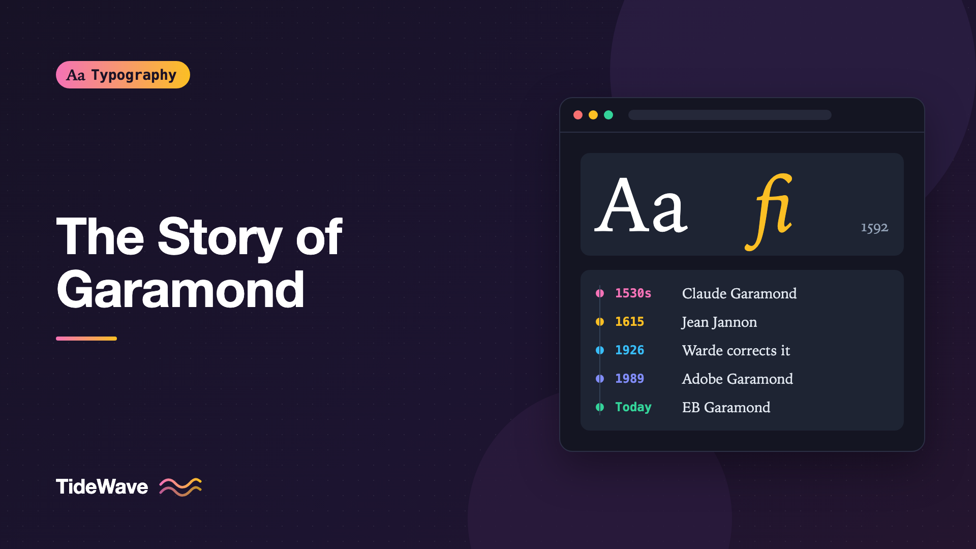
The misattribution was corrected in 1926 by the historian Beatrice Warde, writing under the pseudonym Paul Beaujon in the typographic journal The Fleuron. Her research showed the types were Jannon's. By then, the Jannon-based revivals were already established and kept the Garamond name.
This is why you'll see revivals described as "Garamond-based" or "Jannon-based." Neither is wrong to use. They're simply different designs with different textures.
The Major Revivals
Here's a short field guide to the Garamonds you're most likely to meet. Dates are approximate where foundries released designs over several years.
| Revival | Source | Character |
|---|---|---|
| ATF Garamond | Jannon, via the Imprimerie Nationale | Early 20th-century American revival, crisp and slightly angular |
| Monotype Garamond | Jannon | Widely used in British book printing, sharp and lively |
| Stempel Garamond | Garamond, from 16th-century specimens | Faithful to the original romans, sturdy and even |
| Linotype Granjon | Garamond | A respected 1920s revival despite its name |
| Sabon | Garamond | Designed by Jan Tschichold in the 1960s for consistency across machines |
| ITC Garamond | Loosely Garamond | 1970s design with a very large x-height and tight spacing |
| Adobe Garamond | Garamond, from Plantin-Moretus materials | Robert Slimbach's 1989 digital revival, a desktop-era standard |
| Garamond Premier | Garamond | Slimbach's later, more extensive revival with optical sizes |
| EB Garamond | Garamond, from a 1592 specimen sheet | Open-source, by Georg Duffner, available on Google Fonts |
| Cormorant Garamond | Loosely Garamond | Open-source display family with very refined, high-contrast shapes |
Sabon
Sabon deserves special mention. Jan Tschichold designed it for German printers who wanted a typeface that would look and space identically whether set by hand, on Linotype, or on Monotype machines. Those technical constraints forced a very balanced design, and Sabon became a long-running favorite for book typography. It's a Garamond in spirit, though it carries its own name.
ITC Garamond and the Apple Connection
ITC Garamond, drawn by Tony Stan for the International Typeface Corporation in the 1970s, took Garamond in a very different direction. It has a big x-height, short ascenders and descenders, and tight spacing, in line with the advertising style of the period. Purists consider it barely a Garamond.
It's also the version with the most famous corporate use. Apple used a condensed adaptation of ITC Garamond, usually called Apple Garamond, as its corporate typeface for marketing for many years, including the "Think Different" campaign era. If you associate Garamond with a slightly squeezed, glossy look, that's probably why.
Adobe Garamond and Garamond Premier
Adobe Garamond, designed by Robert Slimbach and released in 1989, was based on careful study of original materials in the Plantin-Moretus Museum. It became one of the defining book typefaces of the desktop publishing era, partly because it was well made and partly because it was easy to get.
Slimbach's later Garamond Premier went further, with multiple optical sizes and an extended character set. If you need a commercial Garamond for serious book work, it's often where people end up.
EB Garamond
EB Garamond is the open-source option most web designers reach for. Georg Duffner based it on a 1592 specimen sheet from the Egenolff-Berner foundry in Frankfurt, which showed type attributed to Garamond. It's released under the SIL Open Font License and available through Google Fonts. It's a good choice for editorial sites that want classical texture without licensing costs.
Why There Are So Many
It's fair to ask why one designer's work produced so many competing versions. Several reasons stack up:
- Garamond's name was never protected. Anyone can release a typeface called Garamond. Foundries used the name because it signaled quality.
- Every new technology needed new fonts. Hand-set metal, hot-metal machines, phototypesetting, desktop PostScript, and web fonts each forced foundries to redraw or adapt designs. Each wave produced new Garamonds.
- Sources differ. A revival based on 16th-century printed books looks different from one based on surviving punches, and both differ from one based on Jannon's types.
- Revivals reflect their era. ITC Garamond looks like the 1970s, and Adobe Garamond looks like careful late-80s scholarship. Designers interpret history through their own taste.
The result is a family tree that's less like a single line and more like a river delta.
Choosing a Garamond Today
The best Garamond depends on what you're setting and where.
For Long-Form Reading on Screen
Classical Garamonds have small x-heights and fine details. At typical screen body sizes, they can look small and spindly compared to typefaces designed for screens. If you want Garamond's texture for long articles, set it larger than you'd set a sans-serif and give it generous line height. Choosing a body text font for long-form reading covers the broader trade-offs.
For Headlines and Display
High-contrast Garamonds like Cormorant Garamond or the display sizes of Garamond Premier look elegant at large sizes. Their thin strokes can disappear at small sizes, so don't use display designs for body text.
For Print
Garamond excels in print, which is what it was designed for. In printed books, its small x-height looks refined, not small, because readers hold the page closer and print resolution preserves the fine serifs.
Setting EB Garamond on the Web
Here's a practical setup using EB Garamond from Google Fonts, with a size and line height suited to its proportions:
<link rel="preconnect" href="https://fonts.googleapis.com" />
<link rel="preconnect" href="https://fonts.gstatic.com" crossorigin />
<link
  href="https://fonts.googleapis.com/css2?family=EB+Garamond:ital,wght@0,400..800;1,400..800&display=swap"
  rel="stylesheet"
/>
.article-body {
  font-family: "EB Garamond", Garamond, "Times New Roman", serif;
  font-size: 1.25rem;
  line-height: 1.6;
  max-width: 34em;
  font-kerning: normal;
  /* Old-style figures sit naturally in running text */
  font-variant-numeric: oldstyle-nums proportional-nums;
  /* Standard ligatures are on by default, but be explicit */
  font-variant-ligatures: common-ligatures;
}

.article-body h2 {
  font-weight: 600;
  line-height: 1.2;
}

.article-body em {
  font-style: italic;
}
A few notes on this setup:
font-size: 1.25remcompensates for Garamond's small x-height. It reads at about the same visual size as a 1rem sans-serif.font-variant-numeric: oldstyle-numsuses figures with ascenders and descenders, which blend into old-style text better than capital-height figures. For tables, switch to lining and tabular figures. See font-variant-numeric explained for the details.- The fallback
Garamondcatches the version installed on many Windows and Mac systems. It won't match EB Garamond's metrics exactly, but it keeps the classical feel if the web font fails.
If you'd rather self-host, download the font files, convert or confirm WOFF2, and use @font-face with a weight range:
@font-face {
  font-family: "EB Garamond";
  src: url("/fonts/EBGaramond-Variable.woff2") format("woff2");
  font-weight: 400 800;
  font-style: normal;
  font-display: swap;
}

@font-face {
  font-family: "EB Garamond";
  src: url("/fonts/EBGaramond-Italic-Variable.woff2") format("woff2");
  font-weight: 400 800;
  font-style: italic;
  font-display: swap;
}
Don't forget the italic. Without it, the browser fakes an oblique by slanting the roman, which looks nothing like a Granjon-style italic. True italics vs obliques explains why that matters.
Common Mistakes
- Assuming all Garamonds are interchangeable: Swapping Adobe Garamond for ITC Garamond changes the x-height, spacing, and mood of a page dramatically. Specify the exact family.
- Setting Garamond too small on screen: A classical Garamond at 16px often reads like a 14px sans-serif. Size up and test on real devices.
- Using display cuts for body text: High-contrast display designs lose their thin strokes at small sizes, especially on low-resolution screens.
- Missing the italic file: Synthesized italics are one of the most visible signs of a careless Garamond setup.
- Using lining figures in running text: Many Garamonds default to old-style figures, but some don't. Check how numbers look in a paragraph and set
font-variant-numericintentionally. - Ignoring licensing: Commercial Garamonds require web licenses, and a desktop copy of a Garamond doesn't cover your website. When in doubt, use an open-source revival like EB Garamond.
Conclusion
Garamond started as the work of one 16th-century Parisian punchcutter and became a name shared by dozens of designs. Some revivals follow Garamond's own romans, some follow Jean Jannon's later types, and some reinterpret the style for the technology and taste of their era. Knowing which one you're using tells you what kind of texture, x-height, and spacing to expect.
For web projects, EB Garamond is an excellent free starting point for editorial work, and commercial revivals like Garamond Premier are worth considering for demanding typography. Whatever you choose, set it larger than a screen sans-serif, load the real italic, and use old-style figures in running text to let the design look the way it was meant to.