Typography and Branding: How Typefaces Shape Brand Personality
- Maria
- Typography
- 23 Oct, 2026
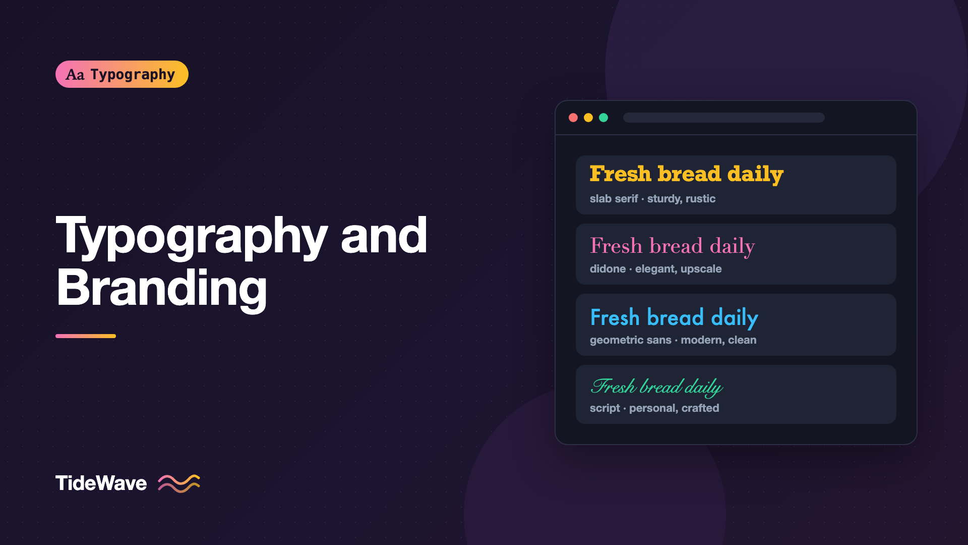
Put the same sentence, "Fresh bread every morning," in three typefaces: a chunky slab serif, a delicate high-contrast Didone, and a rounded geometric sans. You'll picture three different bakeries. One is a rustic neighborhood shop, one is an upscale patisserie, and one is a friendly chain with an app. The words haven't changed. The typeface has done the branding.
Type is often the most consistent part of a brand. Logos appear occasionally and colors vary by context, but type is on every page, every email, every receipt, and every button. That makes the choice of typeface, and the rules for using it, one of the most important decisions in a brand system. This guide covers how typefaces carry personality, how to choose type for a brand, how to build a brand type system, and how to apply it on the web without sacrificing usability.
Why Typefaces Have Personality
People associate letterforms with qualities, partly from the shapes themselves and partly from where they've seen similar type before. A few of the visual traits that drive those associations:
- Serifs or no serifs. Serifs often read as traditional, literary, or established. Sans serifs often read as modern, neutral, or technical.
- Stroke contrast. High contrast between thick and thin strokes feels elegant and formal. Low contrast feels sturdy and practical.
- Geometry. Circular, geometric shapes feel clean and rational. Humanist shapes, with traces of handwriting, feel warmer and more personal.
- Width and weight. Condensed, heavy type feels urgent and loud. Wide, light type feels calm and spacious.
- Terminals and details. Rounded terminals feel friendly and soft. Sharp, cut terminals feel precise or aggressive.
None of these associations is universal, and context changes everything. A geometric sans looks modern on a fintech app and retro on a 1930s-style poster. But designers rely on these tendencies every day, and audiences respond to them whether they notice or not.
Type Classifications and Their Typical Associations
A rough map of type categories and the personalities they're commonly used to express:
| Category | Common associations | Example typefaces |
|---|---|---|
| Old-style serif | Classic, literary, trustworthy | Garamond, Caslon, Sabon |
| Transitional serif | Formal, authoritative, journalistic | Baskerville, Times New Roman |
| Didone | Luxurious, fashionable, dramatic | Didot, Bodoni |
| Slab serif | Sturdy, confident, approachable | Rockwell, Roboto Slab, Clarendon |
| Grotesque sans | Neutral, functional, matter-of-fact | Helvetica, Akzidenz-Grotesk |
| Geometric sans | Modern, clean, optimistic | Futura, Avenir, Poppins |
| Humanist sans | Warm, friendly, readable | Gill Sans, Frutiger, Source Sans |
| Script | Personal, elegant, celebratory | Snell Roundhand, Pinyon Script |
| Monospace | Technical, honest, developer-focused | IBM Plex Mono, JetBrains Mono |
These are tendencies, not rules. Plenty of luxury brands use clean sans serifs, and plenty of tech companies use serifs. For a deeper look at the categories, see understanding type classification.
Choosing Type for a Brand
Start with what the brand needs to communicate, not with typefaces you like.
Define the Personality First
Write down three to five adjectives that describe how the brand should feel. "Calm, precise, trustworthy" points toward different type than "playful, bold, energetic." Then look for typefaces whose shapes match those words. Set your actual brand name, a real headline, and a paragraph of real copy in each candidate. Lorem ipsum hides the problems.
Check the Practical Requirements
A brand typeface has to do more than look right in a logo. Before committing, check:
- Weights and styles. Does it have enough weights for headings, body, and UI? Is there a true italic?
- Language support. Does it cover every language the brand uses, now and in the next few years?
- Screen performance. Does it read well at 14 pixels on a cheap Android phone, not just at 72 points on a poster?
- Figures. Are there tabular figures for prices and data?
- Licensing. Can you use it on the web, in apps, in email, and in print? Licenses differ by use. This isn't legal advice, so read the license or ask the foundry.
- Web formats. Is it available as WOFF2, and is there a variable version?
For a methodical approach, see testing typography before you commit.
Distinctive vs. Neutral
There's a trade-off between a typeface that's instantly recognizable and one that disappears into the content. Very distinctive type gives a brand a strong voice but can become tiring in long text. Neutral type is comfortable to read but says less about the brand.
A common solution is to pair the two: a distinctive face for headlines and brand moments, and a neutral, highly readable face for body text and UI. The post on how to pair fonts covers how to combine them.
Custom and Commissioned Typefaces
Many large companies commission their own typefaces. IBM has IBM Plex, released as open source. Netflix has Netflix Sans, and Airbnb has Airbnb Cereal. A custom typeface gives a brand a unique voice and can remove ongoing licensing costs for a company that uses type across many products and platforms.
For most teams, though, a well-chosen retail or open-source font is the right choice. A custom typeface is a large investment, and a good existing font used consistently does more for a brand than a custom one used inconsistently.
Building a Brand Type System
A typeface is only the start. The brand comes through in how it's used: sizes, weights, spacing, case, and color. Those decisions should be written down and shared.
Roles, Not Just Fonts
Define the type roles your brand uses and assign each one a style:
| Role | Typeface | Weight | Case | Tracking |
|---|---|---|---|---|
| Display | Brand serif | 600 | Sentence case | -0.02em |
| Headline | Brand serif | 600 | Sentence case | -0.01em |
| Eyebrow | Brand sans | 600 | Uppercase | 0.08em |
| Body | Brand sans | 400 | Sentence case | 0 |
| UI label | Brand sans | 500 | Sentence case | 0 |
| Caption | Brand sans | 400 | Sentence case | 0.01em |
These rules are as much a part of the brand as the typeface itself. Two brands using the same font can look very different because of how they set it.
Tokens in Code
Turn those roles into design tokens so every product uses the same values:
:root {
  --font-brand-display: "Fraunces", Georgia, "Times New Roman", serif;
  --font-brand-text: "Inter", system-ui, -apple-system, "Segoe UI", sans-serif;

  --type-display-size: clamp(2.5rem, 1.6rem + 4.5vw, 5rem);
  --type-display-weight: 600;
  --type-display-tracking: -0.02em;

  --type-eyebrow-size: 0.8125rem;
  --type-eyebrow-weight: 600;
  --type-eyebrow-tracking: 0.08em;
}

.display {
  font-family: var(--font-brand-display);
  font-size: var(--type-display-size);
  font-weight: var(--type-display-weight);
  letter-spacing: var(--type-display-tracking);
  line-height: 1.05;
}

.eyebrow {
  font-family: var(--font-brand-text);
  font-size: var(--type-eyebrow-size);
  font-weight: var(--type-eyebrow-weight);
  letter-spacing: var(--type-eyebrow-tracking);
  text-transform: uppercase;
}
The post on typography for design systems covers how to structure these tokens across platforms.
Brand Details in Type
Small typographic features can become part of the brand identity:
- A specific stylistic set with distinctive alternate letters
- Oldstyle figures in editorial content
- A consistent ligature or swash in display text
- Always setting the brand name in a particular weight or case
You can enable OpenType features in CSS to make these consistent:
.brand-headline {
  font-family: var(--font-brand-display);
  font-feature-settings: "ss01" 1;
}

.editorial-body {
  font-variant-numeric: oldstyle-nums proportional-nums;
}
Consistency Across Touchpoints
A brand's typography shows up in places a designer never directly touches: emails, invoices, app store screenshots, slide decks, and help center articles. Each environment has constraints.
- Email: Many clients ignore web fonts. Choose a fallback system font that matches your brand font's shape. See typography for email.
- Office documents and slides: Team members may not have the brand font installed. Provide approved fallbacks like Arial or Georgia.
- Native apps: Some brands use the platform system font in apps for native feel and reserve the brand font for headings.
- Print: Check the license covers it and that the font performs well at print sizes.
A strong fallback strategy keeps the brand recognizable even when the brand font isn't available. Choose fallback fonts with similar proportions and x-height, so layouts and line lengths don't change dramatically.
When Brand Type Hurts Usability
Brand guidelines sometimes call for type that looks great in a style guide PDF and works poorly on screens: thin weights, all-caps body copy, low-contrast gray text, or a script font for navigation. The product has to be usable first.
Warning
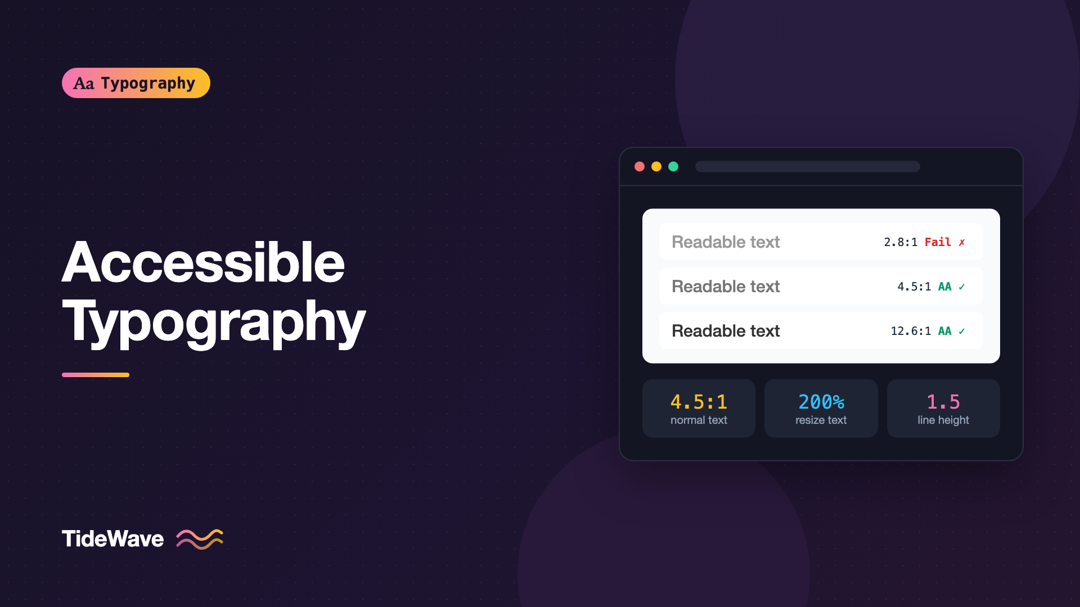
If a brand rule conflicts with accessibility, such as text contrast below 4.5:1 or body text in a light weight at small sizes, the accessibility requirement should win. Work with the brand team to find a version of the rule that keeps the personality and passes the requirement.
Usually there's a compromise: use the distinctive weight only for large headlines, darken the gray, or keep the script font for a single decorative accent.
Common Mistakes
- Choosing a typeface from a logo alone. A logo font is rarely a good body or UI font.
- Too many brand fonts. Two families, three at most, are easier to apply consistently.
- No documented usage rules. Without sizes, weights, and spacing, every team improvises.
- Ignoring fallbacks. Email, documents, and slow connections will show the fallback.
- Picking personality over readability. A beautiful but hard-to-read face hurts the brand.
- Not checking the license. Desktop, web, app, and email use may need separate licenses.
Conclusion
Typefaces carry personality through their shapes, contrast, proportions, and details, and audiences pick up on it before they read a word. Choose brand type by starting from the qualities the brand should express, then check weights, languages, screen performance, and licensing. Pair a distinctive face with a readable one where needed, and document the rules for size, weight, case, and spacing as tokens.
The typeface gives the brand its voice, and consistent use is what makes people recognize it. A clear set of type roles, applied in every product and fallback, will do more for brand recognition than any single font choice.