Adding Syntax Highlighting to Code Blocks in a Next.js Blog
If you write about code, your code blocks are half the post. Plain monospace text in a gray box works, but readers scan code by color: keywords, strings, and comments stand out, and mistakes are easier to spot. Good highlighting also gives you tools for teaching, like marking the lines that changed or labeling which file a snippet belongs to.
The old approach was to ship a client-side highlighter such as Prism or highlight.js and let it colorize code after the page loaded. In the App Router you can do better. Markdown and MDX are compiled on the server, so you can highlight at build time and send finished HTML with inline colors. No highlighting JavaScript reaches the browser, and there's no flash of uncolored code.
In this post I'll set up Shiki through rehype-pretty-code for MDX content, add light and dark themes, line and word highlighting, file titles, and line numbers, then build a copy button and show how to highlight code outside of MDX with Shiki directly.
Why Shiki
Shiki uses the same TextMate grammars and themes as VS Code. That has a few practical benefits:
- Accurate highlighting. TypeScript generics, JSX, template literals, and newer syntax are tokenized the way your editor does it, rather than with a simplified regex grammar.
- Any VS Code theme. Shiki bundles popular themes (
github-dark,github-light,one-dark-pro,vitesse-dark,min-light, and many more), and you can load any theme JSON. - Server-first output. Shiki produces HTML with inline styles. Run it during rendering in a Server Component or at build time, and the client receives static markup.
The trade-off is that Shiki is heavier than Prism, because it loads grammars and a regex engine. That cost only matters if you run it in the browser. On the server, it runs once per build (or per cached render) and the weight never reaches your users.
rehype-pretty-code is a rehype plugin built on Shiki. It handles the MDX side: finding code blocks, reading the language and meta string after the opening fence, and adding data attributes you can style.
Setting Up rehype-pretty-code
Install the plugin and Shiki, which is a peer dependency:
npm install rehype-pretty-code shiki
How you register the plugin depends on how you render MDX. I'll cover the two common setups.
With next-mdx-remote
If your posts live in files or a CMS and you render them with next-mdx-remote/rsc (a setup covered in Building a Markdown-Powered Blog with Next.js and MDX), pass the plugin through mdxOptions:
// components/mdx-content.tsx
import { MDXRemote } from "next-mdx-remote/rsc";
import remarkGfm from "remark-gfm";
import rehypePrettyCode, { type Options } from "rehype-pretty-code";

const prettyCodeOptions: Options = {
  theme: "github-dark",
  keepBackground: true,
  defaultLang: "plaintext",
};

export function MDXContent({ source }: { source: string }) {
  return (
    <MDXRemote
      source={source}
      options={{
        mdxOptions: {
          remarkPlugins: [remarkGfm],
          rehypePlugins: [[rehypePrettyCode, prettyCodeOptions]],
        },
      }}
    />
  );
}
Because MDXRemote from the rsc entry is an async Server Component, the highlighting runs on the server during rendering. If the page is statically generated, that means once at build time.
The options:
themeis any bundled Shiki theme name, or an object of themes (covered below).keepBackgroundkeeps the theme's background color on thepreelement. Set it tofalseif you want to control the background with your own CSS.defaultLangapplies when a code fence has no language. Without it, unlabeled blocks aren't highlighted at all.
With @next/mdx
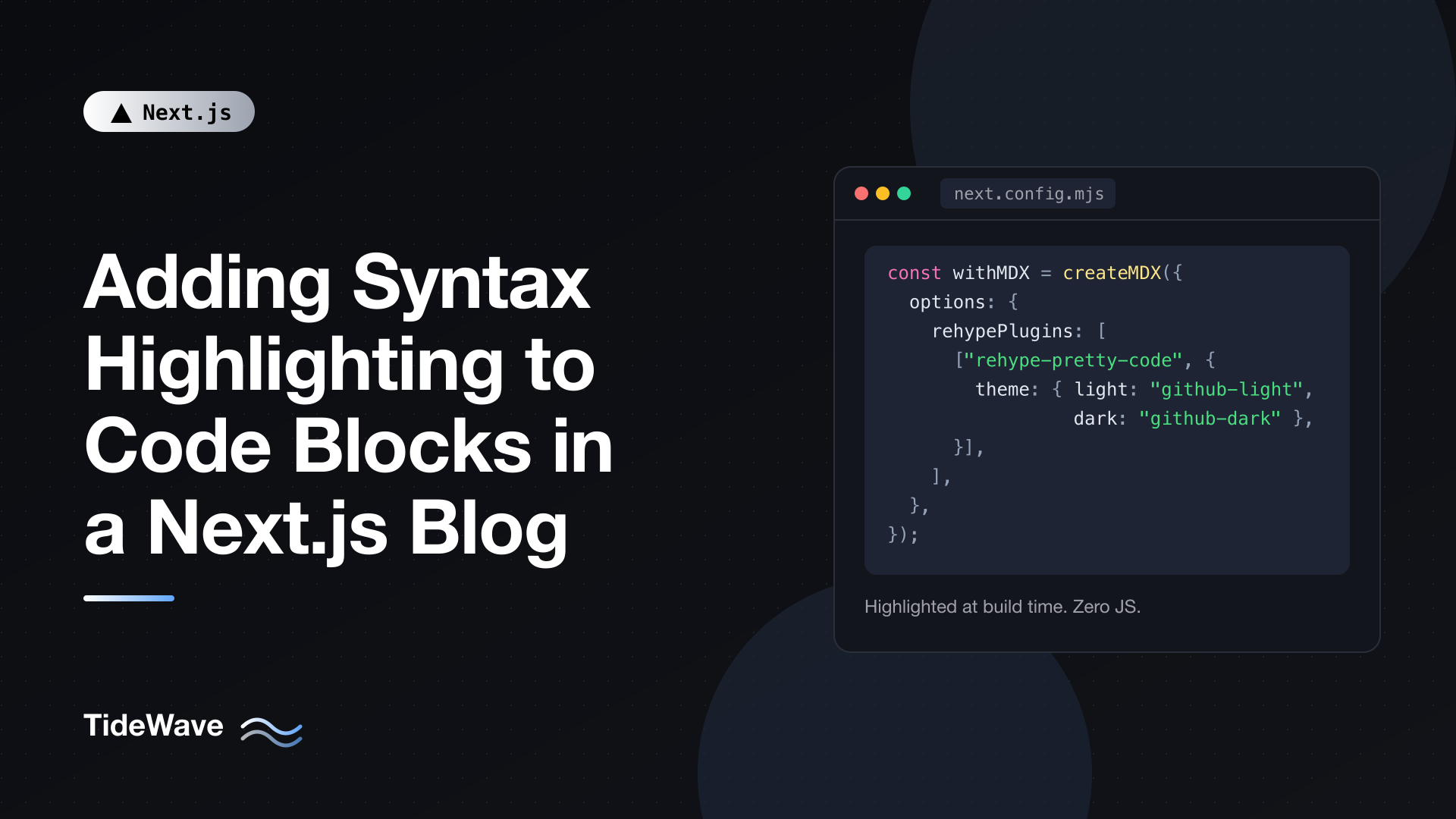
If you use @next/mdx and .mdx files as pages, register the plugin in next.config.mjs. Turbopack is the default bundler in Next.js 16, and it can't receive JavaScript functions from the config, so plugins are referenced by package name as strings, with options as plain serializable values:
// next.config.mjs
import createMDX from "@next/mdx";

/** @type {import('next').NextConfig} */
const nextConfig = {
  pageExtensions: ["js", "jsx", "md", "mdx", "ts", "tsx"],
};

const withMDX = createMDX({
  options: {
    remarkPlugins: ["remark-gfm"],
    rehypePlugins: [
      [
        "rehype-pretty-code",
        {
          theme: { light: "github-light", dark: "github-dark" },
          keepBackground: false,
        },
      ],
    ],
  },
});

export default withMDX(nextConfig);
The limitation is that any option that is a function, such as Shiki transformers or a custom getHighlighter, won't work through this config with Turbopack. If you need those, use next-mdx-remote (or another runtime MDX compiler) where you pass real plugin objects, or build with webpack.
What the Output Looks Like
Once the plugin runs, a fenced block like this:
```ts title="lib/greet.ts" {2}
export function greet(name: string) {
  return `Hello, ${name}`;
}
```
becomes roughly this HTML:
<figure data-rehype-pretty-code-figure="">
  <figcaption
    data-rehype-pretty-code-title=""
    data-language="ts"
    data-theme="github-dark"
  >
    lib/greet.ts
  </figcaption>
  <pre
    data-language="ts"
    data-theme="github-dark"
    style="background-color:#24292e"
  >
    <code data-language="ts" data-theme="github-dark" style="display: grid;">
      <span data-line="">...</span>
      <span data-line="" data-highlighted-line="">...</span>
      <span data-line="">...</span>
    </code>
  </pre>
</figure>
Every line is a span with a data-line attribute, highlighted lines get data-highlighted-line, and the title becomes a figcaption. The token colors are inline styles. Everything else (spacing, highlight colors, line numbers) is up to your CSS, which is what makes the plugin flexible.
Styling the Code Blocks
Here's a solid base stylesheet. It uses plain CSS so it works whether or not you use Tailwind:
/* app/code.css */
[data-rehype-pretty-code-figure] {
  margin: 1.5rem 0;
}

[data-rehype-pretty-code-figure] pre {
  overflow-x: auto;
  padding: 1rem 0;
  border-radius: 0.5rem;
  font-size: 0.875rem;
  line-height: 1.7;
}

[data-rehype-pretty-code-figure] code {
  display: grid;
  min-width: 100%;
}

[data-rehype-pretty-code-figure] [data-line] {
  padding: 0 1.25rem;
  border-left: 3px solid transparent;
}

[data-rehype-pretty-code-figure] [data-highlighted-line] {
  background-color: rgb(200 200 255 / 0.1);
  border-left-color: #60a5fa;
}

[data-rehype-pretty-code-figure] [data-highlighted-chars] {
  background-color: rgb(200 200 255 / 0.15);
  border-radius: 0.25rem;
  padding: 0.1rem 0.2rem;
}

[data-rehype-pretty-code-title] {
  padding: 0.5rem 1rem;
  font-family: ui-monospace, monospace;
  font-size: 0.8rem;
  color: #a1a1aa;
  background-color: #18181b;
  border-top-left-radius: 0.5rem;
  border-top-right-radius: 0.5rem;
}

[data-rehype-pretty-code-title] + pre {
  border-top-left-radius: 0;
  border-top-right-radius: 0;
}
A few choices worth explaining:
display: gridoncodemakes each line span the full width of the block, so highlighted line backgrounds extend all the way across even when the code scrolls horizontally.- The transparent left border on every line keeps text aligned; highlighted lines just change the border color instead of adding one.
- Padding goes on lines, not on
prehorizontally, for the same reason: a full-width highlight looks wrong ifprepadding leaves a gap on the sides.
Import the stylesheet in your root layout (or the blog layout) alongside your global CSS.
Light and Dark Themes
Pass an object of themes instead of a single name:
const prettyCodeOptions: Options = {
  theme: {
    light: "github-light",
    dark: "github-dark",
  },
  keepBackground: true,
};
With multiple themes, the plugin doesn't pick a default color. Each token gets CSS variables instead, named after the keys you chose: --shiki-light, --shiki-dark, and --shiki-light-bg / --shiki-dark-bg for backgrounds. You decide which set applies:
/* app/code.css */
[data-rehype-pretty-code-figure] pre,
[data-rehype-pretty-code-figure] code span {
  color: var(--shiki-light);
  background-color: var(--shiki-light-bg);
}

.dark [data-rehype-pretty-code-figure] pre,
.dark [data-rehype-pretty-code-figure] code span {
  color: var(--shiki-dark);
  background-color: var(--shiki-dark-bg);
}
This assumes your site toggles a dark class on the html element. If you follow the operating system preference instead, wrap the second rule in @media (prefers-color-scheme: dark). Because both palettes are in the HTML and switching is pure CSS, theme changes are instant and there's no re-highlighting. For the class toggle itself, see Implementing Dark Mode in Next.js Without a Flash of Unstyled Content.
Watch the background-color on spans. Lines are spans too, so these rules also set a background on every line. The highlighted-line rule from earlier still wins because two attribute selectors are more specific than one attribute selector plus two element selectors, but if you write your highlight styles with weaker selectors, they'll be painted over. When in doubt, check the computed styles in DevTools.
Meta String Features
Most of the useful features come from the meta string, the text after the language on the opening fence.
Highlighting Lines
Put line numbers or ranges in braces:
```tsx {1,4-6}
import { getPosts } from "@/lib/posts";

export default async function Page() {
  const posts = await getPosts();
  const featured = posts.filter((p) => p.featured);
  const rest = posts.filter((p) => !p.featured);
  return null;
}
```
Lines 1, 4, 5, and 6 get data-highlighted-line. This is the single most useful feature for tutorials: you show the whole file for context and draw attention to what changed.
Highlighting Words
Wrap a word or phrase in slashes to highlight every occurrence:
```ts /revalidatePath/
import { revalidatePath } from "next/cache";

export async function publish() {
  revalidatePath("/blog");
}
```
You can limit it to specific occurrences with a suffix like /revalidatePath/2 (only the second) or /revalidatePath/1-2. Highlighted words get data-highlighted-chars.
Titles and Captions
title="..." renders a figcaption above the block, and caption="..." renders one below:
```ts title="app/rss.xml/route.ts" caption="Runs once at build time"
export const dynamic = "force-static";
```
File titles save you from writing "Create a file called..." before every snippet, and they're easier to scan.
Line Numbers
Add showLineNumbers to the meta string. The plugin sets data-line-numbers on the code element; you draw the numbers with a CSS counter:
/* app/code.css */
code[data-line-numbers] {
  counter-reset: line;
}

code[data-line-numbers] > [data-line]::before {
  counter-increment: line;
  content: counter(line);
  display: inline-block;
  width: 1.5rem;
  margin-right: 1.25rem;
  text-align: right;
  color: #71717a;
}

code[data-line-numbers-max-digits="2"] > [data-line]::before {
  width: 2rem;
}

code[data-line-numbers-max-digits="3"] > [data-line]::before {
  width: 2.75rem;
}
The numbers are generated content, so they aren't part of the text. When readers select and copy code, they don't get the numbers, which is exactly what you want. showLineNumbers{10} starts counting at 10, handy when you're showing a fragment of a longer file.
Inline Code
rehype-pretty-code can also highlight inline code. Append the language in braces at the end of the inline code, like `const x = 1{:ts}`, and it's tokenized as TypeScript. Plain inline code without the suffix is left alone, so this only applies where you opt in.
Adding a Copy Button
Readers copy code constantly, so a copy button is worth the small amount of client JavaScript. The trick is that the highlighted code is already HTML, so you don't have the raw string handy. The simplest approach is to read the pre element's text content at click time.
Create a small Client Component:
// components/code-block.tsx
"use client";

import { useRef, useState, type ComponentProps } from "react";

export function CodeBlock(props: ComponentProps<"pre">) {
  const preRef = useRef<HTMLPreElement>(null);
  const [copied, setCopied] = useState(false);

  async function copy() {
    const text = preRef.current?.textContent ?? "";
    await navigator.clipboard.writeText(text);
    setCopied(true);
    setTimeout(() => setCopied(false), 2000);
  }

  return (
    <div className="code-block">
      <button
        type="button"
        onClick={copy}
        className="copy-button"
        aria-label={copied ? "Copied" : "Copy code"}
      >
        {copied ? "Copied" : "Copy"}
      </button>
      <pre ref={preRef} {...props} />
    </div>
  );
}
Then map pre to it in your MDX components:
// components/mdx-content.tsx
import { MDXRemote } from "next-mdx-remote/rsc";
import rehypePrettyCode from "rehype-pretty-code";
import { CodeBlock } from "@/components/code-block";

const components = {
  pre: CodeBlock,
};

export function MDXContent({ source }: { source: string }) {
  return (
    <MDXRemote
      source={source}
      components={components}
      options={{
        mdxOptions: {
          rehypePlugins: [[rehypePrettyCode, { theme: "github-dark" }]],
        },
      }}
    />
  );
}
And a little positioning CSS:
/* app/code.css */
.code-block {
  position: relative;
}

.copy-button {
  position: absolute;
  top: 0.5rem;
  right: 0.5rem;
  padding: 0.25rem 0.5rem;
  font-size: 0.75rem;
  border-radius: 0.25rem;
  color: #e4e4e7;
  background: rgb(255 255 255 / 0.1);
  opacity: 0;
  transition: opacity 150ms;
}

.code-block:hover .copy-button,
.copy-button:focus-visible {
  opacity: 1;
}
The highlighted children still render on the server; only the small wrapper with the button is a Client Component. The pre props (including the style with the theme background and the data attributes) pass straight through, so your existing CSS keeps working. The button appears on hover and also when focused with the keyboard, so it isn't hidden from keyboard users. textContent excludes the CSS-generated line numbers, so copied code is clean.
Highlighting Code Outside MDX
Not every code block comes from Markdown. You might show a snippet on a landing page, in a docs component, or from a database. Shiki's codeToHtml works directly in a Server Component:
// components/code.tsx
import { codeToHtml } from "shiki";

type CodeProps = {
  code: string;
  lang: string;
};

export async function Code({ code, lang }: CodeProps) {
  const html = await codeToHtml(code, {
    lang,
    themes: {
      light: "github-light",
      dark: "github-dark",
    },
    defaultColor: false,
  });

  return (
    <div className="shiki-wrapper" dangerouslySetInnerHTML={{ __html: html }} />
  );
}
// app/page.tsx
import { Code } from "@/components/code";

const example = `export default function Page() {
  return <h1>Hello</h1>;
}`;

export default function Home() {
  return (
    <main>
      <h1>Get started in seconds</h1>
      <Code code={example} lang="tsx" />
    </main>
  );
}
codeToHtml returns a complete pre element. With defaultColor: false and two themes, it emits the same --shiki-light and --shiki-dark variables as before, so the dark mode CSS from earlier applies if you adjust the selectors to target .shiki (the class Shiki puts on its pre). Using dangerouslySetInnerHTML is safe here because Shiki escapes the code itself; just don't pass untrusted HTML through any other path.
Since Code is an async Server Component, none of Shiki ships to the browser. If you highlight many snippets on one request-time page, cache the result (for example with "use cache" around a helper when Cache Components is enabled) so you're not re-highlighting on every request.
Performance Notes
- Build time. Shiki loads grammars on demand. A large blog with hundreds of posts will spend a noticeable amount of the build highlighting code, but it's a one-time cost per build, not per visitor.
- HTML size. Inline styles on every token make the HTML larger than the raw code. Gzip and Brotli compress this repetitive markup extremely well, so the transfer cost is small. Dual themes roughly double the style attributes, which is still usually fine.
- No layout shift. Because colors are present in the initial HTML, nothing changes after hydration. With a client-side highlighter, code blocks re-render once the script runs, which can shift layout if fonts or padding differ.
Conclusion
Server-side highlighting is one of those things the App Router makes easy. Install rehype-pretty-code and shiki, register the plugin (as a string with options in @next/mdx under Turbopack, or as a real plugin in next-mdx-remote), and your code blocks arrive fully colored with zero highlighting JavaScript on the client.
From there, the meta string gives you line highlights, word highlights, titles, and line numbers, all styled with plain CSS through data attributes. Add dual themes with CSS variables, wrap pre in a small Client Component for a copy button, and use codeToHtml directly when you need highlighted code outside of MDX.