Implementing Dark Mode in Next.js Without a Flash of Unstyled Content
You add a dark mode toggle, pick dark, and reload the page. For a split second the page is bright white, then it snaps to dark. That flash is the most common dark mode bug in Next.js apps, and it's annoying enough that users notice it on every navigation that triggers a full load.
The cause is simple. The server renders HTML before it knows which theme the user picked, because that choice usually lives in localStorage, which only exists in the browser. If you apply the theme in a useEffect, the browser has already painted the default theme by the time your code runs.
In this post I'll go through why the flash happens, the CSS-only approach for when you only need the system preference, the blocking-script approach that supports a user toggle with no flash, a toggle component that doesn't cause hydration errors, the cookie-based alternative and its costs, and how next-themes packages all of this up.
Why the Flash Happens
Here's the naive implementation that causes the problem:
// components/theme-applier.tsx (don't do this)
"use client";

import { useEffect } from "react";

export function ThemeApplier() {
  useEffect(() => {
    const theme = localStorage.getItem("theme");
    if (theme === "dark") {
      document.documentElement.classList.add("dark");
    }
  }, []);

  return null;
}
Follow the timeline on a page load:
- The browser receives HTML from the server. The
htmlelement has nodarkclass, because the server can't readlocalStorage. - The browser parses the HTML and CSS and paints the page in the light theme.
- JavaScript downloads, React hydrates, and only then does
useEffectrun and add thedarkclass. - The page repaints in dark.
Steps 2 to 4 might take 50 milliseconds on a fast connection or a second on a slow phone. Either way, the user sees the wrong theme first. The fix is to set the theme between step 1 and step 2, before the first paint.
Option 1: Follow the System Preference with CSS Only
If you don't need a toggle and just want to respect the operating system setting, you don't need JavaScript at all. CSS media queries are evaluated before the first paint:
/* app/globals.css */
:root {
  color-scheme: light dark;
  --background: #ffffff;
  --foreground: #0f172a;
}

@media (prefers-color-scheme: dark) {
  :root {
    --background: #0b1120;
    --foreground: #e2e8f0;
  }
}

body {
  background: var(--background);
  color: var(--foreground);
}
color-scheme: light dark tells the browser the page supports both schemes, so native UI like scrollbars, form controls, and the default canvas color follow along. Without it, you can get a dark page with bright white scrollbars and inputs.
Modern browsers also support light-dark(), which keeps both values in one declaration:
:root {
  color-scheme: light dark;
  --background: light-dark(#ffffff, #0b1120);
  --foreground: light-dark(#0f172a, #e2e8f0);
}
In Tailwind CSS v4, the dark: variant uses prefers-color-scheme by default, so bg-white dark:bg-slate-950 also works with no setup.
This approach can't flash, because there's nothing to wait for. Its only limitation is that users can't override their system setting for your site. If that's fine, stop here.
Option 2: A Blocking Script Before First Paint
To support a user choice, you need code that runs before the first paint. A regular script tag without async or defer in the document's head does exactly that: the browser stops parsing, runs it, and then continues. A tiny inline script that reads localStorage and sets a class on html costs well under a millisecond.
The Theme Script
// lib/theme-script.ts
export const themeScript = `
(function () {
  try {
    var stored = localStorage.getItem("theme");
    var prefersDark = window.matchMedia("(prefers-color-scheme: dark)").matches;
    var theme =
      stored === "light" || stored === "dark"
        ? stored
        : prefersDark
          ? "dark"
          : "light";
    var root = document.documentElement;
    root.classList.toggle("dark", theme === "dark");
    root.style.colorScheme = theme;
  } catch (e) {}
})();
`;
What it does:
- Reads the stored choice. Anything other than
"light"or"dark"(including nothing) means "follow the system". - Resolves the system preference with
matchMedia. - Toggles the
darkclass onhtmland setscolor-schemeso native controls match. - Wraps everything in
try/catch, becauselocalStoragecan throw in some privacy modes. If it fails, the page falls back to the default theme rather than breaking.
It's written as a string of plain ES5-style JavaScript on purpose. It isn't bundled or transpiled; it's inlined into the HTML as-is, so keep it small and dependency-free.
Adding It to the Root Layout
// app/layout.tsx
import type { Metadata } from "next";
import { themeScript } from "@/lib/theme-script";
import "./globals.css";

export const metadata: Metadata = {
  title: "My Site",
};

export default function RootLayout({
  children,
}: {
  children: React.ReactNode;
}) {
  return (
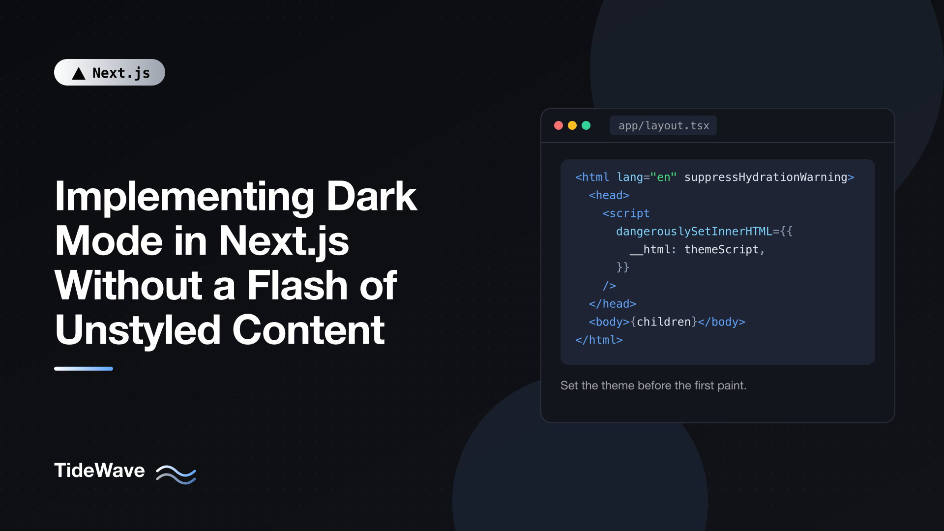
    <html lang="en" suppressHydrationWarning>
      <head>
        <script dangerouslySetInnerHTML={{ __html: themeScript }} />
      </head>
      <body>{children}</body>
    </html>
  );
}
Two important details:
- The script is in
head. It runs before the browser rendersbody, so the first paint already has the right class. Next.js lets you render aheadelement in the root layout for exactly this kind of thing; metadata from the Metadata API is still added alongside it. suppressHydrationWarningonhtml. The script changes thehtmlelement'sclassandstylebefore React hydrates, so React sees attributes that don't match the server HTML. This prop tells React that the mismatch on this one element is expected. It only applies one level deep, so it won't hide real mismatches elsewhere in your tree.
You might wonder why not use next/script with strategy="beforeInteractive". That strategy is designed for third-party scripts that must load before hydration, but the inline script in head is simpler, runs synchronously at the earliest possible point, and has no extra machinery. For theme detection, plain is better. For external scripts in general, see Loading Third-Party Scripts Efficiently with next/script.
Styling with the Class
With Tailwind v4, point the dark variant at the class:
/* app/globals.css */
@import "tailwindcss";

@custom-variant dark (&:where(.dark, .dark *));

:root {
  --background: oklch(1 0 0);
  --foreground: oklch(0.21 0.03 265);
}

.dark {
  --background: oklch(0.15 0.02 265);
  --foreground: oklch(0.96 0.01 265);
}

@theme inline {
  --color-background: var(--background);
  --color-foreground: var(--foreground);
}
Now bg-background text-foreground switches automatically, and dark: utilities work for one-off overrides. Without Tailwind, write plain CSS against .dark the same way. The Tailwind v4 setup guide explains @custom-variant and @theme inline in more detail.
Building a Hydration-Safe Toggle
The toggle is where the second class of bugs shows up. If the toggle renders a sun or moon icon based on localStorage, the server (which doesn't know the theme) renders one icon and the client wants another. That's a hydration mismatch.
There are two clean ways around it.
Let CSS Pick the Icon
The simplest toggle never reads the theme during render. It renders both icons and lets the dark class decide which is visible:
// components/theme-toggle.tsx
"use client";

export function ThemeToggle() {
  function toggle() {
    const root = document.documentElement;
    const next = root.classList.contains("dark") ? "light" : "dark";
    root.classList.toggle("dark", next === "dark");
    root.style.colorScheme = next;
    try {
      localStorage.setItem("theme", next);
    } catch {}
  }

  return (
    <button
      type="button"
      onClick={toggle}
      aria-label="Toggle dark mode"
      className="rounded-md p-2 hover:bg-foreground/10"
    >
      <span className="dark:hidden" aria-hidden="true">
        Moon
      </span>
      <span className="hidden dark:inline" aria-hidden="true">
        Sun
      </span>
    </button>
  );
}
The server and client render identical markup, so there's nothing to mismatch. The visible icon is correct from the first paint because it depends on the class the blocking script already set. Swap the text for real SVG icons in your project.
This is a two-state toggle: once the user clicks, their choice is stored and "follow the system" is gone.
Three States with useSyncExternalStore
Many sites offer light, dark, and system. To show which option is active, the component has to know the stored preference, and that's only available on the client. useSyncExternalStore handles this properly: it renders with a server snapshot during hydration, then immediately re-renders with the real client value, without a mismatch error.
// components/theme-switcher.tsx
"use client";

import { useSyncExternalStore } from "react";

type Theme = "light" | "dark" | "system";

const listeners = new Set<() => void>();

function readTheme(): Theme {
  try {
    const value = localStorage.getItem("theme");
    return value === "light" || value === "dark" ? value : "system";
  } catch {
    return "system";
  }
}

function applyTheme(theme: Theme) {
  const prefersDark = window.matchMedia("(prefers-color-scheme: dark)").matches;
  const resolved =
    theme === "system" ? (prefersDark ? "dark" : "light") : theme;
  const root = document.documentElement;
  root.classList.toggle("dark", resolved === "dark");
  root.style.colorScheme = resolved;
}

function setTheme(theme: Theme) {
  try {
    if (theme === "system") localStorage.removeItem("theme");
    else localStorage.setItem("theme", theme);
  } catch {}
  applyTheme(theme);
  listeners.forEach((listener) => listener());
}

function subscribe(callback: () => void) {
  listeners.add(callback);

  const media = window.matchMedia("(prefers-color-scheme: dark)");
  const onSystemChange = () => {
    if (readTheme() === "system") applyTheme("system");
  };
  const onStorage = (event: StorageEvent) => {
    if (event.key === "theme") {
      applyTheme(readTheme());
      callback();
    }
  };

  media.addEventListener("change", onSystemChange);
  window.addEventListener("storage", onStorage);

  return () => {
    listeners.delete(callback);
    media.removeEventListener("change", onSystemChange);
    window.removeEventListener("storage", onStorage);
  };
}

const options: { value: Theme; label: string }[] = [
  { value: "light", label: "Light" },
  { value: "dark", label: "Dark" },
  { value: "system", label: "System" },
];

export function ThemeSwitcher() {
  const theme = useSyncExternalStore<Theme | null>(
    subscribe,
    readTheme,
    () => null,
  );

  return (
    <div role="group" aria-label="Color theme" className="flex gap-1">
      {options.map((option) => (
        <button
          key={option.value}
          type="button"
          aria-pressed={theme === option.value}
          onClick={() => setTheme(option.value)}
          className="rounded-md px-3 py-1 text-sm aria-pressed:bg-foreground/10"
        >
          {option.label}
        </button>
      ))}
    </div>
  );
}
Breaking it down:
readThemeis the client snapshot. It returns a primitive string, which matters:useSyncExternalStorecompares snapshots withObject.is, so returning a new object each time would cause endless re-renders.- The server snapshot is
null. During server rendering and hydration, no button is pressed. Right after hydration, React re-renders with the real value. The page itself never flashes, because the blocking script already set the class; only the pressed state of the buttons appears a moment later. subscribenotifies React when the theme changes in this tab (throughlisteners), in another tab (through thestorageevent), and re-applies the theme when the system preference changes while the user is on "System".setThemewrites the preference, updates the DOM, and notifies subscribers.
This gives you the full feature set with no hydration warnings and no flash.
Avoiding Transition Flicker
If your CSS has transition: background-color 200ms on many elements, switching themes animates every element at slightly different times, which looks messy. A common trick is to disable transitions for one frame during the switch:
// lib/disable-transitions.ts
export function withoutTransitions(fn: () => void) {
  const style = document.createElement("style");
  style.textContent = "*,*::before,*::after{transition:none!important}";
  document.head.appendChild(style);

  fn();

  // Force a style recalculation before re-enabling transitions
  window.getComputedStyle(document.body).opacity;
  requestAnimationFrame(() => style.remove());
}
Wrap the class change in setTheme with withoutTransitions(() => applyTheme(theme)) and the switch becomes instant and clean.
Option 3: Storing the Theme in a Cookie
There's another way to avoid the flash: store the preference in a cookie and render the right class on the server.
// app/layout.tsx (cookie-based variant)
import { cookies } from "next/headers";
import "./globals.css";

export default async function RootLayout({
  children,
}: {
  children: React.ReactNode;
}) {
  const cookieStore = await cookies();
  const theme = cookieStore.get("theme")?.value === "dark" ? "dark" : "light";

  return (
    <html lang="en" className={theme} style={{ colorScheme: theme }}>
      <body>{children}</body>
    </html>
  );
}
cookies() is async in Next.js 16, so you await it. The server now knows the theme, so there's nothing to fix on the client.
The cost is significant, though. Reading cookies in the root layout makes every route in your app render at request time. You lose static generation and the CDN caching that comes with it, purely to pick a CSS class. With Cache Components enabled it's worse still, since runtime data like cookies must sit inside a Suspense boundary, and the html element can't. The cookie approach also can't follow the system preference on a first visit, because the server can't see prefers-color-scheme without client hints.
For most sites, the blocking script is the better trade: pages stay static and the theme is still correct on first paint. Consider cookies only if your app is already fully dynamic (a logged-in dashboard, for instance) and you'd rather avoid the inline script.
Option 4: Using next-themes
If you don't want to maintain this yourself, next-themes implements the blocking script, the storage, the system preference listener, cross-tab sync, and transition disabling in one small package.
npm install next-themes
Create a provider (it uses context, so it's a Client Component) and add it to the root layout:
// components/theme-provider.tsx
"use client";

import { ThemeProvider as NextThemesProvider } from "next-themes";

export function ThemeProvider({
  children,
  ...props
}: React.ComponentProps<typeof NextThemesProvider>) {
  return <NextThemesProvider {...props}>{children}</NextThemesProvider>;
}
// app/layout.tsx
import { ThemeProvider } from "@/components/theme-provider";
import "./globals.css";

export default function RootLayout({
  children,
}: {
  children: React.ReactNode;
}) {
  return (
    <html lang="en" suppressHydrationWarning>
      <body>
        <ThemeProvider
          attribute="class"
          defaultTheme="system"
          enableSystem
          disableTransitionOnChange
        >
          {children}
        </ThemeProvider>
      </body>
    </html>
  );
}
attribute="class"addsdarkorlightas a class onhtml, matching the@custom-variantabove. Useattribute="data-theme"if you style with a data attribute.defaultTheme="system"withenableSystemfollows the OS until the user picks.disableTransitionOnChangeapplies the transition trick from earlier.suppressHydrationWarningis still needed onhtml, for the same reason as before.
Wrapping children in a Client Component provider doesn't turn your pages into Client Components. Server Components passed as children still render on the server. The composition patterns post explains why.
Read and change the theme with useTheme:
// components/theme-select.tsx
"use client";

import { useTheme } from "next-themes";
import { useSyncExternalStore } from "react";

const emptySubscribe = () => () => {};

export function ThemeSelect() {
  const { theme, setTheme } = useTheme();
  const mounted = useSyncExternalStore(
    emptySubscribe,
    () => true,
    () => false,
  );

  return (
    <select
      aria-label="Color theme"
      value={mounted ? theme : "system"}
      onChange={(event) => setTheme(event.target.value)}
      className="rounded-md border bg-background px-2 py-1 text-sm"
    >
      <option value="light">Light</option>
      <option value="dark">Dark</option>
      <option value="system">System</option>
    </select>
  );
}
theme is undefined on the server, so anything that depends on it must wait until after hydration. The mounted value from useSyncExternalStore is false during server rendering and hydration and true afterwards, which avoids the useEffect plus useState dance. useTheme also returns resolvedTheme, which is "light" or "dark" even when the setting is "system", useful for things like picking a chart palette.
Testing for the Flash
The flash is easy to miss on a fast development machine. To check properly:
- Build for production. Run
next buildandnext start. Development mode loads CSS differently and can produce flashes that don't exist in production (or hide ones that do). - Throttle the network. In DevTools, set the network to "Slow 4G" and reload with the dark theme selected. Any flash will be obvious.
- Disable JavaScript. The blocking script won't run, so you'll see the default theme. That's the expected fallback; make sure the default is readable.
- Check for hydration warnings in the browser console. There should be none.
If you still see a flash, the usual culprits are a theme script placed in body instead of head, a theme applied in useEffect somewhere else in the app, or a component that renders theme-dependent markup during hydration.
Conclusion
Dark mode without a flash comes down to timing: the correct theme has to be on the html element before the browser's first paint. If you only follow the system preference, CSS media queries (or light-dark()) do that for free. For a user toggle, a tiny inline script in head reads localStorage and sets the class, suppressHydrationWarning on html tells React that's expected, and your toggle avoids reading the theme during render, either by letting CSS pick the icon or with useSyncExternalStore.
Cookies work too, but they make every page dynamic. And if you'd rather not maintain any of this, next-themes implements the same approach behind a provider and a hook.