Setting Up Tailwind CSS v4 in a Next.js Project
Tailwind CSS and Next.js are the default pairing for a lot of React projects, and with Tailwind v4 the setup has become noticeably smaller. There's no tailwind.config.js to write, no content array to maintain, and no separate autoprefixer step. You add a PostCSS plugin, import Tailwind in one CSS file, and start writing classes.
That simplicity hides a few Next.js-specific details, though: how next/font fonts plug into the theme, where dark mode is configured, how to make Tailwind see classes in a shared package, and how CSS Modules interact with @apply. This post is a practical setup guide for Next.js 16 with the App Router.
If you want the background on what changed in v4 itself, read What's New in Tailwind CSS v4? first. Here I'll stay focused on getting it working well inside a Next.js project.
Starting a New Project
The quickest path is create-next-app. In Next.js 16, Tailwind CSS is part of the recommended defaults:
npx create-next-app@latest my-app --yes
cd my-app
npm run dev
--yes accepts the defaults: TypeScript, ESLint, Tailwind CSS, the App Router, Turbopack, and the @/* import alias. If you run the command without --yes and choose to customize, answer "Yes" to the Tailwind prompt.
You get three relevant files:
postcss.config.mjs, registering the Tailwind PostCSS plugin.app/globals.css, which starts with@import "tailwindcss";.app/layout.tsx, which importsglobals.css.
That's the whole integration. If that's your situation, skip ahead to the customization sections.
Adding Tailwind v4 to an Existing Project
For an existing Next.js app without Tailwind, install the two packages:
npm install -D tailwindcss @tailwindcss/postcss
tailwindcss is the engine and @tailwindcss/postcss is the PostCSS plugin. In v4 they're separate packages; the plugin entry inside tailwindcss that v3 used no longer works.
Create a PostCSS config in the project root:
// postcss.config.mjs
const config = {
  plugins: {
    "@tailwindcss/postcss": {},
  },
};

export default config;
Next.js picks up this file automatically, with both Turbopack and webpack. Turbopack processes PostCSS configs in a Node.js worker, so Tailwind runs the same way in next dev and next build.
Import Tailwind in your global stylesheet:
/* app/globals.css */
@import "tailwindcss";
And import that stylesheet once, in the root layout:
// app/layout.tsx
import type { Metadata } from "next";
import "./globals.css";

export const metadata: Metadata = {
  title: "My App",
};

export default function RootLayout({
  children,
}: {
  children: React.ReactNode;
}) {
  return (
    <html lang="en">
      <body>{children}</body>
    </html>
  );
}
Now test it with a page that uses a few utilities:
// app/page.tsx
export default function Home() {
  return (
    <main className="mx-auto flex min-h-screen max-w-2xl flex-col justify-center gap-4 p-8">
      <h1 className="text-4xl font-bold tracking-tight text-slate-900">
        Tailwind v4 is working
      </h1>
      <p className="text-lg text-slate-600">
        If this text is gray and the heading is bold, you're set.
      </p>
    </main>
  );
}
If the page renders unstyled, restart the dev server. PostCSS config changes aren't always picked up by a running server.
What You Don't Need Anymore
If you're coming from a v3 setup, a few things can go:
tailwind.config.js: theme customization moves into CSS (next section).- The
contentarray: v4 detects source files automatically. autoprefixerandpostcss-import: vendor prefixing and@importhandling are built in.- The three
@tailwinddirectives:@import "tailwindcss";replaces@tailwind base,@tailwind components, and@tailwind utilities.
Customizing the Theme in globals.css
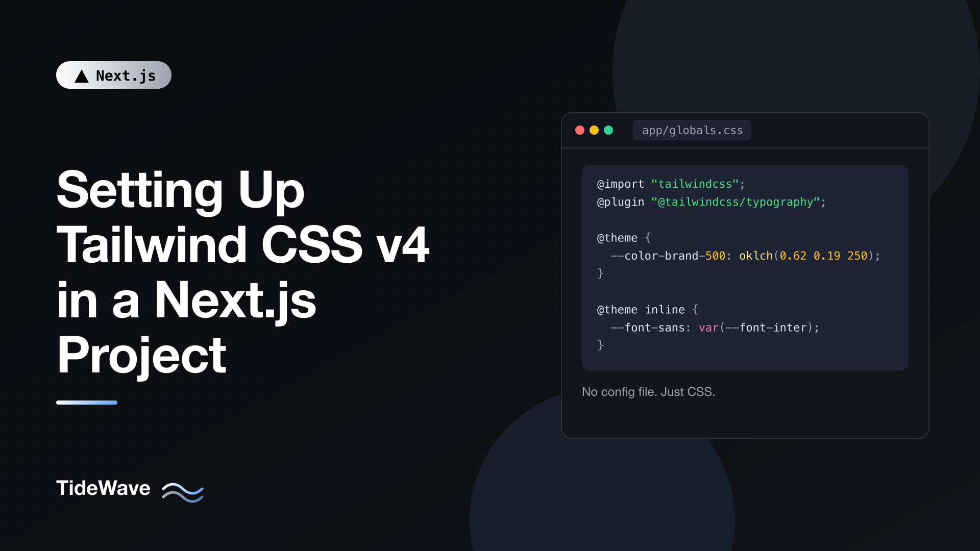
Theme tokens live in your CSS under @theme. Each variable becomes both a CSS custom property and a set of utilities:
/* app/globals.css */
@import "tailwindcss";

@theme {
  --color-brand-50: oklch(0.97 0.02 250);
  --color-brand-500: oklch(0.62 0.19 250);
  --color-brand-700: oklch(0.48 0.17 250);

  --breakpoint-3xl: 1920px;

  --radius-card: 1rem;
}
After saving, bg-brand-500, text-brand-700, 3xl:grid-cols-4, and rounded-card all work. Because the tokens are real custom properties on :root, you can also use them in inline styles or other CSS, for example var(--color-brand-500).
Keep the theme in globals.css for a small project. As it grows, split tokens into their own file and import it after Tailwind:
/* app/globals.css */
@import "tailwindcss";
@import "./theme.css";
/* app/theme.css */
@theme {
  --color-brand-500: oklch(0.62 0.19 250);
  --font-display: var(--font-cal-sans);
}
Using next/font with Tailwind
next/font self-hosts fonts and avoids layout shift. To use those fonts through Tailwind's font-sans and font-mono utilities, expose each font as a CSS variable and map it in the theme.
In the layout, pass a variable name and add the generated class names to html:
// app/layout.tsx
import type { Metadata } from "next";
import { Inter, JetBrains_Mono } from "next/font/google";
import "./globals.css";

const inter = Inter({
  subsets: ["latin"],
  display: "swap",
  variable: "--font-inter",
});

const jetbrainsMono = JetBrains_Mono({
  subsets: ["latin"],
  display: "swap",
  variable: "--font-jetbrains-mono",
});

export const metadata: Metadata = {
  title: "My App",
};

export default function RootLayout({
  children,
}: {
  children: React.ReactNode;
}) {
  return (
    <html lang="en" className={`${inter.variable} ${jetbrainsMono.variable}`}>
      <body className="font-sans antialiased">{children}</body>
    </html>
  );
}
Then map those variables in @theme inline:
/* app/globals.css */
@import "tailwindcss";

@theme inline {
  --font-sans: var(--font-inter);
  --font-mono: var(--font-jetbrains-mono);
}
The inline keyword matters here. Without it, Tailwind defines --font-sans: var(--font-inter) on :root and the utilities reference var(--font-sans). A custom property that references another variable is resolved on the element where it's declared, here :root. That happens to work when the font class is on html, but if you (or a future refactor) put inter.variable on body or a nested layout, :root can't see --font-inter and the font silently falls back. With inline, utilities use the value directly (font-family: var(--font-inter)), so it resolves wherever the utility is applied. Use @theme inline whenever a token points at another variable.
Because the theme now overrides --font-sans, every element using the default sans stack (which is Preflight's default for html) picks up Inter, and font-mono gives you JetBrains Mono for code. For more on how next/font avoids layout shift, see Font Optimization in Next.js with next/font.
Configuring Dark Mode
By default, the dark: variant follows the operating system through prefers-color-scheme. That needs no setup at all.
If you want a toggle that users control, switch dark: to a class-based selector with @custom-variant:
/* app/globals.css */
@import "tailwindcss";

@custom-variant dark (&:where(.dark, .dark *));
Now dark:bg-slate-900 applies when the dark class is on html (or any ancestor). If you prefer a data attribute, use &:where([data-theme=dark], [data-theme=dark] *) instead.
The CSS side is the easy part. The hard part in Next.js is setting the class before the first paint so users don't see a flash of the wrong theme. That deserves its own walkthrough: Implementing Dark Mode in Next.js Without a Flash of Unstyled Content.
Semantic Color Tokens
For a themeable app, it's cleaner to define semantic colors once and switch their values, rather than writing dark: on every element:
/* app/globals.css */
@import "tailwindcss";

@custom-variant dark (&:where(.dark, .dark *));

:root {
  --background: oklch(1 0 0);
  --foreground: oklch(0.2 0.02 260);
}

.dark {
  --background: oklch(0.18 0.02 260);
  --foreground: oklch(0.96 0.01 260);
}

@theme inline {
  --color-background: var(--background);
  --color-foreground: var(--foreground);
}
Now bg-background text-foreground adapts to the theme automatically. This is the same pattern shadcn/ui uses, so it also prepares you for that.
How Tailwind Finds Your Classes
Tailwind v4 scans your project automatically. It looks at every file in the project directory, skips anything ignored by .gitignore (so node_modules and .next are excluded), and skips binary files. In a typical Next.js app, that means app/, components/, lib/, and even Markdown content in content/ are all scanned without any configuration.
Two cases need attention.
Classes Inside a Package
If you import components from a package in node_modules, such as an internal UI library, Tailwind won't see their classes because node_modules is gitignored. Register the path with @source:
/* app/globals.css */
@import "tailwindcss";

@source "../node_modules/@acme/ui/dist";
Paths are relative to the CSS file. The same applies in a monorepo when your shared UI package lives outside the Next.js app's directory:
/* apps/web/app/globals.css */
@import "tailwindcss";

@source "../../../packages/ui/src";
Classes Built From Strings
Tailwind finds classes by scanning text, not by running your code. This won't work:
// Tailwind can't see "bg-red-500" or "bg-green-500" here
const color = status === "error" ? "red" : "green";
return <span className={`bg-${color}-500`}>{status}</span>;
Write the full class names so they appear in the source:
// components/status-badge.tsx
const styles = {
  error: "bg-red-500 text-white",
  success: "bg-green-500 text-white",
} as const;

export function StatusBadge({ status }: { status: keyof typeof styles }) {
  return (
    <span className={`rounded px-2 py-0.5 text-sm ${styles[status]}`}>
      {status}
    </span>
  );
}
If a class genuinely only exists at runtime (from a CMS, for example), use @source inline("bg-red-500 bg-green-500") to force-generate it.
Adding Plugins
Plugins are loaded from CSS with @plugin. The typography plugin is the one most Next.js blogs need, since it styles rendered Markdown:
npm install -D @tailwindcss/typography
/* app/globals.css */
@import "tailwindcss";
@plugin "@tailwindcss/typography";
// app/blog/[slug]/page.tsx
import { notFound } from "next/navigation";
import { getPostBySlug } from "@/lib/posts";

export default async function PostPage({
  params,
}: {
  params: Promise<{ slug: string }>;
}) {
  const { slug } = await params;
  const post = await getPostBySlug(slug);

  if (!post) notFound();

  return (
    <article className="prose prose-slate mx-auto dark:prose-invert">
      <h1>{post.title}</h1>
      <div dangerouslySetInnerHTML={{ __html: post.html }} />
    </article>
  );
}
prose styles every element inside the article: headings, lists, code, tables, blockquotes. dark:prose-invert flips it for dark mode. Note that params is a promise in Next.js 16, so you await it before reading the slug. (getPostBySlug here stands in for whatever loader your blog uses.)
Using Tailwind with CSS Modules
Most styling in a Tailwind project happens in class names, but some components still benefit from a CSS Module, for complex selectors or keyframes. If you want @apply or theme variables inside a module, there's a catch: each CSS Module is processed separately, so it doesn't know about your theme or custom utilities.
Use @reference to give the module access to your main stylesheet without duplicating its output:
/* components/card.module.css */
@reference "../app/globals.css";

.card {
  @apply rounded-card bg-white p-6 shadow-sm;
}

.card:hover {
  box-shadow: 0 8px 24px var(--color-brand-50);
}
@reference imports the theme, custom variants, and utilities for use in @apply, but emits none of their CSS. Without it, @apply rounded-card fails because the module has never heard of --radius-card. If you only need theme variables (not @apply), you can skip @reference and use var(--color-brand-50) directly, since those are real custom properties on :root.
For more on when CSS Modules make sense, see Using CSS Modules in Next.js: Scoped Styles Made Simple.
A Helper for Merging Classes
Once you build reusable components that accept a className prop, you'll hit conflicts like p-4 from the component and p-6 from the caller. tailwind-merge resolves those, and clsx handles conditional classes. Together they make the common cn helper:
npm install clsx tailwind-merge
// lib/utils.ts
import { clsx, type ClassValue } from "clsx";
import { twMerge } from "tailwind-merge";

export function cn(...inputs: ClassValue[]) {
  return twMerge(clsx(inputs));
}
// components/button.tsx
import { cn } from "@/lib/utils";

type ButtonProps = React.ComponentProps<"button"> & {
  variant?: "primary" | "ghost";
};

export function Button({
  variant = "primary",
  className,
  ...props
}: ButtonProps) {
  return (
    <button
      className={cn(
        "rounded-md px-4 py-2 text-sm font-medium transition-colors",
        variant === "primary" && "bg-brand-500 text-white hover:bg-brand-700",
        variant === "ghost" && "bg-transparent hover:bg-slate-100",
        className,
      )}
      {...props}
    />
  );
}
<Button className="px-8"> now produces px-8 instead of both px-4 and px-8 fighting over specificity.
Editor and Formatting Tooling
Two tools make daily work smoother:
- Tailwind CSS IntelliSense for VS Code gives autocomplete, hover previews, and linting. It reads your CSS-based theme in v4, so custom tokens show up in suggestions.
prettier-plugin-tailwindcsssorts classes into a consistent order.
For the Prettier plugin, point it at your stylesheet so it knows about your theme:
npm install -D prettier prettier-plugin-tailwindcss
{
  "plugins": ["prettier-plugin-tailwindcss"],
  "tailwindStylesheet": "./app/globals.css"
}
That goes in .prettierrc. The tailwindStylesheet option replaces the old tailwindConfig option, since there's no JavaScript config to read.
Upgrading an Existing Next.js Project from v3
If your project is on Tailwind v3, the official upgrade tool does most of the work:
npx @tailwindcss/upgrade
Run it on a clean git branch. It updates dependencies, converts tailwind.config.js into CSS (@theme, @plugin, @source), replaces the @tailwind directives, rewrites renamed utilities in your templates, and updates postcss.config.mjs.
After it runs, check these by hand:
postcss.config.mjsshould only list@tailwindcss/postcss. Removeautoprefixerand the oldtailwindcssentry if anything's left.- Fonts. If your v3 config mapped
fontFamily.sanstovar(--font-inter), make sure the converted theme uses@theme inline. - Dark mode.
darkMode: "class"should become a@custom-variant darkline. - Visual diffs. Default border color changed to
currentColor, the default ring is 1px, and several utilities were renamed (shadow-smbecameshadow-xs,shadowbecameshadow-sm, and similar forroundedandblur). Click through your main pages.
One more consideration: v4 targets modern browsers (Safari 16.4+, Chrome 111+, Firefox 128+) because it relies on features like cascade layers and color-mix(). If you need to support older browsers, stay on v3 for now; the Next.js docs still keep a v3 setup guide for that case.
Troubleshooting
| Symptom | Likely cause | Fix |
|---|---|---|
| No styles at all | globals.css not imported, or wrong PostCSS plugin | Import it in app/layout.tsx; use @tailwindcss/postcss |
| "It looks like you're trying to use tailwindcss directly as a PostCSS plugin" | v3-style config | Replace tailwindcss with @tailwindcss/postcss |
| Classes from a package missing | Package is in node_modules | Add @source for its path |
| Custom font not applied | Theme variable resolved too early | Use @theme inline |
@apply fails in a CSS Module | Module can't see theme | Add @reference to globals.css |
dark: ignores your toggle | Still using media query | Add @custom-variant dark |
| Dynamic class not generated | Built from string pieces | Use full class names or @source inline() |
Conclusion
Setting up Tailwind v4 in Next.js comes down to two packages, a three-line PostCSS config, and one @import in globals.css. create-next-app does even that for you.
The details that make it feel finished are the Next.js-specific ones: map next/font variables with @theme inline, configure the dark variant to match your theme toggle, use @source for classes that live in packages, add @reference when CSS Modules need @apply, and keep a cn helper around for component APIs. With those in place, the rest of your styling work happens where it should, in your markup.