Adding Page Transitions and Animations to Next.js with Framer Motion
Animation is one of the easiest ways to make an app feel polished, and one of the easiest ways to make it feel slow. A subtle fade when a page loads, a menu that slides in rather than popping, a tab indicator that glides between items: these give users a sense of where things came from and where they went. Long, decorative animations on every click do the opposite.
Framer Motion has been the go-to animation library for React for years. It's now published as Motion, under the motion package, with the same API. In the Next.js App Router, using it well takes a bit of understanding, because routing, Server Components, and the way pages unmount all affect what you can animate.
In this post I'll set up Motion in a Next.js 16 project, add enter transitions for pages with template.tsx, explain why exit transitions between routes are tricky and what to use instead, then cover the animations that work well inside pages: presence animations for modals and lists, shared layout animations, staggered lists, scroll reveals, and respecting reduced motion.
Installing Motion
npm install motion
Import React components and hooks from motion/react:
import { motion, AnimatePresence } from "motion/react";
If your project already uses framer-motion, it keeps working; it's the same library under the old name, and the import path is the only difference. New projects should use motion.
Motion and Server Components
Motion components use state, effects, and browser APIs, so they're Client Components. The simplest approach is to put animated pieces in files that start with "use client":
// components/fade-in.tsx
"use client";

import { motion } from "motion/react";

export function FadeIn({ children }: { children: React.ReactNode }) {
  return (
    <motion.div
      initial={{ opacity: 0, y: 8 }}
      animate={{ opacity: 1, y: 0 }}
      transition={{ duration: 0.3, ease: "easeOut" }}
    >
      {children}
    </motion.div>
  );
}
A Server Component can then render FadeIn and pass server-rendered content as children. The content stays on the server; only the wrapper ships JavaScript.
For one-off animated elements inside a Server Component, Motion also provides a client-ready entry point, motion/react-client, that you can import directly:
// app/page.tsx
import * as motion from "motion/react-client";

export default function Home() {
  return (
    <motion.h1
      initial={{ opacity: 0 }}
      animate={{ opacity: 1 }}
      className="text-4xl font-bold"
    >
      Welcome
    </motion.h1>
  );
}
That works for components with serializable props. Anything that needs callbacks (event handlers, onAnimationComplete) still belongs in a "use client" file.
Page Enter Transitions with template.tsx
The App Router has two wrapper conventions: layout.tsx and template.tsx. A layout persists across navigations. Its state is kept and it doesn't re-render when you move between child routes. A template is given a unique key per route segment, so it remounts on every navigation within that segment. (The templates vs layouts post covers the difference in detail.)
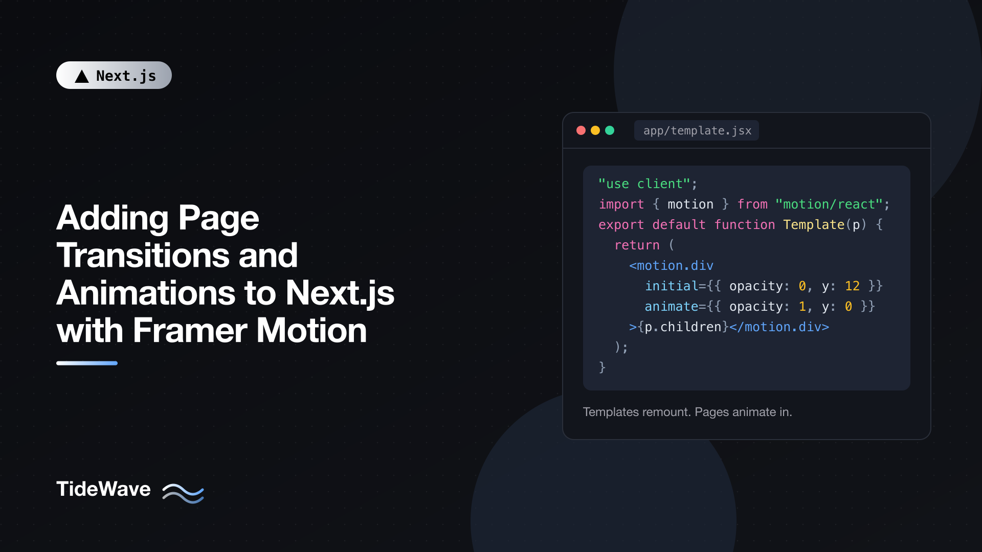
Remounting is exactly what an enter animation needs. Every time the template mounts, Motion plays the initial to animate transition:
// app/template.tsx
"use client";

import { motion } from "motion/react";

export default function Template({ children }: { children: React.ReactNode }) {
  return (
    <motion.div
      initial={{ opacity: 0, y: 12 }}
      animate={{ opacity: 1, y: 0 }}
      transition={{ duration: 0.25, ease: "easeOut" }}
    >
      {children}
    </motion.div>
  );
}
Now every page under app/ fades and slides in when you navigate to it. Some notes:
- Keep it short. 200 to 300 milliseconds feels responsive. Longer page transitions start to feel like waiting.
- Animate
opacityandtransformonly. Here,yis a transform. Both are handled by the compositor and don't trigger layout, so they stay smooth even on slower devices. - Put the template where you want the animation.
app/template.tsxwraps everything below the root layout. If you want only the blog to animate, put it inapp/blog/template.tsxinstead. The header and footer in your layouts stay put while the page content animates. - Search params don't remount templates. Changing
?page=2won't replay the animation, which is usually what you want.
Skipping the Animation on First Load
On the very first page load, the template mounts too, so the content fades in after the HTML has already arrived. Some people like that; others find it delays the first visible content. If you only want transitions between pages, not on initial load, skip the first animation with a module-level flag:
// app/template.tsx
"use client";

import { motion } from "motion/react";

let hasNavigated = false;

export default function Template({ children }: { children: React.ReactNode }) {
  const isFirstRender = !hasNavigated;
  hasNavigated = true;

  return (
    <motion.div
      initial={isFirstRender ? false : { opacity: 0, y: 12 }}
      animate={{ opacity: 1, y: 0 }}
      transition={{ duration: 0.25, ease: "easeOut" }}
    >
      {children}
    </motion.div>
  );
}
initial={false} tells Motion to start in the animate state, with no animation. The module-level variable lives as long as the page's JavaScript does, so it's false only on the first client render after a full page load. On the server it doesn't matter, because the server render outputs the initial styles either way, and with initial={false} those are the final styles.
Why Exit Transitions Between Routes Are Hard
In a single-page app with client-side routing you control, you'd wrap the routes in AnimatePresence, key them by path, and the old page would animate out before the new one animates in. People try the same in the App Router:
// app/template.tsx (this won't animate the exit)
"use client";

import { AnimatePresence, motion } from "motion/react";
import { usePathname } from "next/navigation";

export default function Template({ children }: { children: React.ReactNode }) {
  const pathname = usePathname();

  return (
    <AnimatePresence mode="wait">
      <motion.div
        key={pathname}
        initial={{ opacity: 0 }}
        animate={{ opacity: 1 }}
        exit={{ opacity: 0 }}
      >
        {children}
      </motion.div>
    </AnimatePresence>
  );
}
It doesn't work as expected, for two reasons. First, the template itself remounts on navigation, so the AnimatePresence holding the old page is thrown away along with it. Second, even if you move AnimatePresence up into a layout, children is controlled by the router. By the time your component re-renders with the new pathname, children already contains the new page, so the "exiting" element would render the new content while it fades out.
The workarounds you'll find online freeze the old router context using Next.js internals that aren't part of the public API. They can break on any minor release, so I don't recommend them for production.
You have two solid options instead.
Option 1: Enter-Only Transitions
For most sites, an enter animation is enough. The old page disappears instantly and the new one fades in quickly. With a short duration, users perceive it as a smooth transition, and there's nothing fragile to maintain. That's the template approach above.
Option 2: React's ViewTransition for Cross-Fades
If you want the old page to animate out while the new one animates in, use the browser's View Transitions API through React's ViewTransition component. The App Router supports it with no configuration, and route navigations trigger it automatically because they run inside transitions:
// app/blog/layout.tsx
import { ViewTransition } from "react";

export default function BlogLayout({
  children,
}: {
  children: React.ReactNode;
}) {
  return (
    <section className="mx-auto max-w-3xl px-6">
      <ViewTransition>{children}</ViewTransition>
    </section>
  );
}
By default, the browser snapshots the old content, renders the new content, and cross-fades between them. Because the browser does the animation from snapshots, the "old page is already gone" problem doesn't exist. You can customize the animation with CSS and add directional slides with transition types on Link. In browsers without support, navigation works normally without animation.
Motion and ViewTransition combine well: use ViewTransition for route-level transitions and Motion for interactive animations inside pages. For the CSS side of view transitions, see The View Transitions API: Seamless Page Transitions with CSS.
Presence Animations Inside a Page
Inside a page, you control the state, so AnimatePresence exit animations work perfectly. This is where Motion shines.
A Modal That Animates In and Out
// components/animated-modal.tsx
"use client";

import { AnimatePresence, motion } from "motion/react";
import { useState } from "react";

export function AnimatedModal() {
  const [open, setOpen] = useState(false);

  return (
    <>
      <button
        type="button"
        onClick={() => setOpen(true)}
        className="rounded-md bg-blue-600 px-4 py-2 text-white"
      >
        Show details
      </button>

      <AnimatePresence>
        {open && (
          <motion.div
            key="backdrop"
            className="fixed inset-0 z-50 grid place-items-center bg-black/50 p-4"
            initial={{ opacity: 0 }}
            animate={{ opacity: 1 }}
            exit={{ opacity: 0 }}
            onClick={() => setOpen(false)}
          >
            <motion.div
              role="dialog"
              aria-modal="true"
              aria-labelledby="modal-title"
              className="w-full max-w-md rounded-xl bg-white p-6 shadow-xl"
              initial={{ opacity: 0, scale: 0.95, y: 8 }}
              animate={{ opacity: 1, scale: 1, y: 0 }}
              exit={{ opacity: 0, scale: 0.95, y: 8 }}
              transition={{ duration: 0.2 }}
              onClick={(event) => event.stopPropagation()}
            >
              <h2 id="modal-title" className="text-lg font-semibold">
                Details
              </h2>
              <p className="mt-2 text-gray-600">
                Exit animations work because this component controls when the
                modal leaves.
              </p>
              <button
                type="button"
                onClick={() => setOpen(false)}
                className="mt-4 rounded-md border px-4 py-2"
              >
                Close
              </button>
            </motion.div>
          </motion.div>
        )}
      </AnimatePresence>
    </>
  );
}
When open becomes false, React would normally remove the elements immediately. AnimatePresence keeps them in the DOM until their exit animations finish, then removes them. Direct children of AnimatePresence need a stable key so Motion can track them.
This example focuses on the animation. A production modal also needs focus trapping, Escape handling, and focus restoration. In practice, you'd use an accessible dialog primitive (such as the one in shadcn/ui) and wrap its content with Motion, or use the primitive's own animation hooks.
Animating List Items
The same pattern animates items being added and removed:
// components/todo-list.tsx
"use client";

import { AnimatePresence, motion } from "motion/react";

type Todo = { id: string; text: string };

export function TodoList({
  todos,
  onRemove,
}: {
  todos: Todo[];
  onRemove: (id: string) => void;
}) {
  return (
    <ul className="space-y-2">
      <AnimatePresence initial={false}>
        {todos.map((todo) => (
          <motion.li
            key={todo.id}
            layout
            initial={{ opacity: 0, height: 0 }}
            animate={{ opacity: 1, height: "auto" }}
            exit={{ opacity: 0, height: 0 }}
            transition={{ duration: 0.2 }}
            className="overflow-hidden"
          >
            <div className="flex items-center justify-between rounded-md border px-3 py-2">
              <span>{todo.text}</span>
              <button type="button" onClick={() => onRemove(todo.id)}>
                Remove
              </button>
            </div>
          </motion.li>
        ))}
      </AnimatePresence>
    </ul>
  );
}
initial={false}onAnimatePresenceskips the enter animation for items present on first render, so the list doesn't animate in on page load, only when items are added later.height: "auto"is something CSS transitions can't animate, but Motion can, by measuring the element.layoutmakes remaining items slide smoothly into the gap left by a removed item instead of jumping.
Animating height triggers layout work, unlike opacity and transform. For short lists that's fine; for long ones, consider animating only opacity and letting layout handle the movement.
Shared Layout Animations
The layoutId prop is one of Motion's best features. When an element with a given layoutId unmounts and another with the same layoutId mounts, Motion animates from the first one's position and size to the second's.
A classic use is an active-tab indicator that glides between items. Because a navigation bar usually lives in a layout, which persists across navigations, it works for route-based navigation too:
// components/nav-tabs.tsx
"use client";

import Link from "next/link";
import { usePathname } from "next/navigation";
import { motion } from "motion/react";

const tabs = [
  { href: "/dashboard", label: "Overview" },
  { href: "/dashboard/analytics", label: "Analytics" },
  { href: "/dashboard/settings", label: "Settings" },
];

export function NavTabs() {
  const pathname = usePathname();

  return (
    <nav aria-label="Dashboard">
      <ul className="flex gap-1 border-b">
        {tabs.map((tab) => {
          const active = pathname === tab.href;

          return (
            <li key={tab.href} className="relative">
              <Link
                href={tab.href}
                aria-current={active ? "page" : undefined}
                className="block px-4 py-2 text-sm font-medium"
              >
                {tab.label}
              </Link>
              {active && (
                <motion.span
                  layoutId="active-tab"
                  className="absolute inset-x-0 -bottom-px h-0.5 bg-blue-600"
                  transition={{ type: "spring", stiffness: 500, damping: 40 }}
                />
              )}
            </li>
          );
        })}
      </ul>
    </nav>
  );
}
When you click a new tab, the underline for the old tab unmounts and a new one mounts under the new tab. Because both share layoutId="active-tab", Motion animates the underline from the old position to the new one. A spring transition gives it a natural feel. Render NavTabs from app/dashboard/layout.tsx so it isn't remounted on navigation.
Staggered Lists with Variants
Variants let you name animation states and have them propagate from parent to children. Combined with stagger, a list can animate its items in one after another:
// components/feature-grid.tsx
"use client";

import { motion, stagger, type Variants } from "motion/react";

const container: Variants = {
  hidden: {},
  show: {
    transition: { delayChildren: stagger(0.06) },
  },
};

const item: Variants = {
  hidden: { opacity: 0, y: 12 },
  show: { opacity: 1, y: 0, transition: { duration: 0.3 } },
};

export function FeatureGrid({ features }: { features: string[] }) {
  return (
    <motion.ul
      className="grid gap-4 sm:grid-cols-2 lg:grid-cols-3"
      variants={container}
      initial="hidden"
      whileInView="show"
      viewport={{ once: true, amount: 0.2 }}
    >
      {features.map((feature) => (
        <motion.li
          key={feature}
          variants={item}
          className="rounded-lg border p-4"
        >
          {feature}
        </motion.li>
      ))}
    </motion.ul>
  );
}
How it fits together:
- The parent moves from
hiddentoshow, and children with matching variant names follow automatically. delayChildren: stagger(0.06)delays each child 60 milliseconds more than the previous one. (Older code usesstaggerChildren: 0.06, which is now deprecated in favor ofstagger.)whileInViewtriggers the animation when the list scrolls into view, andviewport={{ once: true }}keeps it from replaying every time it scrolls in and out.amount: 0.2means 20 percent of the element must be visible.
Scroll reveals like this are easy to overuse. Use them for a few sections on a marketing page, not every paragraph of a blog post.
Respecting Reduced Motion
Some users set "reduce motion" in their operating system because animation causes discomfort or distraction. Motion can respect that globally with MotionConfig:
// components/motion-provider.tsx
"use client";

import { MotionConfig } from "motion/react";

export function MotionProvider({ children }: { children: React.ReactNode }) {
  return <MotionConfig reducedMotion="user">{children}</MotionConfig>;
}
// app/layout.tsx
import { MotionProvider } from "@/components/motion-provider";
import "./globals.css";

export default function RootLayout({
  children,
}: {
  children: React.ReactNode;
}) {
  return (
    <html lang="en">
      <body>
        <MotionProvider>{children}</MotionProvider>
      </body>
    </html>
  );
}
With reducedMotion="user", Motion disables transform and layout animations for users who prefer reduced motion, while keeping opacity and color changes, which are generally safe. Fades still happen; slides, scales, and layout movements become instant.
For finer control in a specific component, the useReducedMotion hook returns true when the preference is set:
// components/hero-art.tsx
"use client";

import { motion, useReducedMotion } from "motion/react";

export function HeroArt() {
  const reduce = useReducedMotion();

  return (
    <motion.div
      className="size-48 rounded-full bg-linear-to-br from-blue-500 to-purple-500"
      animate={reduce ? { opacity: 1 } : { rotate: 360 }}
      transition={
        reduce
          ? { duration: 0 }
          : { duration: 20, repeat: Infinity, ease: "linear" }
      }
    />
  );
}
Continuous, decorative animations like this rotating shape are exactly what reduced-motion users want gone.
Keeping the Bundle Small
The full motion component includes every feature: gestures, drag, layout animations, and more. If you only use simple animations, you can load less with LazyMotion and the lighter m component:
// components/lazy-motion-provider.tsx
"use client";

import { LazyMotion, domAnimation } from "motion/react";

export function LazyMotionProvider({
  children,
}: {
  children: React.ReactNode;
}) {
  return (
    <LazyMotion features={domAnimation} strict>
      {children}
    </LazyMotion>
  );
}
// components/fade-in.tsx
"use client";

import * as m from "motion/react-m";

export function FadeIn({ children }: { children: React.ReactNode }) {
  return (
    <m.div initial={{ opacity: 0 }} animate={{ opacity: 1 }}>
      {children}
    </m.div>
  );
}
domAnimation covers animations, variants, exit animations, and gestures like hover and tap. If you need layout animations and drag, use domMax instead. strict throws an error if a motion component sneaks in somewhere under the provider, which would pull the full bundle back in. Check the effect with the bundle analyzer; the bundle size post shows how.
Practical Guidelines
- Fast and subtle beats slow and impressive. Most UI transitions should be 150 to 300 milliseconds.
- Animate
opacityandtransform. Avoid animatingwidth,top, ormarginin performance-sensitive spots; uselayoutwhen elements need to move. - Animate meaning, not decoration. Use motion to show where something came from (a menu from its button) or what changed (an item removed).
- Keep pages Server Components. Wrap the animated parts in small Client Components and pass server content as
children. - Don't fight the router. Use
template.tsxfor enter transitions andViewTransitionfor cross-route transitions, not private Next.js internals.
Conclusion
Motion (formerly Framer Motion) works well in the Next.js App Router once you know where its boundaries are. Use template.tsx with a motion.div for page enter transitions, and React's ViewTransition when you need the old page to animate out. Inside pages, where you own the state, AnimatePresence handles exit animations for modals and lists, layoutId gives you gliding indicators, and variants with stagger choreograph groups of elements.
Wrap it all in MotionConfig reducedMotion="user" so users who prefer less motion get it, keep durations short, and consider LazyMotion when bundle size matters.