Building Accessible UI Components in Next.js with shadcn/ui
Building a dropdown menu that looks right takes an afternoon. Building one that works with a keyboard, announces itself to screen readers, traps and restores focus correctly, closes on Escape, and supports typeahead takes much longer, and most hand-rolled versions miss at least half of that list.
shadcn/ui is a popular answer to that problem in the Next.js world. It isn't a component library you install as a dependency. It's a collection of components you copy into your project with a CLI, built on headless primitives (Radix UI by default) that handle the hard accessibility behavior, and styled with Tailwind CSS. You own the code, so you can change anything, but you start from components that already follow the WAI-ARIA patterns.
In this post I'll set up shadcn/ui in a Next.js 16 App Router project, then build a few common pieces (an accessible dialog with a form, a user menu, and form fields with proper error messaging) and explain which accessibility details the primitives handle for you and which ones are still your job.
What shadcn/ui Gives You (and What It Doesn't)
It helps to be clear about the split of responsibilities:
| Handled by the primitives | Still your responsibility |
|---|---|
ARIA roles and states (role="dialog", aria-expanded, aria-controls) | Meaningful labels and titles |
| Focus trapping in dialogs and restoring focus on close | Visible focus styles that aren't removed by your CSS |
| Keyboard navigation in menus (arrows, Home/End, typeahead) | Color contrast of your theme |
| Escape to close, click outside to dismiss | Associating error messages with inputs |
| Portals and stacking for overlays | Alt text, heading structure, page landmarks |
The primitives make it hard to build a broken widget. They can't make up for an icon button with no label, a dialog with no title, or a gray-on-gray theme.
Setting Up shadcn/ui
Start from a Next.js project with Tailwind CSS v4 (the create-next-app defaults include it; if you're adding it by hand, see Setting Up Tailwind CSS v4 in a Next.js Project). Then run the init command:
npx shadcn@latest init --base radix
The --base flag picks the headless library underneath. This post uses Radix UI, which is the most established option and what most existing shadcn/ui examples use. The CLI also offers Base UI; its components look the same but use a slightly different composition API, so if you choose it, check the docs for the components you add.
The init command:
- Creates
components.json, which records your style, paths, and aliases so lateraddcommands know where to put files. - Adds
lib/utils.tswith thecnhelper (clsxplustailwind-merge). - Adds theme tokens to
app/globals.cssas CSS variables (--background,--foreground,--primary,--ring, and so on) for light and dark themes.
Now add the components this post uses:
npx shadcn@latest add button dialog input label dropdown-menu
Each component lands in components/ui/ as a regular file you can read and edit. Dependencies like radix-ui and lucide-react are installed automatically.
Server and Client Components
Interactive components such as dialog.tsx, dropdown-menu.tsx, and label.tsx start with "use client", because the primitives need state and event handlers. Simpler ones such as input.tsx and button.tsx don't, so they can render on the server.
You don't need to make your pages Client Components to use them. A Server Component can render a Client Component and pass Server Components to it as children. Only the interactive leaf ships JavaScript. The use client directive post explains how that boundary works.
Buttons: Labels and Icon-Only Buttons
The generated Button renders a native button element, so it's focusable, activates with Enter and Space, and announces as a button. Its classes include a focus-visible ring using the --ring token. Keep that ring when you customize the component; removing outlines is the most common way teams accidentally break keyboard navigation.
Icon-only buttons are the usual problem. A trash can icon means something visually, but a screen reader just hears "button". Give it a text label:
// components/delete-button.tsx
import { Trash2 } from "lucide-react";
import { Button } from "@/components/ui/button";

export function DeleteButton() {
  return (
    <Button variant="ghost" size="icon">
      <Trash2 aria-hidden="true" />
      <span className="sr-only">Delete post</span>
    </Button>
  );
}
sr-only hides the text visually but keeps it in the accessibility tree. aria-hidden on the icon keeps the SVG from adding noise. An aria-label on the button works too; visually hidden text has the small advantage of being translated by browser translation tools.
An Accessible Dialog with a Form
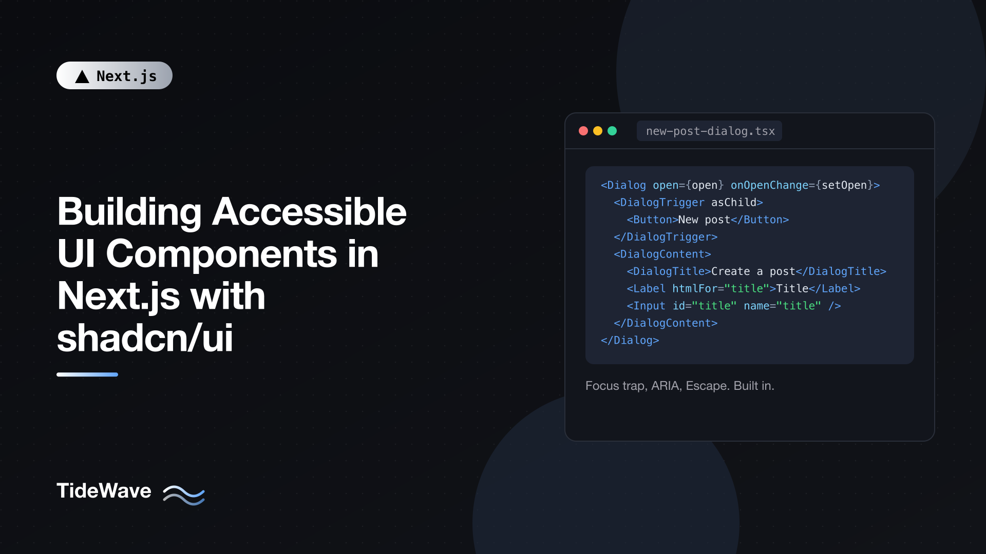
Dialogs are where the primitives earn their keep. When a Radix dialog opens, focus moves inside it, Tab cycles only within it, the rest of the page is hidden from assistive technology, Escape closes it, and focus returns to the trigger when it closes. You get all of that from the generated component.
What you must provide is a title, and ideally a description. Here's a "New post" dialog that submits to a Server Action:
// app/posts/actions.ts
"use server";

import { revalidatePath } from "next/cache";

export type CreatePostState = {
  ok: boolean;
  errors?: { title?: string };
};

export async function createPost(
  _prev: CreatePostState,
  formData: FormData,
): Promise<CreatePostState> {
  const title = String(formData.get("title") ?? "").trim();

  if (title.length < 3) {
    return {
      ok: false,
      errors: { title: "Title must be at least 3 characters." },
    };
  }

  // Save to your database here, for example:
  // await db.post.create({ data: { title } });

  revalidatePath("/posts");
  return { ok: true };
}
// app/posts/new-post-dialog.tsx
"use client";

import { useActionState, useState } from "react";
import { Button } from "@/components/ui/button";
import {
  Dialog,
  DialogClose,
  DialogContent,
  DialogDescription,
  DialogFooter,
  DialogHeader,
  DialogTitle,
  DialogTrigger,
} from "@/components/ui/dialog";
import { Input } from "@/components/ui/input";
import { Label } from "@/components/ui/label";
import { createPost, type CreatePostState } from "./actions";

const initialState: CreatePostState = { ok: false };

export function NewPostDialog() {
  const [open, setOpen] = useState(false);

  async function submit(prev: CreatePostState, formData: FormData) {
    const result = await createPost(prev, formData);
    if (result.ok) setOpen(false);
    return result;
  }

  const [state, formAction, pending] = useActionState(submit, initialState);
  const titleError = state.errors?.title;

  return (
    <Dialog open={open} onOpenChange={setOpen}>
      <DialogTrigger asChild>
        <Button>New post</Button>
      </DialogTrigger>
      <DialogContent>
        <form action={formAction} className="grid gap-4">
          <DialogHeader>
            <DialogTitle>Create a post</DialogTitle>
            <DialogDescription>
              Give your post a title. You can add content later.
            </DialogDescription>
          </DialogHeader>

          <div className="grid gap-2">
            <Label htmlFor="title">Title</Label>
            <Input
              id="title"
              name="title"
              required
              aria-invalid={titleError ? true : undefined}
              aria-describedby={titleError ? "title-error" : undefined}
            />
            {titleError && (
              <p id="title-error" className="text-sm text-destructive">
                {titleError}
              </p>
            )}
          </div>

          <DialogFooter>
            <DialogClose asChild>
              <Button type="button" variant="outline">
                Cancel
              </Button>
            </DialogClose>
            <Button type="submit" disabled={pending}>
              {pending ? "Creating..." : "Create"}
            </Button>
          </DialogFooter>
        </form>
      </DialogContent>
    </Dialog>
  );
}
The accessibility details, in order:
DialogTrigger asChildmerges the trigger behavior into yourButtoninstead of nesting a button inside a button. The rendered element getsaria-haspopup,aria-expanded, andaria-controlsautomatically.DialogTitlebecomes the dialog's accessible name througharia-labelledby. Radix logs a console error in development if a dialog has no title, because an unnamed dialog is confusing to screen reader users. If your design has no visible title, keep the element and hide it withclassName="sr-only".DialogDescriptionis wired toaria-describedby, so it's read after the title. If you really have nothing to describe, passaria-describedby={undefined}toDialogContentto opt out explicitly and silence the warning.Label htmlFor="title"matches the input'sid. Clicking the label focuses the input, and screen readers announce "Title, edit text". Placeholder text is not a substitute for a label.aria-invalidandaria-describedbyconnect the error message to the input. When the field is focused, a screen reader reads the label, then the error. The generatedInputalso hasaria-invalid:styles, so the red border comes for free.DialogClose asChildgives you a Cancel button that closes the dialog and returns focus to the trigger.
The dialog is controlled with open and onOpenChange so it can close after a successful submission. Server-side validation is shown here for brevity; for schema-based validation, see Form Validation in Next.js with Zod and Server Actions.
Using the Dialog from a Server Component
Because NewPostDialog is a Client Component, the page that renders it can stay on the server:
// app/posts/page.tsx
import { NewPostDialog } from "./new-post-dialog";

export default async function PostsPage() {
  // Fetch posts on the server here
  return (
    <main className="mx-auto max-w-3xl p-8">
      <div className="mb-6 flex items-center justify-between">
        <h1 className="text-2xl font-semibold">Posts</h1>
        <NewPostDialog />
      </div>
      {/* post list */}
    </main>
  );
}
A Keyboard-Friendly User Menu
Menus have more keyboard behavior than people expect. The WAI-ARIA menu pattern calls for arrow keys to move between items, Home and End to jump, typing a letter to jump to a matching item, Escape to close and return focus, and Enter or Space to activate. The Radix dropdown implements all of it.
// components/user-menu.tsx
"use client";

import Link from "next/link";
import { LogOut, Settings, User } from "lucide-react";
import { Button } from "@/components/ui/button";
import {
  DropdownMenu,
  DropdownMenuContent,
  DropdownMenuItem,
  DropdownMenuLabel,
  DropdownMenuSeparator,
  DropdownMenuTrigger,
} from "@/components/ui/dropdown-menu";

type UserMenuProps = {
  name: string;
  email: string;
  signOut: () => Promise<void>;
};

export function UserMenu({ name, email, signOut }: UserMenuProps) {
  return (
    <DropdownMenu>
      <DropdownMenuTrigger asChild>
        <Button variant="ghost" size="icon" className="rounded-full">
          <User aria-hidden="true" />
          <span className="sr-only">Open account menu</span>
        </Button>
      </DropdownMenuTrigger>
      <DropdownMenuContent align="end" className="w-56">
        <DropdownMenuLabel>
          <span className="block font-medium">{name}</span>
          <span className="block text-xs text-muted-foreground">{email}</span>
        </DropdownMenuLabel>
        <DropdownMenuSeparator />
        <DropdownMenuItem asChild>
          <Link href="/account">
            <User aria-hidden="true" />
            Profile
          </Link>
        </DropdownMenuItem>
        <DropdownMenuItem asChild>
          <Link href="/settings">
            <Settings aria-hidden="true" />
            Settings
          </Link>
        </DropdownMenuItem>
        <DropdownMenuSeparator />
        <DropdownMenuItem onSelect={() => signOut()}>
          <LogOut aria-hidden="true" />
          Sign out
        </DropdownMenuItem>
      </DropdownMenuContent>
    </DropdownMenu>
  );
}
Points worth noting:
- The trigger has a text label. "Open account menu" tells screen reader users what the avatar button does.
DropdownMenuItem asChildwithLinkrenders a real link with the menu item role and keyboard handling, so navigation still goes through Next.js client-side routing and prefetching.onSelectis the menu's activation event. It fires for mouse clicks, Enter, and Space alike, so you don't need separate keyboard handlers. Here it calls a Server Action passed in from a Server Component parent.DropdownMenuLabeland separators are presentational groupings. The label isn't focusable, so arrow keys skip it.
One rule to keep in mind: menus are for actions and navigation inside a widget, not for site navigation. Your main site navigation should stay a list of links inside a nav element, which is simpler for everyone. The responsive navigation menu post covers that pattern.
Form Fields Beyond the Basics
The dialog example showed the core pattern for a field: label, input, error, all connected. A few more rules cover most forms.
Wrap the Pattern in a Component
When every field needs the same id, aria-describedby, and error wiring, a small wrapper prevents mistakes:
// components/form-field.tsx
"use client";

import { useId } from "react";
import { Input } from "@/components/ui/input";
import { Label } from "@/components/ui/label";

type FormFieldProps = React.ComponentProps<typeof Input> & {
  label: string;
  hint?: string;
  error?: string;
};

export function FormField({
  label,
  hint,
  error,
  ...inputProps
}: FormFieldProps) {
  const id = useId();
  const hintId = `${id}-hint`;
  const errorId = `${id}-error`;

  const describedBy =
    [hint ? hintId : null, error ? errorId : null].filter(Boolean).join(" ") ||
    undefined;

  return (
    <div className="grid gap-2">
      <Label htmlFor={id}>{label}</Label>
      <Input
        id={id}
        aria-invalid={error ? true : undefined}
        aria-describedby={describedBy}
        {...inputProps}
      />
      {hint && (
        <p id={hintId} className="text-sm text-muted-foreground">
          {hint}
        </p>
      )}
      {error && (
        <p id={errorId} className="text-sm text-destructive">
          {error}
        </p>
      )}
    </div>
  );
}
useId generates IDs that match between server and client rendering, so there are no hydration mismatches, and every instance gets a unique ID even when the same field appears twice on a page. Hints and errors are both included in aria-describedby, separated by a space, so screen readers read both.
Required Fields and Error Summaries
- Mark required fields with the native
requiredattribute. Browsers expose it to assistive technology, and you can show an asterisk visually as long as the label also makes sense without it. - After a failed submit, move focus to the first invalid field, or to an error summary at the top of the form that links to each field. Otherwise keyboard users may not realize the submission failed.
- Don't rely on color alone for errors. The message text matters more than the red border.
Theming Without Breaking Contrast
shadcn/ui themes are CSS variables in globals.css, which makes rebranding easy and makes it easy to ship low-contrast combinations. When you change tokens:
- Check
--foregroundon--background,--primary-foregroundon--primary, and--muted-foregroundon--backgroundagainst WCAG AA: 4.5:1 for body text, 3:1 for large text and UI component boundaries. - Check both themes. A palette that passes in light mode often fails in dark mode, especially muted text.
- Keep
--ringclearly visible against both backgrounds. It's the only thing showing keyboard users where they are.
DevTools in Chromium and Firefox both show contrast ratios in the color picker, which is the quickest way to check as you go.
Testing Accessibility
The primitives give you a strong starting point, but your composition can still break things. A quick routine catches most issues:
- Keyboard only. Unplug the mouse (figuratively). Tab through the page, open every dialog and menu, submit forms, and close everything with Escape. Focus should always be visible and should never get lost behind an overlay.
- Automated checks. Run axe DevTools or Lighthouse's accessibility audit on key pages. In end-to-end tests,
@axe-core/playwrightcan fail the build on violations; the Playwright testing post shows how to set up the test runner. - A real screen reader. VoiceOver on macOS (Cmd+F5) or NVDA on Windows. Open the dialog and listen: you should hear the title and description. Open the menu: you should hear the trigger's label and the item count.
- Lint. Next.js's ESLint config includes
eslint-plugin-jsx-a11yrules that catch issues like missingalttext and invalid ARIA attributes while you code.
Conclusion
shadcn/ui gives you accessible behavior without a black-box dependency. The Radix primitives underneath handle focus management, ARIA wiring, and keyboard interaction for dialogs, menus, and other complex widgets, and because the components live in your repo, you can restyle them freely.
The parts that remain yours are about content and composition: give every dialog a title, every icon button a label, and every input a Label plus an error connected with aria-describedby; use asChild to merge behavior into your own buttons and links instead of nesting them; keep focus rings and contrast intact when you theme. Do those consistently and test with a keyboard, and your Next.js UI will work for everyone who uses it.