Building a Responsive Navigation Menu in Next.js
Every site needs navigation, and almost every site needs it to work in two shapes: a horizontal row of links on wide screens and a collapsible menu behind a button on phones. It sounds simple, but the details add up. The menu should close after you tap a link, the current page should be highlighted, keyboard and screen reader users need to know whether the menu is open, and the whole header shouldn't turn into a large Client Component just to toggle one panel.
In this post I'll build a responsive navigation menu for the Next.js App Router with Tailwind CSS. I'll keep the header a Server Component, add a small client piece for active link styling, build an accessible mobile toggle, handle closing on navigation and Escape, add a desktop submenu, and finish with a sticky header and a skip link.
The Plan: Mostly Server, a Little Client
Before writing code, decide which parts actually need JavaScript in the browser:
| Part | Needs client JS? | Why |
|---|---|---|
| Logo, link list, layout | No | Static markup |
| Highlighting the current page | Yes | Needs usePathname |
| Mobile menu open/close | Yes | Needs state and event handlers |
| Desktop submenu | Yes | Needs state |
| Responsive layout switch | No | CSS breakpoints |
So the header itself stays a Server Component, and the interactive parts are small Client Components rendered inside it. That keeps the JavaScript you ship to a minimum and lets the header render with the page HTML. If you want a refresher on where that line sits, see The use client Directive Explained.
The Navigation Data
Keep the links in one place so the desktop and mobile menus can't drift apart:
// lib/navigation.ts
export type NavItem = {
  label: string;
  href: string;
  children?: { label: string; href: string; description?: string }[];
};

export const mainNav: NavItem[] = [
  { label: "Home", href: "/" },
  { label: "Blog", href: "/blog" },
  {
    label: "Guides",
    href: "/guides",
    children: [
      { label: "Getting started", href: "/guides/getting-started" },
      { label: "Deployment", href: "/guides/deployment" },
      { label: "Performance", href: "/guides/performance" },
    ],
  },
  { label: "About", href: "/about" },
  { label: "Contact", href: "/contact" },
];
The optional children array drives the submenu later. If your menu comes from a CMS, fetch it in the header (a Server Component can be async) and pass the same shape down.
Active Links
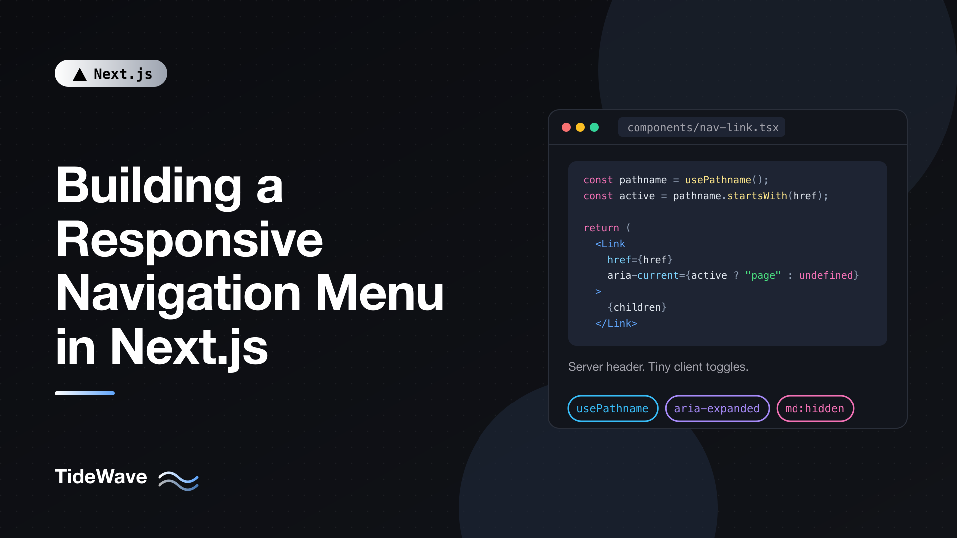
Highlighting the current page needs the pathname, which is only available through the usePathname hook in a Client Component. Wrap Link in a tiny component:
// components/nav-link.tsx
"use client";

import Link from "next/link";
import { usePathname } from "next/navigation";

type NavLinkProps = {
  href: string;
  children: React.ReactNode;
  className?: string;
  onLinkClick?: () => void;
};

export function NavLink({
  href,
  children,
  className,
  onLinkClick,
}: NavLinkProps) {
  const pathname = usePathname();
  const isActive =
    href === "/"
      ? pathname === "/"
      : pathname === href || pathname.startsWith(`${href}/`);

  return (
    <Link
      href={href}
      aria-current={isActive ? "page" : undefined}
      onClick={onLinkClick}
      className={className}
    >
      {children}
    </Link>
  );
}
A few details:
- The home link only matches exactly. Otherwise every path would start with
/and Home would always look active. - Section matching.
/blog/my-postkeeps "Blog" active, because the path starts with/blog/. Checking for the trailing slash avoids false matches like/blogroll. aria-current="page"is how screen readers learn which link is the current page. It's also a convenient styling hook: in Tailwind,aria-[current=page]:font-semiboldstyles it without a separateactiveclass.onLinkClickis an optional callback the mobile menu uses to close itself.
The rest of the link's props stay serializable, so the header (a Server Component) can render NavLink directly.
The Header
Here's the Server Component that puts it together:
// components/site-header.tsx
import Link from "next/link";
import { mainNav } from "@/lib/navigation";
import { NavLink } from "@/components/nav-link";
import { MobileNav } from "@/components/mobile-nav";
import { NavDropdown } from "@/components/nav-dropdown";

const linkClass =
  "rounded-md px-3 py-2 text-sm text-slate-600 hover:bg-slate-100 hover:text-slate-900 aria-[current=page]:font-semibold aria-[current=page]:text-slate-900";

export function SiteHeader() {
  return (
    <header className="sticky top-0 z-40 border-b border-slate-200 bg-white/90 backdrop-blur">
      <div className="mx-auto flex h-16 max-w-6xl items-center justify-between px-4">
        <Link href="/" className="text-lg font-bold">
          TideWave
        </Link>

        <nav aria-label="Main" className="hidden md:block">
          <ul className="flex items-center gap-1">
            {mainNav.map((item) => (
              <li key={item.href} className="relative">
                {item.children ? (
                  <NavDropdown item={item} />
                ) : (
                  <NavLink href={item.href} className={linkClass}>
                    {item.label}
                  </NavLink>
                )}
              </li>
            ))}
          </ul>
        </nav>

        <MobileNav items={mainNav} />
      </div>
    </header>
  );
}
And render it from the root layout so it persists across navigations:
// app/layout.tsx
import type { Metadata } from "next";
import { SiteHeader } from "@/components/site-header";
import "./globals.css";

export const metadata: Metadata = {
  title: "TideWave",
};

export default function RootLayout({
  children,
}: {
  children: React.ReactNode;
}) {
  return (
    <html lang="en">
      <body>
        <SiteHeader />
        <main id="main-content">{children}</main>
      </body>
    </html>
  );
}
The responsive switch is pure CSS. The desktop nav has hidden md:block, so it's hidden below the md breakpoint (768px by default). The mobile component will do the opposite. Both are in the HTML; CSS decides which one is visible, so there's no layout jump while JavaScript loads.
Because the header lives in the root layout, it doesn't re-render or lose state on navigation. Layouts persist; only the page below them changes. The nested layouts post explains that behavior.
The Mobile Menu
The mobile menu is a disclosure: a button that shows and hides a region. That's a simpler and more appropriate pattern than an ARIA menu role, which is meant for application-style menus with arrow-key navigation. Site navigation is a list of links, and screen reader users expect it to behave like one.
// components/mobile-nav.tsx
"use client";

import { useEffect, useRef, useState } from "react";
import { usePathname } from "next/navigation";
import type { NavItem } from "@/lib/navigation";
import { NavLink } from "@/components/nav-link";

export function MobileNav({ items }: { items: NavItem[] }) {
  const pathname = usePathname();
  // Remount the inner menu whenever the path changes, which resets it to closed
  return <MobileNavInner key={pathname} items={items} />;
}

function MobileNavInner({ items }: { items: NavItem[] }) {
  const [open, setOpen] = useState(false);
  const buttonRef = useRef<HTMLButtonElement>(null);

  useEffect(() => {
    if (!open) return;

    function onKeyDown(event: KeyboardEvent) {
      if (event.key === "Escape") {
        setOpen(false);
        buttonRef.current?.focus();
      }
    }

    document.addEventListener("keydown", onKeyDown);
    document.body.style.overflow = "hidden";

    return () => {
      document.removeEventListener("keydown", onKeyDown);
      document.body.style.overflow = "";
    };
  }, [open]);

  return (
    <div className="md:hidden">
      <button
        ref={buttonRef}
        type="button"
        aria-expanded={open}
        aria-controls="mobile-menu"
        onClick={() => setOpen((value) => !value)}
        className="inline-flex size-10 items-center justify-center rounded-md hover:bg-slate-100"
      >
        <span className="sr-only">{open ? "Close menu" : "Open menu"}</span>
        <svg
          aria-hidden="true"
          viewBox="0 0 24 24"
          className="size-6"
          fill="none"
          stroke="currentColor"
          strokeWidth="2"
          strokeLinecap="round"
        >
          {open ? (
            <path d="M6 6l12 12M18 6L6 18" />
          ) : (
            <path d="M4 7h16M4 12h16M4 17h16" />
          )}
        </svg>
      </button>

      <div
        id="mobile-menu"
        hidden={!open}
        className="fixed inset-x-0 top-16 bottom-0 overflow-y-auto border-t border-slate-200 bg-white"
      >
        <nav aria-label="Main">
          <ul className="flex flex-col p-4">
            {items.map((item) => (
              <li key={item.href}>
                <NavLink
                  href={item.href}
                  onLinkClick={() => setOpen(false)}
                  className="block rounded-md px-3 py-3 text-base text-slate-700 hover:bg-slate-100 aria-[current=page]:font-semibold aria-[current=page]:text-slate-900"
                >
                  {item.label}
                </NavLink>
                {item.children && (
                  <ul className="mb-2 ml-3 border-l border-slate-200 pl-3">
                    {item.children.map((child) => (
                      <li key={child.href}>
                        <NavLink
                          href={child.href}
                          onLinkClick={() => setOpen(false)}
                          className="block rounded-md px-3 py-2 text-sm text-slate-600 hover:bg-slate-100 aria-[current=page]:font-semibold"
                        >
                          {child.label}
                        </NavLink>
                      </li>
                    ))}
                  </ul>
                )}
              </li>
            ))}
          </ul>
        </nav>
      </div>
    </div>
  );
}
Let's go through the important decisions.
The Toggle Button
aria-expandedtells assistive technology whether the panel is open. Screen readers announce "Open menu, button, collapsed".aria-controlspoints at the panel'sid.- The label changes between "Open menu" and "Close menu", and the icon is hidden from screen readers with
aria-hidden. Thesr-onlytext is the accessible name. - The button is a real
buttonwithtype="button", so it works with Enter and Space without extra handlers.
Hiding the Panel
The panel uses the hidden attribute rather than only a CSS class. A hidden element is removed from the accessibility tree and from the tab order, so keyboard users can't tab into invisible links. Tailwind's Preflight sets display: none for [hidden], so the attribute alone is enough.
The panel is fixed below the 64px header (top-16) and fills the rest of the screen, with overflow-y-auto so long menus scroll.
Closing the Menu
There are three ways the menu should close, and each is handled differently:
- Tapping a link.
onLinkClickcallssetOpen(false)directly in the click handler. This closes it immediately, even when you tap the link for the page you're already on (which doesn't change the pathname). - Navigating some other way (the browser back button, a link elsewhere on the page). The outer
MobileNavrenders the inner component withkey={pathname}. When the pathname changes, React discards the old instance and mounts a fresh one, which starts closed. This avoids the common pattern of auseEffectthat watches the pathname and callssetOpen(false), which renders once with stale state and then again. - Pressing Escape. The effect adds a
keydownlistener only while the menu is open, closes it, and returns focus to the toggle button so keyboard users don't lose their place.
Locking Page Scroll
While the full-height panel is open, scrolling should move the menu, not the page behind it. Setting overflow: hidden on body does that, and the effect's cleanup restores it when the menu closes or the component unmounts. Cleanup also runs on the key-based remount, so scroll is never left locked after a navigation.
A Desktop Submenu
On desktop, the "Guides" item opens a small panel of links. Like the mobile menu, it's a disclosure: a button that controls a list. Opening on hover alone is a common mistake, since it doesn't work on touch devices or for keyboard users. Open it on click, and close it on Escape, outside clicks, and when focus leaves.
// components/nav-dropdown.tsx
"use client";

import { useEffect, useId, useRef, useState } from "react";
import { usePathname } from "next/navigation";
import type { NavItem } from "@/lib/navigation";
import { NavLink } from "@/components/nav-link";

export function NavDropdown({ item }: { item: NavItem }) {
  const pathname = usePathname();
  return <NavDropdownInner key={pathname} item={item} />;
}

function NavDropdownInner({ item }: { item: NavItem }) {
  const [open, setOpen] = useState(false);
  const containerRef = useRef<HTMLDivElement>(null);
  const buttonRef = useRef<HTMLButtonElement>(null);
  const panelId = useId();
  const pathname = usePathname();
  const sectionActive = pathname.startsWith(item.href);

  useEffect(() => {
    if (!open) return;

    function onPointerDown(event: PointerEvent) {
      if (!containerRef.current?.contains(event.target as Node)) {
        setOpen(false);
      }
    }

    function onKeyDown(event: KeyboardEvent) {
      if (event.key === "Escape") {
        setOpen(false);
        buttonRef.current?.focus();
      }
    }

    document.addEventListener("pointerdown", onPointerDown);
    document.addEventListener("keydown", onKeyDown);

    return () => {
      document.removeEventListener("pointerdown", onPointerDown);
      document.removeEventListener("keydown", onKeyDown);
    };
  }, [open]);

  return (
    <div
      ref={containerRef}
      onBlur={(event) => {
        if (!containerRef.current?.contains(event.relatedTarget as Node)) {
          setOpen(false);
        }
      }}
    >
      <button
        ref={buttonRef}
        type="button"
        aria-expanded={open}
        aria-controls={panelId}
        onClick={() => setOpen((value) => !value)}
        className={`flex items-center gap-1 rounded-md px-3 py-2 text-sm hover:bg-slate-100 ${
          sectionActive ? "font-semibold text-slate-900" : "text-slate-600"
        }`}
      >
        {item.label}
        <svg
          aria-hidden="true"
          viewBox="0 0 20 20"
          className={`size-4 transition-transform ${open ? "rotate-180" : ""}`}
          fill="currentColor"
        >
          <path d="M5.5 7.5l4.5 4.5 4.5-4.5z" />
        </svg>
      </button>

      <ul
        id={panelId}
        hidden={!open}
        className="absolute left-0 top-full mt-2 w-56 rounded-lg border border-slate-200 bg-white p-2 shadow-lg"
      >
        {item.children?.map((child) => (
          <li key={child.href}>
            <NavLink
              href={child.href}
              onLinkClick={() => setOpen(false)}
              className="block rounded-md px-3 py-2 text-sm text-slate-700 hover:bg-slate-100 aria-[current=page]:font-semibold"
            >
              {child.label}
            </NavLink>
          </li>
        ))}
      </ul>
    </div>
  );
}
How it behaves:
- Click or Enter/Space toggles it, with
aria-expandedkept in sync. - Escape closes it and returns focus to the button.
- Clicking outside closes it, through a
pointerdownlistener that's only attached while open. - Tabbing out closes it. The
onBlurhandler checksrelatedTarget, the element receiving focus; if it's outside the container, the panel closes. Tabbing from the button into the links keeps it open, because those links are inside. useIdcreates a unique, hydration-safe ID foraria-controls.- The same
key={pathname}trick resets it after navigation.
The button gets a "section active" style when you're anywhere under /guides, so users can see which section they're in even though the button itself isn't a link. If you want "Guides" to be a page too, link to /guides as the first item in the panel.
Plain Tab navigation through the links is all that's needed here. Arrow-key navigation is expected in ARIA menus, not in navigation disclosures, so you don't have to implement it.
A Skip Link
With a sticky header full of links, keyboard users have to tab through the whole menu on every page before reaching the content. A skip link fixes that. Add it as the first focusable element in the layout:
// app/layout.tsx (inside body, before SiteHeader)
<a
  href="#main-content"
  className="sr-only focus:not-sr-only focus:fixed focus:left-4 focus:top-4 focus:z-50 focus:rounded-md focus:bg-white focus:px-4 focus:py-2 focus:shadow"
>
  Skip to content
</a>
It's invisible until it receives focus, then appears in the corner. Activating it jumps to the main element with id="main-content" from the layout above.
The Sticky Header
The header already uses sticky top-0 with a translucent background and backdrop-blur. Two things are worth handling alongside it.
First, anchor links and the skip link will scroll their target to the very top of the viewport, underneath the sticky header. Add scroll padding equal to the header height:
/* app/globals.css */
@import "tailwindcss";

html {
  scroll-padding-top: 4rem;
}
Second, if your header changes appearance on scroll (a shadow once the page has moved, for instance), avoid scroll listeners that set state on every scroll event. An IntersectionObserver on a small sentinel element at the top of the page fires only when the state actually changes, or you can use a CSS scroll-driven animation in browsers that support it.
Showing Navigation Progress
On a fast site with prefetched links, navigation is near instant. On dynamic routes without a loading.tsx, there can be a short delay after a tap with no visual feedback. Next.js provides useLinkStatus, which a component inside a Link can use to know that its navigation is pending:
// components/link-pending-dot.tsx
"use client";

import { useLinkStatus } from "next/link";

export function LinkPendingDot() {
  const { pending } = useLinkStatus();

  return (
    <span
      aria-hidden="true"
      className={`ml-2 inline-block size-1.5 rounded-full bg-current transition-opacity ${
        pending ? "opacity-100" : "opacity-0"
      }`}
    />
  );
}
Render it as a child of NavLink's Link (for example next to {children}). The dot is always in the DOM and only its opacity changes, so it never shifts the layout. For most navigation menus, a route-level loading.tsx is the better fix, since it gives instant feedback for every link at once; the Link component post covers prefetching in more depth.
Testing the Menu
Run through this checklist on both a phone-width and a desktop-width window:
- Keyboard. Tab to the skip link, activate it, and confirm focus lands in the content. Tab through the header, open the submenu with Enter, tab through its links, and close it with Escape. On mobile width, open the menu, tab through it, and press Escape.
- Screen reader. The toggle should announce as "collapsed" or "expanded". The current page link should be announced as "current page".
- Navigation. Open the mobile menu, tap a link, and confirm it closes. Use the browser back button with the menu open and confirm it closes.
- Scroll. With the mobile menu open, try to scroll the page behind it. It shouldn't move. Close the menu and confirm the page scrolls again.
- Resize. Open the mobile menu, then widen the window past the breakpoint. The mobile wrapper is
md:hidden, so the panel disappears with it; make sure nothing is left locked. If you see the scroll lock persist, close the menu on amatchMediachange for the breakpoint.
Conclusion
A good responsive navigation menu in Next.js is mostly a Server Component: the logo, the link list, and the responsive layout are static markup and CSS breakpoints. The client parts are small and focused: a NavLink that reads usePathname to set aria-current, a mobile disclosure with aria-expanded, the hidden attribute, Escape handling, and scroll locking, and a desktop submenu that opens on click and closes on Escape, outside clicks, and blur.
Resetting menus with key={pathname} keeps them closed after navigation without effects that fight React, and a skip link plus scroll-padding-top make the sticky header pleasant for keyboard users. Build it this way once and you'll reuse the pattern on every project.