Font Optimization in Next.js with next/font: Eliminating Layout Shift
You load a page, start reading the first paragraph, and then the text jumps. Lines rewrap, a button moves down, the paragraph you were reading is suddenly somewhere else. That jump is often the web font arriving. The browser rendered the text in a fallback font first, then swapped in your custom font, which has different letter widths and line heights, so everything reflowed.
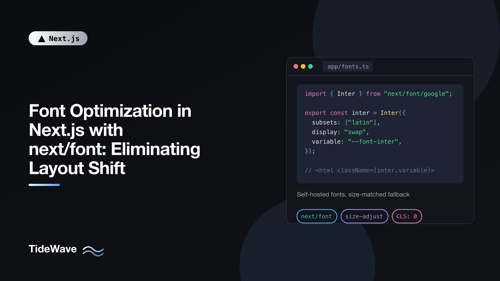
Next.js has a built-in answer for this: next/font. It downloads your fonts at build time, serves them from your own domain, preloads them, and, most importantly, generates a fallback font that's adjusted to take up the same space as your web font. The swap still happens, but nothing moves.
This post explains why fonts cause layout shift, what next/font does about it, and how to use it with Google Fonts, local font files, CSS variables, and Tailwind CSS v4. I'll also cover the display options and the mistakes that quietly undo the benefits.
Why Fonts Cause Layout Shift
When a browser hits text styled with a web font that hasn't downloaded yet, it has two choices: hide the text until the font arrives, or show it in a fallback font and swap later. The CSS font-display property controls that choice, and the most common setting, swap, picks the second option. That's good for readability, since users see text immediately, but it creates a layout problem.
Fonts differ in their metrics: the average width of characters, the height of ascenders and descenders, the default line gap. "Inter" at 16px and "Arial" at 16px don't occupy the same space. A heading that fits on one line in Arial may wrap to two lines in your brand font. When the swap happens, every block of text resizes, and everything below it shifts. That's Cumulative Layout Shift (CLS), one of the Core Web Vitals.
The traditional ways of loading fonts make it worse:
- A
linkto Google Fonts means a DNS lookup and connection to another origin, then a CSS file, then the font files. The longer that takes, the longer users stare at the fallback, and the more noticeable the swap. - An
@importinside your CSS delays font discovery further, because the browser can't see it until it has parsed the stylesheet.
What next/font Does
next/font attacks the problem from both ends:
- Self-hosting. At build time, Next.js downloads the font files (for Google Fonts) and serves them as static assets from your own domain. No requests go to Google from the visitor's browser, which also helps with privacy rules.
- Preloading. The font files are preloaded on the routes that use them, so the browser starts downloading them right away.
- Size-adjusted fallbacks. This is the important part. Next.js generates an extra
@font-facerule for a local system font (Arial, by default) withsize-adjust,ascent-override,descent-override, andline-gap-overridevalues calculated to match your web font's metrics. The fallback text takes up almost exactly the same space as the final text. When the real font swaps in, the glyphs change shape, but lines don't rewrap and nothing moves. - Scoped class names. You apply fonts through generated class names or CSS variables, so the generated
font-familystack always includes the adjusted fallback.
Using a Google Font
Import the font by name from next/font/google, call it at the top level of a module, and apply its className:
// app/layout.tsx
import type { Metadata } from "next";
import { Inter } from "next/font/google";
import "./globals.css";

const inter = Inter({
  subsets: ["latin"],
  display: "swap",
});

export const metadata: Metadata = {
  title: "TideWave",
};

export default function RootLayout({
  children,
}: {
  children: React.ReactNode;
}) {
  return (
    <html lang="en" className={inter.className}>
      <body>{children}</body>
    </html>
  );
}
A few things are happening here:
Interis a function exported bynext/font/google. Font names with spaces use underscores:Roboto_Mono,Source_Sans_3,Playfair_Display.subsets: ["latin"]tells Next.js which character subsets to preload. Google Fonts are split into subsets so a site in English doesn't download Cyrillic or Vietnamese glyphs. You'll get a warning if you leavesubsetsout while preloading is on.inter.classNameis a generated class that setsfont-familyto something like'Inter', 'Inter Fallback', where "Inter Fallback" is the size-adjusted local font.
Because this is the root layout, the font is preloaded on every route.
Variable Fonts vs Fixed Weights
Inter is a variable font: one file contains every weight from 100 to 900, so you don't specify a weight. Variable fonts are the recommended choice because a single file covers everything your design needs.
For fonts that aren't variable, you must list the weights (and styles) you use. Each one is a separate file, so only include what you need:
// app/fonts.ts
import { Roboto } from "next/font/google";

export const roboto = Roboto({
  weight: ["400", "700"],
  style: ["normal", "italic"],
  subsets: ["latin"],
  display: "swap",
});
That's four files: regular, bold, italic, and bold italic. Some variable fonts also have extra axes beyond weight, like slnt or opsz. Only the weight axis is included by default; request others with axes: ["opsz"] if your design uses them.
Using Local Font Files
For a commercial font or one that isn't on Google Fonts, use next/font/local. Put the files in your project, ideally as woff2, and point src at them relative to the file where you call localFont:
// app/fonts.ts
import localFont from "next/font/local";

export const satoshi = localFont({
  src: [
    { path: "./fonts/Satoshi-Variable.woff2", style: "normal" },
    { path: "./fonts/Satoshi-VariableItalic.woff2", style: "italic" },
  ],
  display: "swap",
  variable: "--font-satoshi",
  adjustFontFallback: "Arial",
  fallback: ["system-ui", "arial"],
});
The options:
srccan be a single path or an array of files withweightandstyle, which together form one family. For static (non-variable) files, give each entry its weight, like{ path: "./fonts/Brand-Bold.woff2", weight: "700" }.adjustFontFallbackpicks which local font to size-adjust:"Arial"(the default) for sans-serif designs,"Times New Roman"for serif ones, orfalseto turn it off. Choose the one closest in shape to your font.fallbackadds more fonts to the stack after the adjusted fallback, used only if both fail.declarationslets you add extra@font-facedescriptors when the automatic metrics need a nudge, for exampledeclarations: [{ prop: "ascent-override", value: "90%" }].
Applying Fonts with CSS Variables
className is the simplest way to apply a single font, but most real designs have at least two: a body font and a heading or monospace font. The variable option exposes each font as a CSS custom property instead, so you can use it anywhere in your stylesheets.
The cleanest setup is a single file that defines all your fonts:
// app/fonts.ts
import { Inter, JetBrains_Mono, Fraunces } from "next/font/google";

export const inter = Inter({
  subsets: ["latin"],
  display: "swap",
  variable: "--font-inter",
});

export const fraunces = Fraunces({
  subsets: ["latin"],
  display: "swap",
  variable: "--font-fraunces",
});

export const jetbrainsMono = JetBrains_Mono({
  subsets: ["latin"],
  display: "swap",
  variable: "--font-jetbrains-mono",
});
Apply all the variable classes to html in the root layout:
// app/layout.tsx
import { fraunces, inter, jetbrainsMono } from "./fonts";
import "./globals.css";

export default function RootLayout({
  children,
}: {
  children: React.ReactNode;
}) {
  return (
    <html
      lang="en"
      className={`${inter.variable} ${fraunces.variable} ${jetbrainsMono.variable}`}
    >
      <body>{children}</body>
    </html>
  );
}
Each .variable class declares the custom property, whose value is the full font stack including the adjusted fallback. Now use the variables in CSS:
/* app/globals.css */
body {
  font-family: var(--font-inter);
}

h1,
h2,
h3 {
  font-family: var(--font-fraunces);
}

code,
pre {
  font-family: var(--font-jetbrains-mono);
}
Defining fonts once in app/fonts.ts matters. Every call to a font function creates a separate font instance, so calling Inter() in three different components would ship three copies. Define once, import everywhere.
With Tailwind CSS v4
Tailwind v4 is configured in CSS with @theme. Map Tailwind's font tokens to the next/font variables using @theme inline:
/* app/globals.css */
@import "tailwindcss";

@theme inline {
  --font-sans: var(--font-inter);
  --font-serif: var(--font-fraunces);
  --font-mono: var(--font-jetbrains-mono);
}
Now font-sans, font-serif, and font-mono utilities use your fonts, and since --font-sans is Tailwind's default body font, the body picks up Inter automatically. The inline keyword makes Tailwind emit the var(--font-inter) reference directly in each utility instead of going through a theme variable resolved on :root. That way the utilities work no matter which element carries the next/font classes, whether it's html, body, or a wrapper deeper in the tree. If you're new to v4's CSS-first configuration, see what's new in Tailwind CSS v4 and setting up Tailwind v4 in Next.js.
The style Option
Every font object also has a style property with fontFamily set, useful for inline styles or for passing to libraries that take style objects:
<p style={fraunces.style}>A pull quote in the display font.</p>
Choosing a display Strategy
display maps to CSS font-display and controls what happens while the font loads. The default in next/font is swap.
| Value | While loading | If the font is slow | Best for |
|---|---|---|---|
swap | Fallback text shown immediately | Swaps in whenever it arrives | Most sites; with adjusted fallbacks the swap barely shifts anything |
optional | Very short invisible period, then fallback | If not ready almost immediately, the fallback is kept for this page view | Performance-critical pages where consistency matters less than zero shift |
fallback | Short invisible period, then fallback | Swaps if it arrives within about 3 seconds, otherwise keeps fallback | A middle ground |
block | Text invisible for up to about 3 seconds | Then shows fallback until the font loads | Icon fonts, where fallback text would be meaningless |
auto | Browser decides | Browser decides | Rarely worth choosing |
With next/font's metric-adjusted fallback, swap usually produces no measurable layout shift, while still guaranteeing users see your font. optional goes further: it can guarantee no swap at all, at the cost that a first-time visitor on a slow connection may see the fallback font for the whole page. Because the files are preloaded and served from your domain, they usually arrive fast enough that optional still shows your font on most visits.
Where Fonts Get Preloaded
next/font preloads a font only on the routes where it's used, based on which file calls it:
- Used in the root layout: preloaded on every route.
- Used in a nested layout: preloaded on every route under that layout.
- Used in a page: preloaded only on that route.
This gives you a simple way to keep heavy fonts off pages that don't need them. A display font used only on your marketing landing page can be applied in that page (or in a (marketing) route group's layout) and won't be preloaded on your app's dashboard.
If a font is only used in rare places, such as a decorative script font in a footer, you can set preload: false so it doesn't compete with critical resources. The adjusted fallback still prevents layout shift when it does load.
Rules the Font Loader Enforces
next/font runs at build time, which puts a few constraints on how you call it:
- Call font functions at the module's top level, not inside a component or function.
- Assign the result to a
const. - Pass literal values in the options object. Next.js reads them statically, so options computed at runtime (from environment variables or function calls) won't work.
// Works
const inter = Inter({ subsets: ["latin"], display: "swap" });

// Doesn't work: called inside a component
export function Heading() {
  const inter = Inter({ subsets: ["latin"] });
  return <h1 className={inter.className}>Hi</h1>;
}
Mistakes That Bring Layout Shift Back
Referring to the font by name in CSS. Writing font-family: "Inter", sans-serif in your stylesheet skips the generated fallback entirely. Your text falls back to the plain browser sans-serif, which isn't size-adjusted, and the shift returns. Always go through className, style, or the CSS variable.
Loading the same font twice. It's common to migrate to next/font and forget the old link to fonts.googleapis.com in the layout or the @import url(...) at the top of globals.css. Now the font downloads twice, once from Google, and the old declaration may win the cascade. Remove all other font loading.
Too many weights and families. Every static weight is a separate file. Three families with four weights each is twelve font files competing with your LCP image. Prefer variable fonts and audit what your design actually uses.
Missing subsets. Without them, nothing is preloaded (and you get a warning), so the font is discovered late.
Picking the wrong fallback base for local fonts. A serif font adjusted against Arial will still look quite different during the swap, even if it occupies the same space. Use adjustFontFallback: "Times New Roman" for serif designs.
Checking Your Results
To confirm fonts no longer cause shifts:
- In Chrome DevTools, open the Network panel, throttle to "Slow 4G", and reload with the cache disabled. Watch the text: lines should stay put when the font swaps in.
- Open the Performance panel and record a page load. Layout shifts are listed in their own track, with the elements that moved.
- In the Network panel, filter by "Font". Font files should come from your own domain under
/_next/static/media/, with no requests tofonts.gstatic.com. - Run Lighthouse and check the CLS score and the "Avoid large layout shifts" diagnostic.
For a broader look at CLS and the other metrics, see improving Core Web Vitals in a Next.js application.
Conclusion
Web fonts shift layouts because fallback fonts have different metrics, and the swap reflows your text. next/font fixes that by self-hosting and preloading your fonts and, crucially, generating a fallback that's sized to match. Define your fonts once in a shared module, prefer variable fonts, apply them through className or CSS variables (mapped into Tailwind with @theme inline), and keep display: "swap" unless you specifically want optional's no-swap guarantee. Then remove every other way your project was loading fonts, and the text on your pages will stay exactly where it first appears.