Optimizing Images in Next.js with the next/image Component
Images are usually the heaviest thing on a page. A single unoptimized hero photo can outweigh all of your JavaScript, and images without reserved space are the most common cause of content jumping around while a page loads. Next.js ships an Image component that handles most of this for you: it resizes images on demand, serves modern formats, lazy loads by default, and reserves space to prevent layout shift.
The catch is that next/image only does its best work when you give it the right information. Leave out sizes and phones download desktop-sized images. Lazy load your hero and your Largest Contentful Paint suffers. This guide covers how the component works, the props that matter, the next.config.ts options (including the defaults that changed in Next.js 16), and the mistakes I see most often.
What next/image Actually Does
When you render an Image, Next.js outputs a regular img element with a generated srcset. Each URL in that srcset points at the built-in optimization endpoint, /_next/image, with the desired width and quality:
// app/page.tsx
import Image from "next/image";

export default function Page() {
  return (
    <Image
      src="/team.jpg"
      alt="Our team at the 2026 offsite"
      width={1200}
      height={800}
    />
  );
}
The browser picks the most suitable URL for the device, and the server then:
- Fetches the original image (from
public, your build output, or an allowed remote host). - Resizes it to the requested width.
- Converts it to WebP (or AVIF, if you enable it) when the browser's
Acceptheader says it can handle it. - Caches the result, so the expensive work happens once per size and format.
On top of that, the component sets loading="lazy" and decoding="async" by default, and uses width and height to give the browser the aspect ratio before any pixels arrive. That last part is what prevents Cumulative Layout Shift.
Three Ways to Provide src
Static Imports (Best Option for Local Images)
// app/about/page.tsx
import Image from "next/image";
import teamPhoto from "./team.jpg";

export default function AboutPage() {
  return (
    <Image
      src={teamPhoto}
      alt="Our team at the 2026 offsite"
      placeholder="blur"
    />
  );
}
When you import an image file, Next.js reads it at build time and fills in width, height, and a tiny blurDataURL for you. The file also gets a content hash in its URL, so it can be cached forever. If an image lives in your repo and is used in code, import it.
Files in public
<Image src="/images/team.jpg" alt="Our team" width={1200} height={800} />
Paths starting with / resolve to the public folder. Next.js can't read these at build time, so you must provide width and height yourself. These are the image's intrinsic dimensions (or at least its aspect ratio), not the size it renders at: CSS controls the rendered size.
This is the usual choice for content-driven sites, where image paths come from Markdown frontmatter or a CMS.
Remote Images
<Image
  src="https://images.example-cms.com/uploads/team.jpg"
  alt="Our team"
  width={1200}
  height={800}
/>
Remote images also need explicit dimensions. And for security, the optimizer refuses to fetch from any host you haven't allowed in next.config.ts:
// next.config.ts
import type { NextConfig } from "next";

const nextConfig: NextConfig = {
  images: {
    remotePatterns: [
      new URL("https://images.example-cms.com/uploads/**"),
      {
        protocol: "https",
        hostname: "**.cloudfront.net",
        pathname: "/media/**",
      },
    ],
  },
};

export default nextConfig;
Be as specific as you can. Allowing a whole domain (or worse, **) lets anyone use your server to resize images from that host, which costs you CPU and bandwidth. The older images.domains option is deprecated; use remotePatterns.
If you don't know an image's dimensions at all, use fill instead, covered below.
sizes: The Prop That Saves the Most Bytes
If you take one thing from this post, make it this. Without sizes, the browser has to assume the image will be as wide as the viewport. The generated srcset is also limited to 1x and 2x variants of the width you passed. For a fixed-size image like an avatar, that's fine. For a responsive image, it means downloading far more pixels than needed.
With sizes, Next.js generates a full width-based srcset (640w, 750w, 828w, and so on up to 3840w), and the browser uses your sizes hint to pick the right one.
Say you have a product grid that's one column on mobile, two on tablets, and three on desktop:
// app/products/product-card.tsx
import Image from "next/image";

type Product = { id: string; name: string; imageUrl: string };

export function ProductCard({ product }: { product: Product }) {
  return (
    <article>
      <Image
        src={product.imageUrl}
        alt={product.name}
        width={800}
        height={800}
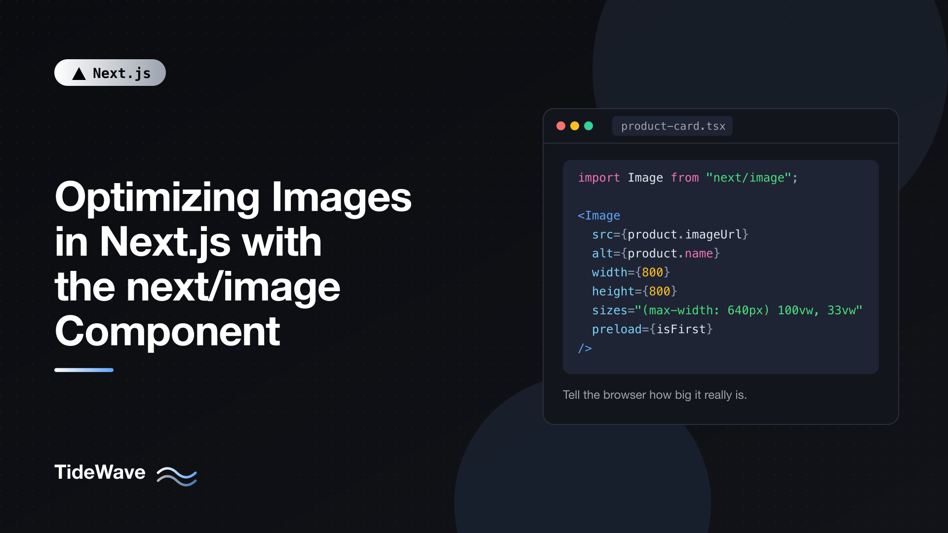
        sizes="(max-width: 640px) 100vw, (max-width: 1024px) 50vw, 33vw"
        style={{ width: "100%", height: "auto" }}
      />
      <h2>{product.name}</h2>
    </article>
  );
}
Reading sizes left to right: on screens up to 640px the image fills the viewport, up to 1024px it takes half, and otherwise it takes a third. On a 1440px desktop, the browser now knows it needs roughly a 480px-wide image (or 960px on a 2x display) instead of a 1440px one. Across a grid of 24 products, that difference adds up to megabytes.
The inline style makes the image scale with its container while keeping its aspect ratio. If you set a width in CSS, always pair it with height: auto, or the image will be squashed to its height attribute.
sizes doesn't need to be exact. A rough description of your layout is enough; being off by a few percent costs a few kilobytes, while omitting it can cost hundreds.
fill: When You Don't Know the Dimensions
fill makes the image expand to cover its parent element, which is useful for user-uploaded images, card thumbnails with a fixed aspect ratio, and hero banners:
// app/blog/post-cover.tsx
import Image from "next/image";

export function PostCover({ src, alt }: { src: string; alt: string }) {
  return (
    <div className="relative aspect-video w-full overflow-hidden rounded-lg">
      <Image
        src={src}
        alt={alt}
        fill
        sizes="(max-width: 768px) 100vw, 768px"
        className="object-cover"
      />
    </div>
  );
}
Three requirements for fill:
- The parent must have
position: relative(orfixed/absolute), because the image is absolutely positioned inside it. - The parent must have a size. Here
aspect-videoplusw-fullgives it one. A parent with no height collapses to zero and the image disappears. - You should always pass
sizes. Afillimage has no intrinsic width for Next.js to work with.
object-cover crops the image to fill the box; object-contain letterboxes it instead.
Loading the Most Important Image First
Lazy loading is the right default for most images. It's the wrong choice for the image that is your page's Largest Contentful Paint element, usually a hero image or the first product photo. That image should start downloading as early as possible.
In Next.js 16, the old priority prop is deprecated. You now have three tools:
// app/page.tsx
import Image from "next/image";
import hero from "./hero.jpg";

export default function Home() {
  return (
    <section className="relative h-[60vh]">
      <Image
        src={hero}
        alt="Sunrise over the harbour"
        fill
        sizes="100vw"
        className="object-cover"
        preload
      />
    </section>
  );
}
preloadinserts alink rel="preload"tag in the document head, so the browser discovers the image before it even parses the body. Use it for a single, known LCP image above the fold.loading="eager"simply turns off lazy loading for that image.fetchPriority="high"tells the browser to prioritize this request over other images. It's passed straight through to theimgelement.
The docs suggest that in most cases loading="eager" or fetchPriority="high" is enough, and to reserve preload for when you're sure which image is the LCP. Don't combine preload with loading or fetchPriority, and don't preload several images "just in case": if different images are the LCP element on mobile and desktop, preloading both wastes bandwidth on the one that isn't shown. For more on measuring LCP, see improving Core Web Vitals in Next.js.
Placeholders
placeholder="blur" shows a blurred preview while the full image loads. For static imports, the blurDataURL is generated automatically, so it's one prop:
<Image src={teamPhoto} alt="Our team" placeholder="blur" />
For remote or public images you have to supply blurDataURL yourself. You can generate tiny previews at build or upload time with a library such as Plaiceholder and store them alongside the image URL. If you don't have one, a solid-color placeholder still beats a blank box:
// lib/color-placeholder.ts
export function colorPlaceholder(hex: string) {
  const svg = `<svg xmlns="http://www.w3.org/2000/svg" width="8" height="8"><rect width="8" height="8" fill="${hex}"/></svg>`;
  return `data:image/svg+xml;base64,${Buffer.from(svg).toString("base64")}`;
}
// app/gallery/photo.tsx
import Image from "next/image";
import { colorPlaceholder } from "@/lib/color-placeholder";

type Photo = {
  url: string;
  alt: string;
  width: number;
  height: number;
  color: string;
};

export function GalleryPhoto({ photo }: { photo: Photo }) {
  return (
    <Image
      src={photo.url}
      alt={photo.alt}
      width={photo.width}
      height={photo.height}
      sizes="(max-width: 768px) 50vw, 25vw"
      placeholder={colorPlaceholder(photo.color)}
      style={{ width: "100%", height: "auto" }}
    />
  );
}
placeholder accepts a data URL directly, which is used as-is rather than blurred. Many image CMSes return a dominant color per image, which is perfect for this. Keep placeholders tiny; a large data URL inflates your HTML for every image on the page.
Configuring Image Optimization
Several defaults changed in Next.js 16, and they're worth knowing because some fail silently.
// next.config.ts
import type { NextConfig } from "next";

const nextConfig: NextConfig = {
  images: {
    remotePatterns: [new URL("https://images.example-cms.com/**")],
    formats: ["image/avif", "image/webp"],
    qualities: [50, 75, 90],
    minimumCacheTTL: 60 * 60 * 24 * 30, // 30 days
  },
};

export default nextConfig;
qualities
The quality prop sets compression from 1 to 100, and the default is 75. Since Next.js 16, images.qualities is an allowlist and defaults to just [75]. If you write quality={90} without adding 90 to the list, you'll silently get the closest allowed value (75) and a warning in development. Add every quality you actually use.
formats
The default is WebP only. Adding image/avif first gives supporting browsers AVIF, which is typically around 20% smaller than WebP but noticeably slower to encode the first time. Each format is cached separately, so enabling both increases cache storage. WebP alone is a perfectly good default; turn on AVIF if images are a large share of your traffic. If a CDN or proxy sits in front of Next.js, it must forward the Accept header, or every visitor gets the same format.
minimumCacheTTL
Optimized images are cached for at least this many seconds. Next.js 16 raised the default from 60 seconds to 4 hours. For images that never change at a given URL, raise it further to cut revalidation work. Statically imported images don't need this: their hashed URLs are already cached as immutable.
deviceSizes and imageSizes
These two arrays define which widths appear in srcset. deviceSizes (default [640, 750, 828, 1080, 1200, 1920, 2048, 3840]) covers full-width images; imageSizes (default [32, 48, 64, 96, 128, 256, 384] in v16, which dropped 16) adds smaller widths for images with a sizes prop. Fewer entries mean fewer variants to generate and cache; more entries mean closer matches. The defaults are fine for most sites.
localPatterns
If you use query strings on local images (like /avatars/me.png?v=3), Next.js 16 requires a matching images.localPatterns entry with a search value; otherwise the request fails. You can also use localPatterns to restrict optimization to specific folders under public.
SVGs and unoptimized
The optimizer doesn't process SVGs by default. They're vectors, so resizing doesn't help, and serving user-supplied SVGs from your domain has security implications. For SVG icons and logos, either use a plain img tag or pass unoptimized. The same goes for animated GIFs and tiny images under about 1KB, where optimization isn't worth a round trip:
<Image src="/logo.svg" alt="TideWave" width={140} height={32} unoptimized />
Using an External Image Service
If your images live in a service that already resizes and converts (Cloudinary, Imgix, a CDN with image transforms), you can skip the built-in optimizer and have next/image generate URLs for that service with a loader file:
// next.config.ts
import type { NextConfig } from "next";

const nextConfig: NextConfig = {
  images: {
    loader: "custom",
    loaderFile: "./lib/image-loader.ts",
  },
};

export default nextConfig;
// lib/image-loader.ts
"use client";

type LoaderArgs = { src: string; width: number; quality?: number };

export default function imageLoader({ src, width, quality }: LoaderArgs) {
  const url = new URL(`https://images.example-cdn.com${src}`);
  url.searchParams.set("w", String(width));
  url.searchParams.set("q", String(quality ?? 75));
  url.searchParams.set("format", "auto");
  return url.toString();
}
Next.js calls the loader once per width in the srcset, and the image service does the actual work. You keep the component's lazy loading, aspect-ratio handling, and sizes support. Adjust the query parameters to whatever your provider expects. A loader is also the way to keep image optimization working with output: "export", where there's no Next.js server to run /_next/image.
Art Direction with getImageProps
Sometimes you want a different crop on mobile, not just a smaller version of the same image. getImageProps gives you the props Image would generate, so you can build a picture element yourself:
// app/hero-art-directed.tsx
import { getImageProps } from "next/image";

export function ArtDirectedHero() {
  const common = { alt: "Harbour at sunrise", sizes: "100vw" };

  const {
    props: { srcSet: desktop },
  } = getImageProps({
    ...common,
    src: "/hero-wide.jpg",
    width: 1600,
    height: 700,
  });

  const {
    props: { srcSet: mobile, ...rest },
  } = getImageProps({
    ...common,
    src: "/hero-tall.jpg",
    width: 750,
    height: 1000,
  });

  return (
    <picture>
      <source media="(min-width: 768px)" srcSet={desktop} />
      <source srcSet={mobile} />
      <img {...rest} style={{ width: "100%", height: "auto" }} />
    </picture>
  );
}
Both sources still go through the optimizer; the browser picks the right source by media query and then the right width from its srcSet.
Common Mistakes
| Mistake | Symptom | Fix |
|---|---|---|
No sizes on a responsive image | Phones download desktop-sized files | Describe your layout in sizes |
fill with an unsized parent | Image is invisible | Give the parent position: relative and a height or aspect ratio |
| Hero image left lazy | Slow LCP | Use preload, loading="eager", or fetchPriority="high" |
preload on many images | Bandwidth contention, slower LCP | Preload only the single LCP image |
CSS width without height: auto | Distorted image | Add height: auto |
quality={90} without config | Served at 75 anyway | Add the value to images.qualities |
Broad remotePatterns | Others can use your optimizer | Restrict hostname and pathname |
Empty or filename alt text | Poor accessibility and SEO | Describe the image, or alt="" if purely decorative |
Conclusion
next/image gives you resizing, modern formats, lazy loading, and layout stability with very little code, but it relies on you to describe how each image is used. Prefer static imports for local images, provide real dimensions or use fill inside a sized container, write a sizes value for anything responsive, and load the one LCP image eagerly. In next.config.ts, keep remotePatterns tight, list every quality you use, and remember the Next.js 16 defaults: WebP only, a four-hour cache TTL, and qualities limited to 75 until you say otherwise. Get those right and images stop being your biggest performance problem. For more on why this matters for search, see the SEO benefits of Next.js.