Styled Components vs Emotion: A Practical Comparison
If you work on a React app that's more than a few years old, there's a good chance it uses styled-components or Emotion. They were the two dominant CSS-in-JS libraries, they look almost identical at first glance, and teams often picked one based on a coin flip or whichever one their UI kit used. MUI, for example, uses Emotion by default.
Today the questions are different. You might be inheriting a codebase and need to understand the one it uses, deciding whether to standardize two apps on one library, or figuring out how either fits with React 19 and Server Components. The small API differences start to matter when you're debugging theming, TypeScript errors, or SSR.
This post compares the two libraries with the same examples written in both: basic styled components, props and variants, theming with TypeScript, Emotion's css prop, global styles and animations, server rendering, and where each project stands now.
Installation
styled-components is a single package:
npm install styled-components
Emotion is split into packages. For the React APIs (the css prop, ThemeProvider, Global, keyframes) and the styled API, install both:
npm install @emotion/react @emotion/styled
Emotion also ships @emotion/css, a framework-agnostic version that generates class names without React. It's useful outside React but isn't covered here.
The styled API Side by Side
The styled API is nearly identical. Here's a card in styled-components:
import styled from "styled-components";

const Card = styled.article`
  padding: 1.5rem;
  border-radius: 12px;
  background: white;
  box-shadow: 0 1px 3px rgb(0 0 0 / 0.1);

  h2 {
    margin: 0 0 0.5rem;
    font-size: 1.25rem;
  }

  &:hover {
    box-shadow: 0 4px 12px rgb(0 0 0 / 0.12);
  }
`;

export function Post({ title, excerpt }: { title: string; excerpt: string }) {
  return (
    <Card>
      <h2>{title}</h2>
      <p>{excerpt}</p>
    </Card>
  );
}
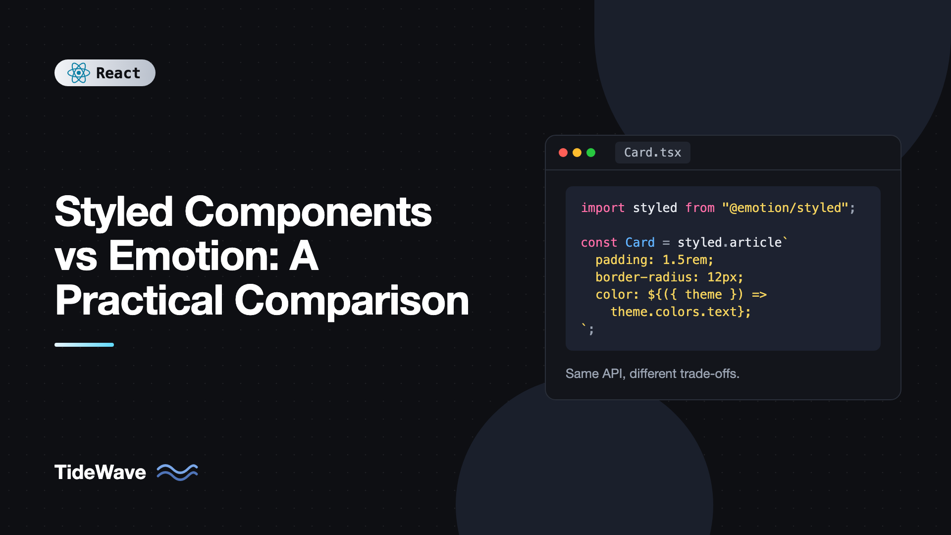
And in Emotion, the only change is the import:
import styled from "@emotion/styled";

const Card = styled.article`
  padding: 1.5rem;
  border-radius: 12px;
  background: white;
  box-shadow: 0 1px 3px rgb(0 0 0 / 0.1);

  h2 {
    margin: 0 0 0.5rem;
    font-size: 1.25rem;
  }

  &:hover {
    box-shadow: 0 4px 12px rgb(0 0 0 / 0.12);
  }
`;
Both libraries hash the styles, generate a class name, and inject a style tag into the document head when the component first renders. Emotion's styled also accepts object styles, which some teams prefer for type checking and autocomplete:
import styled from "@emotion/styled";

const Card = styled.article({
  padding: "1.5rem",
  borderRadius: 12,
  background: "white",
  "&:hover": { boxShadow: "0 4px 12px rgb(0 0 0 / 0.12)" },
});
styled-components also accepts style objects, but template literals are far more common in its ecosystem.
Props, Variants, and Prop Forwarding
Both libraries let styles depend on props through interpolated functions. The difference is in how they decide which props reach the DOM.
styled-components: Transient Props
In styled-components v6, every prop is forwarded to the underlying element unless you prefix it with $. These transient props are used for styling and then dropped:
import styled, { css } from "styled-components";

type ButtonStyleProps = {
  $variant?: "primary" | "outline";
  $fullWidth?: boolean;
};

export const Button = styled.button<ButtonStyleProps>`
  padding: 0.5rem 1rem;
  border-radius: 8px;
  font-weight: 600;
  cursor: pointer;
  width: ${({ $fullWidth }) => ($fullWidth ? "100%" : "auto")};

  ${({ $variant = "primary" }) =>
    $variant === "primary"
      ? css`
          background: #4f46e5;
          color: white;
          border: none;
        `
      : css`
          background: transparent;
          color: #4f46e5;
          border: 1px solid currentColor;
        `}
`;

// Usage
<Button $variant="outline" $fullWidth>
  Continue
</Button>;
If you forget the $ and pass variant to a button, React warns about an unknown attribute in development. v6 dropped the automatic prop filtering v5 used to do. You can restore it globally with StyleSheetManager and @emotion/is-prop-valid if you're migrating a large codebase.
Emotion: shouldForwardProp
Emotion forwards only valid HTML attributes to DOM elements automatically (it uses @emotion/is-prop-valid internally for string tags), so variant won't leak onto a button. When you wrap a custom component, or need precise control, use shouldForwardProp:
import styled from "@emotion/styled";
import { css } from "@emotion/react";

type ButtonStyleProps = {
  variant?: "primary" | "outline";
  fullWidth?: boolean;
};

export const Button = styled("button", {
  shouldForwardProp: (prop) => prop !== "variant" && prop !== "fullWidth",
})<ButtonStyleProps>`
  padding: 0.5rem 1rem;
  border-radius: 8px;
  font-weight: 600;
  cursor: pointer;
  width: ${({ fullWidth }) => (fullWidth ? "100%" : "auto")};

  ${({ variant = "primary" }) =>
    variant === "primary"
      ? css`
          background: #4f46e5;
          color: white;
          border: none;
        `
      : css`
          background: transparent;
          color: #4f46e5;
          border: 1px solid currentColor;
        `}
`;
On string tags, Emotion also drops $-prefixed props, since they aren't valid HTML attributes, so styled-components code that uses transient props usually keeps working after you switch the import.
Theming With TypeScript
Both libraries provide a ThemeProvider that makes a theme object available to every styled component's interpolations. Both rely on module augmentation to type it.
styled-components
// theme.ts
export const theme = {
  colors: {
    primary: "#4f46e5",
    text: "#111827",
    surface: "#ffffff",
  },
  radius: "8px",
} as const;

export type AppTheme = typeof theme;
// styled.d.ts
import "styled-components";
import type { AppTheme } from "./theme";

declare module "styled-components" {
  export interface DefaultTheme extends AppTheme {}
}
// App.tsx
import { ThemeProvider } from "styled-components";
import styled from "styled-components";
import { theme } from "./theme";

const Panel = styled.section`
  background: ${({ theme }) => theme.colors.surface};
  color: ${({ theme }) => theme.colors.text};
  border-radius: ${({ theme }) => theme.radius};
`;

export function App() {
  return (
    <ThemeProvider theme={theme}>
      <Panel>Hello</Panel>
    </ThemeProvider>
  );
}
Emotion
// emotion.d.ts
import "@emotion/react";
import type { AppTheme } from "./theme";

declare module "@emotion/react" {
  export interface Theme extends AppTheme {}
}
// App.tsx
import { ThemeProvider } from "@emotion/react";
import styled from "@emotion/styled";
import { theme } from "./theme";

const Panel = styled.section`
  background: ${({ theme }) => theme.colors.surface};
  color: ${({ theme }) => theme.colors.text};
  border-radius: ${({ theme }) => theme.radius};
`;

export function App() {
  return (
    <ThemeProvider theme={theme}>
      <Panel>Hello</Panel>
    </ThemeProvider>
  );
}
The only differences are the module you augment (styled-components with DefaultTheme, or @emotion/react with Theme) and where ThemeProvider comes from. If you use the as const theme above, the literal types make light and dark themes incompatible, so drop as const or define a shared interface when you need multiple themes.
Both libraries also expose a hook to read the theme in regular code: useTheme from styled-components or from @emotion/react.
Emotion's css Prop
This is the feature that most clearly separates the two. Emotion lets you style any element inline with a css prop, without creating a named component:
import { css } from "@emotion/react";

export function Alert({ message }: { message: string }) {
  return (
    <div
      role="alert"
      css={css`
        padding: 0.75rem 1rem;
        border-left: 4px solid #dc2626;
        background: #fef2f2;
        color: #991b1b;
      `}
    >
      {message}
    </div>
  );
}
The css prop also receives the theme if you pass a function: css={(theme) => ({ color: theme.colors.primary })}.
To enable it, set Emotion as the JSX import source. With Vite and TypeScript:
// vite.config.ts
import { defineConfig } from "vite";
import react from "@vitejs/plugin-react";

export default defineConfig({
  plugins: [
    react({
      jsxImportSource: "@emotion/react",
      babel: { plugins: ["@emotion/babel-plugin"] },
    }),
  ],
});
{
  "compilerOptions": {
    "jsx": "react-jsx",
    "jsxImportSource": "@emotion/react"
  }
}
The Babel plugin is optional but recommended. It adds readable labels to class names in development and source maps for styles.
styled-components has a css prop too, but it relies on its Babel plugin to transform the prop into a styled component at build time. It's less commonly used and isn't available with SWC-only setups unless you configure the SWC plugin.
Global Styles and Keyframes
Both libraries let you inject global CSS and define animations. styled-components uses a component factory:
import styled, { createGlobalStyle, keyframes } from "styled-components";

const GlobalStyle = createGlobalStyle`
  *, *::before, *::after { box-sizing: border-box; }
  body { margin: 0; font-family: system-ui, sans-serif; }
`;

const spin = keyframes`
  to { transform: rotate(360deg); }
`;

const Spinner = styled.div`
  width: 24px;
  height: 24px;
  border: 3px solid #e5e7eb;
  border-top-color: #4f46e5;
  border-radius: 50%;
  animation: ${spin} 0.8s linear infinite;
`;

export function Root() {
  return (
    <>
      <GlobalStyle />
      <Spinner aria-label="Loading" />
    </>
  );
}
Emotion uses a Global component with a styles prop:
import { Global, css, keyframes } from "@emotion/react";
import styled from "@emotion/styled";

const spin = keyframes`
  to { transform: rotate(360deg); }
`;

const Spinner = styled.div`
  width: 24px;
  height: 24px;
  border: 3px solid #e5e7eb;
  border-top-color: #4f46e5;
  border-radius: 50%;
  animation: ${spin} 0.8s linear infinite;
`;

export function Root() {
  return (
    <>
      <Global
        styles={css`
          *, *::before, *::after { box-sizing: border-box; }
          body { margin: 0; font-family: system-ui, sans-serif; }
        `}
      />
      <Spinner aria-label="Loading" />
    </>
  );
}
For CSS animations driven by component state or gestures, a dedicated library is usually a better fit. See animations in React with Motion.
Server Rendering and Server Components
Both libraries inject styles at runtime, so server rendering needs extra work to get the CSS into the HTML before it reaches the browser. Otherwise users see unstyled content until JavaScript runs.
styled-components uses ServerStyleSheet to collect styles during a server render. In frameworks with streaming, like the Next.js App Router, you create a small registry Client Component that collects styles and flushes them with useServerInsertedHTML. Next.js documents this setup and supports the library's SWC transform.
Emotion works with classic renderToString with little configuration, because it can insert style tags inline next to elements. Streaming setups need a custom cache and a similar registry pattern. MUI ships an AppRouterCacheProvider for exactly this reason.
Neither library works in React Server Components. Both depend on React context for theming and runtime injection, so every styled component must live in a file marked "use client". You can still use Server Components for data fetching, but your styled UI becomes client components. That's the biggest reason teams starting new RSC projects choose static approaches instead, as covered in CSS Modules vs Tailwind vs CSS-in-JS.
Performance
The two libraries perform similarly. Both hash and cache styles, so a component with the same props reuses its class name instead of regenerating CSS. Both add a runtime of roughly similar size to your bundle. In benchmarks, Emotion has historically been slightly faster at style serialization, but the difference rarely matters compared to your own component work.
What does matter is how you use them:
- Avoid interpolating values that change constantly. A prop that changes on every scroll or animation frame generates a new class each time. Use the
styleprop or a CSS variable instead. - Define styled components at module scope. Creating one inside a component body creates a new component type on every render, which remounts the subtree and throws away state.
- Prefer static styles with variants over long chains of prop functions where possible.
Project Status in 2026
This is now a significant factor. In 2025, the styled-components maintainer announced the library was entering maintenance mode: bug fixes and compatibility updates continue, but no new features are planned, and the recommendation for new projects is to look elsewhere. Emotion is still maintained but releases slowly, and it faces the same Server Components limitations.
Neither library is going to stop working tomorrow. Existing apps can keep using them for years. But for a new project, both are hard to recommend over static CSS approaches.
Which One Should You Use?
| Factor | styled-components | Emotion |
|---|---|---|
styled API | Yes | Yes |
Inline css prop | Via Babel or SWC plugin | First-class |
| Object styles | Supported | Common and well typed |
| Prop filtering | Transient $ props | Automatic plus shouldForwardProp |
| Theme typing | Augment DefaultTheme | Augment Theme |
| Server Components | Client only | Client only |
| Status | Maintenance mode | Maintained, slow releases |
- Already on one of them? Stay. Migrating between two runtime CSS-in-JS libraries buys you almost nothing.
- Using MUI or another Emotion-based kit? Use Emotion so you have one styling runtime.
- Starting fresh? Consider CSS Modules, Tailwind, or a zero-runtime library instead.
Common Mistakes With styled-components and Emotion
- Defining styled components inside render. It creates a new component on every render and remounts children.
- Forgetting transient props in styled-components v6. Unprefixed custom props are forwarded to the DOM and trigger React warnings.
- Mixing both libraries in one app. You ship two runtimes and maintain two theme providers.
- Interpolating high-frequency values. Scroll positions or animation frames should go through
styleor CSS variables. - Skipping SSR style collection. Without it, server-rendered pages flash unstyled content before hydration.
- Using
as constthemes for multiple themes. Literal types make light and dark theme objects incompatible. Define an explicit interface.
Frequently Asked Questions (FAQ) About Styled Components vs Emotion
Emotion has historically been slightly faster at serializing styles in benchmarks, but in real apps the difference is small. Both cache generated styles. How you use them, such as avoiding fast-changing interpolations and defining components at module scope, matters far more than which library you pick.
Not inside Server Components. Both rely on React context and runtime style injection, so styled components must be Client Components marked with use client. You can still fetch data in Server Components and pass it to styled Client Components.
It's in maintenance mode, not deprecated. The maintainer announced in 2025 that it would receive bug fixes and compatibility updates but no new features, and recommended other approaches for new projects. Existing apps can keep using it.
The styled API is nearly identical, so many files only need a changed import. The main work is converting transient $ props if you rely on them, changing theme type augmentation, and replacing createGlobalStyle with the Global component. It's rarely worth doing unless you're consolidating with an Emotion-based UI library.
It lets you style any JSX element inline by passing styles to a css attribute, without creating a named styled component. It requires setting jsxImportSource to @emotion/react in your compiler config so JSX is processed by Emotion's runtime.
MUI uses Emotion as its default styling engine. It can be configured to use styled-components through an adapter package, but Emotion is the default and the best supported option.
Conclusion
styled-components and Emotion share the same core idea and almost the same styled API. The differences are in the details: Emotion has a first-class css prop and automatic prop filtering, while styled-components uses transient $ props and a single-package install. Theming, global styles, and keyframes work the same way with slightly different imports, and both need extra SSR setup and can't run in Server Components.
If you maintain an app on either one, keep it, follow the performance rules above, and introduce a static approach for new components where it makes sense. If you're starting a new project, weigh the maintenance status and Server Components limits seriously before picking either, and consider whether a build-time solution gives you the same developer experience without the runtime cost.