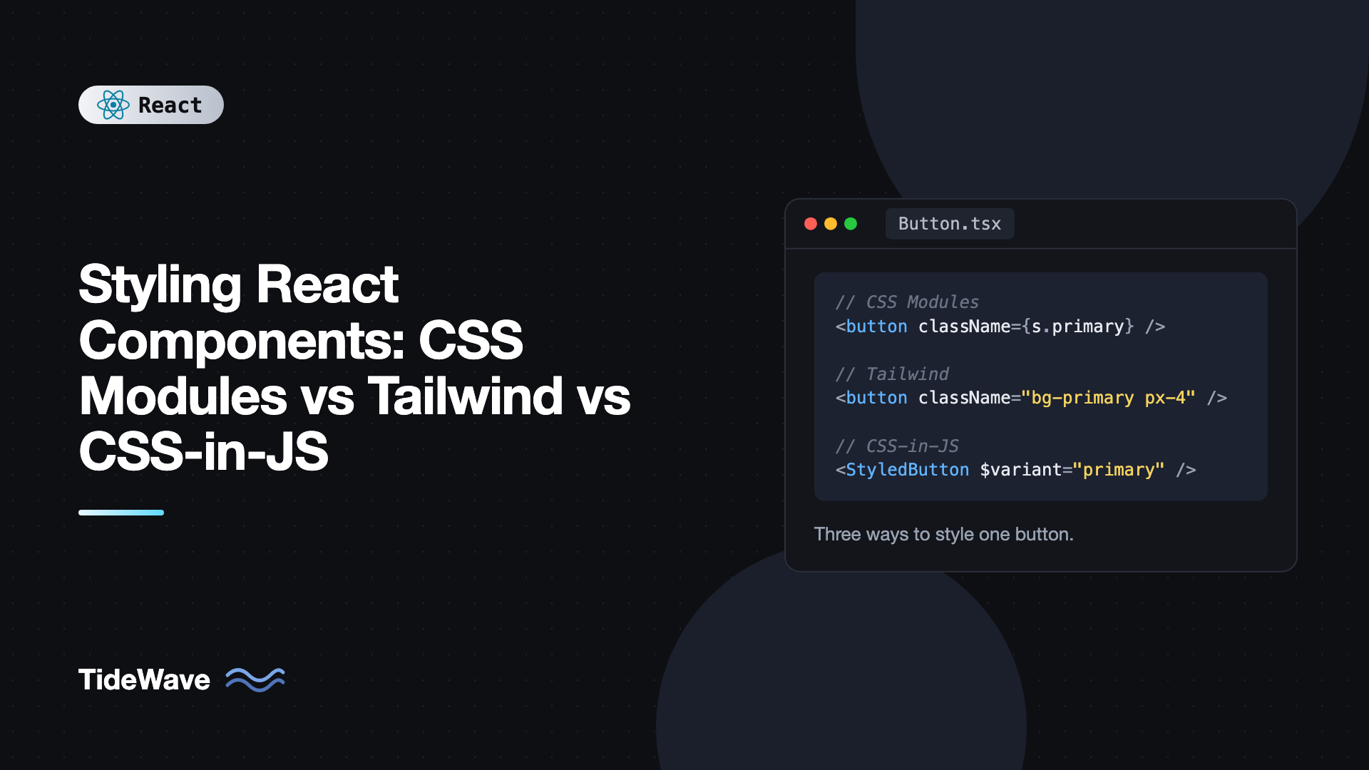
Styling React Components: CSS Modules vs Tailwind vs CSS-in-JS
React doesn't tell you how to style components, so every new project starts with the same argument. One developer wants plain CSS files, another wants Tailwind, and someone who worked on a 2019 codebase suggests styled-components. All three approaches can ship a good product. They differ in where styles live, how they're scoped, what they cost at runtime, and how well they fit the way React apps are built today.
The landscape has also shifted. Server Components made runtime CSS-in-JS awkward, styled-components moved into maintenance mode, and Tailwind v4 rebuilt its engine around native CSS features. Advice from a few years ago doesn't always hold.
In this post you'll build the same Button component three ways, then compare the approaches on scoping, dynamic styles, theming, performance, Server Components support, and team workflow, so you can pick one with clear reasons.
The Component We'll Build
A button with two variants (primary and ghost), two sizes, a disabled state, and a hover style. It's small, but it covers the things that make styling approaches differ: variants, conditional classes, pseudo-classes, and theme colors.
type ButtonProps = {
  variant?: "primary" | "ghost";
  size?: "sm" | "md";
} & React.ComponentProps<"button">;
Option 1: CSS Modules
CSS Modules are regular CSS files where every class name is scoped to the file that imports it. The build tool (Vite, Next.js, webpack) rewrites .button into something like _button_x7f2a_1, and gives you an object that maps the original names to the generated ones. Vite supports any file ending in .module.css with no configuration.
/* Button.module.css */
.button {
  display: inline-flex;
  align-items: center;
  gap: 0.5rem;
  border-radius: 8px;
  font-weight: 600;
  border: 1px solid transparent;
  cursor: pointer;
  transition: background-color 150ms;
}

.button:disabled {
  opacity: 0.5;
  cursor: not-allowed;
}

.sm {
  padding: 0.25rem 0.75rem;
  font-size: 0.875rem;
}

.md {
  padding: 0.5rem 1rem;
  font-size: 1rem;
}

.primary {
  background: var(--color-primary);
  color: white;
}

.primary:hover:not(:disabled) {
  background: var(--color-primary-hover);
}

.ghost {
  background: transparent;
  color: var(--color-primary);
  border-color: currentColor;
}

.ghost:hover:not(:disabled) {
  background: var(--color-primary-soft);
}
// Button.tsx
import type { ComponentProps } from "react";
import styles from "./Button.module.css";

type ButtonProps = {
  variant?: "primary" | "ghost";
  size?: "sm" | "md";
} & ComponentProps<"button">;

export function Button({
  variant = "primary",
  size = "md",
  className,
  ...rest
}: ButtonProps) {
  const classes = [styles.button, styles[variant], styles[size], className]
    .filter(Boolean)
    .join(" ");

  return <button className={classes} {...rest} />;
}
Strengths
- It's just CSS. Every CSS feature works: media queries, container queries,
:has(), nesting, cascade layers, animations. Nothing to learn beyond the language. - Zero runtime. Styles are extracted to static
.cssfiles at build time. - Works everywhere, including Server Components, because there's no JavaScript involved at render time.
- Clear separation. Designers who know CSS can work on the styles directly.
Weaknesses
- Two files per component and switching between them.
- Naming is still your job. Scoping prevents collisions, but you still invent
.wrapper,.inner, and.contenteverywhere. - Dead CSS is easy to accumulate. Nothing tells you a class is unused after a refactor.
- Dynamic values need CSS custom properties passed through
style, which is fine but slightly manual.
Theming works best with CSS custom properties defined globally, as in the var(--color-primary) calls above. That's also how you'd build a dark mode toggle without touching component styles.
Option 2: Tailwind CSS
Tailwind gives you small, single-purpose utility classes and has you compose them in markup. In v4 you install it as a Vite plugin and import it once:
npm install tailwindcss @tailwindcss/vite
// vite.config.ts
import { defineConfig } from "vite";
import react from "@vitejs/plugin-react";
import tailwindcss from "@tailwindcss/vite";

export default defineConfig({
  plugins: [react(), tailwindcss()],
});
/* src/index.css */
@import "tailwindcss";

@theme {
  --color-primary: oklch(0.55 0.2 260);
  --color-primary-hover: oklch(0.48 0.2 260);
  --color-primary-soft: oklch(0.95 0.03 260);
}
Every --color-* variable inside @theme becomes a set of utilities like bg-primary and text-primary. Now the button:
// Button.tsx
import type { ComponentProps } from "react";

const base =
  "inline-flex items-center gap-2 rounded-lg font-semibold border border-transparent cursor-pointer transition-colors disabled:opacity-50 disabled:cursor-not-allowed";

const variants = {
  primary: "bg-primary text-white hover:enabled:bg-primary-hover",
  ghost:
    "bg-transparent text-primary border-current hover:enabled:bg-primary-soft",
};

const sizes = {
  sm: "px-3 py-1 text-sm",
  md: "px-4 py-2 text-base",
};

type ButtonProps = {
  variant?: keyof typeof variants;
  size?: keyof typeof sizes;
} & ComponentProps<"button">;

export function Button({
  variant = "primary",
  size = "md",
  className = "",
  ...rest
}: ButtonProps) {
  return (
    <button
      className={`${base} ${variants[variant]} ${sizes[size]} ${className}`}
      {...rest}
    />
  );
}
Strength
- One file per component. Styles sit next to the markup they affect.
- A constrained design system by default. Spacing, colors, and type sizes come from a shared scale, so values stay consistent across a team.
- Small, predictable CSS. Tailwind only generates classes it finds in your source, and the output barely grows as the app grows, because
px-4is shared everywhere. - Zero runtime and Server Component friendly, since the output is a static stylesheet.
- No naming. You never decide what to call a wrapper div.
Weaknesse
- Long class strings can be hard to scan, especially with many states and breakpoints.
- Class conflicts. Passing
className="px-8"to a button that already haspx-4doesn't reliably win, because CSS order decides, not class order. You need a helper liketailwind-merge. - Dynamic class names don't work. Tailwind scans source files for complete class strings, so
bg-${color}-500is never generated. - A learning curve for the utility names, though editor autocomplete covers most of it.
Patterns for keeping Tailwind components tidy, like variant maps, cn() helpers, and when to extract components, are covered in using Tailwind CSS effectively in React.
Option 3: CSS-in-JS
CSS-in-JS means writing styles in JavaScript, usually as tagged template literals or objects, and letting a library generate and inject class names. There are two families, and the difference matters a lot today.
Runtime CSS-in-JS
Libraries like styled-components and Emotion generate CSS while your components render and inject style tags into the document.
// Button.tsx
import styled, { css } from "styled-components";

type Variant = "primary" | "ghost";
type Size = "sm" | "md";

export const Button = styled.button<{ $variant?: Variant; $size?: Size }>`
  display: inline-flex;
  align-items: center;
  gap: 0.5rem;
  border-radius: 8px;
  font-weight: 600;
  border: 1px solid transparent;
  cursor: pointer;
  transition: background-color 150ms;

  &:disabled {
    opacity: 0.5;
    cursor: not-allowed;
  }

  ${({ $size = "md" }) =>
    $size === "sm"
      ? css`
          padding: 0.25rem 0.75rem;
          font-size: 0.875rem;
        `
      : css`
          padding: 0.5rem 1rem;
          font-size: 1rem;
        `}

  ${({ $variant = "primary", theme }) =>
    $variant === "primary"
      ? css`
          background: ${theme.colors.primary};
          color: white;
          &:hover:not(:disabled) {
            background: ${theme.colors.primaryHover};
          }
        `
      : css`
          background: transparent;
          color: ${theme.colors.primary};
          border-color: currentColor;
        `}
`;
The $ prefix marks transient props that styled-components uses for styling but doesn't forward to the DOM, which avoids React's unknown-attribute warnings. The theme object comes from a ThemeProvider higher in the tree.
Strengths: styles are colocated, any prop or theme value can drive any CSS property, and the developer experience is pleasant. Weaknesses are mostly about runtime:
- Style computation on render adds work to every render that changes props, and serializing styles shows up in profiles on large lists.
- Larger JavaScript bundle, since the library ships to the browser.
- SSR needs extra setup to collect styles and inject them into the HTML.
- Server Components can't use them. They depend on React context, so any styled component must be a Client Component. In an RSC app, that pushes
"use client"far down your tree. - Maintenance status. styled-components announced in 2025 that it's in maintenance mode, which means no new features. That's a real factor for a new project.
Styled Components vs Emotion goes deeper on these two if you're maintaining an app that uses them.
Zero-runtime CSS-in-JS
Libraries like vanilla-extract, Linaria, and Panda CSS let you write styles in TypeScript but extract them to static CSS at build time. Here's the button in vanilla-extract with its recipe API:
// button.css.ts
import { recipe } from "@vanilla-extract/recipes";
import { vars } from "./theme.css";

export const button = recipe({
  base: {
    display: "inline-flex",
    alignItems: "center",
    gap: "0.5rem",
    borderRadius: 8,
    fontWeight: 600,
    border: "1px solid transparent",
    cursor: "pointer",
    selectors: {
      "&:disabled": { opacity: 0.5, cursor: "not-allowed" },
    },
  },
  variants: {
    variant: {
      primary: { background: vars.color.primary, color: "white" },
      ghost: {
        background: "transparent",
        color: vars.color.primary,
        borderColor: "currentColor",
      },
    },
    size: {
      sm: { padding: "0.25rem 0.75rem", fontSize: "0.875rem" },
      md: { padding: "0.5rem 1rem", fontSize: "1rem" },
    },
  },
  defaultVariants: { variant: "primary", size: "md" },
});
// Button.tsx
import type { ComponentProps } from "react";
import { button } from "./button.css";

type ButtonProps = {
  variant?: "primary" | "ghost";
  size?: "sm" | "md";
} & ComponentProps<"button">;

export function Button({ variant, size, className, ...rest }: ButtonProps) {
  return (
    <button
      className={[button({ variant, size }), className]
        .filter(Boolean)
        .join(" ")}
      {...rest}
    />
  );
}
This assumes a theme.css.ts that defines vars with createTheme or createGlobalTheme. You get type-safe tokens and variants, static CSS, and Server Component support. The trade-off is a build plugin and the rule that styles live in .css.ts files, so they can't depend on runtime props. Dynamic values go through CSS variables, the same as with CSS Modules.
Comparing the Approaches
Dynamic Styles
All three can handle variants. The difference is truly dynamic values, like a progress bar width or a user-chosen color.
With CSS Modules, Tailwind, and zero-runtime CSS-in-JS, the clean answer is a CSS custom property:
export function ProgressBar({ value }: { value: number }) {
  return (
    <div className="h-2 w-full rounded bg-gray-200">
      <div
        className="h-full rounded bg-primary w-(--progress)"
        style={{ "--progress": `${value}%` } as React.CSSProperties}
      />
    </div>
  );
}
w-(--progress) is Tailwind v4 shorthand for width: var(--progress). In CSS Modules you'd write width: var(--progress) in the stylesheet. Runtime CSS-in-JS can interpolate the value directly, which is convenient, but it generates a new class for every distinct value, which is wasteful for anything that changes often.
Performance
Static CSS (CSS Modules, Tailwind, zero-runtime libraries) costs nothing at render time. The browser downloads one stylesheet, parses it once, and React only toggles class names. Runtime CSS-in-JS adds style serialization and injection to the render path. On a typical page you won't notice, but in large lists, frequent re-renders, or low-end devices it can show up in a profile.
Bundle size follows the same pattern: Tailwind and CSS Modules add no JavaScript, while runtime libraries add their own code to every page.
Server Components
If you're using React Server Components through a framework, this is often the deciding factor. CSS Modules, Tailwind, and zero-runtime CSS-in-JS all work in Server Components because the output is a stylesheet. Runtime CSS-in-JS requires Client Components and a style registry for SSR.
Theming
All three handle theming well if you lean on CSS custom properties. Tailwind v4's @theme block generates utilities from variables, CSS Modules can read global variables directly, and zero-runtime libraries generate typed variable contracts. Runtime CSS-in-JS has a JavaScript theme object, which is flexible but means theme switches re-render styled components instead of just swapping variables.
Team Workflow
- CSS Modules suit teams with strong CSS skills and designers who touch code.
- Tailwind suits teams that want consistency without a long style guide, and it pairs naturally with component libraries like shadcn/ui.
- Zero-runtime CSS-in-JS suits TypeScript-heavy teams building a design system that wants typed tokens and variants.
- Runtime CSS-in-JS mostly makes sense if you already have a codebase built on it.
Quick Decision Guide
| Situation | Good default |
|---|---|
| New app, any framework, want speed and consistency | Tailwind CSS |
| Team prefers writing real CSS, minimal tooling | CSS Modules |
| Design system with typed tokens and variants | vanilla-extract or Panda CSS |
| Existing large styled-components or Emotion app | Keep it, migrate gradually |
| Heavy use of Server Components | Anything except runtime CSS-in-JS |
You can also mix them. A common setup is Tailwind for most UI and a CSS Module for one complex component, like a rich text editor or a chart, where plain CSS is easier to read.
Common Mistakes When Choosing a Styling Approach
- Choosing runtime CSS-in-JS for a new Server Components app. You'll fight
"use client"boundaries everywhere. - Building dynamic Tailwind class names. Strings like
text-${color}-600never get generated. Map props to complete class names instead. - Using global CSS for components. Unscoped class names collide as the app grows. Use modules or utilities for component styles and keep global CSS for resets and tokens.
- Hardcoding colors in components. Whatever approach you pick, read colors from CSS variables or theme tokens so dark mode and rebrands don't require editing every file.
- Interpolating fast-changing values in runtime CSS-in-JS. Animation frames or scroll positions generate a new class each time. Use inline
styleor CSS variables for those. - Mixing approaches without a rule. Two systems are fine if everyone knows when to use which. Three or four with no guidelines become hard to maintain.
Frequently Asked Questions (FAQ) About Styling React Components
Approaches that produce static CSS at build time are the fastest at runtime: CSS Modules, Tailwind CSS, and zero-runtime CSS-in-JS like vanilla-extract. They don't do any style work during render. Runtime CSS-in-JS adds serialization and style injection to rendering, which is usually small but measurable in large or frequently updating trees.
Runtime CSS-in-JS is declining for new projects, mostly because of Server Components and performance concerns, and styled-components is now in maintenance mode. Zero-runtime CSS-in-JS is alive and well, since it keeps the authoring experience but outputs static CSS.
Yes. Both produce plain CSS, so they coexist without conflict. Many teams use Tailwind for most components and a CSS Module for a few complex pieces where writing real CSS is clearer. Tailwind v4 also lets you use the @apply directive and theme variables inside other stylesheets if you need them.
Yes. CSS Modules compile to static CSS files and a class name map, so there's nothing that needs to run in the browser. You can import a module stylesheet in a Server Component the same way you would in a Client Component.
Define colors as CSS custom properties and switch their values with a class or data attribute on the root element. CSS Modules and zero-runtime libraries read those variables directly, and Tailwind v4 can map them to utilities through its theme. This avoids re-rendering components when the theme changes.
Not all at once. If the app works and performance is fine, there's no urgency. For new components, consider a static approach, and migrate old ones when you're already changing them. Prioritize components in Server Component paths or hot render paths if you see style work in your profiles.
Conclusion
CSS Modules give you scoped, standard CSS with no runtime. Tailwind gives you colocated utility classes, a built-in design scale, and tiny output. CSS-in-JS gives you styles in TypeScript, either at runtime with flexible but costly libraries like styled-components and Emotion, or at build time with vanilla-extract and Panda CSS. For new projects, especially ones using Server Components, the static options are the safer choice.
Pick one based on your team's skills and your rendering model, write down when (if ever) a second approach is allowed, and put your design tokens in CSS custom properties from day one. That last step makes theming, dark mode, and any future migration far easier, no matter which tool you choose.