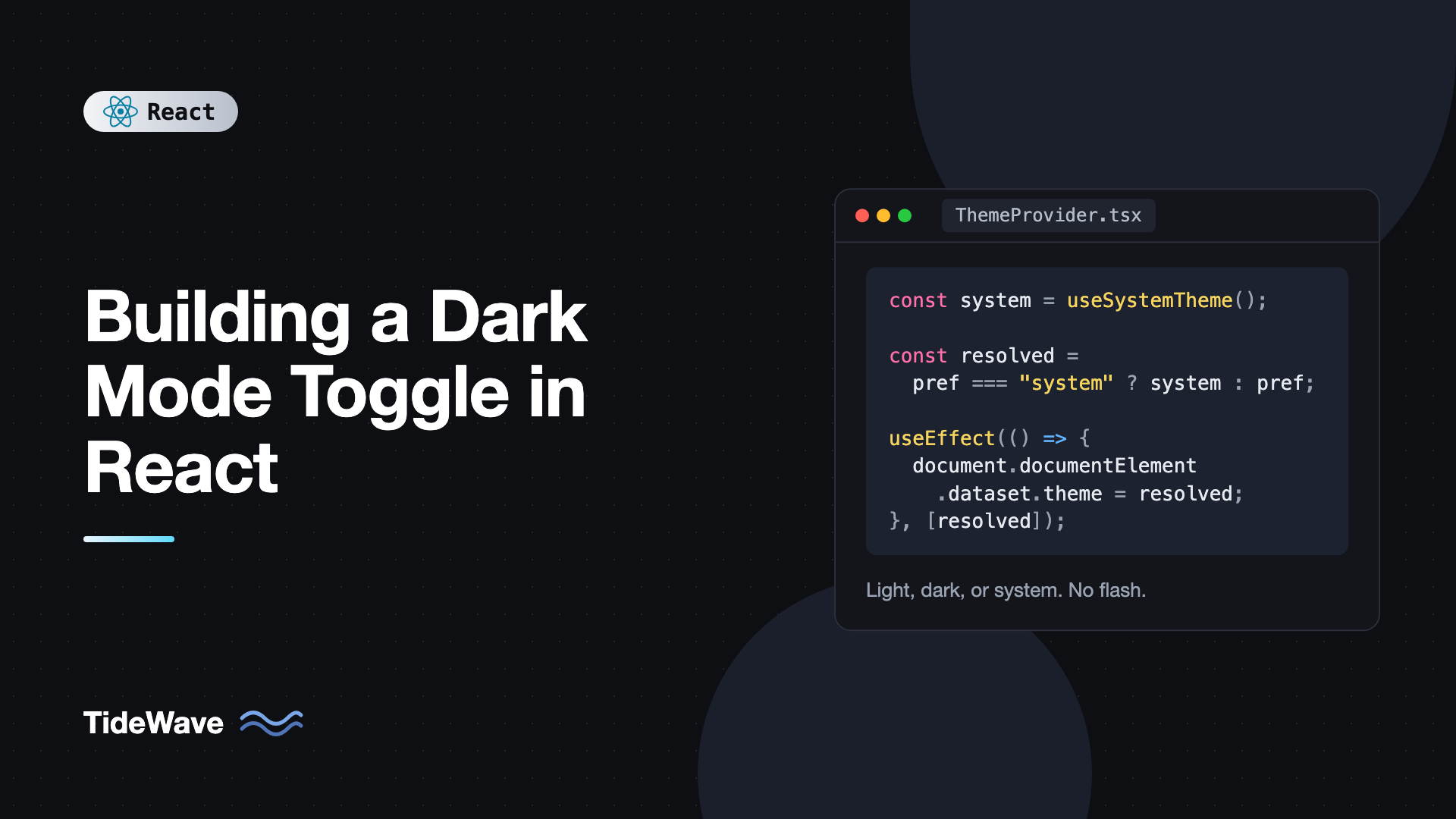
Building a Dark Mode Toggle in React
A dark mode toggle looks like a five-minute feature: a boolean in state and a class on the body. Then the bugs show up. The page flashes white before turning dark on every reload. The toggle ignores the operating system setting. Users who switch their OS theme at sunset don't see the site follow along. Scrollbars and form inputs stay bright in dark mode. Two components disagree about which theme is active.
A solid implementation handles all of these, and it isn't much more code than the naive version once you see the pieces. The trick is letting CSS do the styling, letting the browser tell you the system preference, and letting React manage only the user's choice.
In this post you'll build a three-option theme switcher (light, dark, and system) with CSS custom properties, localStorage persistence, a tiny inline script that prevents the flash on load, a context and hook for reading the theme anywhere, live updates when the OS theme changes, and an optional Tailwind setup.
The Approach
Here's the plan before any code:
- Colors live in CSS custom properties. Components use
var(--color-bg)and similar, never hardcoded colors. - A
data-themeattribute onhtmlswitches those variables between light and dark values. - The user's preference is one of
"light","dark", or"system", stored inlocalStorage. - The resolved theme is what's actually applied. For
"system", it comes from theprefers-color-schememedia query. - An inline script in
index.htmlsetsdata-themebefore React loads, so the first paint is already correct.
Keeping preference and resolved theme separate is what makes "system" work properly. A user who chooses "system" and then changes their OS setting should see the site change too.
Defining Theme Colors With CSS Variables
Start with semantic color tokens. Name them by role (background, text, border), not by value (white, gray-900), so the same names work in both themes.
/* src/theme.css */
:root {
  --color-bg: #ffffff;
  --color-surface: #f8fafc;
  --color-text: #0f172a;
  --color-muted: #64748b;
  --color-border: #e2e8f0;
  --color-accent: #4f46e5;
  color-scheme: light;
}

:root[data-theme="dark"] {
  --color-bg: #0b1120;
  --color-surface: #111827;
  --color-text: #e5e7eb;
  --color-muted: #94a3b8;
  --color-border: #1f2937;
  --color-accent: #818cf8;
  color-scheme: dark;
}

body {
  background: var(--color-bg);
  color: var(--color-text);
}
The color-scheme property is easy to forget and important. It tells the browser to render built-in UI, like scrollbars, form controls, date pickers, and the default background, in the matching theme. Without it, a dark page still gets bright white scrollbars and inputs.
Any component styled with these variables now switches automatically:
.card {
  background: var(--color-surface);
  border: 1px solid var(--color-border);
  color: var(--color-text);
}
This works the same with CSS Modules, plain CSS, or Tailwind. If you're still deciding on a styling approach, CSS Modules vs Tailwind vs CSS-in-JS compares them.
Preventing the Flash on Load
React renders after your JavaScript bundle downloads and runs. If you only set the theme in a useEffect, the browser paints the default light theme first and then switches, which is the infamous flash. On a slow connection that can last a second or more.
The fix is a small, blocking inline script in the head of index.html that runs before the body is painted:
<!doctype html>
<html lang="en">
  <head>
    <meta charset="UTF-8" />
    <meta name="viewport" content="width=device-width, initial-scale=1.0" />
    <script>
      (function () {
        try {
          var pref = localStorage.getItem("theme") || "system";
          var dark =
            pref === "dark" ||
            (pref === "system" &&
              window.matchMedia("(prefers-color-scheme: dark)").matches);
          document.documentElement.dataset.theme = dark ? "dark" : "light";
        } catch (e) {
          document.documentElement.dataset.theme = "light";
        }
      })();
    </script>
    <title>My App</title>
  </head>
  <body>
    <div id="root"></div>
    <script type="module" src="/src/main.tsx"></script>
  </body>
</html>
Keep it tiny and dependency-free. It's inline, so it doesn't add a network request, and the try block protects against browsers where localStorage throws (some privacy modes do).
If you server-render with a framework, put the same script in the root layout's head. Because the script changes the html element before hydration, add suppressHydrationWarning to the html tag so React doesn't warn about the attribute mismatch.
Reading the System Preference
The system theme can change while the page is open, for example when macOS switches to dark mode at sunset. You want a value that updates live. useSyncExternalStore is designed exactly for subscribing to browser state like a media query:
// src/theme/useSystemTheme.ts
import { useSyncExternalStore } from "react";

const query = "(prefers-color-scheme: dark)";

function subscribe(callback: () => void) {
  const mql = window.matchMedia(query);
  mql.addEventListener("change", callback);
  return () => mql.removeEventListener("change", callback);
}

function getSnapshot() {
  return window.matchMedia(query).matches;
}

function getServerSnapshot() {
  return false;
}

export function useSystemTheme(): "light" | "dark" {
  const prefersDark = useSyncExternalStore(
    subscribe,
    getSnapshot,
    getServerSnapshot
  );
  return prefersDark ? "dark" : "light";
}
The functions are defined at module scope so they're stable, which keeps React from resubscribing on every render. The details of this hook are covered in useSyncExternalStore for external data sources.
The Theme Context
Now a provider that owns the user's preference, resolves it, applies it to the document, and exposes it to the rest of the app.
// src/theme/ThemeProvider.tsx
import {
  createContext,
  useContext,
  useEffect,
  useState,
  type ReactNode,
} from "react";
import { useSystemTheme } from "./useSystemTheme";

export type ThemePreference = "light" | "dark" | "system";
export type ResolvedTheme = "light" | "dark";

type ThemeContextValue = {
  preference: ThemePreference;
  resolved: ResolvedTheme;
  setPreference: (pref: ThemePreference) => void;
};

const ThemeContext = createContext<ThemeContextValue | null>(null);

const STORAGE_KEY = "theme";

function readStoredPreference(): ThemePreference {
  try {
    const value = localStorage.getItem(STORAGE_KEY);
    if (value === "light" || value === "dark" || value === "system") {
      return value;
    }
  } catch {
    // storage unavailable
  }
  return "system";
}

export function ThemeProvider({ children }: { children: ReactNode }) {
  const [preference, setPreferenceState] =
    useState<ThemePreference>(readStoredPreference);
  const systemTheme = useSystemTheme();

  const resolved: ResolvedTheme =
    preference === "system" ? systemTheme : preference;

  useEffect(() => {
    document.documentElement.dataset.theme = resolved;
  }, [resolved]);

  function setPreference(pref: ThemePreference) {
    setPreferenceState(pref);
    try {
      localStorage.setItem(STORAGE_KEY, pref);
    } catch {
      // ignore write failures
    }
  }

  return (
    <ThemeContext value={{ preference, resolved, setPreference }}>
      {children}
    </ThemeContext>
  );
}

export function useTheme() {
  const ctx = useContext(ThemeContext);
  if (!ctx) throw new Error("useTheme must be used inside ThemeProvider");
  return ctx;
}
A few decisions worth explaining:
resolvedis derived, not stored. It's computed frompreferenceandsystemThemeduring render, so the two can never get out of sync. Storing it in a separate state would be a classic derived state mistake.- The lazy initializer
useState(readStoredPreference)reads storage once on mount, not every render. - The effect syncs the DOM attribute. On first render it writes the same value the inline script already set, so nothing visibly changes.
- React 19 context syntax renders
ThemeContextdirectly as the provider.
In an SSR app, the lazy initializer would read localStorage on the server, where it doesn't exist, and the try returns "system". That's fine for the attribute because the inline script already handled it, but if you render preference-dependent UI, render it only after mount to avoid hydration mismatches.
Wrap your app once:
// src/main.tsx
import { StrictMode } from "react";
import { createRoot } from "react-dom/client";
import { ThemeProvider } from "./theme/ThemeProvider";
import { App } from "./App";
import "./theme.css";

createRoot(document.getElementById("root")!).render(
  <StrictMode>
    <ThemeProvider>
      <App />
    </ThemeProvider>
  </StrictMode>
);
Building the Toggle
With three options, a segmented control (a radio group) is clearer than a single button. Users can see which option is active and pick "system" explicitly.
// src/theme/ThemeSwitcher.tsx
import { useTheme, type ThemePreference } from "./ThemeProvider";

const options: { value: ThemePreference; label: string; icon: string }[] = [
  { value: "light", label: "Light", icon: "☀️" },
  { value: "dark", label: "Dark", icon: "🌙" },
  { value: "system", label: "System", icon: "💻" },
];

export function ThemeSwitcher() {
  const { preference, setPreference } = useTheme();

  return (
    <fieldset className="theme-switcher">
      <legend className="sr-only">Color theme</legend>
      {options.map((opt) => (
        <label key={opt.value} className="theme-option">
          <input
            type="radio"
            name="theme"
            value={opt.value}
            checked={preference === opt.value}
            onChange={() => setPreference(opt.value)}
          />
          <span aria-hidden="true">{opt.icon}</span>
          <span>{opt.label}</span>
        </label>
      ))}
    </fieldset>
  );
}
Native radio inputs give you arrow-key navigation, correct screen reader announcements, and form semantics for free. Style the inputs visually hidden and highlight the checked label:
.theme-switcher {
  display: inline-flex;
  gap: 0.25rem;
  padding: 0.25rem;
  border: 1px solid var(--color-border);
  border-radius: 999px;
}

.theme-option {
  display: inline-flex;
  align-items: center;
  gap: 0.375rem;
  padding: 0.375rem 0.75rem;
  border-radius: 999px;
  cursor: pointer;
  color: var(--color-muted);
}

.theme-option input {
  position: absolute;
  opacity: 0;
  pointer-events: none;
}

.theme-option:has(input:checked) {
  background: var(--color-surface);
  color: var(--color-text);
}

.theme-option:has(input:focus-visible) {
  outline: 2px solid var(--color-accent);
  outline-offset: 2px;
}

.sr-only {
  position: absolute;
  width: 1px;
  height: 1px;
  overflow: hidden;
  clip-path: inset(50%);
  white-space: nowrap;
}
A Simple Two-State Button
If you only want light and dark, a single button works. Use aria-pressed or a clear label that describes the action:
import { useTheme } from "./ThemeProvider";

export function ThemeToggleButton() {
  const { resolved, setPreference } = useTheme();
  const next = resolved === "dark" ? "light" : "dark";

  return (
    <button
      type="button"
      onClick={() => setPreference(next)}
      aria-label={`Switch to ${next} mode`}
    >
      {resolved === "dark" ? "☀️" : "🌙"}
    </button>
  );
}
Note that clicking this always stores an explicit choice, so the user leaves "system" mode. That's usually what people expect from a single toggle.
Syncing Across Tabs
If a user has two tabs open and changes the theme in one, the other stays stale. The storage event fires in other tabs when localStorage changes, so add a listener in the provider:
useEffect(() => {
  function onStorage(e: StorageEvent) {
    if (e.key !== STORAGE_KEY) return;
    const value = e.newValue;
    if (value === "light" || value === "dark" || value === "system") {
      setPreferenceState(value);
    }
  }
  window.addEventListener("storage", onStorage);
  return () => window.removeEventListener("storage", onStorage);
}, []);
Using It With Tailwind CSS
Tailwind v4's dark: variant follows the OS preference by default. To make it follow your data-theme attribute instead, redefine the variant:
@import "tailwindcss";

@custom-variant dark (&:where([data-theme="dark"], [data-theme="dark"] *));
Now dark:bg-slate-900 applies whenever the root has data-theme="dark". Even better, map your CSS variables into the theme so most components never need dark::
@theme inline {
  --color-canvas: var(--color-bg);
  --color-panel: var(--color-surface);
  --color-fg: var(--color-text);
}
The inline keyword makes the generated utilities reference your variables directly, so bg-canvas, bg-panel, and text-fg follow whatever your data-theme rules set. Use new names here rather than reusing --color-bg, because a variable that references itself is invalid. More patterns are in using Tailwind CSS effectively in React.
Extra Polish
- Update the browser chrome color. Mobile browsers use
meta name="theme-color"for the address bar. You can include two tags withmedia="(prefers-color-scheme: dark)"andmedia="(prefers-color-scheme: light)", or update a single tag'scontentin the provider's effect. - Disable transitions during the switch. If you have
transition: background-coloron many elements, switching themes animates everything at once, which looks messy. Add a class that setstransition: noneon all elements, switch the theme, then remove the class on the next frame. - Handle images. Logos and diagrams might need dark variants. Use the
pictureelement with asourcethat hasmedia="(prefers-color-scheme: dark)"for system mode, or swap thesrcbased onresolved.
Common Mistakes With Dark Mode in React
- Setting the theme only in
useEffect. The page paints in the default theme first. Use an inline script in thehead. - Storing the resolved theme instead of the preference. You lose the ability to follow the OS when the user chose "system."
- Forgetting
color-scheme. Scrollbars, inputs, and native controls stay light in dark mode. - Hardcoding colors in components. Every hardcoded hex value is a spot that won't switch. Use semantic CSS variables.
- Re-rendering the whole app to switch themes. With CSS variables, only the attribute changes. Avoid passing theme colors through React props or context values that every component reads.
- Ignoring storage failures.
localStoragecan throw in private modes or when disabled. Wrap reads and writes intry. - Building the toggle from a
div. Use a button or radio inputs so it's keyboard accessible and announced correctly.
Frequently Asked Questions (FAQ) About Dark Mode in React
Set the theme before the first paint with a small inline script in the document head. It reads the stored preference and the system setting, then sets a data-theme attribute on the html element. React effects run too late, after the browser has already painted.
Either works. A data-theme attribute is slightly more expressive because it can hold more than two values, like a high-contrast theme. A dark class is a common convention with Tailwind. Pick one and use it consistently in CSS and in your inline script.
Read the prefers-color-scheme media query with matchMedia and subscribe to its change event. Offer a system option that uses that value, and default to it when the user hasn't made a choice.
No. A context provider, a media query hook, and an inline script cover everything in under 100 lines. Libraries like next-themes package the same ideas for specific frameworks, which can save time, but the approach is the same.
It tells the browser which color schemes your page supports, so it renders built-in UI to match. Setting it to dark makes scrollbars, form controls, and the default canvas dark. Without it, native elements stay light even when your own styles are dark.
Yes, but be selective. Transitioning background and text colors on every element can look janky. A common approach is a short transition on the body only, or using the View Transitions API with document.startViewTransition to crossfade the whole page.
Conclusion
A reliable dark mode toggle has a few moving parts that each solve one problem. CSS variables and color-scheme handle the styling. An inline script in the head prevents the flash. useSyncExternalStore tracks the OS preference live. A context stores the user's choice of light, dark, or system and derives the resolved theme from it. A radio group makes the switcher accessible.
Start by moving your hardcoded colors into semantic variables, because that's the step everything else depends on. Then add the inline script and provider from this post, and test the cases that usually break: reloading in dark mode, switching the OS theme while the page is open, and using two tabs at once.