Accessibility Best Practices for React Developers
React makes it easy to build interfaces out of anything. A div with an onClick looks and behaves like a button for a mouse user, so it ships. Then someone tries to reach it with the Tab key, or a screen reader announces it as "group", and the feature simply doesn't exist for them. Most accessibility bugs in React apps aren't exotic. They come from a handful of habits repeated across hundreds of components.
The good news is that the same component model that spreads those bugs also lets you fix them once. If your Button, Dialog, TextField, and Toast components are accessible, every screen built from them inherits that work.
This guide covers the practices that matter most in day-to-day React work: semantic elements, labelling, when and how to use ARIA, focus handling after route changes and dialogs, live regions for async updates, motion preferences, and how to catch regressions automatically in your tests.
Start With Semantic HTML
The single most effective accessibility practice is using the right HTML element. Native elements come with keyboard support, focus behavior, and a role that assistive technology already understands. You get all of it for free.
Compare these two buttons:
// Inaccessible: not focusable, no role, no keyboard activation
function BadButton({ onClick }: { onClick: () => void }) {
  return (
    <div className="btn" onClick={onClick}>
      Save
    </div>
  );
}

// Accessible: focusable, announced as "button", Enter and Space work
function GoodButton({ onClick }: { onClick: () => void }) {
  return (
    <button type="button" className="btn" onClick={onClick}>
      Save
    </button>
  );
}
To make the div version equivalent, you'd need role="button", tabIndex={0}, an onKeyDown handler for Enter and Space, and disabled-state handling. That's a lot of code to recreate something the browser already provides.
A quick mapping for common UI:
- Actions that do something on the page:
<button>. - Navigation to another URL:
<a href>(or your router'sLink, which renders one). - Page regions:
<header>,<nav>,<main>,<aside>,<footer>. - Lists of things:
<ul>/<ol>with<li>. - Tabular data:
<table>with<th scope="col">. - Grouped form controls:
<fieldset>with<legend>.
Headings deserve special attention. Screen reader users often navigate by heading, so each page should have one h1 and a logical outline beneath it. Don't pick heading levels for their font size. Style them with CSS instead.
Fragments Keep the DOM Clean
React components often wrap output in a div just to return a single root. Inside lists and tables, that extra element breaks semantics: a div between a ul and its li children is invalid, and screen readers may stop announcing the list correctly. Use a fragment:
function NavItems() {
  return (
    <>
      <li>
        <a href="/docs">Docs</a>
      </li>
      <li>
        <a href="/blog">Blog</a>
      </li>
    </>
  );
}
Label Every Form Control
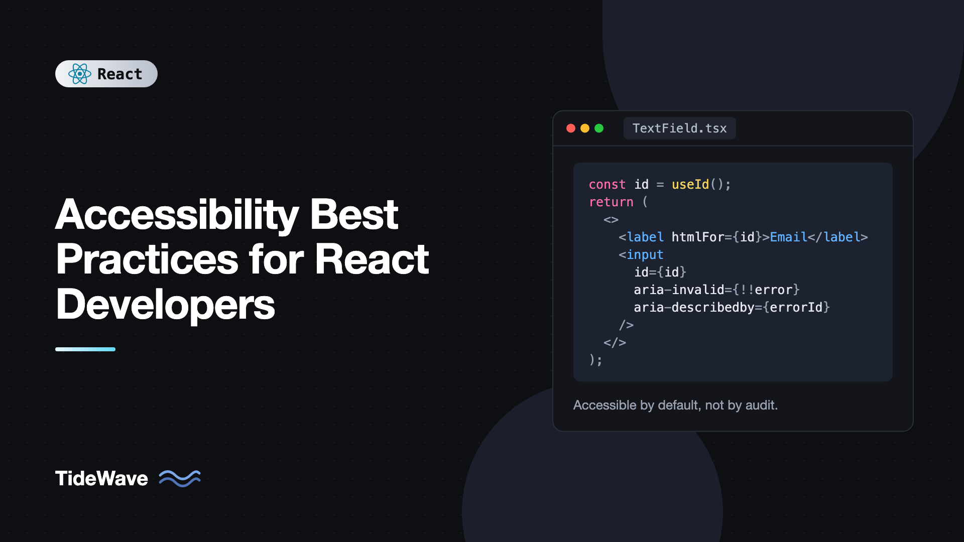
Every input needs an accessible name. The most reliable way is a <label> tied to the input's id. In React, use useId to generate that id, so the component works no matter how many times it's rendered on the page:
import { useId, type InputHTMLAttributes } from "react";

type TextFieldProps = InputHTMLAttributes<HTMLInputElement> & {
  label: string;
  hint?: string;
  error?: string;
};

export function TextField({
  label,
  hint,
  error,
  ...inputProps
}: TextFieldProps) {
  const id = useId();
  const hintId = `${id}-hint`;
  const errorId = `${id}-error`;

  const describedBy = [hint ? hintId : null, error ? errorId : null]
    .filter(Boolean)
    .join(" ");

  return (
    <div className="field">
      <label htmlFor={id}>{label}</label>
      {hint && (
        <p id={hintId} className="hint">
          {hint}
        </p>
      )}
      <input
        id={id}
        aria-invalid={error ? true : undefined}
        aria-describedby={describedBy || undefined}
        {...inputProps}
      />
      {error && (
        <p id={errorId} className="error">
          {error}
        </p>
      )}
    </div>
  );
}
This component does several things right:
htmlForconnects the label, so clicking the label focuses the input and screen readers read "Email, edit text".aria-describedbyattaches the hint and error text, which are read after the label.aria-invalidtells assistive technology the field currently fails validation.
If you want to go deeper on stable IDs, the post on generating stable IDs with useId covers server rendering and multiple related IDs.
Placeholders are not labels. They disappear when the user starts typing, often have poor contrast, and some screen readers skip them. Keep a visible label, and use the placeholder only for an example value if at all.
Icon-Only Buttons
A button containing only an SVG has no accessible name. Add one with aria-label, and hide the decorative icon:
import { X } from "lucide-react";

export function CloseButton({ onClose }: { onClose: () => void }) {
  return (
    <button type="button" aria-label="Close dialog" onClick={onClose}>
      <X aria-hidden="true" />
    </button>
  );
}
If you'd rather keep the text in the DOM, a visually hidden class works too. It hides content visually while keeping it available to screen readers:
.sr-only {
  position: absolute;
  width: 1px;
  height: 1px;
  padding: 0;
  margin: -1px;
  overflow: hidden;
  clip: rect(0, 0, 0, 0);
  white-space: nowrap;
  border: 0;
}
Tailwind ships the same utility as sr-only.
Use ARIA Sparingly and Correctly
ARIA attributes change how elements are announced, but they don't add behavior. Adding role="button" to a div makes a screen reader call it a button. It does not make it focusable or respond to Enter. That's why the first rule of ARIA is: if a native element does the job, use it.
Where ARIA genuinely helps is in describing state that HTML can't express on its own. A disclosure (show/hide) widget is a good example:
import { useId, useState, type ReactNode } from "react";

export function Disclosure({
  title,
  children,
}: {
  title: string;
  children: ReactNode;
}) {
  const [open, setOpen] = useState(false);
  const panelId = useId();

  return (
    <div>
      <button
        type="button"
        aria-expanded={open}
        aria-controls={panelId}
        onClick={() => setOpen((o) => !o)}
      >
        {title}
      </button>
      <div id={panelId} hidden={!open}>
        {children}
      </div>
    </div>
  );
}
aria-expanded lets a screen reader say "Shipping details, button, collapsed". The hidden attribute removes the panel from both the visual layout and the accessibility tree, so its links can't be tabbed into while closed.
A few ARIA attributes you'll use often in React:
aria-expandedon buttons that open menus, accordions, or popovers.aria-pressedon toggle buttons, like a bold button in a toolbar.aria-current="page"on the active link in a navigation menu.aria-busyon a region that's being updated.aria-hidden="true"on decorative icons and duplicated content.
In JSX, ARIA attributes keep their hyphenated names (aria-label, not ariaLabel), and boolean values can be passed as real booleans. React converts them to the "true"/"false" strings ARIA expects.
For complex widgets like comboboxes, menus, and tabs, the keyboard and ARIA requirements are detailed and easy to get wrong. Consider a tested primitive library. The post on Radix UI primitives walks through using them as accessible building blocks.
Manage Focus Deliberately
Focus is where single-page apps most often break accessibility. In a traditional multi-page site, every navigation loads a new document and focus resets to the top. In a React app, the URL changes, new content renders, and focus stays on the link that was clicked, which may no longer exist.
Focus After Route Changes
A common fix is to move focus to the main heading after navigation. With React Router v7:
import { useEffect, useRef } from "react";
import { useLocation } from "react-router";

export function PageHeading({ children }: { children: string }) {
  const ref = useRef<HTMLHeadingElement>(null);
  const { pathname } = useLocation();

  useEffect(() => {
    ref.current?.focus();
  }, [pathname]);

  return (
    <h1 ref={ref} tabIndex={-1} className="outline-none">
      {children}
    </h1>
  );
}
tabIndex={-1} makes the heading programmatically focusable without adding it to the Tab order. Screen readers announce the new heading, which confirms the page changed. Update document.title too, since many screen readers read it on navigation.
Dialogs
Modal dialogs need three things: focus moves into the dialog when it opens, focus stays inside while it's open, and focus returns to the trigger when it closes. The native <dialog> element with showModal() handles trapping and Escape for you:
import { useEffect, useRef, type ReactNode } from "react";

type ModalProps = {
  open: boolean;
  onClose: () => void;
  title: string;
  children: ReactNode;
};

export function Modal({ open, onClose, title, children }: ModalProps) {
  const ref = useRef<HTMLDialogElement>(null);

  useEffect(() => {
    const dialog = ref.current;
    if (!dialog) return;
    if (open && !dialog.open) dialog.showModal();
    if (!open && dialog.open) dialog.close();
  }, [open]);

  return (
    <dialog ref={ref} aria-labelledby="modal-title" onClose={onClose}>
      <h2 id="modal-title">{title}</h2>
      {children}
      <button type="button" onClick={onClose}>
        Close
      </button>
    </dialog>
  );
}
Browsers return focus to the previously focused element when a modal dialog closes. In a real component, generate the title id with useId instead of hardcoding it. Focus management has enough edge cases to deserve its own article, and managing focus and keyboard navigation in React covers roving tabindex, focus traps, and restoring focus in detail.
Never Remove Focus Outlines Without a Replacement
outline: none on every element is one of the most damaging single lines of CSS. Keyboard users lose track of where they are. Use :focus-visible to show a clear ring only for keyboard interaction:
button:focus-visible,
a:focus-visible {
  outline: 2px solid #2563eb;
  outline-offset: 2px;
}
Announce Dynamic Changes With Live Regions
When content changes without a page load, such as a "Saved" toast, a search result count, or a form error summary, sighted users see it but screen reader users hear nothing. A live region fixes that. Content added inside an element with aria-live is announced automatically.
The key rule: the live region must already exist in the DOM before you change its content. Rendering a brand new element with aria-live and text at the same moment is often not announced. So keep the container mounted and change only its text:
import { useEffect, useState } from "react";

export function StatusMessage({ message }: { message: string }) {
  const [text, setText] = useState("");

  useEffect(() => {
    // Clear, then set, so repeating the same message is announced again
    setText("");
    const id = setTimeout(() => setText(message), 100);
    return () => clearTimeout(id);
  }, [message]);

  return (
    <div role="status" aria-live="polite" className="sr-only">
      {text}
    </div>
  );
}
role="status" implies aria-live="polite", which waits until the screen reader finishes its current sentence. Use role="alert" (assertive) only for urgent errors, because it interrupts whatever is being read.
A search page might use it like this:
<StatusMessage
  message={isPending ? "Searching…" : `${results.length} results found`}
/>
Images, Media, and Motion
Every img needs an alt attribute. The question is what to put in it:
- Informative images: describe what the image communicates, not what it looks like pixel by pixel. "Revenue grew 40% from Q1 to Q2" is better than "bar chart".
- Decorative images: use an empty string,
alt="", so screen readers skip them. Leavingaltoff entirely causes some screen readers to read the file name. - Images inside links or buttons: the alt text becomes the link's name, so describe the destination or action.
For animation, respect the user's operating system setting. Some people get dizzy or nauseous from large motion. A small hook reads the media query and stays in sync:
import { useSyncExternalStore } from "react";

const query = "(prefers-reduced-motion: reduce)";

function subscribe(callback: () => void) {
  const mql = window.matchMedia(query);
  mql.addEventListener("change", callback);
  return () => mql.removeEventListener("change", callback);
}

export function usePrefersReducedMotion() {
  return useSyncExternalStore(
    subscribe,
    () => window.matchMedia(query).matches,
    () => false,
  );
}
If you use Motion, the useReducedMotion hook from motion/react does the same job, and MotionConfig with reducedMotion="user" applies it globally.
Color and Contrast
Color problems are usually design problems, but developers implement them. Check these when building components:
- Body text needs a contrast ratio of at least 4.5:1 against its background, large text 3:1 (WCAG AA).
- Focus indicators and input borders need at least 3:1 against adjacent colors.
- Never use color alone to convey meaning. An error field should have an icon or text, not only a red border.
- Check both light and dark themes. Dark mode palettes often fail contrast on muted text.
Browser DevTools show the contrast ratio when you inspect a text element, which makes this quick to verify.
Test Accessibility Automatically
Manual testing with a keyboard and a screen reader catches the most issues, but automated checks stop obvious regressions from reaching production. Three layers work well together.
Lint at Write Time
eslint-plugin-jsx-a11y flags problems like missing alt, click handlers on non-interactive elements, and invalid ARIA attributes as you type:
npm install -D eslint-plugin-jsx-a11y
// eslint.config.js
import jsxA11y from "eslint-plugin-jsx-a11y";

export default [
  jsxA11y.flatConfigs.recommended,
  // ...your other configs
];
Query by Role in Component Tests
React Testing Library encourages queries that mirror how assistive technology sees the page. If getByRole("button", { name: "Save" }) can't find your button, a screen reader user probably can't either:
import { render, screen } from "@testing-library/react";
import userEvent from "@testing-library/user-event";
import { expect, test } from "vitest";
import { Disclosure } from "./Disclosure";

test("disclosure exposes its expanded state", async () => {
  const user = userEvent.setup();
  render(<Disclosure title="Shipping details">Ships in 2 days</Disclosure>);

  const button = screen.getByRole("button", { name: "Shipping details" });
  expect(button).toHaveAttribute("aria-expanded", "false");

  await user.click(button);
  expect(button).toHaveAttribute("aria-expanded", "true");
  expect(screen.getByText("Ships in 2 days")).toBeVisible();
});
The toHaveAttribute and toBeVisible matchers come from @testing-library/jest-dom. If you haven't set that up yet, see testing React components with Vitest and Testing Library.
Run axe in Tests
vitest-axe runs the axe-core rules engine against rendered output:
import { render } from "@testing-library/react";
import { axe } from "vitest-axe";
import { expect, test } from "vitest";
import { TextField } from "./TextField";

test("TextField has no detectable a11y violations", async () => {
  const { container } = render(
    <TextField label="Email" error="Enter a valid email" />,
  );
  const results = await axe(container);
  expect(results.violations).toEqual([]);
});
Automated tools catch roughly a third of real issues. They can tell you an image has no alt, but not whether the alt text is meaningful. Treat them as a safety net, not a certificate.
Common Mistakes in React Accessibility
- Click handlers on
divandspan. They aren't focusable or keyboard operable. Use<button>or a link. - Using
aria-labelto override visible text. Voice control users say what they see. If the button shows "Submit", don't label it "Send form". - Conditionally rendering live regions. Mounting the region and its message together is often silent. Keep the container in the DOM.
- Removing focus outlines. Replace them with a
:focus-visiblestyle instead of deleting them. - Disabling buttons without explanation. A disabled submit button gives no feedback about what's wrong. Consider leaving it enabled and showing validation errors on submit.
- Ignoring route changes. Without focus management or a title update, screen reader users may not know the page changed.
- Adding
rolewithout behavior. Arole="tab"element needs arrow-key handling andaria-selected. If you can't implement all of it, use a library.
Frequently Asked Questions (FAQ) About React Accessibility
No. React renders regular DOM elements, so accessibility depends on which elements and attributes you render. The risks come from habits React makes easy, like clickable divs and client-side routing without focus management. Built carefully, a React app can be just as accessible as a server-rendered site.
Use aria-label when there's no visible text to reference, such as icon-only buttons or a search input whose purpose is clear from a nearby icon. When visible text exists, prefer a real label element or aria-labelledby pointing to it, so the spoken name matches what sighted users see.
No. It catches static problems in JSX, like missing alt attributes or invalid ARIA, but it can't see runtime behavior, focus order, color contrast, or whether labels make sense. Use it alongside component tests, axe checks, and regular manual testing with a keyboard and screen reader.
Test with at least one desktop and one mobile screen reader. VoiceOver ships with macOS and iOS, NVDA is free on Windows, and TalkBack is built into Android. NVDA with Firefox or Chrome and VoiceOver with Safari are the most common combinations real users rely on.
Build simple ones yourself, like buttons, text fields, and disclosures, because native elements do most of the work. For complex widgets such as comboboxes, menus, date pickers, and tabs, a tested headless library saves a lot of time and avoids subtle keyboard and screen reader bugs.
First check whether a native select element meets your needs, since it works everywhere. If you need custom rendering, follow the ARIA combobox or listbox pattern, which requires specific roles, aria-activedescendant or roving focus, and full arrow key support. A primitive library is usually the safer choice here.
Conclusion
Accessible React apps come from a few consistent habits: use semantic elements before ARIA, give every control a name, describe state with attributes like aria-expanded, move focus deliberately after navigation and inside dialogs, announce async changes with persistent live regions, and respect motion and contrast preferences. Because React is component-based, fixing these in your shared building blocks fixes them across the whole app.
Start by auditing your most-used components: buttons, inputs, modals, and navigation. Add eslint-plugin-jsx-a11y and role-based queries to your tests so regressions get caught early, then spend ten minutes navigating your app with only a keyboard. You'll likely find the next thing to fix within the first minute.