Radix UI Primitives: Accessible Building Blocks for React
Building a dropdown menu that looks right takes an afternoon. Building one that works right takes weeks. It needs arrow-key navigation, typeahead, focus that returns to the trigger, Escape to close, correct ARIA roles, submenus that open on hover and on the right arrow key, collision detection near screen edges, and it must not break when it's rendered inside a scrolling container. Most hand-rolled menus get a few of those and miss the rest.
Radix UI Primitives are unstyled, accessible React components that handle all of that behavior and leave the visuals to you. You get the hard parts, like focus management, keyboard interactions, and ARIA wiring, and you style them with whatever you already use: plain CSS, CSS Modules, or Tailwind.
This post covers how Radix primitives are structured, how to install and style them, and how to build five common components with them: a dialog, a dropdown menu, a tooltip, tabs, and an accordion. You'll also see controlled versus uncontrolled usage, the asChild prop, animations, and the mistakes that undo the accessibility Radix gives you.
What "Primitive" Means Here
Radix components are headless. They render the right elements with the right attributes and behaviors, but ship no visual styles. That puts them in between two extremes:
- Building from scratch gives full control but you own every accessibility detail.
- Styled libraries give you a finished look but customizing it means fighting their theme system.
Primitives give you finished behavior and no look. That's why they're popular as the foundation of design systems, and why shadcn/ui is built on them. If you'd like to understand the headless idea more deeply, including building one yourself, see building headless UI components in React.
Installation
Radix ships all primitives in a single tree-shakeable package:
npm install radix-ui
import { Dialog, DropdownMenu, Tooltip, Tabs, Accordion } from "radix-ui";
Individual packages like @radix-ui/react-dialog are still published if you prefer installing only what you use. The APIs are the same.
The Anatomy Pattern
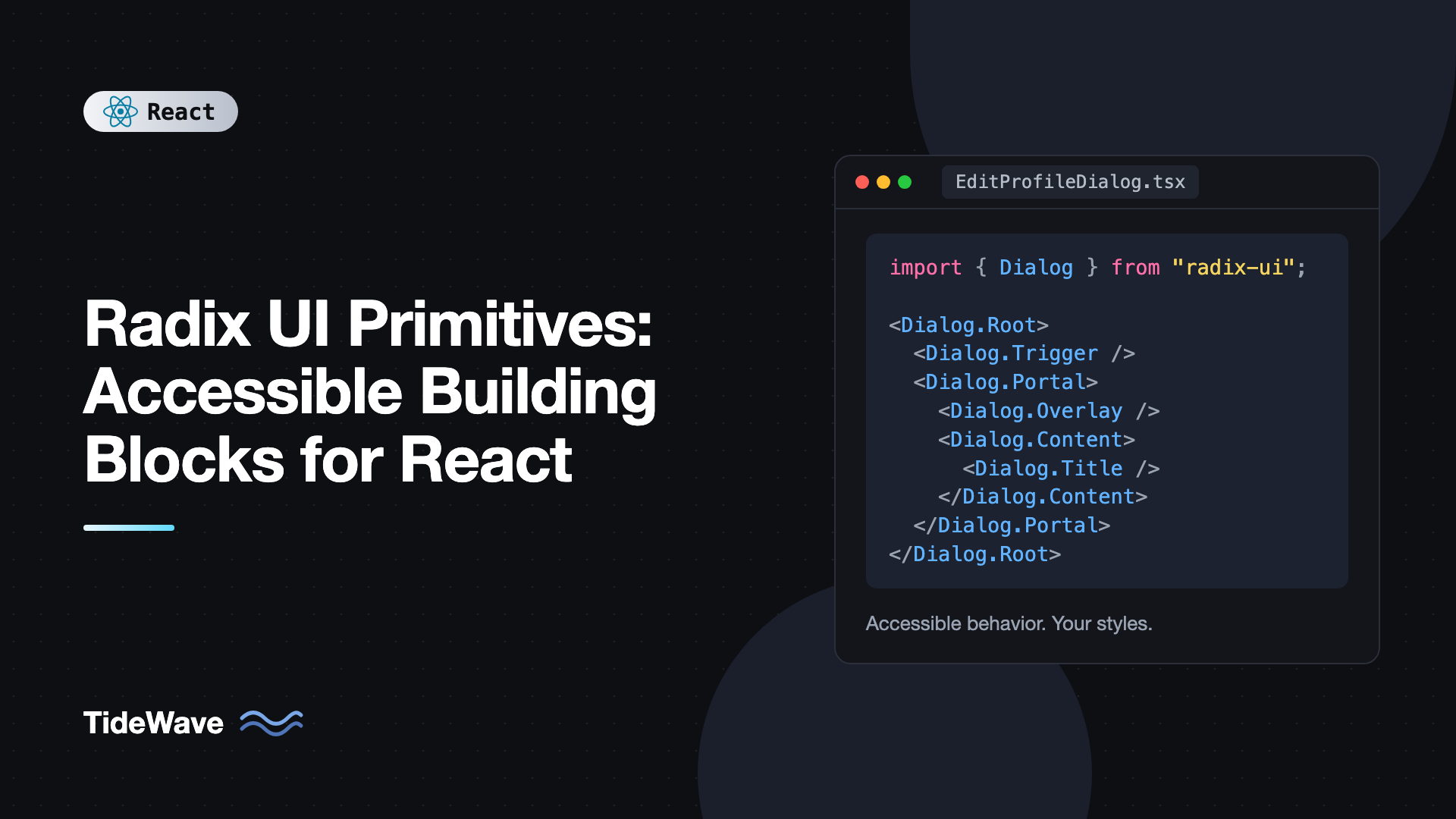
Every primitive is a set of parts you compose, not one component with a big props object. A dialog looks like this:
<Dialog.Root>
  <Dialog.Trigger />
  <Dialog.Portal>
    <Dialog.Overlay />
    <Dialog.Content>
      <Dialog.Title />
      <Dialog.Description />
      <Dialog.Close />
    </Dialog.Content>
  </Dialog.Portal>
</Dialog.Root>
Root holds state and shares it through context. The other parts read that state and render the right elements. You can put any markup between parts, reorder them, and leave out optional ones. This is the compound components pattern, and once you've learned it for one primitive, the rest feel familiar.
Building a Dialog
// src/components/EditProfileDialog.tsx
import { Dialog } from "radix-ui";
import "./dialog.css";

export function EditProfileDialog() {
  return (
    <Dialog.Root>
      <Dialog.Trigger className="btn">Edit profile</Dialog.Trigger>
      <Dialog.Portal>
        <Dialog.Overlay className="dialog-overlay" />
        <Dialog.Content className="dialog-content">
          <Dialog.Title className="dialog-title">Edit profile</Dialog.Title>
          <Dialog.Description className="dialog-description">
            Update your public details. Click save when you're done.
          </Dialog.Description>

          <form
            onSubmit={(e) => {
              e.preventDefault();
              // save...
            }}
          >
            <label className="field">
              Name
              <input name="name" defaultValue="Ada Lovelace" />
            </label>
            <div className="dialog-actions">
              <Dialog.Close className="btn btn-ghost" type="button">
                Cancel
              </Dialog.Close>
              <button className="btn" type="submit">
                Save
              </button>
            </div>
          </form>

          <Dialog.Close className="dialog-x" aria-label="Close">
            ×
          </Dialog.Close>
        </Dialog.Content>
      </Dialog.Portal>
    </Dialog.Root>
  );
}
Without writing any logic, you get:
- Focus moved into the dialog on open, trapped inside while open, and returned to the trigger on close.
- Escape and overlay clicks close it.
- Content outside the dialog is hidden from assistive technology, and page scrolling is locked.
role="dialog",aria-modal, andaria-labelledbyandaria-describedbypointing at the title and description.- The trigger gets
aria-expandedandaria-controls.
Dialog.Portal renders the content into document.body, so it escapes overflow and stacking contexts. The reasons that matters are covered in portals in React.
Styling is plain CSS:
/* dialog.css */
.dialog-overlay {
  position: fixed;
  inset: 0;
  background: rgb(0 0 0 / 0.45);
}

.dialog-content {
  position: fixed;
  top: 50%;
  left: 50%;
  translate: -50% -50%;
  width: min(90vw, 28rem);
  padding: 1.5rem;
  border-radius: 12px;
  background: white;
  box-shadow: 0 20px 50px rgb(0 0 0 / 0.2);
}

.dialog-content:focus {
  outline: none;
}

.dialog-title {
  margin: 0;
  font-size: 1.125rem;
}

.dialog-description {
  margin: 0.5rem 0 1.25rem;
  color: #64748b;
}
Controlled Dialogs
By default, Radix manages open state internally (uncontrolled). Pass open and onOpenChange to control it, for example to close after an async save:
import { useState } from "react";
import { Dialog } from "radix-ui";

export function SaveDialog({ onSave }: { onSave: () => Promise<void> }) {
  const [open, setOpen] = useState(false);

  return (
    <Dialog.Root open={open} onOpenChange={setOpen}>
      <Dialog.Trigger className="btn">Save as...</Dialog.Trigger>
      <Dialog.Portal>
        <Dialog.Overlay className="dialog-overlay" />
        <Dialog.Content className="dialog-content" aria-describedby={undefined}>
          <Dialog.Title>Save document</Dialog.Title>
          <button
            className="btn"
            onClick={async () => {
              await onSave();
              setOpen(false);
            }}
          >
            Confirm
          </button>
        </Dialog.Content>
      </Dialog.Portal>
    </Dialog.Root>
  );
}
Every stateful Radix primitive follows this convention: defaultX for uncontrolled, x plus onXChange for controlled. The trade-offs are the same as with form inputs, covered in controlled vs uncontrolled components.
Passing aria-describedby={undefined} tells Radix you're intentionally omitting a description, which silences its development warning. Don't omit Dialog.Title, though. If you don't want it visible, wrap it in VisuallyHidden.Root from radix-ui.
Styling State With Data Attributes
Radix exposes component state as data-* attributes on the rendered elements. That's the main styling hook:
data-state="open"or"closed"on dialogs, popovers, accordions, and triggers.data-state="active"or"inactive"on tabs.data-state="checked"or"unchecked"on switches and checkboxes.data-highlightedon the menu item that currently has keyboard or pointer focus.data-disabledon disabled items.data-sideanddata-alignon positioned content, telling you where it actually rendered after collision handling.
Target them in CSS:
.accordion-trigger[data-state="open"] .chevron {
  rotate: 180deg;
}

.menu-item[data-highlighted] {
  background: #eef2ff;
  outline: none;
}

.menu-item[data-disabled] {
  color: #94a3b8;
  pointer-events: none;
}
Or with Tailwind's data variants, like data-[state=open]:rotate-180 and data-highlighted:bg-indigo-50.
Building a Dropdown Menu
// src/components/AccountMenu.tsx
import { useState } from "react";
import { DropdownMenu } from "radix-ui";
import "./menu.css";

export function AccountMenu({ onSignOut }: { onSignOut: () => void }) {
  const [showStatus, setShowStatus] = useState(true);

  return (
    <DropdownMenu.Root>
      <DropdownMenu.Trigger className="btn" aria-label="Account menu">
        Ada ▾
      </DropdownMenu.Trigger>

      <DropdownMenu.Portal>
        <DropdownMenu.Content className="menu" sideOffset={6} align="end">
          <DropdownMenu.Label className="menu-label">My account</DropdownMenu.Label>
          <DropdownMenu.Item className="menu-item" onSelect={() => console.log("profile")}>
            Profile
          </DropdownMenu.Item>
          <DropdownMenu.Item className="menu-item" disabled>
            Billing
          </DropdownMenu.Item>

          <DropdownMenu.CheckboxItem
            className="menu-item"
            checked={showStatus}
            onCheckedChange={setShowStatus}
          >
            <DropdownMenu.ItemIndicator className="menu-indicator">✓</DropdownMenu.ItemIndicator>
            Show status
          </DropdownMenu.CheckboxItem>

          <DropdownMenu.Sub>
            <DropdownMenu.SubTrigger className="menu-item">Theme ▸</DropdownMenu.SubTrigger>
            <DropdownMenu.Portal>
              <DropdownMenu.SubContent className="menu" sideOffset={4}>
                <DropdownMenu.Item className="menu-item">Light</DropdownMenu.Item>
                <DropdownMenu.Item className="menu-item">Dark</DropdownMenu.Item>
                <DropdownMenu.Item className="menu-item">System</DropdownMenu.Item>
              </DropdownMenu.SubContent>
            </DropdownMenu.Portal>
          </DropdownMenu.Sub>

          <DropdownMenu.Separator className="menu-separator" />
          <DropdownMenu.Item className="menu-item" onSelect={onSignOut}>
            Sign out
          </DropdownMenu.Item>
        </DropdownMenu.Content>
      </DropdownMenu.Portal>
    </DropdownMenu.Root>
  );
}
That's a fully keyboard-accessible menu: arrow keys move between items and skip disabled ones, typing a letter jumps to a matching item, Enter or Space selects, the right arrow opens the submenu, and Escape closes and returns focus to the trigger. onSelect fires for both pointer and keyboard selection, so don't use onClick on menu items.
Positioning is automatic. side, align, and sideOffset set the preferred placement, and the content flips or shifts when it would overflow the viewport. Radix also sets CSS variables like --radix-dropdown-menu-content-transform-origin so animations can grow from the trigger.
/* menu.css */
.menu {
  min-width: 12rem;
  padding: 0.25rem;
  border-radius: 8px;
  background: white;
  box-shadow: 0 10px 30px rgb(0 0 0 / 0.15);
  transform-origin: var(--radix-dropdown-menu-content-transform-origin);
}

.menu-item {
  position: relative;
  display: flex;
  align-items: center;
  padding: 0.375rem 0.5rem 0.375rem 1.5rem;
  border-radius: 4px;
  font-size: 0.875rem;
  cursor: default;
  user-select: none;
}

.menu-indicator {
  position: absolute;
  left: 0.375rem;
}

.menu-separator {
  height: 1px;
  margin: 0.25rem;
  background: #e2e8f0;
}
Building a Tooltip
Tooltips need a shared Tooltip.Provider near the root, which coordinates delays so moving between tooltips feels instant after the first one opens:
// src/App.tsx
import { Tooltip } from "radix-ui";
import { Toolbar } from "./Toolbar";

export default function App() {
  return (
    <Tooltip.Provider delayDuration={300}>
      <Toolbar />
    </Tooltip.Provider>
  );
}
// src/components/IconButton.tsx
import type { ComponentProps, ReactNode } from "react";
import { Tooltip } from "radix-ui";

type IconButtonProps = ComponentProps<"button"> & {
  label: string;
  icon: ReactNode;
};

export function IconButton({ label, icon, ...rest }: IconButtonProps) {
  return (
    <Tooltip.Root>
      <Tooltip.Trigger asChild>
        <button className="icon-btn" aria-label={label} {...rest}>
          {icon}
        </button>
      </Tooltip.Trigger>
      <Tooltip.Portal>
        <Tooltip.Content className="tooltip" side="top" sideOffset={6}>
          {label}
          <Tooltip.Arrow className="tooltip-arrow" />
        </Tooltip.Content>
      </Tooltip.Portal>
    </Tooltip.Root>
  );
}
The tooltip opens on hover and keyboard focus and closes on Escape. Notice the button still has its own aria-label. Tooltips are supplementary, and an icon-only button needs an accessible name whether or not the tooltip is showing. Also, never put interactive content inside a tooltip. If it needs a link or button, use Popover instead.
The asChild Prop
By default, Tooltip.Trigger renders its own button. With asChild, Radix renders your child element instead and merges its props, event handlers, and ref onto it. That's how you avoid a button inside a button, and how you make a router link act as a trigger:
<DropdownMenu.Trigger asChild>
  <MyButton variant="ghost">Options</MyButton>
</DropdownMenu.Trigger>
For asChild to work, your component must spread incoming props onto its DOM element and accept a ref. In React 19, ref arrives as a normal prop, so a component typed with ComponentProps<"button"> that spreads ...rest already qualifies.
Building Tabs
import { Tabs } from "radix-ui";

export function SettingsTabs() {
  return (
    <Tabs.Root defaultValue="general" className="tabs">
      <Tabs.List aria-label="Settings sections" className="tabs-list">
        <Tabs.Trigger value="general" className="tabs-trigger">General</Tabs.Trigger>
        <Tabs.Trigger value="security" className="tabs-trigger">Security</Tabs.Trigger>
        <Tabs.Trigger value="billing" className="tabs-trigger">Billing</Tabs.Trigger>
      </Tabs.List>
      <Tabs.Content value="general" className="tabs-panel">General settings</Tabs.Content>
      <Tabs.Content value="security" className="tabs-panel">Security settings</Tabs.Content>
      <Tabs.Content value="billing" className="tabs-panel">Billing settings</Tabs.Content>
    </Tabs.Root>
  );
}
You get role="tablist", role="tab", and role="tabpanel" with correct aria-selected and aria-controls, plus arrow-key navigation between tabs with roving focus. Set activationMode="manual" if tabs should only switch on Enter or Space, which is better when panels are expensive to render. To sync the active tab with the URL, control it with value and onValueChange.
Building an Accordion
import { Accordion } from "radix-ui";

const faqs = [
  { id: "shipping", q: "How long does shipping take?", a: "Three to five business days." },
  { id: "returns", q: "Can I return an item?", a: "Yes, within 30 days of delivery." },
  { id: "support", q: "How do I contact support?", a: "Email support@example.com." },
];

export function Faq() {
  return (
    <Accordion.Root type="single" collapsible className="accordion">
      {faqs.map((item) => (
        <Accordion.Item key={item.id} value={item.id} className="accordion-item">
          <Accordion.Header>
            <Accordion.Trigger className="accordion-trigger">
              {item.q}
              <span className="chevron" aria-hidden="true">▾</span>
            </Accordion.Trigger>
          </Accordion.Header>
          <Accordion.Content className="accordion-content">
            <p>{item.a}</p>
          </Accordion.Content>
        </Accordion.Item>
      ))}
    </Accordion.Root>
  );
}
type="single" allows one open item at a time, and collapsible lets the open one close. Use type="multiple" to allow several. Accordion.Header renders a heading element so the structure makes sense to screen reader users navigating by headings.
Radix measures the content and exposes its height as --radix-accordion-content-height, which makes a smooth open and close animation possible in pure CSS:
.accordion-content {
  overflow: hidden;
}

.accordion-content[data-state="open"] {
  animation: slide-down 200ms ease-out;
}

.accordion-content[data-state="closed"] {
  animation: slide-up 200ms ease-out;
}

@keyframes slide-down {
  from { height: 0; }
  to { height: var(--radix-accordion-content-height); }
}

@keyframes slide-up {
  from { height: var(--radix-accordion-content-height); }
  to { height: 0; }
}
Animations
Radix delays unmounting content until CSS animations triggered by data-state="closed" finish, so exit animations work with plain @keyframes like the ones above. For JavaScript animation libraries, use the forceMount prop on Portal, Overlay, or Content to keep them mounted, and let the library handle presence. With Motion, that means wrapping the forced-mounted parts in AnimatePresence and rendering them only when open is true, which requires controlling open yourself.
Respect reduced motion in either case. A prefers-reduced-motion: reduce media query that disables the keyframes is enough for CSS animations.
Common Mistakes With Radix Primitives
- Removing
Titlefrom dialogs. It's the dialog's accessible name. Hide it visually if needed, but keep it. - Using
onClickon menu items. UseonSelect, which fires for keyboard and pointer selection and lets Radix close the menu correctly. - Passing a component that doesn't forward props to
asChild. If your component dropsonClick,ref, or ARIA props, the trigger silently breaks. - Putting interactive content in tooltips. Tooltip content isn't focusable. Use
Popoverfor anything users need to click. - Forgetting
Tooltip.Provider. Tooltips need it as an ancestor. - Styling with
:hoverinstead ofdata-highlighted. Keyboard users see no highlight. Use the data attribute, which covers both. - Overriding
outline: nonewithout a replacement. Radix handles focus, but you're responsible for making it visible.
Frequently Asked Questions (FAQ) About Radix UI Primitives
Radix Primitives are unstyled, accessible components that you style yourself. Radix Themes is a separate, pre-styled component library built on top of the primitives, with its own design tokens and theme configuration. Use Primitives when you have your own design, and Themes when you want a finished look.
No. The radix-ui package includes every primitive and is tree-shakeable, so only the components you import end up in your bundle. Individual scoped packages like @radix-ui/react-dialog are still available if you prefer them.
Pass Tailwind classes through className on each part, and use data attribute variants for state, such as data-[state=open] or data-highlighted. Radix renders no styles of its own, so there's nothing to override.
It tells a Radix part to render its single child element instead of its default element, merging Radix props, event handlers, and the ref onto that child. It's used to make your own button or link act as a trigger without nesting interactive elements.
They use state, context, and effects, so they run as Client Components. In a framework with Server Components, put Radix usage in files marked with use client. You can still render them from Server Components and pass server data as props.
Radix expects Dialog.Description so the dialog has an accessible description. If you intentionally have none, pass aria-describedby set to undefined on Dialog.Content to tell Radix the omission is deliberate, and the warning goes away.
Conclusion
Radix UI Primitives give you the behavior that's hardest to get right, like focus management, keyboard navigation, ARIA wiring, positioning, and dismissal, without imposing any visual design. Each primitive is a set of composable parts, state is exposed through data-* attributes for styling, asChild lets your own components act as triggers, and every stateful primitive supports both controlled and uncontrolled use.
Pick the interactive component in your app that's most likely to have accessibility gaps, usually a custom dropdown or modal, and replace its behavior with the matching primitive while keeping your existing styles. Test it with only a keyboard and a screen reader. Once you see how much comes for free, Radix makes a natural foundation for the rest of your component library.