Portals in React: Building Modals, Tooltips, and Toasts
You build a modal inside a card component, open it, and half of it is cut off. The card has overflow: hidden, or a parent has a transform, or some ancestor created a stacking context that no amount of z-index: 9999 can escape. The modal is logically part of the card, but visually it needs to live at the top of the page.
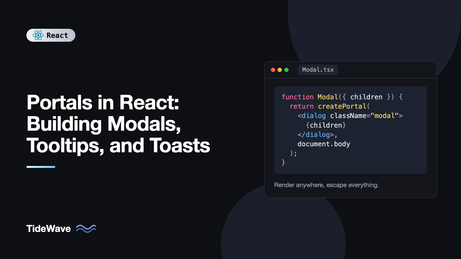
That's exactly the problem portals solve. createPortal lets a component render its output into a different DOM node, usually one attached directly to document.body, while staying in the same place in the React tree. Props, context, and state keep working as if nothing moved.
In this post you'll learn how portals work, how events behave inside them, and how to build three real UI pieces with them: an accessible modal dialog, a tooltip positioned next to its trigger, and a toast notification system driven by context.
What a Portal Actually Does
A normal React component renders its children into its parent's DOM node. A portal breaks that link for the DOM only. You call createPortal from react-dom with two arguments: the JSX to render and the DOM node to render it into.
import { createPortal } from "react-dom";

export function FloatingBadge() {
  return createPortal(
    <div className="badge">I live in document.body</div>,
    document.body
  );
}
If you inspect the page, the badge is a direct child of body. But in React DevTools it still sits under whatever component rendered FloatingBadge. That split is the whole idea:
- DOM position follows the container you pass to
createPortal. - React position stays where you wrote the component, so context providers above it still apply and state updates still flow normally.
Why Not Just Use CSS?
Sometimes you can. position: fixed with a high z-index works fine until an ancestor has transform, filter, perspective, or contain set. Any of those turns the ancestor into the containing block for fixed elements, so your "fixed" modal becomes relative to a card. Ancestors with overflow: hidden clip absolutely positioned tooltips. Stacking contexts created by opacity, isolation, or z-index on positioned elements trap your layer below siblings.
You don't control every ancestor, especially in a component library. Rendering into body sidesteps all of these at once.
Event Bubbling Through Portals
This is the part that surprises people. Events from inside a portal bubble up through the React tree, not the DOM tree. A click inside a portaled modal triggers onClick handlers on the React ancestors of the modal, even though in the DOM those ancestors don't contain it.
import { useState } from "react";
import { createPortal } from "react-dom";

export function Card() {
  const [clicks, setClicks] = useState(0);

  return (
    <div onClick={() => setClicks((c) => c + 1)} className="card">
      <p>Card clicks: {clicks}</p>
      {createPortal(
        <button>Inside a portal</button>,
        document.body
      )}
    </div>
  );
}
Clicking the portaled button increments the counter. Usually that's what you want, because the portal behaves like any other child. It becomes a bug when a parent has a "click outside to close" handler or a row-level onClick. If clicks inside your modal are triggering a table row's navigation, stop propagation at the portal boundary:
{createPortal(
  <div onClick={(e) => e.stopPropagation()}>{children}</div>,
  document.body
)}
Native DOM listeners added with addEventListener follow the DOM tree as usual, which matters later when we detect outside clicks.
Rendering Portals Safely
document.body doesn't exist during server-side rendering. If your component might render on the server (Next.js, React Router framework mode, or any SSR setup), calling createPortal(..., document.body) during render throws. The usual fix is to wait until the component has mounted on the client.
import { useEffect, useState, type ReactNode } from "react";
import { createPortal } from "react-dom";

type PortalProps = {
  children: ReactNode;
  containerId?: string;
};

export function Portal({ children, containerId = "portal-root" }: PortalProps) {
  const [container, setContainer] = useState<HTMLElement | null>(null);

  useEffect(() => {
    let el = document.getElementById(containerId);
    let created = false;

    if (!el) {
      el = document.createElement("div");
      el.id = containerId;
      document.body.appendChild(el);
      created = true;
    }

    setContainer(el);

    return () => {
      if (created && el?.childElementCount === 0) {
        el.remove();
      }
    };
  }, [containerId]);

  if (!container) return null;
  return createPortal(children, container);
}
This component renders nothing on the server and on the first client render, then portals into a dedicated container.
If your app is client-only (a plain Vite SPA), you can skip the effect and portal straight into document.body. See building React apps with Vite for that setup.
Building an Accessible Modal
A modal is the classic portal use case. A good one needs more than a fixed overlay, though. It should:
- Render above everything, regardless of where it's used.
- Close on Escape and on backdrop click.
- Move focus into the dialog when it opens and return it when it closes.
- Keep keyboard focus inside the dialog while open.
- Hide the rest of the page from assistive technology.
The native <dialog> element handles most of this for you when opened with showModal(). It renders in the browser's top layer, traps focus, makes the rest of the page inert, and fires a cancel event on Escape. Combining it with a portal keeps the markup out of clipped containers and gives you consistent placement.
import { useEffect, useRef, type ReactNode } from "react";
import { createPortal } from "react-dom";

type ModalProps = {
  open: boolean;
  onClose: () => void;
  title: string;
  children: ReactNode;
};

export function Modal({ open, onClose, title, children }: ModalProps) {
  const dialogRef = useRef<HTMLDialogElement>(null);

  useEffect(() => {
    const dialog = dialogRef.current;
    if (!dialog) return;

    if (open && !dialog.open) {
      dialog.showModal();
    } else if (!open && dialog.open) {
      dialog.close();
    }
  }, [open]);

  return createPortal(
    <dialog
      ref={dialogRef}
      aria-labelledby="modal-title"
      className="modal"
      onCancel={(e) => {
        e.preventDefault();
        onClose();
      }}
      onClick={(e) => {
        if (e.target === e.currentTarget) onClose();
      }}
    >
      <div className="modal-body">
        <h2 id="modal-title">{title}</h2>
        {children}
        <button type="button" onClick={onClose}>
          Close
        </button>
      </div>
    </dialog>,
    document.body
  );
}
A few details are worth calling out:
onCancelwithpreventDefaultstops the browser from closing the dialog on its own. React state stays the single source of truth, and the effect closes the dialog whenopenflips tofalse.- Backdrop clicks land on the
dialogelement itself, because the::backdroppseudo-element belongs to it. Checkinge.target === e.currentTargetdistinguishes a backdrop click from a click on content. For this to work, the inner.modal-bodyshould fill the dialog's padding box, so setpadding: 0on the dialog and put padding on the body. - Focus return happens automatically. When a modal
dialogcloses, the browser restores focus to the element that was focused before it opened.
Here's the matching CSS:
.modal {
  padding: 0;
  border: none;
  border-radius: 12px;
  max-width: min(90vw, 32rem);
}

.modal::backdrop {
  background: rgb(0 0 0 / 0.5);
}

.modal-body {
  padding: 1.5rem;
}
And usage from anywhere, even deep inside a clipped card:
import { useState } from "react";
import { Modal } from "./Modal";

export function DeleteButton({ onConfirm }: { onConfirm: () => void }) {
  const [open, setOpen] = useState(false);

  return (
    <>
      <button onClick={() => setOpen(true)}>Delete</button>
      <Modal open={open} onClose={() => setOpen(false)} title="Delete item?">
        <p>This can't be undone.</p>
        <button
          onClick={() => {
            onConfirm();
            setOpen(false);
          }}
        >
          Yes, delete
        </button>
      </Modal>
    </>
  );
}
If you'd rather not use dialog, you'll need to handle focus trapping, Escape, scroll locking, and aria-modal yourself. That's a lot of edge cases, which is why many teams reach for a primitive library instead. The post on Radix UI primitives covers one that does all of it and uses portals internally.
The id="modal-title" in this example is hardcoded for clarity. In a real component library, generate it with useId so two modals on a page don't collide. useId for accessible components explains how.
Building a Tooltip
Tooltips have a different challenge: they must appear next to a specific element, but they also need to escape overflow: hidden containers. A portal handles the escape. You handle the positioning by reading the trigger's bounding rectangle.
import {
  useLayoutEffect,
  useRef,
  useState,
  useId,
  type ReactNode,
} from "react";
import { createPortal } from "react-dom";

type TooltipProps = {
  label: string;
  children: ReactNode;
};

export function Tooltip({ label, children }: TooltipProps) {
  const triggerRef = useRef<HTMLSpanElement>(null);
  const tooltipRef = useRef<HTMLDivElement>(null);
  const [open, setOpen] = useState(false);
  const [pos, setPos] = useState({ top: 0, left: 0 });
  const id = useId();

  useLayoutEffect(() => {
    if (!open || !triggerRef.current || !tooltipRef.current) return;

    const trigger = triggerRef.current.getBoundingClientRect();
    const tip = tooltipRef.current.getBoundingClientRect();

    let top = trigger.top - tip.height - 8;
    if (top < 8) top = trigger.bottom + 8; // flip below if no room

    let left = trigger.left + trigger.width / 2 - tip.width / 2;
    left = Math.max(8, Math.min(left, window.innerWidth - tip.width - 8));

    setPos({ top, left });
  }, [open]);

  return (
    <>
      <span
        ref={triggerRef}
        aria-describedby={open ? id : undefined}
        onMouseEnter={() => setOpen(true)}
        onMouseLeave={() => setOpen(false)}
        onFocus={() => setOpen(true)}
        onBlur={() => setOpen(false)}
      >
        {children}
      </span>
      {open &&
        createPortal(
          <div
            ref={tooltipRef}
            id={id}
            role="tooltip"
            className="tooltip"
            style={{ position: "fixed", top: pos.top, left: pos.left }}
          >
            {label}
          </div>,
          document.body
        )}
    </>
  );
}
Why useLayoutEffect here? The tooltip must be measured after it's in the DOM but before the browser paints, otherwise you'd see it flash at 0, 0 and jump. Layout effects run synchronously after DOM mutations and before paint, so the corrected position is the first thing the user sees. The trade-offs are covered in useLayoutEffect vs useEffect.
Because the tooltip uses position: fixed with viewport coordinates from getBoundingClientRect, it stays correct as long as nothing scrolls while it's open. For hover tooltips that's usually fine. For popovers that stay open during scrolling, listen to scroll (with capture: true, so you catch scrolling containers too) and resize, and recompute. At that point a positioning library like Floating UI is worth it, since it also handles collision detection, arrows, and virtual elements.
Make sure the trigger is focusable. A span around plain text isn't, so keyboard users can't reach it. Wrap a button or link, or add tabIndex={0} when the trigger is purely informational.
Building a Toast System
Toasts are the most interesting case because any component, anywhere, needs to trigger them, but they all render in one stack in a corner of the screen. That's a context provider plus a single portal.
import {
  createContext,
  useCallback,
  useContext,
  useEffect,
  useState,
  type ReactNode,
} from "react";
import { createPortal } from "react-dom";

type ToastKind = "info" | "success" | "error";

type Toast = {
  id: number;
  message: string;
  kind: ToastKind;
};

type ToastContextValue = {
  show: (message: string, kind?: ToastKind) => void;
};

const ToastContext = createContext<ToastContextValue | null>(null);

let nextId = 1;

export function ToastProvider({ children }: { children: ReactNode }) {
  const [toasts, setToasts] = useState<Toast[]>([]);

  const dismiss = useCallback((id: number) => {
    setToasts((list) => list.filter((t) => t.id !== id));
  }, []);

  const show = useCallback((message: string, kind: ToastKind = "info") => {
    setToasts((list) => [...list, { id: nextId++, message, kind }]);
  }, []);

  return (
    <ToastContext value={{ show }}>
      {children}
      {createPortal(
        <div className="toast-region" role="status" aria-live="polite">
          {toasts.map((t) => (
            <ToastItem key={t.id} toast={t} onDismiss={dismiss} />
          ))}
        </div>,
        document.body
      )}
    </ToastContext>
  );
}

function ToastItem({
  toast,
  onDismiss,
}: {
  toast: Toast;
  onDismiss: (id: number) => void;
}) {
  useEffect(() => {
    const timer = setTimeout(() => onDismiss(toast.id), 4000);
    return () => clearTimeout(timer);
  }, [toast.id, onDismiss]);

  return (
    <div className={`toast toast-${toast.kind}`}>
      <span>{toast.message}</span>
      <button aria-label="Dismiss" onClick={() => onDismiss(toast.id)}>
        ×
      </button>
    </div>
  );
}

export function useToast() {
  const ctx = useContext(ToastContext);
  if (!ctx) throw new Error("useToast must be used inside ToastProvider");
  return ctx;
}
React 19 lets you render a context directly as a provider (<ToastContext value={...}>), so you don't need ToastContext.Provider anymore. Like the modal, this example portals straight into document.body, which assumes a client-only app. With SSR, render the region through the Portal component from earlier instead.
The live region is the accessibility piece. role="status" with aria-live="polite" tells screen readers to announce new content when they're idle. The region must exist in the DOM before toasts are added to it, which is why the container is always rendered and only its children change. For error toasts that need immediate attention, use a separate region with role="alert".
Style it into a corner:
.toast-region {
  position: fixed;
  bottom: 1rem;
  right: 1rem;
  display: flex;
  flex-direction: column;
  gap: 0.5rem;
  z-index: 1000;
}

.toast {
  display: flex;
  gap: 1rem;
  align-items: center;
  padding: 0.75rem 1rem;
  border-radius: 8px;
  background: #1f2937;
  color: white;
}
Wrap your app once and call show from anywhere:
import { useToast } from "./toast";

export function SaveButton() {
  const { show } = useToast();

  async function handleSave() {
    try {
      await fetch("/api/save", { method: "POST" });
      show("Saved", "success");
    } catch {
      show("Couldn't save. Try again.", "error");
    }
  }

  return <button onClick={handleSave}>Save</button>;
}
The provider re-renders when toasts change, but its children prop is the same element tree it received, so your app doesn't re-render with it. Only the portaled toast list updates.
Outside Clicks and Portals
A common pattern is closing a dropdown when the user clicks outside it. The naive approach checks whether the click target is inside the dropdown's DOM node with contains. With portals, that breaks: a click inside a portaled submenu is "outside" the dropdown in the DOM, even though it's inside in React.
import { useEffect, type RefObject } from "react";

export function useOutsideClick(
  refs: RefObject<HTMLElement | null>[],
  onOutside: () => void
) {
  useEffect(() => {
    function handle(e: PointerEvent) {
      const target = e.target as Node;
      const inside = refs.some((r) => r.current?.contains(target));
      if (!inside) onOutside();
    }
    document.addEventListener("pointerdown", handle);
    return () => document.removeEventListener("pointerdown", handle);
  }, [refs, onOutside]);
}
Pass refs for every DOM island that counts as "inside": the trigger, the dropdown, and any portaled children. Remember to memoize the refs array and the callback, or the listener re-subscribes on every render.
Common Mistakes With Portals
- Calling
createPortalduring SSR.documentis undefined on the server. Render the portal only after mount, or make the component client-only. - Forgetting that events bubble through React. Parent
onClickandonKeyDownhandlers fire for clicks inside portals. Stop propagation at the boundary when that's not what you want. - Assuming portals fix accessibility. A portal only moves DOM nodes. You still need focus management,
role,aria-modalordialog, and keyboard handling. - Creating a new container on every render. Calling
document.createElementin the render body creates a fresh node each time and remounts your content. Create it once in an effect or use a stable existing node. - Using
z-indexwars instead of the top layer. A nativedialogopened withshowModal()sits above everything without anyz-index. Prefer it for modals. - Measuring with
useEffectinstead ofuseLayoutEffect. Positioning after paint causes a visible jump on tooltips and popovers. - Leaving the live region conditional. If your toast container mounts at the same time as its first toast, many screen readers won't announce it.
Frequently Asked Questions (FAQ) About Portals in React
Yes. A portal keeps its position in the React tree, so it reads context from every provider above the component that rendered it. Theme, router, auth, and query client contexts all work inside portaled modals and tooltips without any extra wiring.
React events bubble through the React component tree, not the DOM tree. A portaled modal is still a React child of the component that rendered it, so onClick handlers on that component's ancestors fire. Call stopPropagation on a wrapper element inside the portal if you need to isolate it.
Not during the server render, because there's no document to portal into. Render the portal only after the component mounts on the client, for example by storing the container in state set inside useEffect. The content then appears right after hydration.
They work well together. The dialog element opened with showModal gives you the top layer, focus trapping, inert background, and Escape handling for free. A portal keeps the markup out of clipped containers and makes placement consistent. For most modals, a portaled dialog is the simplest accessible option.
No. A portal is just a different mount point for part of the tree, and React reconciles it the same way as any other subtree. The cost comes from what you render inside it, such as large modals or many toasts, not from the portal itself.
Testing Library queries search document.body by default, so portaled content is found with normal queries like getByRole. Make sure your test environment, such as jsdom in Vitest, supports anything else you use, like showModal, which may need a small polyfill or mock in older jsdom versions.
Conclusion
Portals separate where a component lives in the DOM from where it lives in React. That lets modals, tooltips, and toasts escape overflow, transform, and stacking context problems while still reading context and bubbling events through their React parents. You saw how to render portals safely on the client, build a modal on top of the native dialog element, position a tooltip with useLayoutEffect, and drive a toast stack from context with an accessible live region.
Start by moving one clipped modal or dropdown in your app into a portal and see what CSS hacks you can delete. Then look at the accessibility details, focus return, live regions, and keyboard support, because the portal only solves the layout half of the problem. When you need more complex floating UI, reach for a primitives library that has already solved positioning and focus management, and use what you learned here to understand what it's doing under the hood.