Animations in React with Motion (Framer Motion)
CSS transitions get you far, until you need to animate something leaving the page. React removes the element from the DOM immediately, so there's nothing left to fade out. The same wall shows up with list reordering, elements that change size, shared transitions between two components, and gestures like drag. You end up juggling timeouts, extra state, and onTransitionEnd handlers.
Motion (the library formerly called Framer Motion) solves these problems with a declarative API. You describe the state an element should be in, and Motion animates there, including when it mounts, unmounts, or moves in the layout. In 2024 the project became independent and was renamed. The package is now motion and the React API imports from motion/react, but it's the same library and the same API.
This post covers installing Motion, the core animate and transition props, variants and staggered children, exit animations with AnimatePresence, layout animations, gestures, scroll-driven effects, imperative animations, and how to respect users who prefer reduced motion.
Installing Motion
npm install motion
If you're migrating from framer-motion, replace the package and update imports from "framer-motion" to "motion/react". The APIs are compatible.
The motion Component
Every HTML and SVG element has a motion counterpart: motion.div, motion.button, motion.li, motion.svg, motion.path, and so on. They accept all normal props plus animation props.
import { motion } from "motion/react";

export function FadeIn() {
  return (
    <motion.div
      initial={{ opacity: 0, y: 20 }}
      animate={{ opacity: 1, y: 0 }}
      transition={{ duration: 0.4, ease: "easeOut" }}
    >
      Hello there
    </motion.div>
  );
}
initialis the state on first render.animateis the target state. Whenever these values change, Motion animates to the new values.transitioncontrols how it gets there.
x, y, scale, and rotate are shorthand transforms that Motion composes into a single transform. Animating transforms and opacity is the most performant choice, because browsers can run them without triggering layout.
Animating From State
Because animate is just a prop, you drive animations with ordinary React state:
import { useState } from "react";
import { motion } from "motion/react";

export function Toggle() {
  const [on, setOn] = useState(false);

  return (
    <button
      type="button"
      role="switch"
      aria-checked={on}
      onClick={() => setOn((v) => !v)}
      className="switch"
      style={{ justifyContent: on ? "flex-end" : "flex-start" }}
    >
      <motion.span
        layout
        className="knob"
        transition={{ type: "spring", stiffness: 500, damping: 30 }}
      />
    </button>
  );
}
The knob jumps between flex-start and flex-end, and the layout prop tells Motion to animate that position change smoothly. More on layout shortly.
Transitions: Tweens and Springs
Motion supports two main kinds of transitions:
- Tween: duration-based with an easing curve. Good for opacity and color.
- Spring: physics-based, defined by
stiffness,damping, andmass, or byvisualDurationandbounce. Springs feel natural for movement and handle interruption gracefully, because they carry velocity into the next animation.
<motion.div
  animate={{ x: 100 }}
  transition={{ type: "spring", visualDuration: 0.4, bounce: 0.25 }}
/>
You can set transitions per property, which is useful when opacity should be quick but movement should be springy:
<motion.div
  animate={{ opacity: 1, y: 0 }}
  transition={{
    opacity: { duration: 0.2 },
    y: { type: "spring", stiffness: 300, damping: 24 },
  }}
/>
Variants and Staggered Children
Variants are named animation states. Define them once in an object, then refer to them by name. Their real power is propagation: when a parent switches variants, every motion child with the same variant names switches too, and the parent can stagger them.
import { motion, type Variants } from "motion/react";

const list: Variants = {
  hidden: { opacity: 0 },
  visible: {
    opacity: 1,
    transition: { staggerChildren: 0.08, delayChildren: 0.1 },
  },
};

const item: Variants = {
  hidden: { opacity: 0, y: 12 },
  visible: { opacity: 1, y: 0 },
};

export function FeatureList({ features }: { features: string[] }) {
  return (
    <motion.ul variants={list} initial="hidden" animate="visible">
      {features.map((feature) => (
        <motion.li key={feature} variants={item}>
          {feature}
        </motion.li>
      ))}
    </motion.ul>
  );
}
The children don't need initial or animate props. They inherit the active variant name from the parent and play in sequence 80ms apart. This keeps orchestration in one place instead of computing a delay for each item.
Exit Animations With AnimatePresence
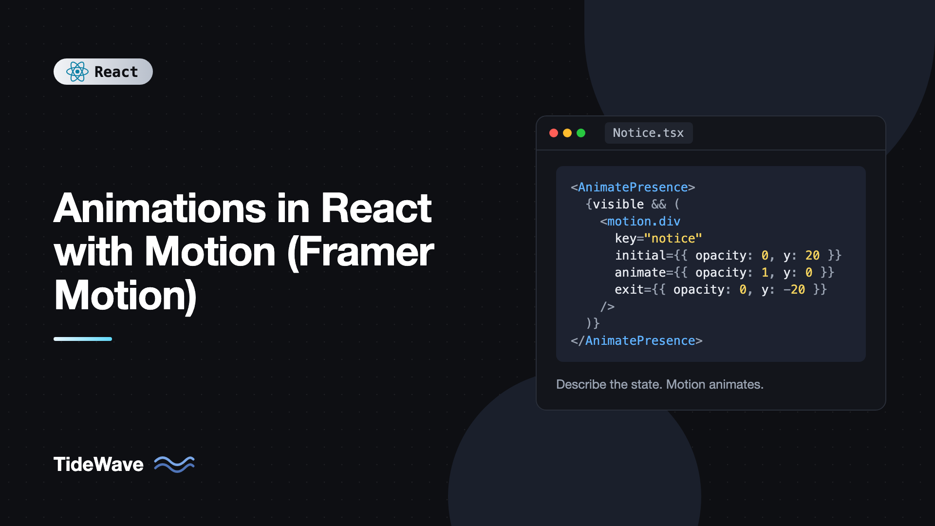
When React unmounts a component, it's gone. AnimatePresence changes that. It keeps a removed child in the DOM long enough to play its exit animation, then removes it.
import { useState } from "react";
import { AnimatePresence, motion } from "motion/react";

export function Notice() {
  const [visible, setVisible] = useState(true);

  return (
    <div>
      <button onClick={() => setVisible((v) => !v)}>Toggle</button>
      <AnimatePresence>
        {visible && (
          <motion.div
            key="notice"
            initial={{ opacity: 0, height: 0 }}
            animate={{ opacity: 1, height: "auto" }}
            exit={{ opacity: 0, height: 0 }}
            style={{ overflow: "hidden" }}
          >
            <p>Your changes were saved.</p>
          </motion.div>
        )}
      </AnimatePresence>
    </div>
  );
}
Two rules make AnimatePresence work:
- It must stay mounted. Put the condition inside it, not around it.
- Direct children need a stable, unique
keyso Motion can track which ones left.
Notice height: "auto". Animating to and from auto is something CSS transitions can't do, and Motion measures it for you.
Switching Between Elements
Change the key to make AnimatePresence treat content as a new element. With mode="wait", the old one exits before the new one enters, which is ideal for step-by-step flows and tab panels:
import { AnimatePresence, motion } from "motion/react";

type Step = { id: string; title: string; body: string };

export function StepPanel({ step }: { step: Step }) {
  return (
    <AnimatePresence mode="wait">
      <motion.section
        key={step.id}
        initial={{ opacity: 0, x: 24 }}
        animate={{ opacity: 1, x: 0 }}
        exit={{ opacity: 0, x: -24 }}
        transition={{ duration: 0.2 }}
      >
        <h2>{step.title}</h2>
        <p>{step.body}</p>
      </motion.section>
    </AnimatePresence>
  );
}
Exit animations combine naturally with portals for modals and toasts. If you're building those, portals in React shows how to render them, and you can wrap the portaled content in AnimatePresence for enter and exit transitions.
Layout Animations
Layout changes are the hardest thing to animate by hand. An element changes size, a list reorders, or a grid reflows, and you want a smooth transition instead of a jump. Add the layout prop and Motion handles it using a technique called FLIP: it measures the element before and after the change, then animates the difference with transforms.
import { useState } from "react";
import { motion } from "motion/react";

export function ExpandableCard({
  title,
  body,
}: {
  title: string;
  body: string;
}) {
  const [open, setOpen] = useState(false);

  return (
    <motion.article
      layout
      onClick={() => setOpen((v) => !v)}
      className="card"
      style={{ borderRadius: 12 }}
    >
      <motion.h3 layout="position">{title}</motion.h3>
      {open && (
        <motion.p initial={{ opacity: 0 }} animate={{ opacity: 1 }}>
          {body}
        </motion.p>
      )}
    </motion.article>
  );
}
Setting borderRadius through style (rather than only in CSS) lets Motion correct for distortion while scaling. layout="position" on the heading animates only its position, so the text doesn't stretch.
Reordering Lists
Add layout to each list item and reordering animates automatically:
import { motion } from "motion/react";

type Task = { id: string; title: string; done: boolean };

export function TaskList({ tasks }: { tasks: Task[] }) {
  const sorted = [...tasks].sort((a, b) => Number(a.done) - Number(b.done));

  return (
    <ul>
      {sorted.map((task) => (
        <motion.li
          key={task.id}
          layout
          transition={{ type: "spring", bounce: 0.2 }}
        >
          {task.title}
        </motion.li>
      ))}
    </ul>
  );
}
Stable keys matter here more than anywhere. If keys are array indexes, Motion can't tell which element moved. Why keys matter in React lists explains the underlying reason.
Shared Element Transitions With layoutId
Give two different elements the same layoutId, and when one unmounts as the other mounts, Motion animates between them. A classic example is an active-tab indicator that slides between tabs:
import { useState } from "react";
import { motion } from "motion/react";

const tabs = ["Overview", "Activity", "Settings"];

export function Tabs() {
  const [active, setActive] = useState(tabs[0]);

  return (
    <div role="tablist" className="tabs">
      {tabs.map((tab) => (
        <button
          key={tab}
          role="tab"
          aria-selected={active === tab}
          onClick={() => setActive(tab)}
          className="tab"
          style={{ position: "relative" }}
        >
          {active === tab && (
            <motion.span
              layoutId="tab-indicator"
              className="tab-indicator"
              transition={{ type: "spring", stiffness: 400, damping: 30 }}
            />
          )}
          <span style={{ position: "relative" }}>{tab}</span>
        </button>
      ))}
    </div>
  );
}
Only one indicator exists at a time, but because they share a layoutId, it appears to glide from tab to tab.
Gestures
Motion has gesture props for hover, tap, focus, and drag. The while props animate to a state while the gesture is active and back when it ends:
import { motion } from "motion/react";

export function LikeButton({ onLike }: { onLike: () => void }) {
  return (
    <motion.button
      type="button"
      onClick={onLike}
      whileHover={{ scale: 1.05 }}
      whileTap={{ scale: 0.95 }}
      whileFocus={{ boxShadow: "0 0 0 3px rgb(99 102 241 / 0.5)" }}
    >
      Like
    </motion.button>
  );
}
Drag is a single prop. Constrain it with pixel bounds or a ref to a container:
import { useRef } from "react";
import { motion } from "motion/react";

export function DragArea() {
  const constraintsRef = useRef<HTMLDivElement>(null);

  return (
    <div ref={constraintsRef} className="drag-area">
      <motion.div
        drag
        dragConstraints={constraintsRef}
        dragElastic={0.2}
        whileDrag={{ scale: 1.1 }}
        className="draggable"
      />
    </div>
  );
}
For sortable lists and drop zones, a dedicated library is a better fit. See building drag-and-drop interfaces with dnd-kit.
Scroll Animations
Animate When Entering the Viewport
whileInView animates an element when it scrolls into view. viewport={{ once: true }} keeps it from replaying every time:
import { motion } from "motion/react";

export function Reveal({ children }: { children: React.ReactNode }) {
  return (
    <motion.div
      initial={{ opacity: 0, y: 40 }}
      whileInView={{ opacity: 1, y: 0 }}
      viewport={{ once: true, amount: 0.3 }}
      transition={{ duration: 0.5 }}
    >
      {children}
    </motion.div>
  );
}
Link Values to Scroll Position
useScroll returns motion values for scroll progress, and useTransform maps them to other values. Motion values update outside React's render cycle, so these animations don't re-render your component on every scroll event.
import { motion, useScroll, useSpring } from "motion/react";

export function ReadingProgress() {
  const { scrollYProgress } = useScroll();
  const scaleX = useSpring(scrollYProgress, { stiffness: 200, damping: 30 });

  return (
    <motion.div
      className="progress-bar"
      style={{
        scaleX,
        transformOrigin: "0%",
        position: "fixed",
        top: 0,
        left: 0,
        right: 0,
        height: 4,
      }}
    />
  );
}
import { useRef } from "react";
import { motion, useScroll, useTransform } from "motion/react";

export function ParallaxImage({ src }: { src: string }) {
  const ref = useRef<HTMLDivElement>(null);
  const { scrollYProgress } = useScroll({
    target: ref,
    offset: ["start end", "end start"],
  });
  const y = useTransform(scrollYProgress, [0, 1], ["-15%", "15%"]);

  return (
    <div ref={ref} style={{ overflow: "hidden", height: 400 }}>
      <motion.img src={src} alt="" style={{ y, width: "100%" }} />
    </div>
  );
}
Imperative Animations With useAnimate
Sometimes you need to sequence animations in response to an event, like shaking a form on invalid submit. useAnimate gives you a scoped animate function:
import { useAnimate } from "motion/react";

export function LoginForm() {
  const [scope, animate] = useAnimate();

  function handleSubmit(e: React.FormEvent<HTMLFormElement>) {
    e.preventDefault();
    const data = new FormData(e.currentTarget);
    if (!data.get("password")) {
      animate(scope.current, { x: [0, -10, 10, -6, 6, 0] }, { duration: 0.4 });
    }
  }

  return (
    <form ref={scope} onSubmit={handleSubmit}>
      <input name="password" type="password" aria-label="Password" />
      <button type="submit">Log in</button>
    </form>
  );
}
animate returns a promise-like animation, so you can await it and chain steps. Selectors passed to animate are scoped to the element in scope, so animate("button", { scale: 1.1 }) only affects buttons inside the form.
Respecting Reduced Motion
Some users enable "reduce motion" in their OS because large movement causes dizziness or nausea. Respecting that preference is an accessibility requirement, not a nice-to-have. The simplest approach is wrapping your app in MotionConfig:
import { MotionConfig } from "motion/react";

export function AppShell({ children }: { children: React.ReactNode }) {
  return <MotionConfig reducedMotion="user">{children}</MotionConfig>;
}
With reducedMotion="user", Motion disables transform and layout animations when the user's OS requests reduced motion, while keeping opacity and color transitions. For custom behavior, useReducedMotion returns a boolean you can use to choose alternative animations.
Keeping the Bundle Small
The full motion component includes every feature. If bundle size matters, use LazyMotion with the lighter m components and load only the features you need:
import { LazyMotion, domAnimation } from "motion/react";
import * as m from "motion/react-m";

export function App() {
  return (
    <LazyMotion features={domAnimation}>
      <m.div animate={{ opacity: 1 }} initial={{ opacity: 0 }}>
        Lighter bundle
      </m.div>
    </LazyMotion>
  );
}
domAnimation covers animations, variants, exit, and tap/hover/focus gestures. Use domMax if you also need drag and layout animations. Both can be loaded asynchronously with a dynamic import.
Common Mistakes With Motion
- Wrapping
AnimatePresencein the condition. It must stay mounted and contain the conditional child, or exit animations never run. - Missing or unstable keys.
AnimatePresenceand layout animations rely on keys to track elements. Index keys break them. - Animating
width,height, ortopwhen transforms would do. Layout properties trigger reflow every frame. Preferx,y, andscale, or use thelayoutprop. - Ignoring reduced motion. Add
MotionConfigwithreducedMotion="user"at the root. - Storing scroll values in React state. Use motion values from
useScrollanduseTransform, which update without re-rendering. - Animating everything. Motion should guide attention. If every element bounces in, nothing stands out and the UI feels slow.
Frequently Asked Questions (FAQ) About Motion for React
They're the same library. Framer Motion became an independent project in 2024 and was renamed Motion. The package is now motion, and React components import from motion/react. The API is the same, so migrating is mostly a matter of changing the package and import paths.
Motion components need to run in the browser, so they must be used in Client Components. In frameworks with Server Components, add the use client directive to files that use motion components, or import from motion/react-client, which marks the components as client components for you.
Usually because AnimatePresence is unmounting along with the child, or the child has no stable key. Keep AnimatePresence always rendered, put the condition inside it, and give each direct child a unique key.
Not when used well. It animates transforms and opacity using hardware-accelerated paths where possible, and motion values update without React re-renders. Performance problems usually come from animating layout properties or animating many elements at once.
Use CSS transitions for simple hover and focus effects. Reach for Motion when you need exit animations, layout and reorder animations, shared element transitions, gestures like drag, springs, or scroll-linked effects. Mixing both in one app is normal.
Wrap your app in MotionConfig with reducedMotion set to user. Motion then skips transform and layout animations for users who have reduced motion enabled. For finer control, use the useReducedMotion hook to choose different animations.
Conclusion
Motion turns animation into a matter of describing states. initial, animate, and transition cover most needs. Variants coordinate groups and stagger children. AnimatePresence makes exit animations possible, layout and layoutId animate changes that would be painful by hand, gesture props handle hover, tap, and drag, and useScroll with useTransform drives scroll effects without re-renders.
Start small: add an exit animation to a toast or modal, then a layout prop to a list that reorders. Wrap the app in MotionConfig with reduced motion support from day one, and keep animations short and purposeful. Once those feel natural, explore layoutId for shared transitions, which is where Motion really sets itself apart from plain CSS.