Building Headless UI Components in React
Every team that builds a component library hits the same wall. The dropdown works perfectly, keyboard navigation, focus management, ARIA attributes and all, but then a designer wants it to look completely different on the marketing site. Or another team uses Tailwind while yours uses CSS Modules. The component's behavior is exactly right, but its markup and styles are baked in, so it gets forked or wrapped in layers of override props.
Headless components separate the two. A headless component provides state, behavior, and accessibility, but renders no markup and ships no styles. The consumer decides every element and class name. Libraries like TanStack Table, Downshift, React Aria, Headless UI, and Radix UI's unstyled primitives all follow this idea in some form.
In this post I'll build two headless components from scratch: a simple disclosure toggle to introduce the concepts, then a full combobox with keyboard support and ARIA wiring. I'll cover the prop getter pattern, how to merge consumer handlers safely, how to expose the same logic as both a hook and a component, and how to test headless code.
What Makes a Component Headless?
A traditional component bundles three things:
- State and logic: what's open, what's selected, what's highlighted.
- Accessibility and interaction: ARIA roles and attributes, keyboard handling, focus.
- Presentation: the elements, class names, and styles.
A headless component keeps the first two and gives up the third. In React, that usually takes one of these forms:
- A hook that returns state and functions, like
useCombobox(). - Compound components that render minimal or no default styling but accept
classNameandchildren, like Radix primitives. - Render props that hand state to a function you provide.
Hooks are the most flexible and the easiest to build, so that's where we'll start. If you're interested in the compound approach, I cover it in the compound components pattern in React.
A Headless Disclosure Hook
A disclosure is a button that shows and hides a panel, like a "Show details" toggle. The behavior is small, but it has the same parts as bigger components: state, an accessible relationship between button and panel, and actions.
// useDisclosure.ts
import { useCallback, useId, useState } from "react";

type Options = {
  defaultOpen?: boolean;
  onOpenChange?: (open: boolean) => void;
};

export function useDisclosure({ defaultOpen = false, onOpenChange }: Options = {}) {
  const [open, setOpenState] = useState(defaultOpen);
  const id = useId();
  const panelId = `${id}-panel`;

  const setOpen = useCallback(
    (next: boolean) => {
      setOpenState(next);
      onOpenChange?.(next);
    },
    [onOpenChange],
  );

  const toggle = useCallback(() => setOpen(!open), [open, setOpen]);

  return {
    open,
    setOpen,
    toggle,
    buttonProps: {
      type: "button" as const,
      "aria-expanded": open,
      "aria-controls": panelId,
      onClick: toggle,
    },
    panelProps: {
      id: panelId,
      hidden: !open,
    },
  };
}
The hook returns state and two objects of props. The consumer spreads them onto whatever elements they want:
import { useDisclosure } from "./useDisclosure";

export function ShippingDetails() {
  const { open, buttonProps, panelProps } = useDisclosure();

  return (
    <div className="rounded border p-4">
      <button {...buttonProps} className="flex w-full justify-between font-medium">
        Shipping details
        <span aria-hidden="true">{open ? "−" : "+"}</span>
      </button>
      <div {...panelProps} className="mt-2 text-sm text-gray-600">
        Orders ship within two business days from our Dhaka warehouse.
      </div>
    </div>
  );
}
The hook handles aria-expanded, aria-controls, the generated id, and the toggle. The consumer handles Tailwind classes, the icon, and the layout. Someone else could render the same hook as a card with an animated chevron without touching its logic.
From Props Objects to Prop Getters
The props-object approach has a problem. What if the consumer also wants an onClick on the button, say for analytics? If they write onClick after the spread, it replaces the hook's toggle handler and the disclosure stops working. If they write it before, theirs is ignored.
Prop getters fix this. Instead of returning objects, the hook returns functions that take the consumer's props and merge them with its own:
// mergeHandlers.ts
import type { SyntheticEvent } from "react";

export function callAll<E extends SyntheticEvent>(
  ...fns: Array<((event: E) => void) | undefined>
) {
  return (event: E) => {
    for (const fn of fns) {
      if (event.defaultPrevented) return;
      fn?.(event);
    }
  };
}
callAll runs the consumer's handler first, then the hook's, and stops if the consumer called preventDefault(). That gives consumers a way to cancel default behavior, a convention popularized by Downshift.
Here's the disclosure rewritten with prop getters:
import { useCallback, useId, useState, type ComponentProps } from "react";
import { callAll } from "./mergeHandlers";

export function useDisclosure({ defaultOpen = false } = {}) {
  const [open, setOpen] = useState(defaultOpen);
  const id = useId();
  const panelId = `${id}-panel`;
  const toggle = useCallback(() => setOpen((o) => !o), []);

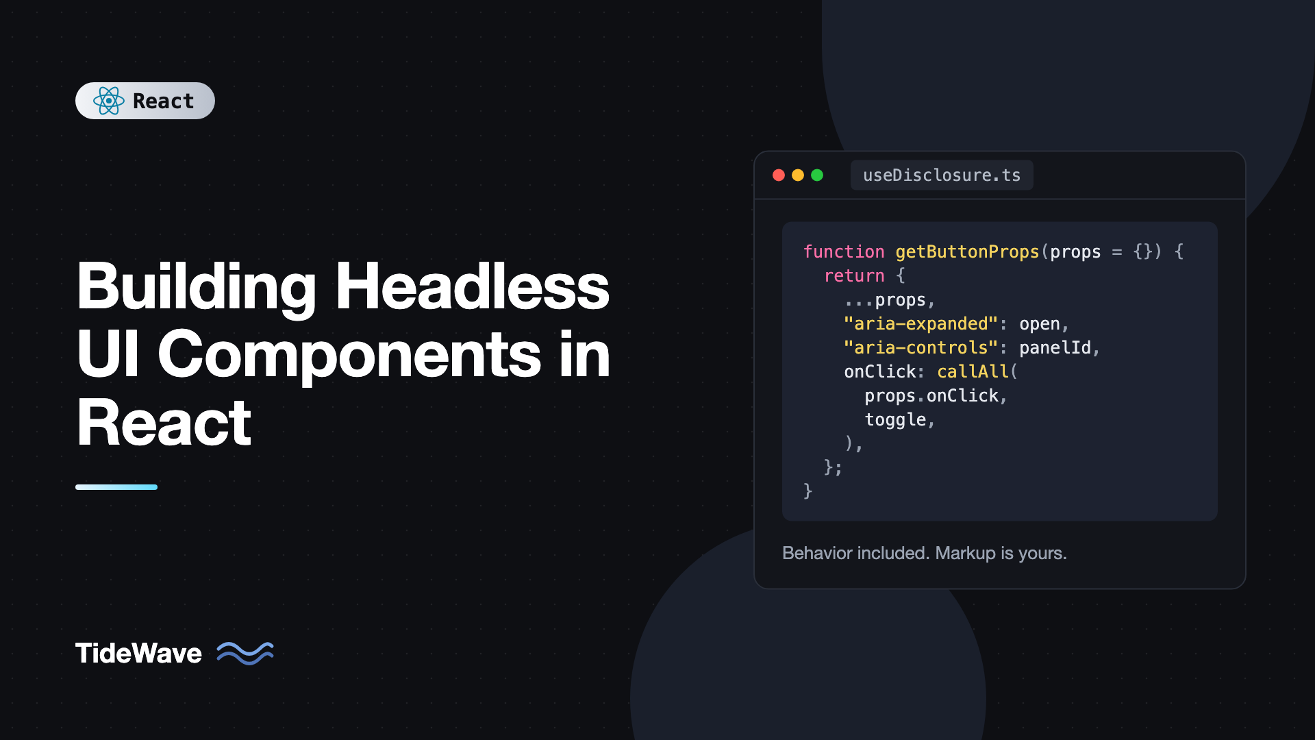
  function getButtonProps(props: ComponentProps<"button"> = {}) {
    return {
      ...props,
      type: "button" as const,
      "aria-expanded": open,
      "aria-controls": panelId,
      onClick: callAll(props.onClick, () => toggle()),
    };
  }

  function getPanelProps(props: ComponentProps<"div"> = {}) {
    return { ...props, id: panelId, hidden: !open };
  }

  return { open, setOpen, toggle, getButtonProps, getPanelProps };
}
Usage now looks like this:
<button {...getButtonProps({ className: "btn", onClick: () => track("details_toggled") })}>
  Shipping details
</button>
<div {...getPanelProps({ className: "panel" })}>...</div>
The consumer's onClick and the hook's toggle both run. The ARIA attributes always win, because they're spread after the consumer's props, which protects accessibility from accidental overrides.
Building a Headless Combobox
A combobox, a text input with a filtered list of suggestions, is where headless components really earn their keep. The behavior is genuinely hard to get right, and the visual design varies a lot between products.
Here's what the hook needs to handle:
- Input value and filtering
- Open and closed state
- A highlighted index for keyboard navigation
- Selection with Enter or click
- Escape to close, arrow keys to move
- ARIA:
role="combobox",aria-expanded,aria-controls,aria-activedescendant,role="listbox",role="option",aria-selected
// useCombobox.ts
import { useId, useState, type ComponentProps, type KeyboardEvent } from "react";
import { callAll } from "./mergeHandlers";

type UseComboboxOptions<T> = {
  items: T[];
  itemToString: (item: T) => string;
  onSelect?: (item: T) => void;
  filter?: (item: T, input: string) => boolean;
};

export function useCombobox<T>({
  items,
  itemToString,
  onSelect,
  filter = (item, input) => itemToString(item).toLowerCase().includes(input.toLowerCase()),
}: UseComboboxOptions<T>) {
  const [inputValue, setInputValue] = useState("");
  const [isOpen, setIsOpen] = useState(false);
  const [highlightedIndex, setHighlightedIndex] = useState(-1);
  const [selectedItem, setSelectedItem] = useState<T | null>(null);

  const id = useId();
  const listboxId = `${id}-listbox`;
  const optionId = (index: number) => `${id}-option-${index}`;

  const filtered = inputValue ? items.filter((item) => filter(item, inputValue)) : items;

  function selectItem(item: T) {
    setSelectedItem(item);
    setInputValue(itemToString(item));
    setIsOpen(false);
    setHighlightedIndex(-1);
    onSelect?.(item);
  }

  function handleKeyDown(e: KeyboardEvent<HTMLInputElement>) {
    switch (e.key) {
      case "ArrowDown":
        e.preventDefault();
        setIsOpen(true);
        setHighlightedIndex((i) => (filtered.length === 0 ? -1 : (i + 1) % filtered.length));
        break;
      case "ArrowUp":
        e.preventDefault();
        setIsOpen(true);
        setHighlightedIndex((i) =>
          filtered.length === 0 ? -1 : (i - 1 + filtered.length) % filtered.length,
        );
        break;
      case "Enter":
        if (isOpen && highlightedIndex >= 0 && filtered[highlightedIndex] !== undefined) {
          e.preventDefault();
          selectItem(filtered[highlightedIndex]);
        }
        break;
      case "Escape":
        setIsOpen(false);
        setHighlightedIndex(-1);
        break;
    }
  }

  function getInputProps(props: ComponentProps<"input"> = {}) {
    return {
      ...props,
      role: "combobox" as const,
      "aria-expanded": isOpen,
      "aria-controls": listboxId,
      "aria-autocomplete": "list" as const,
      "aria-activedescendant": isOpen && highlightedIndex >= 0 ? optionId(highlightedIndex) : undefined,
      value: inputValue,
      onChange: callAll(props.onChange, (e) => {
        setInputValue(e.currentTarget.value);
        setIsOpen(true);
        setHighlightedIndex(-1);
      }),
      onKeyDown: callAll(props.onKeyDown, handleKeyDown),
      onBlur: callAll(props.onBlur, () => setIsOpen(false)),
    };
  }

  function getListboxProps(props: ComponentProps<"ul"> = {}) {
    return { ...props, id: listboxId, role: "listbox" as const };
  }

  function getOptionProps({ item, index, ...props }: ComponentProps<"li"> & { item: T; index: number }) {
    return {
      ...props,
      id: optionId(index),
      role: "option" as const,
      "aria-selected": highlightedIndex === index,
      onMouseMove: callAll(props.onMouseMove, () => setHighlightedIndex(index)),
      // mousedown fires before the input's blur, so the list doesn't close first
      onMouseDown: callAll(props.onMouseDown, (e) => {
        e.preventDefault();
        selectItem(item);
      }),
    };
  }

  return {
    inputValue,
    isOpen,
    highlightedIndex,
    selectedItem,
    items: filtered,
    getInputProps,
    getListboxProps,
    getOptionProps,
  };
}
A few design decisions worth explaining:
aria-activedescendantinstead of moving focus. Focus stays in the input so the user can keep typing, and screen readers announce the highlighted option through this attribute.onMouseDownwithpreventDefaultfor selection. A click fires after the input'sblur, which would close the list before the click registers. Handlingmousedownand preventing default keeps focus in the input.- Generic
T. The hook works with strings, objects, or anything else.itemToStringtells it how to display and filter items. For more on this technique, see generic components in React with TypeScript.
Rendering It Your Way
Here's one rendering of the combobox, a country picker:
import { useCombobox } from "./useCombobox";

type Country = { code: string; name: string };

const countries: Country[] = [
  { code: "BD", name: "Bangladesh" },
  { code: "CA", name: "Canada" },
  { code: "DE", name: "Germany" },
  { code: "JP", name: "Japan" },
  { code: "KE", name: "Kenya" },
];

export function CountryPicker() {
  const { isOpen, items, highlightedIndex, getInputProps, getListboxProps, getOptionProps } = useCombobox({
    items: countries,
    itemToString: (c) => c.name,
    onSelect: (c) => console.log("Selected", c.code),
  });

  return (
    <div className="relative w-72">
      <label htmlFor="country" className="block text-sm font-medium">
        Country
      </label>
      <input {...getInputProps({ id: "country", className: "w-full rounded border px-3 py-2" })} />
      <ul
        {...getListboxProps({
          className: "absolute z-10 mt-1 w-full rounded border bg-white shadow",
          hidden: !isOpen || items.length === 0,
        })}
      >
        {items.map((country, index) => (
          <li
            key={country.code}
            {...getOptionProps({
              item: country,
              index,
              className: index === highlightedIndex ? "bg-blue-600 px-3 py-2 text-white" : "px-3 py-2",
            })}
          >
            {country.name} ({country.code})
          </li>
        ))}
      </ul>
    </div>
  );
}
The same hook could power a user mention picker with avatars, a command palette in a modal, or a plain unstyled list in an admin panel. None of them need to know how keyboard navigation works.
Offering a Component API on Top
Some consumers prefer components to hooks. You can wrap the hook in a render-prop component without duplicating logic:
import type { ReactNode } from "react";
import { useCombobox } from "./useCombobox";

type ComboboxProps<T> = Parameters<typeof useCombobox<T>>[0] & {
  children: (api: ReturnType<typeof useCombobox<T>>) => ReactNode;
};

export function Combobox<T>({ children, ...options }: ComboboxProps<T>) {
  const api = useCombobox(options);
  return <>{children(api)}</>;
}
The typeof useCombobox<T> syntax is an instantiation expression, available since TypeScript 4.7. It lets you grab the parameter and return types for a specific T. This "hook first, component as sugar" layering is the same approach many headless libraries take. I compare the two delivery styles in render props vs custom hooks.
Testing Headless Components
Test headless components through a minimal rendering, the way a consumer would use them. Testing Library queries by role, so it doubles as an accessibility check:
import { render, screen } from "@testing-library/react";
import userEvent from "@testing-library/user-event";
import { expect, it, vi } from "vitest";
import { useCombobox } from "./useCombobox";

function TestCombobox({ onSelect }: { onSelect: (v: string) => void }) {
  const { isOpen, items, getInputProps, getListboxProps, getOptionProps } = useCombobox({
    items: ["Apple", "Banana", "Cherry"],
    itemToString: (s) => s,
    onSelect,
  });
  return (
    <>
      <input {...getInputProps({ "aria-label": "Fruit" })} />
      <ul {...getListboxProps({ hidden: !isOpen })}>
        {items.map((item, index) => (
          <li key={item} {...getOptionProps({ item, index })}>
            {item}
          </li>
        ))}
      </ul>
    </>
  );
}

it("filters and selects with the keyboard", async () => {
  const user = userEvent.setup();
  const onSelect = vi.fn();
  render(<TestCombobox onSelect={onSelect} />);

  const input = screen.getByRole("combobox", { name: "Fruit" });
  await user.type(input, "an");
  expect(screen.getAllByRole("option")).toHaveLength(1);

  await user.keyboard("{ArrowDown}{Enter}");
  expect(onSelect).toHaveBeenCalledWith("Banana");
  expect(input).toHaveValue("Banana");
});
Because there's no styling to worry about, tests focus entirely on behavior and roles.
Best Practices for Headless Components
- Use prop getters for anything with event handlers. Merge consumer handlers with
callAll, and letpreventDefault()cancel your default behavior. - Spread consumer props first, ARIA last. Accessibility attributes shouldn't be accidentally overridden.
- Generate ids with
useId. Hardcoded ids break when two instances render on the same page, anduseIdis stable across server and client rendering. - Support controlled state for important values. Let consumers pass
selectedItemandonSelectedItemChangewhen they need to sync with forms or URLs. - Keep the returned API small. Return state the consumer needs to render and getters for each element role. Internals like timers stay private.
- Don't reinvent the hard ones without reason. For production comboboxes, menus, and date pickers, React Aria or Radix have handled years of screen reader edge cases. Build your own when you need full control or want to learn.
Frequently Asked Questions (FAQ) About Headless UI Components
It's a component or hook that provides state, interactions, and accessibility, but no markup or styles. The consumer renders the elements and applies their own styling, so the same behavior can be reused across completely different designs.
A function returned by a headless hook, like getInputProps, that takes the consumer's props and returns a merged props object with the required ARIA attributes and event handlers. It lets consumers add their own handlers without breaking the component's behavior.
Hooks are the most flexible primitive and easiest to compose. Many libraries also offer a component API built on the hook for convenience. Building the hook first and layering components on top avoids duplicating logic.
Unstyled components still render fixed markup, just without CSS. Headless hooks render nothing and let you choose every element. In practice, libraries like Radix are close to headless because they accept asChild or className, while hooks like Downshift's are fully headless.
It lets focus stay in the text input while the highlighted option changes. Screen readers announce the option referenced by aria-activedescendant, so users can keep typing and navigating without focus jumping into the list.
Yes, very well. Because you render every element yourself, you apply utility classes directly. Many headless libraries also expose data-state or similar attributes so you can style states with Tailwind's data attribute variants.
Conclusion
Headless components split what a component does from how it looks. A hook owns state, keyboard handling, and ARIA wiring, and returns prop getters that merge consumer props safely. The consumer renders whatever markup and styles fit their design, which means one implementation can serve every product surface without forks or override props.
Start small: extract the behavior of one component you've had to restyle more than once into a hook with prop getters. Once that feels natural, try the combobox above and test it by role with Testing Library. For the accessibility details that make headless components worth building, managing focus and keyboard navigation in React goes deeper on focus patterns.