Compound Components Pattern in React
Every component library eventually builds a Tabs component, and the first version usually looks like this: Tabs with an items prop that takes an array of { label, content, disabled, icon, badge } objects. Then someone needs a tooltip on one tab, a different layout for the panel, or a tab list that sits in the page header while panels render below. Each request adds another prop, and soon the configuration object has twenty fields and the component has a dozen if statements.
The compound components pattern solves this by splitting one component into several that work together, the way select and option do in HTML. The parent owns the state, the children read it through context, and the consumer arranges the pieces however they like. You stop passing configuration and start composing markup.
In this post I'll build a Tabs component and an Accordion with the compound pattern, using React 19 and TypeScript. I'll cover sharing state through context, supporting both controlled and uncontrolled usage, keyboard accessibility, guarding against misuse, and the trade-offs compared to config-driven APIs.
What Compound Components Look Like
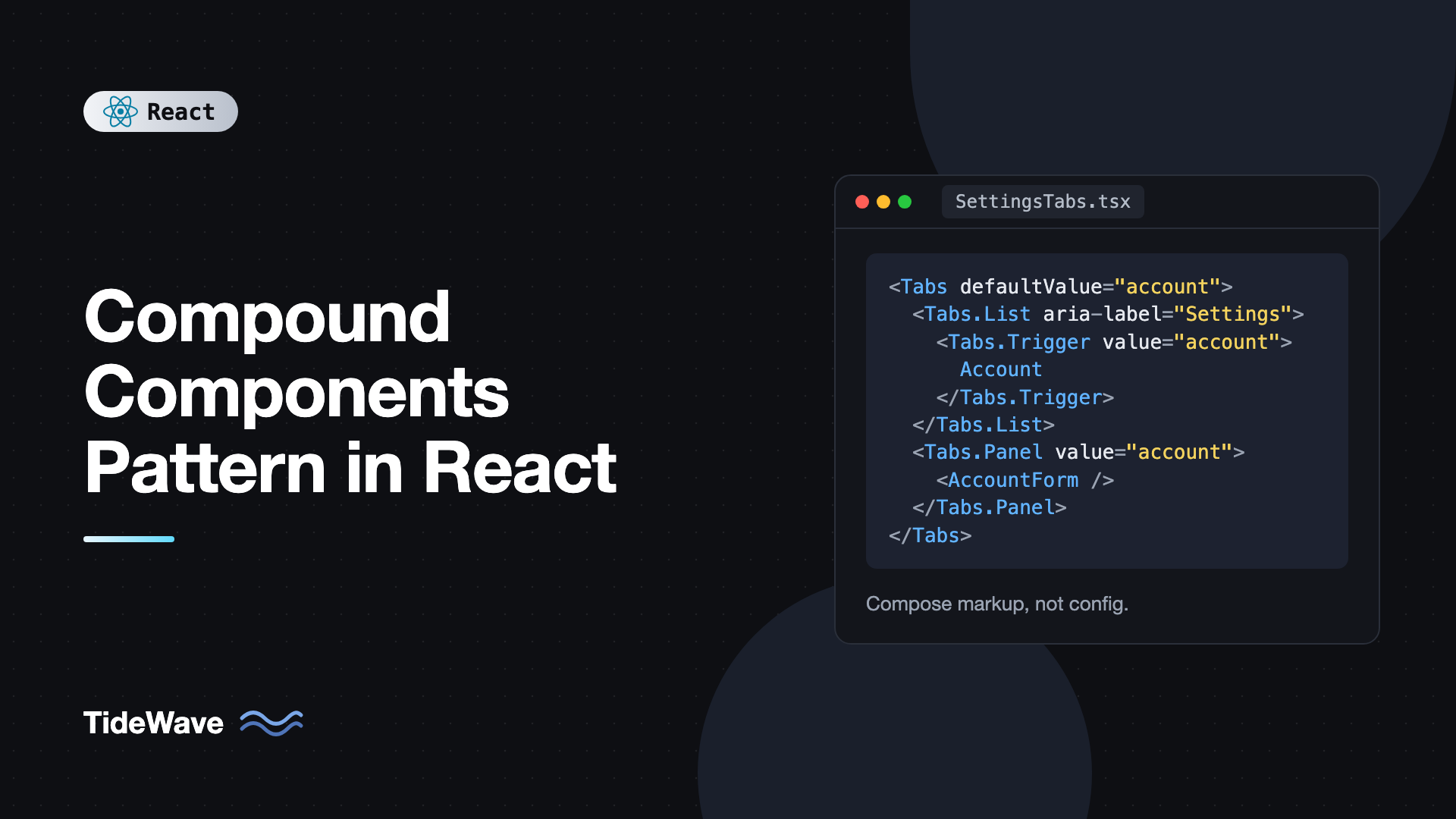
Here's the API we're aiming for:
<Tabs defaultValue="account">
  <Tabs.List aria-label="Settings">
    <Tabs.Trigger value="account">Account</Tabs.Trigger>
    <Tabs.Trigger value="billing">Billing</Tabs.Trigger>
    <Tabs.Trigger value="team" disabled>
      Team
    </Tabs.Trigger>
  </Tabs.List>

  <Tabs.Panel value="account">
    <AccountForm />
  </Tabs.Panel>
  <Tabs.Panel value="billing">
    <BillingDetails />
  </Tabs.Panel>
</Tabs>
Compare it to the config version, Tabs with items={[{ value: "account", label: "Account", content: <AccountForm /> }, ...]}. The compound version is longer, but it's ordinary JSX. You can wrap a trigger in a tooltip, put an icon inside it, add a wrapper div around the list, or render panels conditionally, all without the Tabs component knowing about any of it.
If you've used Radix UI, Headless UI, or Reach UI, this API will feel familiar. It's the dominant pattern for flexible UI primitives.
How the Pattern Works
There are three parts:
- A parent component that holds the shared state (which tab is active).
- A context that exposes that state and the functions to change it.
- Child components that read from the context and render their own piece.
Older implementations used React.Children.map and cloneElement to inject props into direct children. That approach breaks as soon as a consumer wraps a child in another element, because the parent only sees its direct children. Context works at any depth, so it's the approach to use today.
Building Tabs Step by Step
The Context
Start with a typed context and a hook that throws a helpful error when a child is used outside the parent:
// tabs-context.ts
import { createContext, useContext } from "react";

type TabsContextValue = {
  value: string;
  setValue: (value: string) => void;
  baseId: string;
};

export const TabsContext = createContext<TabsContextValue | null>(null);

export function useTabsContext(componentName: string) {
  const ctx = useContext(TabsContext);
  if (!ctx) {
    throw new Error(`<${componentName}> must be used inside <Tabs>.`);
  }
  return ctx;
}
Creating the context with null as the default and throwing in the hook is better than inventing a fake default. A missing provider is a programming mistake, and a clear error message saves debugging time.
A Controllable State Hook
Good compound components work both uncontrolled (the component manages its own state, seeded by defaultValue) and controlled (the parent passes value and onValueChange). A small hook handles both:
// use-controllable-state.ts
import { useCallback, useState } from "react";

type Options<T> = {
  value?: T;
  defaultValue: T;
  onChange?: (value: T) => void;
};

export function useControllableState<T>({ value, defaultValue, onChange }: Options<T>) {
  const [internal, setInternal] = useState(defaultValue);
  const isControlled = value !== undefined;
  const current = isControlled ? value : internal;

  const setValue = useCallback(
    (next: T) => {
      if (!isControlled) setInternal(next);
      onChange?.(next);
    },
    [isControlled, onChange],
  );

  return [current, setValue] as const;
}
When value is provided, the hook ignores its internal state and just reports changes. When it isn't, it stores the value itself and still calls onChange so the parent can observe changes. This mirrors how native inputs behave with value versus defaultValue, which I cover in controlled vs uncontrolled components.
The Parent Component
The root Tabs component wires the state into the context provider:
// tabs.tsx
import { useId, useMemo, type ReactNode } from "react";
import { TabsContext } from "./tabs-context";
import { useControllableState } from "./use-controllable-state";

type TabsProps = {
  value?: string;
  defaultValue?: string;
  onValueChange?: (value: string) => void;
  children: ReactNode;
  className?: string;
};

function TabsRoot({ value, defaultValue = "", onValueChange, children, className }: TabsProps) {
  const [current, setCurrent] = useControllableState({
    value,
    defaultValue,
    onChange: onValueChange,
  });
  const baseId = useId();

  const ctx = useMemo(
    () => ({ value: current, setValue: setCurrent, baseId }),
    [current, setCurrent, baseId],
  );

  return (
    <TabsContext value={ctx}>
      <div className={className}>{children}</div>
    </TabsContext>
  );
}
Two React 19 details here. First, you can render TabsContext directly as a provider instead of TabsContext.Provider. Second, useId generates a stable prefix we'll use to connect each trigger to its panel with aria-controls and aria-labelledby.
The useMemo keeps the context value stable between renders when nothing changed, so consumers don't re-render just because the parent did. If your project uses the React Compiler, it does this for you and you can drop the manual memo.
The List and Triggers
The tab list needs the tablist role and arrow-key navigation. The triggers need role="tab", the right aria-selected state, and a roving tabIndex so only the active tab is in the tab order:
import type { ComponentProps, KeyboardEvent } from "react";
import { useTabsContext } from "./tabs-context";

function TabsList({ children, onKeyDown, ...rest }: ComponentProps<"div">) {
  function handleKeyDown(e: KeyboardEvent<HTMLDivElement>) {
    onKeyDown?.(e);
    const tabs = Array.from(
      e.currentTarget.querySelectorAll<HTMLButtonElement>('[role="tab"]:not([disabled])'),
    );
    const index = tabs.indexOf(document.activeElement as HTMLButtonElement);
    if (index === -1) return;

    let next: number | null = null;
    if (e.key === "ArrowRight") next = (index + 1) % tabs.length;
    if (e.key === "ArrowLeft") next = (index - 1 + tabs.length) % tabs.length;
    if (e.key === "Home") next = 0;
    if (e.key === "End") next = tabs.length - 1;

    if (next !== null) {
      e.preventDefault();
      tabs[next].focus();
      tabs[next].click();
    }
  }

  return (
    <div role="tablist" {...rest} onKeyDown={handleKeyDown}>
      {children}
    </div>
  );
}

type TriggerProps = Omit<ComponentProps<"button">, "value"> & { value: string };

function TabsTrigger({ value, children, ...rest }: TriggerProps) {
  const { value: active, setValue, baseId } = useTabsContext("Tabs.Trigger");
  const selected = active === value;

  return (
    <button
      type="button"
      role="tab"
      id={`${baseId}-tab-${value}`}
      aria-controls={`${baseId}-panel-${value}`}
      aria-selected={selected}
      tabIndex={selected ? 0 : -1}
      data-state={selected ? "active" : "inactive"}
      {...rest}
      onClick={(e) => {
        rest.onClick?.(e);
        if (!e.defaultPrevented) setValue(value);
      }}
    >
      {children}
    </button>
  );
}
A few details worth noting. The trigger calls the consumer's onClick before its own logic and respects preventDefault, so consumers can cancel a tab change. The data-state attribute gives you a styling hook, like [data-state="active"] in CSS or data-[state=active]: in Tailwind. And the list spreads ...rest so consumers can add aria-label, class names, or anything else.
The Panel
Panels only render when active, and they point back to their trigger:
type PanelProps = ComponentProps<"div"> & { value: string };

function TabsPanel({ value, children, ...rest }: PanelProps) {
  const { value: active, baseId } = useTabsContext("Tabs.Panel");
  if (active !== value) return null;

  return (
    <div
      role="tabpanel"
      id={`${baseId}-panel-${value}`}
      aria-labelledby={`${baseId}-tab-${value}`}
      tabIndex={0}
      {...rest}
    >
      {children}
    </div>
  );
}
Attaching the Subcomponents
Finally, attach the children as static properties so consumers import one thing:
export const Tabs = Object.assign(TabsRoot, {
  List: TabsList,
  Trigger: TabsTrigger,
  Panel: TabsPanel,
});
Object.assign keeps the types intact, so Tabs.Trigger is fully typed. Some libraries export named parts instead (TabsList, TabsTrigger), which works better with tree shaking and React Server Components, because dot access on a client component isn't allowed across the server/client boundary. If you use the dotted API in a Next.js app, the file using it must be a client component, or you should export named parts too.
Controlled Usage
Because of useControllableState, the same component can be driven from outside. Syncing the active tab with the URL is a common reason:
import { useSearchParams } from "react-router";
import { Tabs } from "./tabs";

export function SettingsPage() {
  const [params, setParams] = useSearchParams();
  const tab = params.get("tab") ?? "account";

  return (
    <Tabs value={tab} onValueChange={(next) => setParams({ tab: next })}>
      <Tabs.List aria-label="Settings">
        <Tabs.Trigger value="account">Account</Tabs.Trigger>
        <Tabs.Trigger value="billing">Billing</Tabs.Trigger>
      </Tabs.List>
      <Tabs.Panel value="account">Account settings</Tabs.Panel>
      <Tabs.Panel value="billing">Billing settings</Tabs.Panel>
    </Tabs>
  );
}
Now the active tab survives a refresh and can be linked to directly.
A Second Example: Accordion
The pattern generalizes. An accordion has a root that tracks which items are open, items that know their own value, and triggers and content that read both. That means two levels of context: one for the accordion, one for each item.
import { createContext, use, useId, useState, type ReactNode } from "react";

type AccordionCtx = {
  openItems: Set<string>;
  toggle: (value: string) => void;
};
const AccordionContext = createContext<AccordionCtx | null>(null);

type ItemCtx = { value: string; open: boolean; triggerId: string; contentId: string };
const ItemContext = createContext<ItemCtx | null>(null);

function useRequired<T>(ctx: T | null, name: string): T {
  if (!ctx) throw new Error(`<${name}> is missing its parent.`);
  return ctx;
}

function AccordionRoot({ multiple = false, children }: { multiple?: boolean; children: ReactNode }) {
  const [openItems, setOpenItems] = useState<Set<string>>(() => new Set());

  function toggle(value: string) {
    setOpenItems((prev) => {
      const next = new Set(multiple ? prev : []);
      if (prev.has(value)) next.delete(value);
      else next.add(value);
      return next;
    });
  }

  return <AccordionContext value={{ openItems, toggle }}>{children}</AccordionContext>;
}

function AccordionItem({ value, children }: { value: string; children: ReactNode }) {
  const { openItems } = useRequired(use(AccordionContext), "Accordion.Item");
  const id = useId();
  const item = { value, open: openItems.has(value), triggerId: `${id}-t`, contentId: `${id}-c` };

  return (
    <ItemContext value={item}>
      <div data-state={item.open ? "open" : "closed"}>{children}</div>
    </ItemContext>
  );
}

function AccordionTrigger({ children }: { children: ReactNode }) {
  const { toggle } = useRequired(use(AccordionContext), "Accordion.Trigger");
  const item = useRequired(use(ItemContext), "Accordion.Trigger");

  return (
    <h3>
      <button
        type="button"
        id={item.triggerId}
        aria-expanded={item.open}
        aria-controls={item.contentId}
        onClick={() => toggle(item.value)}
      >
        {children}
      </button>
    </h3>
  );
}

function AccordionContent({ children }: { children: ReactNode }) {
  const item = useRequired(use(ItemContext), "Accordion.Content");

  return (
    <div id={item.contentId} role="region" aria-labelledby={item.triggerId} hidden={!item.open}>
      {children}
    </div>
  );
}

export const Accordion = Object.assign(AccordionRoot, {
  Item: AccordionItem,
  Trigger: AccordionTrigger,
  Content: AccordionContent,
});
This version reads context with React 19's use() instead of useContext. They behave the same here, but use() can also be called conditionally, which is occasionally handy. The usage reads like the HTML it produces:
<Accordion multiple>
  <Accordion.Item value="shipping">
    <Accordion.Trigger>How long does shipping take?</Accordion.Trigger>
    <Accordion.Content>Orders ship within two business days.</Accordion.Content>
  </Accordion.Item>
  <Accordion.Item value="returns">
    <Accordion.Trigger>Can I return an item?</Accordion.Trigger>
    <Accordion.Content>Yes, within 30 days of delivery.</Accordion.Content>
  </Accordion.Item>
</Accordion>
The ItemContext is what makes this clean. Accordion.Trigger doesn't need a value prop because it reads it from the item it's nested in.
When to Use Compound Components
Compound components shine when:
- Consumers need layout control, like putting a tab list in a toolbar or adding elements between items.
- Parts need individual customization, such as a single disabled trigger with a tooltip.
- The component has a clear set of related parts, like menus, selects, tabs, accordions, steppers, and dialogs.
They're less useful for components that are mostly data-driven, like a table with 10,000 rows from an API. There, a rows prop with render callbacks is usually better. Many libraries offer both: a compound API for flexibility and a thin config wrapper for the common case.
Common Mistakes With Compound Components
- Using
cloneElementto pass state. It only reaches direct children and breaks when consumers wrap parts in other elements. Use context. - Silent defaults in context. A default context value hides missing providers. Default to
nulland throw a clear error in the consumer hook. - Forgetting the controlled mode. Without
valueandonValueChange, consumers can't sync state with the URL, a form, or analytics. - Overriding consumer handlers. If a trigger sets its own
onClickafter spreading props, the consumer's handler is lost. Call both, and respectdefaultPrevented. - Skipping accessibility. Tabs need roles,
aria-selected, roving focus, and arrow-key support. Getting this right once is a big part of why the pattern is worth it. - Putting everything in one context. If triggers re-render on every unrelated change, split the context or memoize the value.
Frequently Asked Questions (FAQ) About Compound Components in React
It's a way of building one logical component out of several cooperating components, such as Tabs, Tabs.List, Tabs.Trigger, and Tabs.Panel. The parent holds shared state in context, and each child reads what it needs, so consumers compose the pieces with ordinary JSX.
Use context. cloneElement only reaches direct children, so wrapping a child in a tooltip or a div breaks it, and the React docs list it as a legacy API. Context works at any nesting depth and is easier to type.
Accept value, defaultValue, and an onValueChange callback. If value is defined, treat it as the source of truth and only report changes. Otherwise, store the state internally, initialized from defaultValue. A small useControllableState hook keeps this logic in one place.
The parts that use state and context must be client components. Dotted access like Tabs.Trigger can be a problem when a server component imports a client module, so many libraries also export named parts like TabsTrigger that work across the boundary.
Not usually. The main cost is context updates re-rendering every consumer. Memoize the context value, keep the context focused on the state that changes together, and let the React Compiler handle the rest if you use it.
For production apps, a library like Radix UI or React Aria saves a lot of accessibility work and edge cases. Building your own is worth it for learning, for very custom behavior, or when you want zero dependencies for a small set of components.
Conclusion
The compound components pattern replaces growing configuration props with composition. A parent owns the state, a context shares it, and small child components render their own part, so consumers can arrange, wrap, and style pieces freely. Add controlled and uncontrolled support, throw clear errors for misuse, and build in the right ARIA roles and keyboard behavior once.
Try converting one config-heavy component in your codebase, a tabs or dropdown with an items array is a good candidate. Once it clicks, you'll see the same idea in many places, and it pairs naturally with building headless UI components, where the logic is separated from markup entirely.