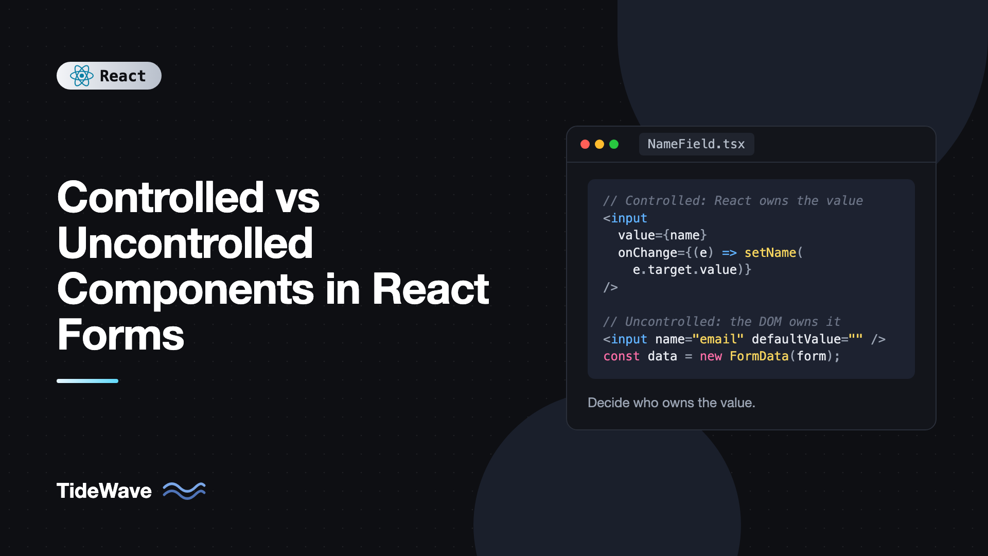
Controlled vs Uncontrolled Components in React Forms
Every form input in React has a value, and something has to own it. Either React holds the value in state and pushes it into the input on every render, or the browser's DOM holds it and React reads it when needed. That choice is the difference between controlled and uncontrolled components, and it affects how you validate, how you reset, how often your component re-renders, and which bugs you will run into.
You have probably seen the warning "A component is changing an uncontrolled input to be controlled" at some point. It is a sign that an input switched owners halfway through its life. Understanding the two models makes that warning, and a lot of form behavior, easy to reason about.
This post explains both approaches with working examples, compares their trade-offs, shows how React 19 form actions make uncontrolled inputs more attractive, and covers how to build your own components that support both modes.
Controlled Components
A controlled input gets its value from React state and reports changes through onChange. React is the single source of truth.
import { useState } from "react";

export function NameField() {
  const [name, setName] = useState("");

  return (
    <div>
      <label htmlFor="name">Name</label>
      <input
        id="name"
        value={name}
        onChange={(e) => setName(e.target.value)}
      />
      <p>Hello, {name || "stranger"}!</p>
    </div>
  );
}
The cycle on each keystroke is:
- The user types a character.
- The browser fires an input event, which React exposes as
onChange. - Your handler calls
setNamewith the new value. - React re-renders and sets the input's
valueto the new state.
If your handler did not call setName, the input would refuse to change. That is the defining property: the input displays exactly what state says, nothing more.
That control is useful. You can transform input as the user types:
import { useState } from "react";

export function PhoneField() {
  const [digits, setDigits] = useState("");

  return (
    <input
      inputMode="numeric"
      aria-label="Phone number"
      value={digits}
      onChange={(e) => setDigits(e.target.value.replace(/\D/g, "").slice(0, 10))}
    />
  );
}
Non-digit characters never appear, and the length is capped at ten. With a controlled input you can also enable or disable buttons based on current values, show live character counts, and keep several inputs in sync.
Uncontrolled Components
An uncontrolled input keeps its value in the DOM, just like plain HTML. You give it an initial value with defaultValue and read the current value when you need it.
There are two common ways to read uncontrolled values. The first is a ref:
import { useRef, type FormEvent } from "react";

export function SearchBox({ onSearch }: { onSearch: (q: string) => void }) {
  const inputRef = useRef<HTMLInputElement>(null);

  function handleSubmit(e: FormEvent<HTMLFormElement>) {
    e.preventDefault();
    onSearch(inputRef.current?.value ?? "");
  }

  return (
    <form onSubmit={handleSubmit}>
      <input ref={inputRef} defaultValue="" aria-label="Search" />
      <button type="submit">Search</button>
    </form>
  );
}
The second, and usually better, way is to read the whole form with FormData, which needs no refs at all:
import type { FormEvent } from "react";

interface Signup {
  email: string;
  plan: string;
  newsletter: boolean;
}

export function SignupForm({ onSubmit }: { onSubmit: (data: Signup) => void }) {
  function handleSubmit(e: FormEvent<HTMLFormElement>) {
    e.preventDefault();
    const form = new FormData(e.currentTarget);
    onSubmit({
      email: String(form.get("email") ?? ""),
      plan: String(form.get("plan") ?? "free"),
      newsletter: form.get("newsletter") === "on",
    });
  }

  return (
    <form onSubmit={handleSubmit}>
      <label htmlFor="email">Email</label>
      <input id="email" name="email" type="email" required />

      <label htmlFor="plan">Plan</label>
      <select id="plan" name="plan" defaultValue="free">
        <option value="free">Free</option>
        <option value="pro">Pro</option>
      </select>

      <label>
        <input type="checkbox" name="newsletter" defaultChecked />
        Send me product updates
      </label>

      <button type="submit">Sign up</button>
    </form>
  );
}
Note the attribute pairs:
| Input | Controlled | Uncontrolled |
|---|---|---|
| Text, textarea, select | value | defaultValue |
| Checkbox, radio | checked | defaultChecked |
Uncontrolled inputs do not re-render your component on each keystroke because there is no state change. They also work with native browser validation like required, type="email", and pattern out of the box.
File Inputs Are Always Uncontrolled
An input with type="file" cannot be controlled, because browsers do not let scripts set its value for security reasons. You read the selected files from the event or a ref:
export function AvatarPicker({ onPick }: { onPick: (file: File) => void }) {
  return (
    <input
      type="file"
      accept="image/*"
      aria-label="Choose avatar"
      onChange={(e) => {
        const file = e.target.files?.[0];
        if (file) onPick(file);
      }}
    />
  );
}
Using onChange does not make an input controlled. What makes it controlled is passing value or checked. For a complete upload flow, see handling file uploads in React with drag and drop.
The Switching Warning
React warns when an input changes from uncontrolled to controlled, or the other way round. The most common cause is an initial value of undefined:
// Causes the warning
const [user, setUser] = useState<{ name?: string }>({});
<input value={user.name} onChange={(e) => setUser({ name: e.target.value })} />;
On the first render user.name is undefined, so React treats the input as uncontrolled. After the first keystroke it becomes a string, and the input switches to controlled. Fix it by always providing a defined value:
<input
  value={user.name ?? ""}
  onChange={(e) => setUser({ name: e.target.value })}
/>
A related mistake is passing value without onChange. React then renders a read-only input and warns. Either add onChange, use defaultValue if you meant it as an initial value, or add readOnly if it really should not change.
React 19 Form Actions and Uncontrolled Inputs
React 19 lets you pass a function to a form's action prop. React calls it with the form's FormData when the form is submitted, tracks the pending state, and, after a successful action, resets uncontrolled fields automatically. This makes uncontrolled inputs the natural fit for many forms.
import { useActionState } from "react";
import { useFormStatus } from "react-dom";

interface State {
  error: string | null;
  saved: string | null;
}

async function saveComment(_prev: State, formData: FormData): Promise<State> {
  const text = String(formData.get("comment") ?? "").trim();
  if (text.length < 3) {
    return { error: "Comment is too short", saved: null };
  }

  const res = await fetch("/api/comments", {
    method: "POST",
    headers: { "Content-Type": "application/json" },
    body: JSON.stringify({ text }),
  });
  if (!res.ok) return { error: "Could not save comment", saved: null };

  return { error: null, saved: text };
}

function SubmitButton() {
  const { pending } = useFormStatus();
  return (
    <button type="submit" disabled={pending}>
      {pending ? "Posting..." : "Post comment"}
    </button>
  );
}

export function CommentForm() {
  const [state, formAction] = useActionState(saveComment, {
    error: null,
    saved: null,
  });

  return (
    <form action={formAction}>
      <label htmlFor="comment">Comment</label>
      <textarea id="comment" name="comment" rows={3} />
      {state.error && <p role="alert">{state.error}</p>}
      {state.saved && <p role="status">Posted: {state.saved}</p>}
      <SubmitButton />
    </form>
  );
}
No useState for the textarea, no onChange, and no manual reset. Because the form resets after the action, a validation failure also clears the user's text in this example. For better UX on errors, return the submitted values in the state and use them as defaultValue, or switch that field to controlled. The details are covered in useActionState and form actions in modern React.
Comparing the Two Approaches
| Concern | Controlled | Uncontrolled |
|---|---|---|
| Source of truth | React state | DOM |
| Re-renders on typing | Every keystroke | None |
| Live validation and formatting | Easy | Needs event handlers or a library |
| Conditional UI based on values | Easy | Harder |
| Native validation | Works | Works |
| Reset | Set state back | form.reset() or automatic after actions |
| Boilerplate | value plus onChange per field | name per field |
| Programmatic value changes | Set state | Set via ref (not recommended often) |
Neither model is "correct." Choose per field based on what the UI needs:
- Choose controlled when the UI reacts to the value while the user types: live search, formatting masks, character counters, dependent fields, or enabling a button only when inputs are valid.
- Choose uncontrolled when you only need the value at submit time: simple contact forms, search forms submitted with a button, and forms using form actions.
You can mix them in a single form. A long signup form might keep most inputs uncontrolled and make just the username field controlled to show availability as the user types.
Performance on Large Forms
A controlled form with fifty fields stored in one useState object re-renders the whole form on every keystroke. For most forms this is fast enough. When it is not, you have a few options:
- Move state down. Keep each field's state inside its own component and lift values up only on blur or submit.
- Use uncontrolled inputs. No state changes means no re-renders.
- Use a form library built on uncontrolled inputs. React Hook Form registers native inputs, reads values from the DOM, and only re-renders the parts that subscribe to specific fields or errors. The trade-offs versus Formik, which is built around controlled state, are compared in Formik vs React Hook Form.
Building Components That Support Both Modes
Native inputs support both modes: pass value for controlled, defaultValue for uncontrolled. Well-designed custom components do the same. Here is a toggle switch that works either way:
import { useState } from "react";

interface ToggleProps {
  checked?: boolean;
  defaultChecked?: boolean;
  onCheckedChange?: (checked: boolean) => void;
  label: string;
}

export function Toggle({
  checked,
  defaultChecked = false,
  onCheckedChange,
  label,
}: ToggleProps) {
  const [internal, setInternal] = useState(defaultChecked);
  const isControlled = checked !== undefined;
  const on = isControlled ? checked : internal;

  function toggle() {
    const next = !on;
    if (!isControlled) setInternal(next);
    onCheckedChange?.(next);
  }

  return (
    <button
      type="button"
      role="switch"
      aria-checked={on}
      onClick={toggle}
      className={on ? "toggle toggle-on" : "toggle"}
    >
      {label}
    </button>
  );
}
Usage in both modes:
import { useState } from "react";
import { Toggle } from "./Toggle";

export function Settings() {
  const [emails, setEmails] = useState(true);

  return (
    <>
      {/* Uncontrolled: the Toggle manages its own state */}
      <Toggle label="Sounds" defaultChecked />

      {/* Controlled: the parent owns the state */}
      <Toggle label="Email alerts" checked={emails} onCheckedChange={setEmails} />
      <p>Email alerts are {emails ? "on" : "off"}.</p>
    </>
  );
}
The key line is const on = isControlled ? checked : internal, which is itself derived state. When a checked prop is passed, the internal state is ignored. This is the same contract that component libraries like Radix UI use, often wrapped in a reusable hook. The ideas behind it connect closely to derived state patterns.
A component should not switch modes during its life, for the same reason native inputs warn about it. Decide once, based on whether the parent passes checked.
Common Mistakes
- Initializing a controlled value as
undefinedornull. Use an empty string,false, or another defined default. - Passing
valuewithoutonChange. The input becomes read-only. UsedefaultValueor add a handler. - Using both
valueanddefaultValue. React warns, anddefaultValueis ignored. Pick one. - Expecting
defaultValueto update. It is only read on mount. To show a new initial value, change the input'skeyor make it controlled. - Reading
e.target.valueasynchronously in older patterns. In modern React, events are not pooled, but it is still clearer to read the value immediately and pass it along. - Controlling every field by habit. Simple forms are often shorter and faster with
FormData.
Frequently Asked Questions (FAQ) About Controlled and Uncontrolled Components
A controlled input gets its value from React state through the value prop and updates through onChange. An uncontrolled input keeps its value in the DOM, starts from defaultValue, and you read it with a ref or FormData when you need it.
React's documentation describes both as valid. Controlled inputs are recommended when you need to react to every change. With React 19 form actions, uncontrolled inputs read through FormData have become a common and simple choice for forms that only need values on submit.
Usually because the value prop was undefined on the first render and a string later. React treats an input without a defined value as uncontrolled. Always provide a defined initial value, such as an empty string.
No. Browsers do not allow setting a file input's value from JavaScript, so it is always uncontrolled. Read selected files from e.target.files in onChange or from FormData on submit.
They avoid a re-render on every keystroke, which can matter in large forms or slow components. For typical forms, the difference is not noticeable, so pick the model that makes the code simpler.
It is built around uncontrolled inputs. The register function attaches a ref and listeners to native inputs and reads values from the DOM. For third-party components that only work in controlled mode, it provides a Controller component.
Conclusion
Controlled inputs let React own the value, which makes live validation, formatting, and dependent UI straightforward, at the cost of a re-render per keystroke and a bit more code. Uncontrolled inputs let the DOM own the value, which keeps forms short and fast and pairs naturally with FormData and React 19 form actions.
Pick per field rather than per app. Start with uncontrolled inputs and FormData for simple forms, switch individual fields to controlled when the UI needs to respond as the user types, and when you build reusable inputs, support both modes with the value or defaultValue contract that native elements already use.