Managing Focus and Keyboard Navigation in React
Open a modal in a typical React app, press Tab a few times, and you'll often find yourself back on the page behind it, clicking links you can't see. Delete an item from a list and focus vanishes to the top of the document. Switch routes and the screen reader says nothing at all. None of these bugs show up when you test with a mouse, which is why they survive so long.
Browsers handle focus well for static documents. React apps are not static: elements mount, unmount, and move all the time, and the browser can't guess where focus should go next. That decision is yours.
This post covers the practical toolkit: moving focus with refs, deciding where focus goes after something disappears, trapping and restoring focus in dialogs, the roving tabindex pattern for toolbars and lists, and adding keyboard shortcuts without breaking typing. Every example is a small, reusable piece you can drop into a real codebase.
How Focus Works in the Browser
A few rules shape everything else:
- Only one element has focus at a time, available as
document.activeElement. - Natively focusable elements are links with
href, buttons, inputs, selects, textareas, and elements withcontenteditable. tabIndex={0}adds any element to the natural Tab order, in DOM order.tabIndex={-1}makes an element focusable by script (element.focus()) but skips it when tabbing.- Positive
tabIndexvalues (1, 2, 3) override DOM order. Avoid them. They create an order that's almost impossible to maintain.
When a focused element is removed from the DOM, focus falls back to document.body. For a keyboard user, that means the next Tab press starts from the top of the page. Most focus bugs in React are some version of this.
Moving Focus With Refs
To focus an element from React, attach a ref and call focus() in an effect or an event handler:
import { useEffect, useRef, useState } from "react";

export function EditableTitle({ initial }: { initial: string }) {
  const [editing, setEditing] = useState(false);
  const [title, setTitle] = useState(initial);
  const inputRef = useRef<HTMLInputElement>(null);
  const buttonRef = useRef<HTMLButtonElement>(null);

  useEffect(() => {
    if (editing) {
      inputRef.current?.focus();
      inputRef.current?.select();
    }
  }, [editing]);

  function finish() {
    setEditing(false);
    // Wait for the button to render again, then return focus to it
    requestAnimationFrame(() => buttonRef.current?.focus());
  }

  if (editing) {
    return (
      <input
        ref={inputRef}
        value={title}
        onChange={(e) => setTitle(e.target.value)}
        onBlur={finish}
        onKeyDown={(e) => {
          if (e.key === "Enter" || e.key === "Escape") finish();
        }}
        aria-label="Title"
      />
    );
  }

  return (
    <button ref={buttonRef} type="button" onClick={() => setEditing(true)}>
      {title}
    </button>
  );
}
The effect runs after React commits the input to the DOM, so the ref is populated. Returning focus to the button uses requestAnimationFrame because the button doesn't exist yet when finish runs.
For simple cases where an input should be focused as soon as it mounts, the autoFocus prop works. React calls focus() on mount rather than relying on the HTML attribute, so it also works for elements rendered later. Use it carefully: autofocusing on page load can skip content screen reader users need to hear first.
A Ref Callback Alternative
React 19 lets ref callbacks return a cleanup function, which makes "focus when this appears" a one-liner without an effect:
<input
  ref={(node) => {
    node?.focus();
  }}
  aria-label="Search"
/>
Be aware that an inline function is a new ref callback on every render, so React detaches and reattaches it, focusing the input again each time. Wrap it in useCallback if the component re-renders while the user is elsewhere on the page. For a deeper look at refs, see mastering useRef beyond DOM elements.
Where Should Focus Go When Something Disappears?
When the focused element is removed, you have to pick a new target. Some sensible defaults:
- Deleting a list item: focus the next item, or the previous one if it was last, or the list's heading if it's now empty.
- Closing a dialog or popover: return to the element that opened it.
- Submitting an inline form: focus the newly created item or a success message.
- Dismissing a notification: focus the next notification or the region's heading.
Here's a deletable list that keeps focus in a sensible place:
import { useRef, useState } from "react";

type Todo = { id: string; text: string };

export function TodoList({ initial }: { initial: Todo[] }) {
  const [todos, setTodos] = useState(initial);
  const itemRefs = useRef(new Map<string, HTMLButtonElement>());
  const headingRef = useRef<HTMLHeadingElement>(null);

  function remove(index: number) {
    const next = todos.filter((_, i) => i !== index);
    setTodos(next);

    const target = next[index] ?? next[index - 1];
    requestAnimationFrame(() => {
      if (target) itemRefs.current.get(target.id)?.focus();
      else headingRef.current?.focus();
    });
  }

  return (
    <section>
      <h2 ref={headingRef} tabIndex={-1}>
        Todos ({todos.length})
      </h2>
      <ul>
        {todos.map((todo, index) => (
          <li key={todo.id}>
            {todo.text}
            <button
              type="button"
              ref={(node) => {
                if (node) itemRefs.current.set(todo.id, node);
                else itemRefs.current.delete(todo.id);
              }}
              onClick={() => remove(index)}
              aria-label={`Delete ${todo.text}`}
            >
              Delete
            </button>
          </li>
        ))}
      </ul>
    </section>
  );
}
A Map of refs keyed by ID handles any number of items. The ref callback adds and removes entries as items mount and unmount. Stable keys are essential here. If you used the index as the key, React would reuse DOM nodes for different items and your focus targets would point at the wrong buttons. Why keys matter when rendering lists explains this in detail.
Focus Traps and Restoration in Dialogs
A modal dialog should keep focus inside itself until it closes. The best option today is the native <dialog> element. Calling showModal() makes everything outside it inert, closes on Escape, and returns focus to the previously focused element on close.
When you can't use <dialog>, for example inside an older design system, you can trap focus yourself. The building block is a function that finds all tabbable elements in a container:
// focusable.ts
const SELECTOR = [
  "a[href]",
  "button:not([disabled])",
  "input:not([disabled]):not([type='hidden'])",
  "select:not([disabled])",
  "textarea:not([disabled])",
  "[tabindex]:not([tabindex='-1'])",
  "[contenteditable='true']",
].join(",");

export function getFocusable(container: HTMLElement): HTMLElement[] {
  return Array.from(container.querySelectorAll<HTMLElement>(SELECTOR)).filter(
    (el) => !el.hasAttribute("inert") && el.getClientRects().length > 0,
  );
}
The getClientRects check filters out hidden elements. Now a hook that traps Tab inside a container and restores focus on unmount:
// useFocusTrap.ts
import { useEffect, useRef } from "react";
import { getFocusable } from "./focusable";

export function useFocusTrap<T extends HTMLElement>(active: boolean) {
  const containerRef = useRef<T>(null);

  useEffect(() => {
    if (!active) return;
    const container = containerRef.current;
    if (!container) return;

    const previouslyFocused = document.activeElement as HTMLElement | null;
    const [first] = getFocusable(container);
    (first ?? container).focus();

    function onKeyDown(event: KeyboardEvent) {
      if (event.key !== "Tab" || !container) return;
      const items = getFocusable(container);
      if (items.length === 0) {
        event.preventDefault();
        return;
      }
      const firstItem = items[0];
      const lastItem = items[items.length - 1];

      if (event.shiftKey && document.activeElement === firstItem) {
        event.preventDefault();
        lastItem.focus();
      } else if (!event.shiftKey && document.activeElement === lastItem) {
        event.preventDefault();
        firstItem.focus();
      }
    }

    document.addEventListener("keydown", onKeyDown);
    return () => {
      document.removeEventListener("keydown", onKeyDown);
      previouslyFocused?.focus();
    };
  }, [active]);

  return containerRef;
}
And a dialog that uses it:
import { useId, type ReactNode } from "react";
import { createPortal } from "react-dom";
import { useFocusTrap } from "./useFocusTrap";

type DialogProps = {
  open: boolean;
  title: string;
  onClose: () => void;
  children: ReactNode;
};

export function Dialog({ open, title, onClose, children }: DialogProps) {
  const ref = useFocusTrap<HTMLDivElement>(open);
  const titleId = useId();

  if (!open) return null;

  return createPortal(
    <div className="backdrop" onClick={onClose}>
      <div
        ref={ref}
        role="dialog"
        aria-modal="true"
        aria-labelledby={titleId}
        tabIndex={-1}
        className="dialog"
        onClick={(e) => e.stopPropagation()}
        onKeyDown={(e) => {
          if (e.key === "Escape") onClose();
        }}
      >
        <h2 id={titleId}>{title}</h2>
        {children}
      </div>
    </div>,
    document.body,
  );
}
There's one gap: screen reader users can still reach background content with virtual cursor commands, because aria-modal support varies. To fully hide the background, set the inert attribute on your app root while the dialog is open. React 19 supports inert as a boolean prop, so <div id="app" inert={dialogOpen}> works. For more on rendering overlays outside the main tree, see portals in React for modals, tooltips, and toasts.
The Roving Tabindex Pattern
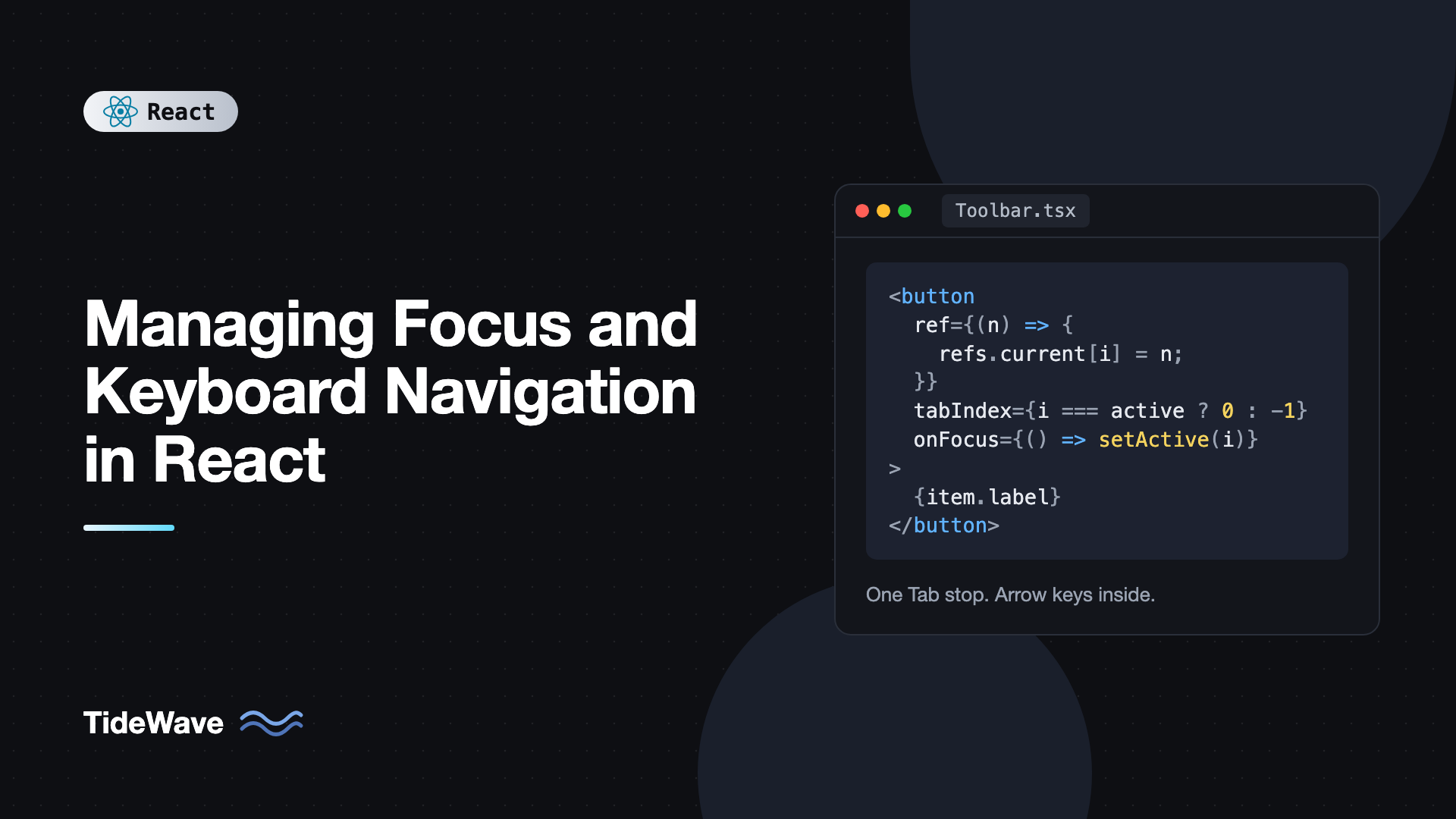
Some widgets contain many interactive items but should be a single Tab stop: toolbars, tab lists, radio groups, menus, and grids. Tabbing through 20 toolbar buttons to reach the editor would be painful. Instead, Tab enters the widget once, and arrow keys move within it.
The roving tabindex technique gives tabIndex={0} to the active item and tabIndex={-1} to the rest. Arrow keys move the zero to a new item and focus it. Because the active item keeps tabIndex={0}, tabbing back into the widget returns the user to where they left off.
import { useRef, useState, type KeyboardEvent } from "react";

type ToolbarItem = { id: string; label: string; onSelect: () => void };

export function Toolbar({ items, label }: { items: ToolbarItem[]; label: string }) {
  const [activeIndex, setActiveIndex] = useState(0);
  const refs = useRef<(HTMLButtonElement | null)[]>([]);

  function move(index: number) {
    const next = (index + items.length) % items.length;
    setActiveIndex(next);
    refs.current[next]?.focus();
  }

  function onKeyDown(event: KeyboardEvent<HTMLDivElement>) {
    switch (event.key) {
      case "ArrowRight":
        event.preventDefault();
        move(activeIndex + 1);
        break;
      case "ArrowLeft":
        event.preventDefault();
        move(activeIndex - 1);
        break;
      case "Home":
        event.preventDefault();
        move(0);
        break;
      case "End":
        event.preventDefault();
        move(items.length - 1);
        break;
    }
  }

  return (
    <div role="toolbar" aria-label={label} onKeyDown={onKeyDown}>
      {items.map((item, index) => (
        <button
          key={item.id}
          type="button"
          ref={(node) => {
            refs.current[index] = node;
          }}
          tabIndex={index === activeIndex ? 0 : -1}
          onClick={() => {
            setActiveIndex(index);
            item.onSelect();
          }}
          onFocus={() => setActiveIndex(index)}
        >
          {item.label}
        </button>
      ))}
    </div>
  );
}
A few details matter:
event.preventDefault()stops arrow keys from scrolling the page.- The
onFocushandler keeps state in sync if the user clicks a button directly. - Wrapping with the modulo makes the last item flow to the first, which is expected in toolbars. For vertical widgets like menus, use
ArrowUpandArrowDown.
aria-activedescendant as an Alternative
Comboboxes usually keep DOM focus on the text input while the user arrows through options. You can't move real focus to the options without losing the input. Instead, set aria-activedescendant on the input to the id of the highlighted option. Screen readers announce that option as if it were focused. This is the right pattern whenever typing must continue while navigating a list.
Skip Links
On every page, keyboard users must tab through the header and navigation before reaching content. A skip link lets them jump straight to the main region:
import type { ReactNode } from "react";

export function SkipLink() {
  return (
    <a href="#main" className="skip-link">
      Skip to main content
    </a>
  );
}

export function Layout({ children }: { children: ReactNode }) {
  return (
    <>
      <SkipLink />
      <header>{/* nav */}</header>
      <main id="main" tabIndex={-1}>
        {children}
      </main>
    </>
  );
}
.skip-link {
  position: absolute;
  left: 1rem;
  top: -100px;
}
.skip-link:focus {
  top: 1rem;
}
The link is hidden off-screen until it receives focus, then slides into view. Make it the very first focusable element on the page.
Keyboard Shortcuts Without Breaking Typing
Global shortcuts like / to open search or Cmd+K for a command palette are handy, but they must not fire while the user is typing in an input. A small hook handles that:
import { useEffect, useRef } from "react";

type Options = { meta?: boolean; allowInInputs?: boolean };

function isTypingTarget(target: EventTarget | null) {
  if (!(target instanceof HTMLElement)) return false;
  return (
    target.isContentEditable ||
    ["INPUT", "TEXTAREA", "SELECT"].includes(target.tagName)
  );
}

export function useHotkey(key: string, handler: () => void, options: Options = {}) {
  const handlerRef = useRef(handler);

  useEffect(() => {
    handlerRef.current = handler;
  });

  useEffect(() => {
    function onKeyDown(event: KeyboardEvent) {
      if (event.key.toLowerCase() !== key.toLowerCase()) return;
      const modifier = event.metaKey || event.ctrlKey;
      if (options.meta ? !modifier : modifier) return;
      if (!options.allowInInputs && isTypingTarget(event.target)) return;
      event.preventDefault();
      handlerRef.current();
    }
    window.addEventListener("keydown", onKeyDown);
    return () => window.removeEventListener("keydown", onKeyDown);
  }, [key, options.meta, options.allowInInputs]);
}
Usage:
useHotkey("k", () => setPaletteOpen(true), { meta: true, allowInInputs: true });
useHotkey("/", () => searchRef.current?.focus());
Storing the latest handler in a ref (updated in an effect, not during render) means the listener isn't reattached on every render. Single-character shortcuts can conflict with screen reader and voice control commands, so WCAG requires that users can turn them off or remap them, or that they only work when a specific component has focus. Modifier-based shortcuts like Cmd+K avoid the problem.
Testing Focus Behavior
React Testing Library and user-event simulate real keyboard interaction, including Tab:
import { render, screen } from "@testing-library/react";
import userEvent from "@testing-library/user-event";
import { expect, test } from "vitest";
import { Toolbar } from "./Toolbar";

test("arrow keys move focus within the toolbar", async () => {
  const user = userEvent.setup();
  const noop = () => {};
  render(
    <Toolbar
      label="Formatting"
      items={[
        { id: "b", label: "Bold", onSelect: noop },
        { id: "i", label: "Italic", onSelect: noop },
      ]}
    />,
  );

  await user.tab();
  expect(screen.getByRole("button", { name: "Bold" })).toHaveFocus();

  await user.keyboard("{ArrowRight}");
  expect(screen.getByRole("button", { name: "Italic" })).toHaveFocus();
});
toHaveFocus comes from @testing-library/jest-dom. Tests like this pin down keyboard behavior so a refactor can't silently break it.
Best Practices for Focus Management
- Prefer native elements.
<button>,<a href>, and<dialog>handle focus and keyboard behavior for you. - Always decide where focus goes after removal. Never let it silently fall back to
body. - Restore focus when overlays close. Return users to the trigger that opened the dialog, menu, or popover.
- Use
tabIndex={-1}for programmatic targets. Headings and containers you focus by script shouldn't become Tab stops. - Keep focus visible. Style
:focus-visible, and make sure focused elements aren't hidden behind sticky headers.scroll-margin-tophelps. - One Tab stop per composite widget. Use roving tabindex or
aria-activedescendantinside toolbars, lists, and grids. - Don't steal focus unexpectedly. Moving focus while someone is typing or reading is disorienting. Only move it in response to their actions.
Frequently Asked Questions (FAQ) About Focus Management in React
When the focused element is removed from the DOM, the browser moves focus to the document body. The next Tab press then starts from the beginning of the page. Fix it by focusing a sensible neighbor, such as the next item or the list heading, right after the removal renders.
Use the native dialog element with showModal() whenever you can. It traps focus, makes the background inert, closes on Escape, and restores focus on close, all built into the browser. Build your own only if you need behavior it can't provide, and in that case set inert on the rest of the page.
tabIndex 0 puts an element in the natural Tab order based on its DOM position. tabIndex -1 makes it focusable only through script, so it's skipped when tabbing. Use 0 for custom interactive widgets and -1 for headings, containers, and items managed by roving tabindex.
Use roving tabindex when the items themselves should receive real focus, like buttons in a toolbar or tabs in a tab list. Use aria-activedescendant when focus must stay on one element, usually a text input in a combobox, while the user highlights options in a list.
Usually the element isn't rendered yet, so the ref is null. Make sure the effect depends on the state that renders the element, and that the element isn't hidden with display: none at that moment. If focus targets an element that appears after another state update, requestAnimationFrame or a ref callback can help.
Yes, in client-rendered apps. Without it, focus stays on the clicked link and screen readers don't announce the new page. Moving focus to the main heading, or to a wrapper with tabIndex -1, and updating the document title gives users a clear signal that navigation happened.
Conclusion
Focus management in React comes down to one idea: whenever the UI changes in a way that removes, hides, or replaces the focused element, you choose the next focus target instead of letting the browser fall back to the page body. Refs and effects let you move focus, the native dialog element or a small trap hook keeps it contained, roving tabindex keeps composite widgets to a single Tab stop, and skip links plus careful shortcuts make the whole page faster to use from the keyboard.
Pick one interactive component in your app, unplug your mouse, and use it with Tab, Shift+Tab, arrow keys, Enter, and Escape. Fix whatever surprises you, then lock in the behavior with a user-event test. For the wider set of habits that make React apps accessible, read accessibility best practices for React developers.