Building a Reusable Design System with React and Storybook
Most teams don't decide to build a design system. They notice they have four slightly different buttons, three shades of "primary blue," and a modal that works differently in every app. Someone copies components between repos, fixes a bug in one copy, and the others drift further apart.
A design system fixes that by giving everyone one source of truth for tokens and components. Storybook is the workshop where you build and document it. Each component gets isolated stories for every state, the stories double as documentation, and the same stories run as interaction and accessibility tests.
In this post you'll set up a small React design system from scratch: design tokens in CSS, typed components with variants, Storybook stories and autodocs, a theme switcher in the toolbar, interaction tests with play functions, accessibility checks, and finally packaging the library so other apps can install it.
What Goes Into a Design System
A design system has three layers, and it helps to build them in this order:
- Design tokens: the raw decisions. Colors, spacing, type scale, radii, shadows, motion durations. They're named values, not components.
- Primitives: small, highly reusable components built only from tokens. Button, Input, Badge, Stack, Text.
- Composites: components built from primitives. Dialog, Combobox, Card, Toast.
Documentation and testing wrap around all three. If a token changes, every component that uses it updates. If a primitive is accessible, every composite built from it inherits that.
Project Setup
Start with a Vite React TypeScript project, which will become the library:
npm create vite@latest acme-ui -- --template react-ts
cd acme-ui
npm install
npm create storybook@latest
The Storybook installer detects Vite and React, installs the @storybook/react-vite framework, and creates a .storybook folder plus example stories. Delete the examples. A structure that scales:
src/
  tokens/
    tokens.css
  components/
    Button/
      Button.tsx
      Button.module.css
      Button.stories.tsx
    Input/
      Input.tsx
      Input.module.css
      Input.stories.tsx
  index.ts            # public exports
.storybook/
  main.ts
  preview.tsx
Keeping each component's code, styles, and stories in one folder makes it obvious when a component is missing stories, and deleting a component deletes everything related to it.
Design Tokens
Define tokens as CSS custom properties. They work with any styling approach, they can be overridden at any level of the tree, and themes become a matter of swapping values.
/* src/tokens/tokens.css */
:root {
  /* color */
  --acme-color-bg: #ffffff;
  --acme-color-fg: #0f172a;
  --acme-color-muted: #64748b;
  --acme-color-border: #e2e8f0;
  --acme-color-primary: #4f46e5;
  --acme-color-primary-hover: #4338ca;
  --acme-color-primary-fg: #ffffff;
  --acme-color-danger: #dc2626;
  --acme-color-danger-hover: #b91c1c;
  --acme-color-focus: #818cf8;

  /* spacing */
  --acme-space-1: 0.25rem;
  --acme-space-2: 0.5rem;
  --acme-space-3: 0.75rem;
  --acme-space-4: 1rem;
  --acme-space-6: 1.5rem;

  /* type */
  --acme-font-sans: "Inter", ui-sans-serif, system-ui, sans-serif;
  --acme-text-sm: 0.875rem;
  --acme-text-md: 1rem;
  --acme-text-lg: 1.125rem;

  /* shape */
  --acme-radius-sm: 6px;
  --acme-radius-md: 10px;
}

[data-theme="dark"] {
  --acme-color-bg: #0b1120;
  --acme-color-fg: #e5e7eb;
  --acme-color-muted: #94a3b8;
  --acme-color-border: #1f2937;
  --acme-color-primary: #818cf8;
  --acme-color-primary-hover: #a5b4fc;
  --acme-color-primary-fg: #0b1120;
}
The acme- prefix avoids collisions with the consuming app's own variables. Dark mode is just a second set of values, which is the same technique as in building a dark mode toggle in React.
For larger teams, tools like Style Dictionary can generate this file from JSON so designers and developers edit one source, but plain CSS is a fine start.
Building a Button
Components should only use tokens, never raw values. Here's a button with variants, sizes, a loading state, and correct accessibility:
/* src/components/Button/Button.module.css */
.button {
  display: inline-flex;
  align-items: center;
  justify-content: center;
  gap: var(--acme-space-2);
  font-family: var(--acme-font-sans);
  font-weight: 600;
  border: 1px solid transparent;
  border-radius: var(--acme-radius-sm);
  cursor: pointer;
  transition: background-color 120ms;
}

.button:focus-visible {
  outline: 2px solid var(--acme-color-focus);
  outline-offset: 2px;
}

.button:disabled,
.button[aria-busy="true"] {
  opacity: 0.6;
  cursor: not-allowed;
}

.sm { padding: var(--acme-space-1) var(--acme-space-3); font-size: var(--acme-text-sm); }
.md { padding: var(--acme-space-2) var(--acme-space-4); font-size: var(--acme-text-md); }
.lg { padding: var(--acme-space-3) var(--acme-space-6); font-size: var(--acme-text-lg); }

.primary { background: var(--acme-color-primary); color: var(--acme-color-primary-fg); }
.primary:hover:not(:disabled) { background: var(--acme-color-primary-hover); }

.secondary {
  background: transparent;
  color: var(--acme-color-fg);
  border-color: var(--acme-color-border);
}

.danger { background: var(--acme-color-danger); color: #fff; }
.danger:hover:not(:disabled) { background: var(--acme-color-danger-hover); }

.spinner {
  width: 1em;
  height: 1em;
  border: 2px solid currentColor;
  border-right-color: transparent;
  border-radius: 50%;
  animation: spin 0.7s linear infinite;
}

@keyframes spin {
  to { transform: rotate(360deg); }
}
// src/components/Button/Button.tsx
import type { ComponentProps } from "react";
import styles from "./Button.module.css";

export type ButtonProps = ComponentProps<"button"> & {
  variant?: "primary" | "secondary" | "danger";
  size?: "sm" | "md" | "lg";
  loading?: boolean;
};

export function Button({
  variant = "primary",
  size = "md",
  loading = false,
  disabled,
  className,
  children,
  type = "button",
  ...rest
}: ButtonProps) {
  const classes = [styles.button, styles[variant], styles[size], className]
    .filter(Boolean)
    .join(" ");

  return (
    <button
      type={type}
      className={classes}
      disabled={disabled || loading}
      aria-busy={loading || undefined}
      {...rest}
    >
      {loading && <span className={styles.spinner} aria-hidden="true" />}
      {children}
    </button>
  );
}
A few design system habits are visible here:
type="button"by default. A button inside a form defaults tosubmit, which surprises people. A design system should pick the safe default.- It accepts every native button prop through
ComponentProps<"button">, includingrefin React 19, so consumers can attach refs for focus management. forwardRef and useImperativeHandle explained covers why that matters. classNameis merged, not replaced, so apps can add layout classes without breaking styles.- Variant names describe intent (
danger), not appearance (red), so a rebrand doesn't require renaming props.
Writing Stories
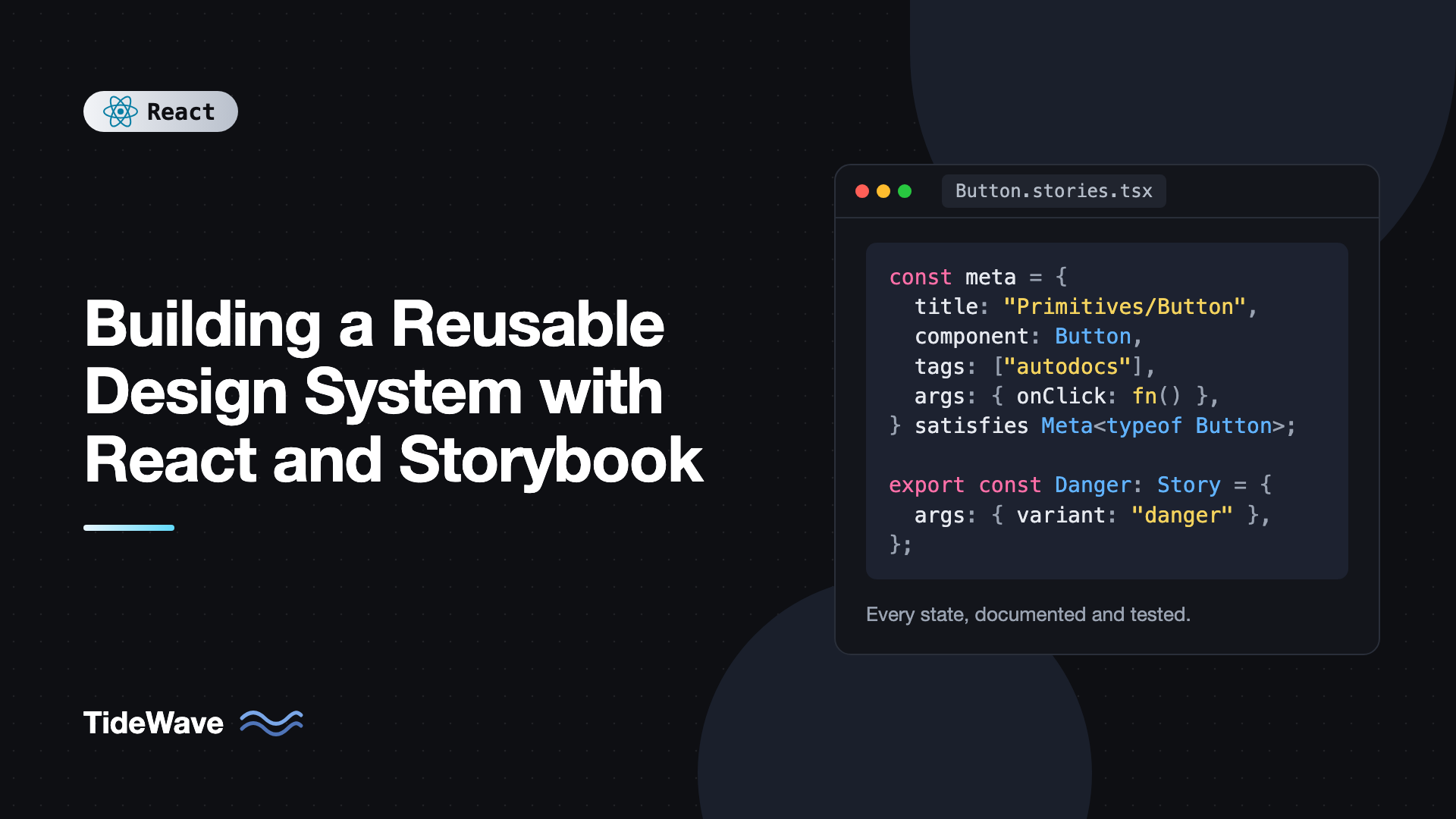
A story is a single rendered state of a component. Stories use Component Story Format (CSF): a default export describing the component and named exports for each state.
// src/components/Button/Button.stories.tsx
import type { Meta, StoryObj } from "@storybook/react-vite";
import { fn } from "storybook/test";
import { Button } from "./Button";

const meta = {
  title: "Primitives/Button",
  component: Button,
  tags: ["autodocs"],
  args: {
    children: "Save changes",
    onClick: fn(),
  },
  argTypes: {
    variant: {
      control: "inline-radio",
      options: ["primary", "secondary", "danger"],
    },
    size: {
      control: "inline-radio",
      options: ["sm", "md", "lg"],
    },
  },
} satisfies Meta<typeof Button>;

export default meta;
type Story = StoryObj<typeof meta>;

export const Primary: Story = {};

export const Secondary: Story = {
  args: { variant: "secondary" },
};

export const Danger: Story = {
  args: { variant: "danger", children: "Delete project" },
};

export const Loading: Story = {
  args: { loading: true, children: "Saving" },
};

export const Disabled: Story = {
  args: { disabled: true },
};

export const Sizes: Story = {
  render: (args) => (
    <div style={{ display: "flex", gap: 12, alignItems: "center" }}>
      <Button {...args} size="sm">Small</Button>
      <Button {...args} size="md">Medium</Button>
      <Button {...args} size="lg">Large</Button>
    </div>
  ),
};
What's happening:
argsare the props passed to the component. Storybook generates interactive controls for them, so anyone can change the variant or text in the browser.fn()creates a spy foronClick. Clicks show up in the Actions panel and can be asserted in tests.satisfies Meta<typeof Button>keeps full type checking onargswhile lettingStoryObj<typeof meta>know which args are already provided.tags: ["autodocs"]generates a documentation page from the component's props and its stories.
Run npm run storybook and you'll see a sidebar with Primitives, then Button, then each story.
Global Styles and a Theme Switcher
Stories need the tokens loaded, and you want to check every component in both themes. Both happen in .storybook/preview.tsx:
// .storybook/preview.tsx
import type { Preview } from "@storybook/react-vite";
import "../src/tokens/tokens.css";

const preview: Preview = {
  globalTypes: {
    theme: {
      description: "Color theme",
      toolbar: {
        title: "Theme",
        icon: "mirror",
        items: [
          { value: "light", title: "Light" },
          { value: "dark", title: "Dark" },
        ],
        dynamicTitle: true,
      },
    },
  },
  initialGlobals: {
    theme: "light",
  },
  decorators: [
    (Story, context) => (
      <div
        data-theme={context.globals.theme}
        style={{
          padding: 24,
          background: "var(--acme-color-bg)",
          color: "var(--acme-color-fg)",
        }}
      >
        <Story />
      </div>
    ),
  ],
  parameters: {
    layout: "centered",
  },
};

export default preview;
A decorator wraps every story. This one applies the selected theme and the background color, so a new toolbar menu lets you flip every story between light and dark without touching the stories themselves.
Interaction Tests With Play Functions
Stories can include a play function that runs after the story renders. It can click, type, and assert, which turns stories into component tests that you can also watch step by step in the Interactions panel.
Here's an input with validation and a story that tests it:
// src/components/Input/Input.tsx
import { useId, type ComponentProps } from "react";
import styles from "./Input.module.css";

export type InputProps = ComponentProps<"input"> & {
  label: string;
  error?: string;
  hint?: string;
};

export function Input({ label, error, hint, id, className, ...rest }: InputProps) {
  const generatedId = useId();
  const inputId = id ?? generatedId;
  const hintId = `${inputId}-hint`;
  const errorId = `${inputId}-error`;

  const describedBy = [hint && hintId, error && errorId].filter(Boolean).join(" ");

  return (
    <div className={styles.field}>
      <label htmlFor={inputId} className={styles.label}>
        {label}
      </label>
      <input
        id={inputId}
        className={[styles.input, className].filter(Boolean).join(" ")}
        aria-invalid={error ? true : undefined}
        aria-describedby={describedBy || undefined}
        {...rest}
      />
      {hint && <p id={hintId} className={styles.hint}>{hint}</p>}
      {error && <p id={errorId} className={styles.error}>{error}</p>}
    </div>
  );
}
// src/components/Input/Input.stories.tsx
import { useState } from "react";
import type { Meta, StoryObj } from "@storybook/react-vite";
import { expect } from "storybook/test";
import { Input } from "./Input";

const meta = {
  title: "Primitives/Input",
  component: Input,
  tags: ["autodocs"],
  args: { label: "Email", type: "email", hint: "We'll never share it." },
} satisfies Meta<typeof Input>;

export default meta;
type Story = StoryObj<typeof meta>;

export const Default: Story = {};

export const WithError: Story = {
  args: { error: "Enter a valid email address" },
};

function ValidatedInput() {
  const [value, setValue] = useState("");
  const error = value && !value.includes("@") ? "Enter a valid email address" : undefined;

  return (
    <Input
      label="Email"
      value={value}
      onChange={(e) => setValue(e.target.value)}
      error={error}
    />
  );
}

export const ValidatesOnType: Story = {
  render: () => <ValidatedInput />,
  play: async ({ canvas, userEvent }) => {
    const input = canvas.getByLabelText("Email");

    await userEvent.type(input, "not-an-email");
    await expect(canvas.getByText("Enter a valid email address")).toBeVisible();
    await expect(input).toHaveAttribute("aria-invalid", "true");

    await userEvent.clear(input);
    await userEvent.type(input, "ada@example.com");
    await expect(input).not.toHaveAttribute("aria-invalid");
  },
};
The play function uses the same queries and userEvent API as Testing Library, so the skills transfer directly. If you already write component tests, testing React components with Vitest and Testing Library covers the same query patterns.
Running Stories as Tests
Storybook's Vitest addon runs every story (and its play function) as a test, in a real browser through Vitest's browser mode:
npx storybook add @storybook/addon-vitest
npx vitest
Every story becomes a smoke test that it renders without errors, and stories with play functions become interaction tests. That's a lot of coverage for little extra effort, and it runs in CI like any other test suite.
Accessibility Checks
Add the accessibility addon, which runs axe-core against each story:
npx storybook add @storybook/addon-a11y
An Accessibility panel then lists violations like missing labels, low contrast, or invalid ARIA for the current story. Because it runs per story, you catch problems in specific states, like the error state having insufficient contrast in dark mode. With the Vitest addon installed, accessibility checks can also run as part of your tests, and you can set parameters.a11y.test to "error" to fail the build on violations.
Documenting Usage
Autodocs generates a page with the component description, a props table built from your TypeScript types, and every story with its code. Add JSDoc comments to props and they appear in the table:
export type ButtonProps = ComponentProps<"button"> & {
  /** Visual style. Use `danger` only for destructive actions. */
  variant?: "primary" | "secondary" | "danger";
  /** Shows a spinner and disables the button. */
  loading?: boolean;
};
For guidelines that don't fit in a story, like when to use a dialog versus a drawer, write an MDX docs page next to the component. Keep the advice short and concrete, with do and don't examples rendered from real components.
Packaging the Library
Other apps need to install your components. Configure Vite's library mode to build an ES module bundle with type declarations:
npm install -D vite-plugin-dts
// vite.config.ts
import { defineConfig } from "vite";
import react from "@vitejs/plugin-react";
import dts from "vite-plugin-dts";
import { resolve } from "node:path";

export default defineConfig({
  plugins: [react(), dts({ include: ["src"], exclude: ["**/*.stories.tsx"] })],
  build: {
    lib: {
      entry: resolve(__dirname, "src/index.ts"),
      formats: ["es"],
      fileName: "index",
    },
    rollupOptions: {
      external: ["react", "react-dom", "react/jsx-runtime"],
    },
    cssCodeSplit: false,
  },
});
// src/index.ts
import "./tokens/tokens.css";

export { Button, type ButtonProps } from "./components/Button/Button";
export { Input, type InputProps } from "./components/Input/Input";
{
  "name": "@acme/ui",
  "version": "0.1.0",
  "type": "module",
  "files": ["dist"],
  "module": "./dist/index.js",
  "types": "./dist/index.d.ts",
  "exports": {
    ".": {
      "types": "./dist/index.d.ts",
      "import": "./dist/index.js"
    },
    "./styles.css": "./dist/acme-ui.css"
  },
  "sideEffects": ["**/*.css"],
  "peerDependencies": {
    "react": "^19.0.0",
    "react-dom": "^19.0.0"
  }
}
Key points:
- React is a peer dependency and external. Bundling React into the library would give consumers two copies and break hooks.
- CSS is emitted as one file that apps import once with
import "@acme/ui/styles.css". Check the generated filename indistafter your first build and match it inexports. sideEffectstells bundlers that CSS imports must not be tree-shaken away, while unused components can be.
Publish to a private registry, or consume it directly from a monorepo workspace. Version it with semver and keep a changelog, because breaking a prop name breaks every app that uses it.
Best Practices for a React Design System
- Start with what you have. Audit existing apps, pick the most common components, and build those first. Don't design 40 components nobody asked for.
- Tokens before components. Components that hardcode values can't be themed or rebranded.
- One story per meaningful state. Default, hover-relevant variants, disabled, loading, error, long content, and empty content.
- Accept native props and
className. Components that block normal HTML attributes push teams to fork them. - Accessibility is the system's job. Get labels, focus styles, and keyboard support right once, so every app inherits them.
- Treat stories as tests. Run them in CI with the Vitest and accessibility addons so regressions are caught before release.
- Publish Storybook. A deployed Storybook is the catalog designers, PMs, and other teams browse before asking "do we have a component for this?"
Frequently Asked Questions (FAQ) About Design Systems With React and Storybook
No, but it helps a lot. Storybook gives you isolated development, a browsable catalog, generated docs, and a place to run interaction and accessibility tests on every component state. You could build those yourself, but Storybook does it with very little setup.
Anything that compiles to static CSS and uses CSS custom properties for tokens works well, such as CSS Modules, Tailwind, or vanilla-extract. Static CSS avoids runtime overhead and works with Server Components in consuming apps. Avoid approaches that force consumers to install a specific runtime.
It's an async function attached to a story that runs after the story renders. It can interact with the component using Testing Library style queries and userEvent, and make assertions with expect. Storybook shows each step in the Interactions panel, and the Vitest addon runs them as tests.
Many teams combine both. Use unstyled accessible primitives like Radix or React Aria for complex behavior such as dialogs, menus, and comboboxes, then style them with your tokens. Build simple components like buttons and badges yourself.
Use semantic versioning. Bump the major version for breaking changes like renamed props or removed components, minor for new components or props, and patch for fixes. Keep a changelog and deprecate props for at least one release before removing them.
Share tokens as the bridge. Export tokens from Figma variables into JSON, generate CSS custom properties from it, and use the same names in both places. Storybook addons can also embed Figma frames next to stories so reviewers can compare them.
Conclusion
A reusable design system is built in layers: tokens as CSS custom properties, primitives that use only tokens and accept native props, and composites built from primitives. Storybook ties it together. Stories show every state, autodocs turns them into documentation, a decorator adds theme switching, play functions add interaction tests, and the accessibility addon checks every state. Vite's library mode then packages it with React as a peer dependency.
Begin with tokens and the two or three components your apps duplicate most, usually buttons, inputs, and dialogs. Write stories for each state, add the Vitest and accessibility addons, and deploy Storybook so the rest of the team can see what exists. Grow the system from real needs, and you'll end up with something people actually use.