Building a Rich Text Editor in React with Tiptap
A plain textarea is fine until someone asks for bold text, headings, bullet lists, or links. At that point you have two bad options: build an editor on top of contentEditable yourself, which means fighting browser inconsistencies for weeks, or drop in a heavy WYSIWYG widget that fights React's rendering model and is hard to style.
Tiptap sits in the middle. It's a headless editor framework built on ProseMirror, so it handles the hard parts (selection, undo history, schema validation, paste handling) while leaving the UI entirely to you. You render the toolbar, menus, and styles with normal React components, and Tiptap gives you a clean command API and a structured document you can save as HTML or JSON.
In this post you'll build a complete editor with Tiptap 3 in a React 19 app: the basic setup, a toolbar that reflects the current selection, links and images, a placeholder and character limit, loading and saving content, and the mistakes that tend to cause re-render storms or broken output.
Installing Tiptap
Tiptap is split into small packages. For a React project you need the React bindings, the core ProseMirror wrapper, and the StarterKit bundle of common extensions:
npm install @tiptap/react @tiptap/pm @tiptap/starter-kit
In Tiptap 3, StarterKit already includes the extensions most editors need: paragraphs, headings, bold, italic, strike, underline, code, code blocks, blockquotes, bullet and ordered lists, horizontal rules, hard breaks, links, and undo/redo history. You only add separate packages for features outside that set, like images or placeholders.
A Minimal Editor
The two pieces you'll use everywhere are the useEditor hook, which creates and owns the editor instance, and the EditorContent component, which renders the editable area.
// src/components/editor/BasicEditor.tsx
import { useEditor, EditorContent } from "@tiptap/react";
import StarterKit from "@tiptap/starter-kit";

export function BasicEditor() {
  const editor = useEditor({
    extensions: [StarterKit],
    content: "<p>Start writing here...</p>",
  });

  return <EditorContent editor={editor} className="prose max-w-none" />;
}
That's a working editor. You can type, press Ctrl+B for bold, type ## at the start of a line to get a heading, or - for a bullet list. Those Markdown-style shortcuts are called input rules, and StarterKit enables them by default.
Because Tiptap is headless, the content comes with no styles. Headings and lists render as plain HTML elements, so if you use Tailwind's preflight they'll look like normal text. The prose class from the @tailwindcss/typography plugin is the quickest fix, or you can write your own CSS against the .tiptap class that Tiptap adds to the editable element:
.tiptap {
  min-height: 12rem;
  padding: 1rem;
  outline: none;
}

.tiptap h2 {
  font-size: 1.5rem;
  font-weight: 700;
  margin: 1.25rem 0 0.5rem;
}

.tiptap ul {
  list-style: disc;
  padding-left: 1.5rem;
}

.tiptap blockquote {
  border-left: 3px solid #cbd5e1;
  padding-left: 1rem;
  color: #475569;
}
Server rendering
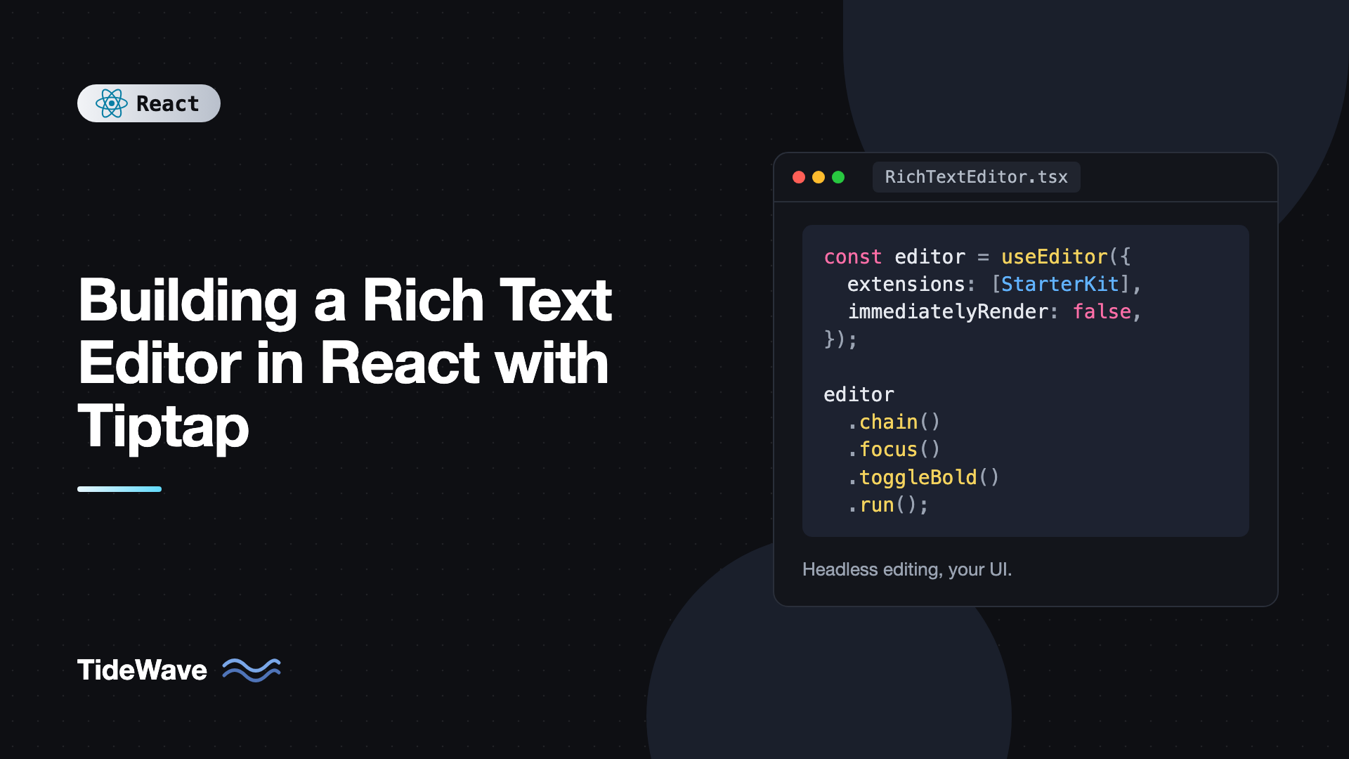
If your app renders on the server (Next.js, React Router framework mode), pass immediatelyRender: false to useEditor. The editor needs the DOM, so it should be created after hydration. Without this option Tiptap logs a warning and you can get hydration mismatches. In a client-only Vite app you can leave it out.
const editor = useEditor({
  extensions: [StarterKit],
  content: "",
  immediatelyRender: false,
});
With that option, editor is null on the first render, so any component that uses it should handle the null case.
Running Commands
Every formatting action goes through Tiptap's chainable command API. A command chain starts with editor.chain(), adds one or more commands, and ends with .run():
editor.chain().focus().toggleBold().run();
editor.chain().focus().toggleHeading({ level: 2 }).run();
editor.chain().focus().toggleBulletList().run();
The focus() call matters. When a user clicks a toolbar button, the button takes focus away from the editor. Calling focus() first puts the cursor back where it was, so the command applies to the user's selection instead of nothing.
Two other methods round out the API:
editor.isActive("bold")returns whether the current selection has that mark or node. You can pass attributes too:editor.isActive("heading", { level: 2 }).editor.can().chain().toggleBold().run()returns whether the command would succeed, without actually running it. Use this to disable buttons, for example undo when there's no history.
Building a Toolbar With Active States
A toolbar needs to re-render whenever the selection changes, so the Bold button lights up when the cursor is inside bold text. In Tiptap 3, the editor no longer re-renders your component on every transaction by default. That's a good thing for performance, but it means you have to subscribe to the specific state you care about.
The useEditorState hook does exactly that. You give it a selector, and your component only re-renders when the selected values change:
// src/components/editor/Toolbar.tsx
import { useEditorState, type Editor } from "@tiptap/react";

type ToolbarProps = { editor: Editor | null };

export function Toolbar({ editor }: ToolbarProps) {
  const state = useEditorState({
    editor,
    selector: ({ editor }) => ({
      isBold: editor?.isActive("bold") ?? false,
      isItalic: editor?.isActive("italic") ?? false,
      isH2: editor?.isActive("heading", { level: 2 }) ?? false,
      isH3: editor?.isActive("heading", { level: 3 }) ?? false,
      isBulletList: editor?.isActive("bulletList") ?? false,
      isOrderedList: editor?.isActive("orderedList") ?? false,
      isBlockquote: editor?.isActive("blockquote") ?? false,
      canUndo: editor?.can().chain().undo().run() ?? false,
      canRedo: editor?.can().chain().redo().run() ?? false,
    }),
  });

  if (!editor || !state) return null;

  return (
    <div
      role="toolbar"
      aria-label="Formatting"
      className="flex flex-wrap gap-1 border-b p-2"
    >
      <ToolbarButton
        label="Bold"
        active={state.isBold}
        onClick={() => editor.chain().focus().toggleBold().run()}
      >
        B
      </ToolbarButton>
      <ToolbarButton
        label="Italic"
        active={state.isItalic}
        onClick={() => editor.chain().focus().toggleItalic().run()}
      >
        I
      </ToolbarButton>
      <ToolbarButton
        label="Heading 2"
        active={state.isH2}
        onClick={() => editor.chain().focus().toggleHeading({ level: 2 }).run()}
      >
        H2
      </ToolbarButton>
      <ToolbarButton
        label="Heading 3"
        active={state.isH3}
        onClick={() => editor.chain().focus().toggleHeading({ level: 3 }).run()}
      >
        H3
      </ToolbarButton>
      <ToolbarButton
        label="Bullet list"
        active={state.isBulletList}
        onClick={() => editor.chain().focus().toggleBulletList().run()}
      >
        List
      </ToolbarButton>
      <ToolbarButton
        label="Numbered list"
        active={state.isOrderedList}
        onClick={() => editor.chain().focus().toggleOrderedList().run()}
      >
        1.
      </ToolbarButton>
      <ToolbarButton
        label="Quote"
        active={state.isBlockquote}
        onClick={() => editor.chain().focus().toggleBlockquote().run()}
      >
        Quote
      </ToolbarButton>
      <ToolbarButton
        label="Undo"
        disabled={!state.canUndo}
        onClick={() => editor.chain().focus().undo().run()}
      >
        Undo
      </ToolbarButton>
      <ToolbarButton
        label="Redo"
        disabled={!state.canRedo}
        onClick={() => editor.chain().focus().redo().run()}
      >
        Redo
      </ToolbarButton>
    </div>
  );
}

type ToolbarButtonProps = {
  label: string;
  active?: boolean;
  disabled?: boolean;
  onClick: () => void;
  children: React.ReactNode;
};

function ToolbarButton({
  label,
  active = false,
  disabled,
  onClick,
  children,
}: ToolbarButtonProps) {
  return (
    <button
      type="button"
      aria-label={label}
      aria-pressed={active}
      disabled={disabled}
      onClick={onClick}
      className={`rounded px-2 py-1 text-sm ${
        active ? "bg-slate-900 text-white" : "hover:bg-slate-100"
      } disabled:opacity-40`}
    >
      {children}
    </button>
  );
}
A few details worth noting. Every button has type="button", so placing the editor inside a form won't submit it on click. The aria-pressed attribute tells screen readers whether a toggle is on, which is the right pattern for formatting buttons. If you want to go further, the post on accessibility best practices for React developers covers toolbar roles and keyboard handling in more depth.
Adding Links
StarterKit 3 includes the Link extension, but its default behavior opens links when you click them in the editor, which makes editing a link annoying. Configure it through StarterKit:
const editor = useEditor({
  extensions: [
    StarterKit.configure({
      link: {
        openOnClick: false,
        autolink: true,
        defaultProtocol: "https",
        protocols: ["http", "https", "mailto"],
      },
    }),
  ],
});
To add or edit a link from the toolbar, read the current href, ask the user for a new one, and either set or remove the mark:
function setLink(editor: Editor) {
  const previousUrl = editor.getAttributes("link").href as string | undefined;
  const url = window.prompt("Link URL", previousUrl ?? "");

  // User cancelled the prompt
  if (url === null) return;

  // Empty string removes the link
  if (url.trim() === "") {
    editor.chain().focus().extendMarkRange("link").unsetLink().run();
    return;
  }

  editor
    .chain()
    .focus()
    .extendMarkRange("link")
    .setLink({ href: url.trim() })
    .run();
}
extendMarkRange("link") expands the selection to cover the whole link when the cursor is just sitting inside it. Without it, editing a link with a collapsed cursor would do nothing. In a real product you'd replace window.prompt with a small popover, but the commands stay the same.
Adding Images
Images need their own extension:
npm install @tiptap/extension-image
import Image from "@tiptap/extension-image";

const editor = useEditor({
  extensions: [
    StarterKit,
    Image.configure({
      inline: false,
      allowBase64: false,
    }),
  ],
});
Inserting an image is one command:
editor
  .chain()
  .focus()
  .setImage({ src: "https://cdn.example.com/photo.jpg", alt: "Team photo" })
  .run();
Keep allowBase64 set to false unless you have a good reason. If users paste or drop images as base64, your saved HTML can grow to several megabytes per document. A better flow is to upload the file first and insert the returned URL:
async function insertUploadedImage(editor: Editor, file: File) {
  const body = new FormData();
  body.append("file", file);

  const res = await fetch("/api/uploads", { method: "POST", body });
  if (!res.ok) throw new Error("Upload failed");

  const { url } = (await res.json()) as { url: string };
  editor.chain().focus().setImage({ src: url, alt: file.name }).run();
}
You can wire that to a hidden file input in the toolbar. The post on handling file uploads in React with drag and drop shows how to build the upload side with progress and validation.
Placeholder and Character Count
Tiptap 3 ships several small utility extensions in one package:
npm install @tiptap/extensions
The Placeholder extension adds a data-placeholder attribute and an is-editor-empty class to the empty first paragraph. You still need a bit of CSS to show it:
.tiptap p.is-editor-empty:first-child::before {
  content: attr(data-placeholder);
  float: left;
  height: 0;
  color: #94a3b8;
  pointer-events: none;
}
The CharacterCount extension tracks characters and words, and can enforce a hard limit:
import { Placeholder, CharacterCount } from "@tiptap/extensions";

const LIMIT = 5000;

const editor = useEditor({
  extensions: [
    StarterKit,
    Placeholder.configure({ placeholder: "Write something worth reading..." }),
    CharacterCount.configure({ limit: LIMIT }),
  ],
});
Once the limit is reached, the editor refuses further input. To show a counter, read it through useEditorState so it updates as the user types:
const counts = useEditorState({
  editor,
  selector: ({ editor }) => ({
    characters: editor?.storage.characterCount.characters() ?? 0,
    words: editor?.storage.characterCount.words() ?? 0,
  }),
});
Putting It Together
Here's the full editor component. It accepts initial HTML, calls onChange with the latest HTML, and composes the toolbar and counter:
// src/components/editor/RichTextEditor.tsx
import { useEditor, useEditorState, EditorContent } from "@tiptap/react";
import StarterKit from "@tiptap/starter-kit";
import Image from "@tiptap/extension-image";
import { Placeholder, CharacterCount } from "@tiptap/extensions";
import { Toolbar } from "./Toolbar";

const LIMIT = 5000;

type RichTextEditorProps = {
  initialContent?: string;
  onChange?: (html: string) => void;
};

export function RichTextEditor({
  initialContent = "",
  onChange,
}: RichTextEditorProps) {
  const editor = useEditor({
    extensions: [
      StarterKit.configure({
        heading: { levels: [2, 3] },
        link: { openOnClick: false, autolink: true, defaultProtocol: "https" },
      }),
      Image,
      Placeholder.configure({
        placeholder: "Write something worth reading...",
      }),
      CharacterCount.configure({ limit: LIMIT }),
    ],
    content: initialContent,
    immediatelyRender: false,
    editorProps: {
      attributes: {
        class: "tiptap prose max-w-none",
        "aria-label": "Post body",
      },
    },
    onUpdate: ({ editor }) => {
      onChange?.(editor.getHTML());
    },
  });

  const characters = useEditorState({
    editor,
    selector: ({ editor }) => editor?.storage.characterCount.characters() ?? 0,
  });

  return (
    <div className="rounded-lg border">
      <Toolbar editor={editor} />
      <EditorContent editor={editor} />
      <p className="border-t px-3 py-2 text-right text-xs text-slate-500">
        {characters} / {LIMIT}
      </p>
    </div>
  );
}
The heading: { levels: [2, 3] } option restricts headings to the two levels the toolbar exposes. Restricting the schema is useful: if someone pastes content with an h1, Tiptap converts it into a valid node instead of letting an unexpected heading level into your data.
Saving and Loading Content
Tiptap gives you three output formats:
editor.getHTML()returns an HTML string. Easy to render and to store in a text column.editor.getJSON()returns the ProseMirror document as a JSON object. It's lossless and easy to transform on the server.editor.getText()returns plain text, useful for search indexes and excerpts.
JSON is usually the better storage format if you control the rendering side, since you can migrate it, inspect it, and render it to HTML later. HTML is simpler if other systems need to display the content directly.
Debouncing saves
onUpdate fires on every keystroke. Sending a request each time is wasteful, so debounce the save:
import { useMemo } from "react";
import { RichTextEditor } from "./RichTextEditor";

function debounce<T extends (...args: never[]) => void>(fn: T, ms: number) {
  let timer: ReturnType<typeof setTimeout> | undefined;
  return (...args: Parameters<T>) => {
    clearTimeout(timer);
    timer = setTimeout(() => fn(...args), ms);
  };
}

export function PostEditor({
  postId,
  initialHtml,
}: {
  postId: string;
  initialHtml: string;
}) {
  const save = useMemo(
    () =>
      debounce((html: string) => {
        void fetch(`/api/posts/${postId}`, {
          method: "PATCH",
          headers: { "Content-Type": "application/json" },
          body: JSON.stringify({ body: html }),
        });
      }, 800),
    [postId],
  );

  return <RichTextEditor initialContent={initialHtml} onChange={save} />;
}
The same idea is covered in more detail in debouncing and throttling user input in React.
Updating content from outside
The content option is only read when the editor is created. Changing the initialContent prop later won't update the editor. If you need to load a different document into an existing editor, call setContent:
editor.commands.setContent(newHtml, { emitUpdate: false });
Passing emitUpdate: false stops onUpdate from firing, which avoids an immediate save of the content you just loaded. Alternatively, give the editor component a key tied to the document ID, so React mounts a fresh editor for each document.
Rendering saved HTML safely
Tiptap's schema strips unknown tags on input, but the HTML you store can still be tampered with on its way to your database. Never trust it when displaying it. Sanitize on the server before saving, and sanitize again before rendering with dangerouslySetInnerHTML:
import DOMPurify from "dompurify";

export function PostBody({ html }: { html: string }) {
  return (
    <div
      className="prose"
      dangerouslySetInnerHTML={{ __html: DOMPurify.sanitize(html) }}
    />
  );
}
The post on securing React apps against XSS explains why this matters and where sanitization belongs.
Common Mistakes With Tiptap
- Forgetting
focus()in command chains. Toolbar clicks steal focus, so commands run against no selection and appear to do nothing. - Reading editor state directly in render. Calling
editor.isActive("bold")in JSX withoutuseEditorStategives a stale value in Tiptap 3, because the component doesn't re-render on every transaction. TurningshouldRerenderOnTransactionback on fixes it but re-renders the whole tree on every keystroke. - Expecting the
contentoption to be reactive. It's only the initial value. UsesetContentor akeyto load new documents. - Leaving out
immediatelyRender: falseunder SSR. You'll get hydration warnings and sometimes a broken editor on first load. - Storing base64 images. Documents balloon in size. Upload images and store URLs.
- Rendering stored HTML without sanitizing. The editor's schema protects input, not your database or your API.
- Missing
type="button"on toolbar buttons inside a form. Each formatting click submits the form.
Frequently Asked Questions (FAQ) About Tiptap in React
Yes. The core editor, the React bindings, StarterKit, and the common extensions are open source under the MIT license. Tiptap also sells paid cloud features such as real-time collaboration hosting, comments, and AI tools, but you don't need any of them to build a full-featured editor.
JSON from editor.getJSON() is lossless and easy to transform or migrate later, so it's usually the better choice when you control both editing and rendering. HTML is simpler when other systems need to display the content directly. Many teams store JSON and generate HTML when publishing.
In Tiptap 3 the editor doesn't re-render your component on every transaction by default. Read values like isActive through the useEditorState hook with a selector, and the toolbar will re-render only when those values change.
Tiptap is built on ProseMirror and gives you a large set of ready-made extensions plus a simple command API. Slate is a lower-level toolkit where you build more behavior yourself. Lexical is Meta's editor framework with its own document model. Tiptap is usually the fastest of the three to get a polished editor running.
StarterKit already supports Markdown-style input rules, so typing ## or - at the start of a line creates headings and lists. For importing and exporting Markdown files, Tiptap has a Markdown extension, or you can convert between HTML and Markdown on the server with a library like turndown.
Pass editable: false to useEditor, or call editor.setEditable(false) at runtime. For displaying saved content to readers, it's usually lighter to render sanitized HTML directly instead of creating an editor instance.
Conclusion
Tiptap gives you a production-grade editing engine without dictating your UI. Create the editor with useEditor, render it with EditorContent, drive formatting through command chains that start with focus(), and subscribe to toolbar state with useEditorState. Add links through StarterKit's configuration, images and utility extensions as separate packages, and restrict the schema to what your product actually supports.
From here, try replacing the window.prompt link flow with a proper popover, add a slash command menu for inserting blocks, or write a small custom extension for something specific to your app, like a callout block. Whatever you add, keep saving debounced, store JSON or sanitized HTML, and sanitize again wherever you render it.