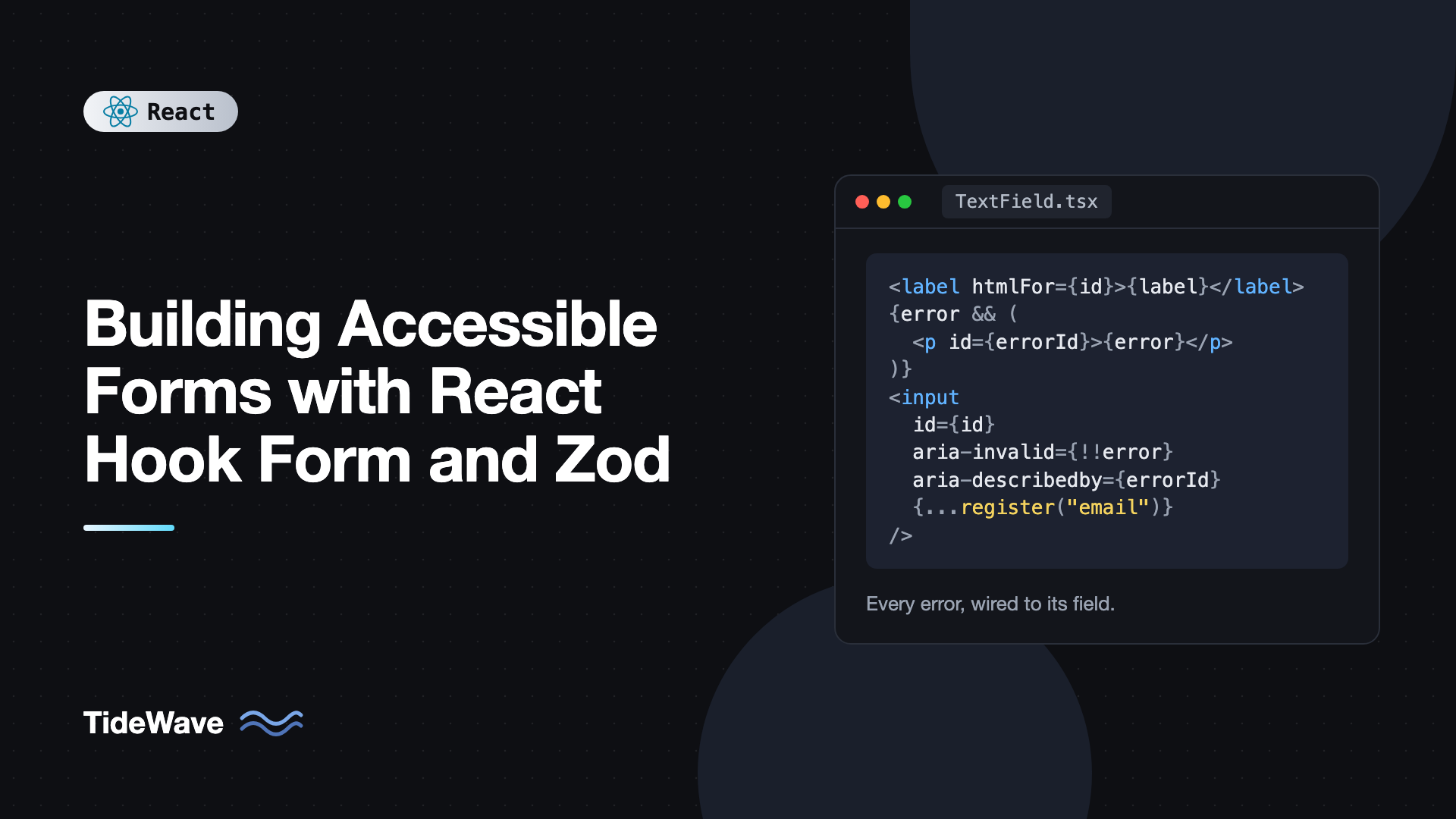
Building Accessible Forms with React Hook Form and Zod
A form can look polished and still be unusable for a large group of people. A screen reader user tabs into an input and hears "edit text" with no idea what it is for. A keyboard user submits, nothing seems to happen, and the only clue is a red border somewhere off screen. Someone using voice control cannot say "click Email" because the label is a placeholder that vanished when they started typing.
None of this is hard to fix, but it needs to be designed in, and validation is where most forms fall apart. React Hook Form handles form state and focus management, and Zod defines the rules and messages in one schema. Together they give you a solid base, as long as you wire the accessibility details correctly.
This post builds a contact form step by step: the schema, a reusable accessible field component, radio groups and checkboxes, focus handling on errors, an error summary for longer forms, and announcing the submission result. Every pattern here follows WCAG guidance and works with real assistive technology.
Setup
npm install react-hook-form zod @hookform/resolvers
This post uses React 19, React Hook Form 7, Zod 4, and @hookform/resolvers v5. In Zod 4, z.email() is the top-level email validator; on Zod 3, use z.string().email() instead.
What Makes a Form Accessible
Before writing code, here is the checklist the rest of the post implements:
- Every input has a visible, programmatically associated label. Placeholders are not labels.
- Related controls are grouped. Radio buttons and checkbox sets use
fieldsetandlegend. - Required fields are marked in the visible label text and to assistive technology.
- Errors are in text, not color alone, and each one is connected to its input with
aria-describedby. - Invalid inputs set
aria-invalid, so screen readers announce them as invalid. - After a failed submit, focus moves to the first invalid field or to an error summary.
- The submission outcome is announced through a live region.
- Hints are connected to their input as well, so the user hears format requirements before typing.
The Schema
Zod messages become the error text users read and hear, so write them as instructions, not as complaints. "Enter an email address like name@example.com" is more helpful than "Invalid input".
// src/features/contact/schema.ts
import { z } from "zod";

export const contactSchema = z.object({
  name: z.string().trim().min(1, "Enter your full name"),
  email: z.email("Enter an email address like name@example.com"),
  phone: z
    .string()
    .trim()
    .regex(
      /^[0-9 +()-]*$/,
      "Phone number can only contain digits, spaces, and + ( ) -",
    )
    .optional(),
  contactMethod: z.enum(["email", "phone"], {
    error: "Choose how you would like us to contact you",
  }),
  message: z
    .string()
    .trim()
    .min(20, "Your message must be at least 20 characters")
    .max(1000, "Your message must be 1000 characters or fewer"),
  consent: z.boolean().refine((v) => v, {
    message: "You must agree to the privacy policy to send this form",
  }),
});

export type ContactValues = z.infer<typeof contactSchema>;
A few message-writing rules that help everyone:
- Say what to do, not what went wrong: "Enter your full name" rather than "Name is required".
- Be specific about formats and limits.
- Use the same wording as the visible label so users can match the error to the field.
A Reusable Accessible Field
Wiring labels, hints, errors, and ARIA attributes on every input is repetitive and easy to get wrong, so put it in one component. React 19 passes ref as a regular prop to function components, so the object returned by register can be spread straight onto it.
// src/components/TextField.tsx
import { useId, type ComponentProps } from "react";

interface TextFieldProps extends ComponentProps<"input"> {
  label: string;
  hint?: string;
  error?: string;
}

export function TextField({
  label,
  hint,
  error,
  required,
  id,
  ...inputProps
}: TextFieldProps) {
  const generatedId = useId();
  const inputId = id ?? generatedId;
  const hintId = `${inputId}-hint`;
  const errorId = `${inputId}-error`;

  const describedBy =
    [hint ? hintId : null, error ? errorId : null].filter(Boolean).join(" ") ||
    undefined;

  return (
    <div className="field">
      <label htmlFor={inputId}>
        {label}
        {required ? (
          <span aria-hidden="true"> *</span>
        ) : (
          <span className="optional"> (optional)</span>
        )}
      </label>

      {hint && (
        <p id={hintId} className="hint">
          {hint}
        </p>
      )}

      {error && (
        <p id={errorId} className="error">
          <span className="visually-hidden">Error: </span>
          {error}
        </p>
      )}

      <input
        id={inputId}
        aria-required={required || undefined}
        aria-invalid={error ? true : undefined}
        aria-describedby={describedBy}
        {...inputProps}
      />
    </div>
  );
}
Let's go through the decisions:
useIdgenerates a unique, stable id per instance, so you can render the same field twice without duplicate ids, and it is consistent between server and client rendering. The details are in useId for accessible components.htmlForon the label associates it with the input. Clicking the label focuses the input, and screen readers read the label when the input gets focus.aria-describedbylists the hint and error ids. Screen readers read the label, then the descriptions, so a user hears "Email, required, invalid entry, Error: Enter an email address like name@example.com".aria-invalidis only set when there is an error. Settingaria-invalid="false"everywhere adds noise for no benefit.- The asterisk is
aria-hidden, andaria-requiredconveys the same information to assistive technology. Optional fields are labeled "(optional)" in text, which many users find clearer than asterisks alone. - "Error:" is visually hidden but read aloud, so the message is identified as an error without relying on red text.
- The error is placed before the input in the DOM, following the GOV.UK design system pattern, so sighted users see it before they reach the field.
We use aria-required rather than the native required attribute because the form will set noValidate. Native browser validation bubbles are inconsistent across browsers and screen readers, and we want one set of styled, schema-driven messages.
The visually-hidden class is the standard pattern:
.visually-hidden {
  position: absolute;
  width: 1px;
  height: 1px;
  padding: 0;
  margin: -1px;
  overflow: hidden;
  clip: rect(0, 0, 0, 0);
  white-space: nowrap;
  border: 0;
}
Radio Groups and Checkboxes
A group of radio buttons needs a fieldset and legend so the question is read along with each option. The error must be attached to the group, not to an individual radio.
// src/components/RadioGroup.tsx
import { useId, type ComponentProps } from "react";

interface Option {
  value: string;
  label: string;
}

interface RadioGroupProps extends Omit<ComponentProps<"input">, "type"> {
  legend: string;
  options: Option[];
  error?: string;
}

export function RadioGroup({
  legend,
  options,
  error,
  ...inputProps
}: RadioGroupProps) {
  const groupId = useId();
  const errorId = `${groupId}-error`;

  return (
    <fieldset
      aria-describedby={error ? errorId : undefined}
      aria-invalid={error ? true : undefined}
      className="field"
    >
      <legend>{legend}</legend>

      {error && (
        <p id={errorId} className="error">
          <span className="visually-hidden">Error: </span>
          {error}
        </p>
      )}

      {options.map((option, index) => (
        <div key={option.value} className="radio">
          <input
            type="radio"
            id={`${groupId}-${index}`}
            value={option.value}
            {...inputProps}
          />
          <label htmlFor={`${groupId}-${index}`}>{option.label}</label>
        </div>
      ))}
    </fieldset>
  );
}
Spreading register(...) onto each radio works because React Hook Form tracks radio groups by name and calls the ref callback for each input. When a radio group fails validation, React Hook Form focuses the first radio in the group.
A single checkbox, like the consent box, is just a labeled input. Here the label wraps the input, which is another valid association method:
// src/components/Checkbox.tsx
import { useId, type ComponentProps } from "react";

interface CheckboxProps extends Omit<ComponentProps<"input">, "type"> {
  label: string;
  error?: string;
}

export function Checkbox({ label, error, ...inputProps }: CheckboxProps) {
  const errorId = `${useId()}-error`;

  return (
    <div className="field">
      {error && (
        <p id={errorId} className="error">
          <span className="visually-hidden">Error: </span>
          {error}
        </p>
      )}
      <label className="checkbox">
        <input
          type="checkbox"
          aria-invalid={error ? true : undefined}
          aria-describedby={error ? errorId : undefined}
          {...inputProps}
        />
        {label}
      </label>
    </div>
  );
}
Putting the Form Together
Now the form itself. React Hook Form's shouldFocusError option is true by default, so when handleSubmit finds errors it moves focus to the first invalid field in field registration order. Combined with aria-describedby, the user immediately hears what to fix.
// src/features/contact/ContactForm.tsx
import { useState } from "react";
import { useForm } from "react-hook-form";
import { zodResolver } from "@hookform/resolvers/zod";
import { contactSchema, type ContactValues } from "./schema";
import { TextField } from "../../components/TextField";
import { RadioGroup } from "../../components/RadioGroup";
import { Checkbox } from "../../components/Checkbox";

export function ContactForm() {
  const [statusMessage, setStatusMessage] = useState("");

  const {
    register,
    handleSubmit,
    reset,
    formState: { errors, isSubmitting },
  } = useForm<ContactValues>({
    resolver: zodResolver(contactSchema),
    mode: "onTouched",
    defaultValues: {
      name: "",
      email: "",
      phone: "",
      message: "",
      consent: false,
    },
  });

  async function onSubmit(values: ContactValues) {
    setStatusMessage("");
    const res = await fetch("/api/contact", {
      method: "POST",
      headers: { "Content-Type": "application/json" },
      body: JSON.stringify(values),
    });

    if (!res.ok) {
      setStatusMessage(
        "Sorry, your message could not be sent. Please try again.",
      );
      return;
    }

    reset();
    setStatusMessage("Thank you. Your message has been sent.");
  }

  return (
    <form
      onSubmit={
        isSubmitting ? (e) => e.preventDefault() : handleSubmit(onSubmit)
      }
      noValidate
    >
      <h2>Contact us</h2>

      <TextField
        label="Full name"
        autoComplete="name"
        required
        error={errors.name?.message}
        {...register("name")}
      />

      <TextField
        label="Email address"
        type="email"
        autoComplete="email"
        hint="We will only use this to reply to your message."
        required
        error={errors.email?.message}
        {...register("email")}
      />

      <TextField
        label="Phone number"
        type="tel"
        autoComplete="tel"
        error={errors.phone?.message}
        {...register("phone")}
      />

      <RadioGroup
        legend="How should we contact you?"
        options={[
          { value: "email", label: "Email" },
          { value: "phone", label: "Phone" },
        ]}
        error={errors.contactMethod?.message}
        {...register("contactMethod")}
      />

      <MessageField
        error={errors.message?.message}
        registration={register("message")}
      />

      <Checkbox
        label="I agree to the privacy policy"
        error={errors.consent?.message}
        {...register("consent")}
      />

      <button type="submit" aria-disabled={isSubmitting}>
        {isSubmitting ? "Sending..." : "Send message"}
      </button>

      <p role="status" className="form-status">
        {statusMessage}
      </p>
    </form>
  );
}
And the textarea, written inline to show the same wiring without the shared component:
// src/features/contact/MessageField.tsx
import { useId } from "react";
import type { UseFormRegisterReturn } from "react-hook-form";

export function MessageField({
  error,
  registration,
}: {
  error?: string;
  registration: UseFormRegisterReturn<"message">;
}) {
  const id = useId();
  const hintId = `${id}-hint`;
  const errorId = `${id}-error`;

  return (
    <div className="field">
      <label htmlFor={id}>
        Message<span aria-hidden="true"> *</span>
      </label>
      <p id={hintId} className="hint">
        Between 20 and 1000 characters.
      </p>
      {error && (
        <p id={errorId} className="error">
          <span className="visually-hidden">Error: </span>
          {error}
        </p>
      )}
      <textarea
        id={id}
        rows={6}
        aria-required="true"
        aria-invalid={error ? true : undefined}
        aria-describedby={error ? `${hintId} ${errorId}` : hintId}
        {...registration}
      />
    </div>
  );
}
Remember to import MessageField at the top of ContactForm.tsx.
Some details worth calling out:
noValidateturns off native browser validation so only your accessible messages appear.mode: "onTouched"validates a field when it loses focus and re-validates on each change after that. Errors do not appear while someone is still typing their first attempt, which is less disruptive for screen reader users who hear every change.autoCompletevalues likename,email, andtellet browsers and password managers fill fields, which helps users with motor and cognitive disabilities and is required by WCAG success criterion 1.3.5.- The submit button uses
aria-disabledrather thandisabledwhile submitting. A truly disabled button loses focus and disappears from the tab order, which can drop keyboard users back to the top of the page. The form'sonSubmitignores extra submissions whileisSubmittingis true, so a double press does not send the message twice. Never disable the submit button just because the form is invalid; users would have no way to discover what is wrong. - The
role="status"paragraph is a polite live region that is always in the DOM. Changing its text announces the result without moving focus. Live regions must exist before their content changes, which is why it is rendered unconditionally.
Adding an Error Summary for Long Forms
On a short form, focusing the first invalid field is enough. On a long form, users benefit from a summary at the top listing every problem, with links to each field. This is the pattern used by GOV.UK and recommended by many accessibility teams.
// src/components/ErrorSummary.tsx
import { useEffect, useRef } from "react";
import type { FieldErrors, FieldValues, Path } from "react-hook-form";

interface ErrorSummaryProps<T extends FieldValues> {
  errors: FieldErrors<T>;
  focusToken: number;
  onSelect: (name: Path<T>) => void;
}

export function ErrorSummary<T extends FieldValues>({
  errors,
  focusToken,
  onSelect,
}: ErrorSummaryProps<T>) {
  const headingRef = useRef<HTMLHeadingElement>(null);

  useEffect(() => {
    if (focusToken > 0) headingRef.current?.focus();
  }, [focusToken]);

  const entries = Object.entries(errors).filter(
    ([, error]) => typeof error?.message === "string",
  );

  if (entries.length === 0) return null;

  return (
    <div className="error-summary">
      <h2 ref={headingRef} tabIndex={-1}>
        There is a problem
      </h2>
      <ul>
        {entries.map(([name, error]) => (
          <li key={name}>
            <a
              href={`#${name}`}
              onClick={(e) => {
                e.preventDefault();
                onSelect(name as Path<T>);
              }}
            >
              {String(error?.message)}
            </a>
          </li>
        ))}
      </ul>
    </div>
  );
}
Wire it into the form by turning off automatic field focus and focusing the summary instead:
// Inside ContactForm
const [focusToken, setFocusToken] = useState(0);

const { register, handleSubmit, setFocus, formState } = useForm<ContactValues>({
  resolver: zodResolver(contactSchema),
  mode: "onTouched",
  shouldFocusError: false,
});

// In the JSX, at the top of the form:
// <ErrorSummary errors={formState.errors} focusToken={focusToken} onSelect={setFocus} />
// and the form's submit handler becomes:
// onSubmit={handleSubmit(onSubmit, () => setFocusToken((t) => t + 1))}
The second argument to handleSubmit runs when validation fails. Incrementing focusToken causes a re-render in which the summary exists with the new errors, and its effect then moves focus to the heading. The heading has tabIndex={-1} so it can receive focus programmatically without being added to the tab order. Screen readers announce "There is a problem" followed by the list, and each link uses setFocus to jump to the field.
Testing Your Form's Accessibility
Automated checks catch the basics, and manual checks catch the rest:
- Keyboard only. Unplug the mouse. Can you reach every field, select radios with the arrow keys, submit, and land on the errors?
- Screen reader. Try VoiceOver on macOS or NVDA on Windows. Listen to each field: label, required state, hint, and error should all be announced.
- Zoom to 200%. Labels, hints, and errors should stay next to their inputs without overlapping.
- Automated tests. Testing Library queries like
getByRole("textbox", { name: "Email address" })only pass if labels are associated correctly, so tests double as accessibility checks. Addaxeto catch missing attributes. See testing React components with Vitest and Testing Library for setup.
Common Accessibility Mistakes in Forms
- Placeholders as labels. They disappear on input, often have poor contrast, and are not reliably announced as labels.
role="alert"on every inline error. WithonTouchedvalidation, alerts fire while users are moving between fields and interrupt whatever the screen reader is reading. Connect errors witharia-describedbyand manage focus on submit instead.- Color-only errors. A red border means nothing to colorblind users or screen readers. Always include text.
- Disabling submit until the form is valid. Users cannot find out what is missing. Let them submit and show the errors.
- Radio groups without
fieldsetandlegend. Users hear "Email, radio button" without the question. - Duplicate ids. Hard-coded ids break when a component renders twice. Use
useId. - Moving focus unexpectedly. Only move focus in response to a user action, like submit, never while they are typing.
Frequently Asked Questions (FAQ) About Accessible Forms With React Hook Form and Zod
Yes. The shouldFocusError option is true by default, so after a failed submit React Hook Form focuses the first field with an error, using the ref from register. If you build a custom input, make sure the ref reaches a focusable element.
Not for inline field errors in most cases. Connect them with aria-describedby and move focus to the first error or an error summary on submit. Use a polite live region like role="status" for the overall submission result, such as a success or server error message.
If you set noValidate and handle validation yourself, aria-required tells assistive technology the field is required without triggering native browser bubbles. If you rely on native validation, the required attribute covers both. Either way, also mark required or optional fields in visible text.
Use React Hook Form's Controller or useController to connect them, and pass the error id and aria-invalid through to the focusable element. Make sure the component forwards the ref from the field to that element so focus on error still works.
Close to the input and associated with it through aria-describedby. Placing the message between the label and the input, as the GOV.UK design system does, means sighted users see it before they reach the field and it is never hidden by on-screen keyboards.
Yes. Client validation is for user experience and can be bypassed. Parse the same Zod schema on the server and return field errors that you map back with setError, then show them with the same accessible field components.
Conclusion
Accessible forms come down to a handful of habits: every input has a real label, related controls sit in a fieldset with a legend, errors are text connected with aria-describedby and flagged with aria-invalid, focus moves to the problem after a failed submit, and outcomes are announced through a live region. React Hook Form supplies the focus management and state, and Zod gives you one place to write clear, instructive messages.
Wrap the wiring in small components like TextField and RadioGroup so every form in your app gets it for free, then test with a keyboard and a screen reader at least once per form. For the broader picture beyond forms, read accessibility best practices for React developers, and for splitting long forms into steps, see building multi-step forms with React Hook Form.