Image Lazy Loading Techniques for React Apps
Images are usually the heaviest thing on a page. A product grid with 60 thumbnails, a blog index with a hero image per post, or a photo gallery can easily add 10 MB of downloads. If all of them start loading the moment the page opens, they compete for bandwidth with the images the user can actually see, and with your JavaScript and fonts too.
Lazy loading defers off-screen images until the user scrolls near them. Done well, it cuts initial page weight dramatically and makes the first screen load faster. Done badly, it delays the most important image on the page, causes layout shifts as images pop in, and leaves users staring at empty boxes.
This post covers the techniques that matter in a React app: native loading="lazy", reserving space to prevent layout shift, responsive images with srcSet, prioritizing the hero image, an IntersectionObserver hook for cases native lazy loading can't handle, blur-up placeholders, and error fallbacks.
Native Lazy Loading
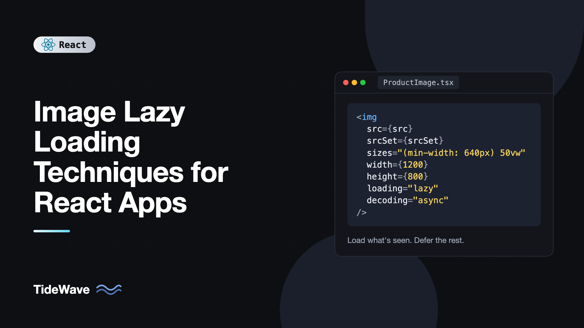
Every modern browser supports lazy loading with a single attribute:
export function ProductImage({ src, alt }: { src: string; alt: string }) {
  return (
    <img
      src={src}
      alt={alt}
      width={400}
      height={300}
      loading="lazy"
      decoding="async"
    />
  );
}
With loading="lazy", the browser waits to fetch the image until it's within a certain distance of the viewport. That distance depends on the browser and connection speed, and is typically a few thousand pixels or less, so images usually start loading before the user reaches them.
decoding="async" lets the browser decode the image off the main thread instead of blocking rendering. It's a safe default for most images.
Native lazy loading should be your first choice:
- No JavaScript. It works before React hydrates and doesn't add bundle size.
- Browser-tuned thresholds. The browser adjusts how early it starts loading based on network conditions.
- Works with server rendering. The attribute is in the HTML, so the browser handles it from the first byte.
Always Reserve Space
The most common lazy-loading bug isn't about loading at all. It's layout shift. An <img> without dimensions has zero height until it loads, so when it finally arrives, everything below it jumps down. This hurts your Cumulative Layout Shift (CLS) score and makes users lose their place.
Setting width and height attributes lets the browser compute the aspect ratio before the image loads:
<img src="/photos/lake.jpg" alt="A lake at dawn" width={1200} height={800} loading="lazy" />
With CSS that makes images responsive, the browser keeps the ratio while scaling:
img {
  max-width: 100%;
  height: auto;
}
When you don't know the exact dimensions but know the ratio, use aspect-ratio:
.card-image {
  width: 100%;
  aspect-ratio: 16 / 9;
  object-fit: cover;
  background: #e5e7eb;
}
The gray background shows as a placeholder while the image loads, and the layout never moves.
Responsive Images with srcSet and sizes
Lazy loading decides when to load an image. Responsive images decide which file to load. A phone with a 400-pixel-wide screen shouldn't download a 2400-pixel image.
In React, the attributes are camelCased: srcSet and sizes.
type ResponsiveImageProps = {
  name: string;
  alt: string;
  width: number;
  height: number;
};

const widths = [400, 800, 1200, 1600];

export function ResponsiveImage({ name, alt, width, height }: ResponsiveImageProps) {
  return (
    <img
      src={`/images/${name}-800.webp`}
      srcSet={widths.map((w) => `/images/${name}-${w}.webp ${w}w`).join(", ")}
      sizes="(min-width: 1024px) 33vw, (min-width: 640px) 50vw, 100vw"
      alt={alt}
      width={width}
      height={height}
      loading="lazy"
      decoding="async"
    />
  );
}
srcSetlists the available files and their actual pixel widths.sizestells the browser how wide the image will be displayed at each breakpoint: a third of the viewport on desktop, half on tablets, full width on phones.
The browser combines sizes with the device's pixel density and picks the smallest file that looks sharp. Generate the different sizes at build time or use an image CDN that resizes on the fly through URL parameters.
For modern formats with fallbacks, use <picture>:
export function HeroPicture() {
  return (
    <picture>
      <source srcSet="/images/hero.avif" type="image/avif" />
      <source srcSet="/images/hero.webp" type="image/webp" />
      <img src="/images/hero.jpg" alt="Team working together" width={1600} height={900} />
    </picture>
  );
}
Don't Lazy Load the Hero Image
The largest image in the first viewport is usually your Largest Contentful Paint (LCP) element. Lazy loading it makes LCP worse, because the browser waits for layout to decide whether it's in view before fetching it.
For above-the-fold images, do the opposite: load eagerly and give them high priority. React 19 supports the fetchPriority attribute directly:
export function Hero() {
  return (
    <img
      src="/images/hero-1600.webp"
      srcSet="/images/hero-800.webp 800w, /images/hero-1600.webp 1600w"
      sizes="100vw"
      alt="Mountains under a clear sky"
      width={1600}
      height={900}
      fetchPriority="high"
    />
  );
}
React 19 also adds resource hint functions in react-dom. Calling preload during render tells the browser to start fetching the image early, and when server rendering, React places the <link rel="preload"> in the document head:
import { preload } from "react-dom";

export function ArticleHeader({ cover }: { cover: string }) {
  preload(cover, { as: "image", fetchPriority: "high" });
  return <img src={cover} alt="" width={1200} height={630} fetchPriority="high" />;
}
A good rule: the first one or two images visible on load are eager and high priority. Everything else is lazy.
An IntersectionObserver Hook for Custom Cases
Native lazy loading covers <img> and <iframe>. It doesn't cover CSS background images, images inside horizontally scrolling carousels in all cases, or situations where you want to do something extra when an element becomes visible, like fading it in or starting a request.
For those, use IntersectionObserver. Here's a reusable hook:
// useInView.ts
import { useEffect, useRef, useState } from "react";

export function useInView<T extends Element>(
  options: IntersectionObserverInit = { rootMargin: "200px" }
) {
  const ref = useRef<T>(null);
  const [inView, setInView] = useState(false);
  const { root, rootMargin, threshold } = options;

  useEffect(() => {
    const element = ref.current;
    if (!element || inView) return;

    const observer = new IntersectionObserver(
      ([entry]) => {
        if (entry.isIntersecting) {
          setInView(true);
          observer.disconnect();
        }
      },
      { root, rootMargin, threshold }
    );

    observer.observe(element);
    return () => observer.disconnect();
  }, [inView, root, rootMargin, threshold]);

  return { ref, inView };
}
The hook observes an element, flips inView to true once it comes within 200 pixels of the viewport, and stops observing. Destructuring the options keeps the effect from re-running when you pass a new options object with the same values.
Using it for a lazy background image:
import { useInView } from "./useInView";

export function BannerSection({ image, title }: { image: string; title: string }) {
  const { ref, inView } = useInView<HTMLElement>();

  return (
    <section
      ref={ref}
      style={{
        minHeight: 320,
        backgroundColor: "#1f2937",
        backgroundImage: inView ? `url(${image})` : undefined,
        backgroundSize: "cover",
        backgroundPosition: "center",
        color: "white",
        display: "grid",
        placeItems: "center",
      }}
    >
      <h2>{title}</h2>
    </section>
  );
}
The background URL is only set once the section is near the viewport, so the browser doesn't request it earlier. The dark background color holds the space and keeps the text readable in the meantime.
Blur-Up Placeholders
A gray box is fine, but a blurred preview of the actual image feels faster. The technique, often called LQIP (low-quality image placeholder), shows a tiny version of the image scaled up and blurred, then fades in the full image when it loads.
// BlurImage.tsx
import { useState } from "react";

type BlurImageProps = {
  src: string;
  placeholder: string; // tiny base64 or 20px-wide image URL
  alt: string;
  width: number;
  height: number;
};

export function BlurImage({ src, placeholder, alt, width, height }: BlurImageProps) {
  const [loaded, setLoaded] = useState(false);

  return (
    <div
      style={{
        position: "relative",
        overflow: "hidden",
        aspectRatio: `${width} / ${height}`,
        backgroundImage: `url(${placeholder})`,
        backgroundSize: "cover",
      }}
    >
      <img
        src={src}
        alt={alt}
        width={width}
        height={height}
        loading="lazy"
        decoding="async"
        onLoad={() => setLoaded(true)}
        style={{
          width: "100%",
          height: "100%",
          objectFit: "cover",
          opacity: loaded ? 1 : 0,
          transition: "opacity 300ms ease",
        }}
      />
      {!loaded && (
        <div
          aria-hidden="true"
          style={{ position: "absolute", inset: 0, backdropFilter: "blur(16px)" }}
        />
      )}
    </div>
  );
}
The placeholder is a background image on the wrapper, blurred by an overlay. The real image starts transparent and fades in when its onLoad fires. Because native lazy loading is still used on the <img>, you get both deferred loading and a smooth reveal.
Generate placeholders at build time. Libraries like sharp can resize an image to 16 or 20 pixels wide and output a base64 data URL of a few hundred bytes. Store it alongside your image metadata.
One caveat: if an image is already in the browser cache, onLoad may fire before React attaches the handler during hydration. If you see images stuck invisible after a server render, also check img.complete in a ref callback and set loaded when it's already true.
Handling Errors
Images fail: broken URLs, deleted uploads, CDN outages. Without handling, users see the browser's broken image icon. Swap in a fallback on error:
import { useState } from "react";

type SafeImageProps = React.ComponentProps<"img"> & { fallback: string };

export function SafeImage({ src, fallback, alt, ...rest }: SafeImageProps) {
  const [failedSrc, setFailedSrc] = useState<string | undefined>(undefined);
  const showFallback = failedSrc === src;

  return (
    <img
      {...rest}
      src={showFallback ? fallback : src}
      alt={alt}
      loading={rest.loading ?? "lazy"}
      onError={() => {
        if (!showFallback) setFailedSrc(src);
      }}
    />
  );
}
Tracking which src failed, rather than a plain boolean, means the component recovers automatically if the parent passes a new src. The showFallback check also prevents an infinite loop if the fallback itself fails. This kind of wrapper fits well in a shared component library, and the loading and error states guide covers the broader patterns.
Lazy Loading in Long Lists
For a feed or gallery with hundreds of images, lazy loading alone keeps DOM nodes around for every image, even if their downloads are deferred. Combine it with list virtualization so only visible rows are rendered at all, and with infinite scroll to fetch more items as the user goes.
In virtualized lists, keep loading="lazy" on images anyway. Rows rendered in the overscan area outside the viewport then won't fetch until they're actually close.
Common Mistakes with Image Lazy Loading
- Lazy loading the LCP image. The hero or first visible product image should load eagerly with
fetchPriority="high". - Missing width and height. Images without dimensions cause layout shift when they load. Always set them or use
aspect-ratio. - Reaching for a library first. Native
loading="lazy"covers most cases with zero JavaScript. - Serving one huge file to every device. Lazy loading a 3 MB image still downloads 3 MB. Use
srcSetandsizes. - Empty or missing alt text on meaningful images. Describe content images. Use
alt=""only for purely decorative ones. - Recreating the IntersectionObserver on every render. Pass stable option values and disconnect after the first intersection.
- Forgetting about cached images during hydration. An
onLoadhandler can miss images that loaded before hydration. Checkcompleteas a backup.
Frequently Asked Questions (FAQ) About Image Lazy Loading in React
Usually not. The native loading attribute set to lazy is supported in all modern browsers and needs no JavaScript. Reach for an IntersectionObserver hook only for background images, custom animations, or when you need to run code as elements enter the viewport.
No. Images visible in the first viewport, especially the largest one, should load eagerly. Lazy loading them delays Largest Contentful Paint. Apply lazy loading to images below the fold, and use fetchPriority set to high on the main hero image.
The images don't have reserved space before they load. Add width and height attributes that match the image's intrinsic size, along with CSS that sets height to auto, or give the container an aspect-ratio. The browser then holds the correct space before the file arrives.
Native lazy loading doesn't. Search engine crawlers understand the loading attribute and the src is present in the HTML. JavaScript approaches that only set src after scrolling can hide images from crawlers, so prefer native lazy loading for content images.
They solve different problems. Lazy loading controls when an image is fetched. srcSet and sizes control which version of the image is fetched based on screen size and pixel density. Use both together for the best results.
The Next.js Image component applies most of them automatically: lazy loading by default, required dimensions, generated srcset files, blur placeholders, and a priority or preload option for the hero image. In a plain React app with Vite, you combine the techniques from this post yourself.
Conclusion
Effective image loading comes down to a few rules. Use native loading="lazy" for everything below the fold, always reserve space with dimensions or aspect-ratio, serve the right file size with srcSet and sizes, and load the hero image eagerly with fetchPriority="high". Add an IntersectionObserver hook for background images and custom behavior, blur-up placeholders for a polished feel, and an error fallback for broken URLs.
Run Lighthouse on your heaviest page and check the LCP element and CLS score first. Fix the hero image priority and missing dimensions, then add responsive sources to your largest images. Those three changes usually deliver most of the improvement before you need any custom code.