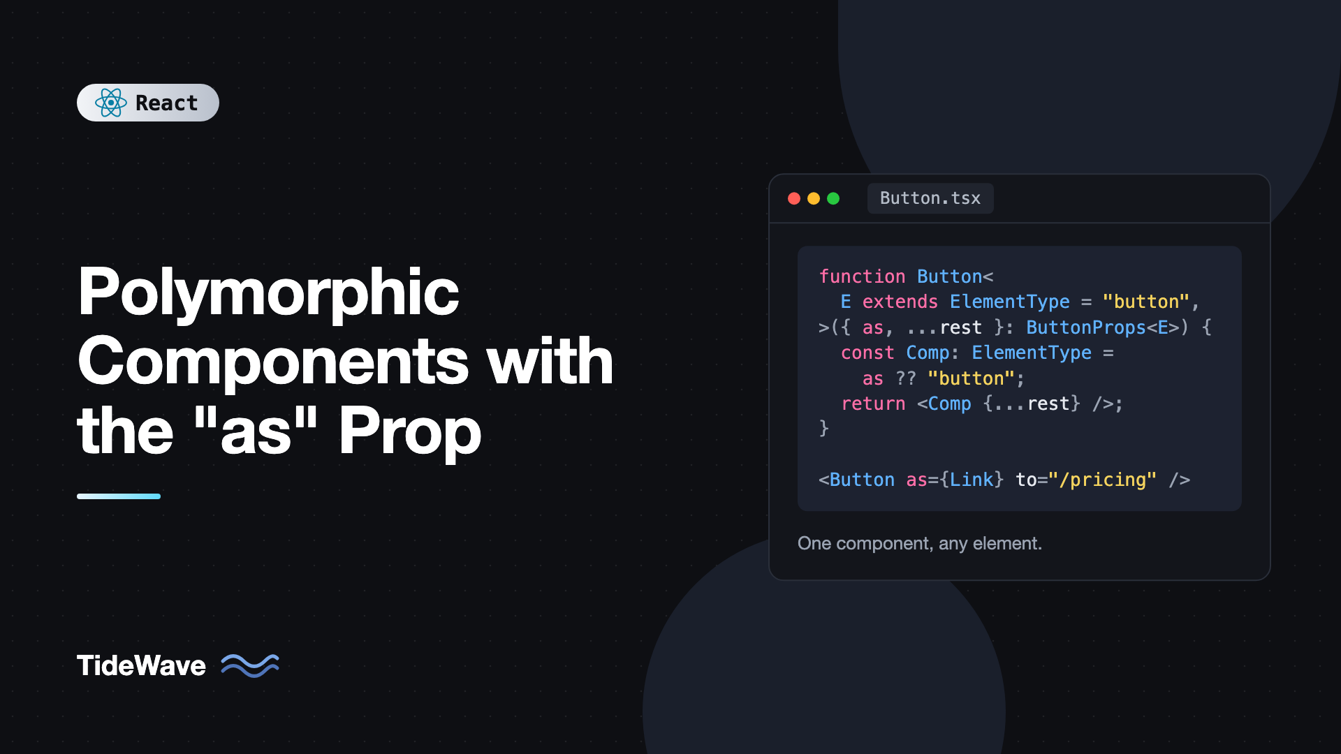
Polymorphic Components with the "as" Prop
Design systems constantly run into the same small dilemma. You build a Button with the right padding, colors, focus ring, and loading state. Then someone needs a link that looks exactly like a button. Then a router link that looks like a button. Then a Text component that's a p in one place, a span in another, and a label in a form. Duplicating styles across Button, ButtonLink, and RouterButtonLink gets old fast, and each copy drifts.
A polymorphic component solves this by letting the caller choose which element or component gets rendered, usually through an as prop. Button with as="a" renders an anchor with button styles. Text with as="label" renders a label. The component keeps its styling and behavior, and the caller gets the right semantics.
The JavaScript side is a few lines. The TypeScript side is where it gets interesting, because you want href to be allowed when as="a" and rejected when it's a button, and you want to to be required when as is a React Router Link. In this post I'll build polymorphic Text and Button components with accurate types, handle refs in React 19, and compare the as prop with the asChild pattern used by Radix and shadcn/ui.
The Basic Idea
At runtime, a polymorphic component just renders a variable as a JSX tag. JSX treats a capitalized variable as a component, and that variable can hold a string like "h2" or a component like Link:
export function Text({ as: Component = "p", className = "", ...props }) {
  return <Component className={`text ${className}`} {...props} />;
}
Usage:
<Text>Default paragraph</Text>
<Text as="span">Inline text</Text>
<Text as="label" htmlFor="email">Email</Text>
The as: Component destructuring renames the prop to a capitalized variable, which is required because lowercase JSX tags like as would be treated as an HTML element named "as". That's the whole runtime trick. Everything else is about types.
Why the Naive TypeScript Version Fails
The obvious TypeScript translation loses all the attribute checking:
import type { ElementType, HTMLAttributes } from "react";

type TextProps = HTMLAttributes<HTMLElement> & {
  as?: ElementType;
};

export function Text({ as: Component = "p", ...props }: TextProps) {
  return <Component {...props} />;
}
This compiles, but HTMLAttributes<HTMLElement> is the generic set shared by all elements. Text with as="label" htmlFor="email" fails because htmlFor isn't in that set. And Text with as="span" href="/x" passes even though spans don't have an href. The props need to depend on what as is.
Typing the as Prop Properly
The fix is to make the component generic over the element type, and derive allowed props from it. React's types give you what you need:
ElementTypeis any valid JSX tag: an intrinsic element name like"a"or a component.ComponentProps<E>gives the props of that element or component. In React 19, it includesref.
Here's a reusable helper type:
// polymorphic.ts
import type { ComponentProps, ElementType } from "react";

export type PolymorphicProps<
  E extends ElementType,
  OwnProps = object,
> = OwnProps & {
  as?: E;
} & Omit<ComponentProps<E>, keyof OwnProps | "as">;
It combines three things: the component's own props, the as prop itself, and every prop of the chosen element except the ones your component redefines. The Omit matters. If your Text has its own size prop with values "sm" | "md" | "lg", it must replace the native size attribute that exists on some elements, not intersect with it.
A Polymorphic Text Component
Now build Text on top of it:
// Text.tsx
import type { ElementType } from "react";
import type { PolymorphicProps } from "./polymorphic";

type TextOwnProps = {
  size?: "sm" | "md" | "lg";
  tone?: "default" | "muted" | "danger";
  className?: string;
};

type TextProps<E extends ElementType> = PolymorphicProps<E, TextOwnProps>;

const sizes = { sm: "text-sm", md: "text-base", lg: "text-lg" };
const tones = {
  default: "text-gray-900",
  muted: "text-gray-500",
  danger: "text-red-600",
};

export function Text<E extends ElementType = "p">({
  as,
  size = "md",
  tone = "default",
  className = "",
  ...rest
}: TextProps<E>) {
  const Component: ElementType = as ?? "p";
  return (
    <Component
      className={`${sizes[size]} ${tones[tone]} ${className}`}
      {...rest}
    />
  );
}
Two details make this work. The generic has a default, E extends ElementType = "p", so when as is omitted, the props are those of a paragraph. And inside the component, Component is annotated as plain ElementType. TypeScript can't check JSX attributes against a generic element type inside the implementation, and trying to usually produces long, unhelpful errors. The public signature is where type safety matters, and that stays precise.
Now the call sites behave correctly:
<Text as="label" htmlFor="email" size="sm">Email</Text>        // OK: htmlFor exists on label
<Text as="a" href="/docs" tone="muted">Read the docs</Text>     // OK: href exists on a
<Text as="span" href="/docs">Oops</Text>                        // Error: no href on span
<Text size="xl">Too big</Text>                                  // Error: "xl" is not a valid size
Because E is inferred from the as value, the editor's autocomplete also switches to the right attributes as soon as you type as="a".
A Polymorphic Button
Buttons are the most common polymorphic component. Here's one that can render a button, an a, or a router link, and keeps type="button" as a sensible default only when it's a real button:
// Button.tsx
import type { ElementType, ReactNode } from "react";
import type { PolymorphicProps } from "./polymorphic";

type ButtonOwnProps = {
  variant?: "primary" | "secondary" | "ghost";
  size?: "sm" | "md";
  loading?: boolean;
  className?: string;
  children?: ReactNode;
};

type ButtonProps<E extends ElementType> = PolymorphicProps<E, ButtonOwnProps>;

const variantClasses = {
  primary: "bg-blue-600 text-white hover:bg-blue-700",
  secondary: "border border-gray-300 bg-white text-gray-900 hover:bg-gray-50",
  ghost: "text-gray-700 hover:bg-gray-100",
};

export function Button<E extends ElementType = "button">({
  as,
  variant = "primary",
  size = "md",
  loading = false,
  className = "",
  children,
  ...rest
}: ButtonProps<E>) {
  const Component: ElementType = as ?? "button";
  const isNativeButton = Component === "button";

  return (
    <Component
      {...(isNativeButton
        ? { type: "button", disabled: loading }
        : { "aria-disabled": loading || undefined })}
      aria-busy={loading || undefined}
      className={`inline-flex items-center gap-2 rounded font-medium ${
        size === "sm" ? "px-3 py-1.5 text-sm" : "px-4 py-2"
      } ${variantClasses[variant]} ${className}`}
      {...rest}
    >
      {loading && <span className="spinner" aria-hidden="true" />}
      {children}
    </Component>
  );
}
The type: "button" default is placed before ...rest, so a caller can still pass type="submit". For non-button elements, disabled isn't a valid attribute, so the component uses aria-disabled instead. Remember that aria-disabled doesn't block clicks on a link. If a disabled link must be inert, handle that in the click handler or don't render it as a link.
Using it with React Router v7:
import { Link } from "react-router";
import { Button } from "./Button";

export function Hero() {
  return (
    <div className="flex gap-3">
      <Button onClick={() => console.log("trial")}>Start free trial</Button>

      <Button
        as="a"
        href="https://github.com/example"
        target="_blank"
        rel="noreferrer"
        variant="secondary"
      >
        View on GitHub
      </Button>

      <Button as={Link} to="/pricing" variant="ghost">
        See pricing
      </Button>
    </div>
  );
}
With as={Link}, the props come from ComponentProps<typeof Link>, so to is required and type-checked, and prefetch or replace autocomplete correctly. Leave out to and you get a compile error, exactly as if you'd used Link directly.
Refs in React 19
In React 18 and earlier, refs were the hardest part of polymorphic components. forwardRef erased the generic, so typing a polymorphic component with a forwarded ref required elaborate casts.
React 19 removes most of that pain. ref is a regular prop for function components, and ComponentProps<E> includes the correct ref type for E. Because Button spreads ...rest onto the element, refs just work:
import { useEffect, useRef } from "react";
import { Button } from "./Button";

export function FocusOnMount() {
  const linkRef = useRef<HTMLAnchorElement>(null);

  useEffect(() => {
    linkRef.current?.focus();
  }, []);

  return (
    <Button as="a" href="/start" ref={linkRef}>
      Get started
    </Button>
  );
}
The ref is typed as Ref<HTMLAnchorElement> because as="a". Passing a useRef<HTMLButtonElement> here would be a type error. For background on how ref props changed, see forwardRef and useImperativeHandle explained.
The asChild Alternative
Radix UI and shadcn/ui popularized a different approach: asChild. Instead of naming the element, you pass it as the only child, and the component merges its props onto that child:
<Button asChild>
  <Link to="/pricing">See pricing</Link>
</Button>
The implementation typically uses Radix's Slot component, which merges props, class names, event handlers, and refs onto its child:
import { Slot } from "@radix-ui/react-slot";
import type { ComponentProps } from "react";

type ButtonProps = ComponentProps<"button"> & {
  asChild?: boolean;
  variant?: "primary" | "secondary";
};

export function Button({
  asChild = false,
  variant = "primary",
  className = "",
  ...props
}: ButtonProps) {
  const Comp = asChild ? Slot : "button";
  return <Comp className={`btn btn-${variant} ${className}`} {...props} />;
}
This is the exact shape shadcn/ui's button uses. If you're using shadcn, getting started with shadcn/ui shows how it fits with the rest of the components.
as vs asChild
| Concern | as prop | asChild |
|---|---|---|
| Type safety of target props | Checked through generics | Checked on the child element itself |
| TypeScript complexity | Generic helper types, slower inference | Simple, non-generic props |
| Passing props to target | Mixed in with the component's own props | Written on the child, clearly separated |
| Name collisions | Own props must Omit native ones | No collisions, each element owns its props |
| Readability | One element in JSX | Two nested elements |
| Supported by | Chakra UI, Mantine (component), MUI | Radix UI, shadcn/ui, Ark UI |
Both are valid. as is compact and great for typography and layout primitives like Text, Heading, and Box. asChild scales better for interactive components where the target has many of its own props, like router links with loaders and prefetch options, and it sidesteps the heavy generic types.
Common Mistakes With Polymorphic Components
- Breaking semantics.
Buttonwithas="div"looks like a button but isn't focusable and doesn't respond to Enter or Space. Only polymorph into elements with the right semantics, or addrole,tabIndex, and key handlers yourself. - Using
HTMLAttributes<HTMLElement>for props. It accepts attributes that don't exist on the chosen element and rejects ones that do. Derive props fromComponentProps<E>. - Forgetting to
Omitoverlapping props. If your ownsizeorcolorprop has different values than the native attribute, intersecting them produces confusing types. Omit the native ones. - Typing the inner
Componentas generic. Inside the implementation, annotate it asElementType. Precise types belong in the public props. - Using
disabledon links. Anchors ignoredisabled. Usearia-disabledand prevent navigation explicitly if needed. - Making everything polymorphic. Heavy generic types slow down the TypeScript language server in large codebases. Reserve polymorphism for primitives that really need it.
Frequently Asked Questions (FAQ) About Polymorphic Components
It's a component that can render as different elements or components while keeping its own styling and behavior. Typically the caller picks the element with an as prop, so a Button can render a button, an a, or a router Link.
Make the component generic over E extends ElementType, type the as prop as E, and combine your own props with Omit<ComponentProps<E>, keyof OwnProps>. TypeScript infers E from the as value and checks every other prop against that element.
Not in React 19. Function components receive ref as a normal prop, and ComponentProps<E> includes the correct ref type. If you spread the remaining props onto the rendered element, refs pass through automatically.
With as, you name the element and pass its props to the polymorphic component. With asChild, you render the target element as a child, and the component merges its props onto it. asChild avoids complex generics and name collisions, while as is more compact.
Every usage requires TypeScript to infer the generic and compute the props of the chosen element, including large intersections with Omit. In big codebases with many polymorphic usages, this adds up. Limiting polymorphism to a few primitives keeps the editor responsive.
Yes. Pass the component itself, like as set to a router Link or your own Card. Its props are derived from ComponentProps of that component, so required props like to are enforced at the call site.
Conclusion
Polymorphic components let one set of styles and behavior render as whatever element the situation calls for. The runtime part is a single renamed variable in JSX. The TypeScript part is a generic over ElementType, a helper that combines your own props with ComponentProps<E> minus overlaps, a sensible default element, and an ElementType annotation inside the implementation. React 19's ref-as-prop removes the old forwardRef workarounds.
Use the as prop for typography and layout primitives, consider asChild for interactive components that wrap routers and complex children, and keep semantics in mind whichever you choose. For a refresher on the conditional-props techniques used under the hood, read discriminated unions for type-safe React props, and to go further with generics, see generic components in React with TypeScript.