Getting Started with shadcn/ui in React Projects
Most component libraries give you a package to install and a theme API to fight with. You want the button slightly rounder, or the dialog to animate differently, and you end up overriding nested class names or wrapping everything. When the library releases a breaking change, you inherit it whether you want it or not.
shadcn/ui takes a different approach. It isn't a dependency you install. It's a CLI that copies well-built component source code into your project. The components are built on accessible primitives and styled with Tailwind CSS, and once they're in your repo, they're yours to edit like any other file.
This post walks through setting up shadcn/ui in a Vite React project, how the generated files fit together, adding and using components, customizing variants and themes, building a small dialog form with toast feedback, and the mistakes people make when they treat it like a regular library.
How shadcn/ui Is Different
With a traditional library, you write import { Button } from "some-ui" and the code lives in node_modules. With shadcn/ui, you run a command and get src/components/ui/button.tsx in your own source tree.
That has some clear consequences:
- Full control. Change markup, styles, or behavior directly. No wrapper components or style overrides.
- No version lock-in. Updates to shadcn/ui never change your components unless you re-add them.
- You own maintenance. Bugs fixed upstream don't reach you automatically. You decide when to pull changes.
- Readable code. Each component is a short, idiomatic React file, which makes it a good learning resource too.
Under the hood, interactive components use accessible headless primitives (Radix UI for most of them), Tailwind CSS for styling, and class-variance-authority for variants. If you're curious about the primitives layer, Radix UI primitives covers it in depth.
Setting Up a Vite Project
Create a React TypeScript app with Vite and add Tailwind CSS v4:
npm create vite@latest my-app -- --template react-ts
cd my-app
npm install
npm install tailwindcss @tailwindcss/vite
Replace the contents of src/index.css with a single import:
@import "tailwindcss";
Configure the Path Alias
shadcn/ui components import each other with the @/ alias, like @/lib/utils. Vite's template splits TypeScript config into several files, so add the alias to both tsconfig.json and tsconfig.app.json:
{
  "compilerOptions": {
    "baseUrl": ".",
    "paths": {
      "@/*": ["./src/*"]
    }
  }
}
Keep the existing files and references in tsconfig.json and just add the compilerOptions block. In tsconfig.app.json, add baseUrl and paths inside the existing compilerOptions.
Then teach Vite to resolve the same alias:
npm install -D @types/node
// vite.config.ts
import path from "node:path";
import { defineConfig } from "vite";
import react from "@vitejs/plugin-react";
import tailwindcss from "@tailwindcss/vite";

export default defineConfig({
  plugins: [react(), tailwindcss()],
  resolve: {
    alias: {
      "@": path.resolve(__dirname, "./src"),
    },
  },
});
Run the CLI
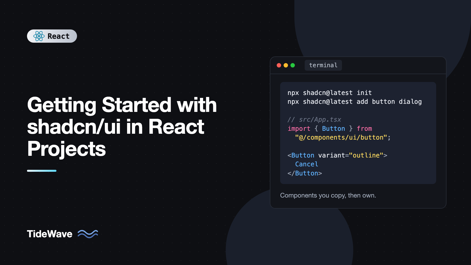
npx shadcn@latest init
The CLI asks a few questions, like which base color you want, then:
- Creates
components.json, which records your settings and paths. - Creates
src/lib/utils.tswith thecn()helper. - Adds CSS variables for the theme to
src/index.css. - Installs the small runtime dependencies it needs.
If you're on Next.js, the same CLI works there too, and building accessible UI components in Next.js with shadcn/ui covers that setup.
What the CLI Generated
components.json
{
  "$schema": "https://ui.shadcn.com/schema.json",
  "style": "new-york",
  "rsc": false,
  "tsx": true,
  "tailwind": {
    "config": "",
    "css": "src/index.css",
    "baseColor": "neutral",
    "cssVariables": true
  },
  "aliases": {
    "components": "@/components",
    "utils": "@/lib/utils",
    "ui": "@/components/ui",
    "lib": "@/lib",
    "hooks": "@/hooks"
  },
  "iconLibrary": "lucide"
}
The CLI reads this file every time you add a component, so it knows where to put files and how to rewrite imports. Your generated version may have a few extra keys depending on the CLI version. Commit it.
The cn() Helper
// src/lib/utils.ts
import { clsx, type ClassValue } from "clsx";
import { twMerge } from "tailwind-merge";

export function cn(...inputs: ClassValue[]) {
  return twMerge(clsx(inputs));
}
Every component uses cn() to combine its default classes with the className you pass. tailwind-merge resolves conflicts, so passing className="rounded-full" really does replace the default rounded-md. The reasoning behind this helper is covered in using Tailwind CSS effectively in React.
Theme Variables
The CSS file now contains variables like these (abbreviated):
:root {
  --radius: 0.625rem;
  --background: oklch(1 0 0);
  --foreground: oklch(0.145 0 0);
  --primary: oklch(0.205 0 0);
  --primary-foreground: oklch(0.985 0 0);
  --muted: oklch(0.97 0 0);
  --muted-foreground: oklch(0.556 0 0);
  --border: oklch(0.922 0 0);
  --ring: oklch(0.708 0 0);
}

.dark {
  --background: oklch(0.145 0 0);
  --foreground: oklch(0.985 0 0);
  --primary: oklch(0.922 0 0);
  --primary-foreground: oklch(0.205 0 0);
}

@theme inline {
  --color-background: var(--background);
  --color-foreground: var(--foreground);
  --color-primary: var(--primary);
  --color-primary-foreground: var(--primary-foreground);
  --radius-md: calc(var(--radius) - 2px);
}
The pattern is semantic pairs: every surface color (primary) has a matching text color (primary-foreground). The @theme inline block maps them to Tailwind utilities like bg-primary and text-primary-foreground. Change a variable and every component that uses it updates.
Adding and Using Components
Add components by name. Dependencies between components are resolved for you:
npx shadcn@latest add button input label card
Each one lands in src/components/ui. Use them like any local component:
// src/App.tsx
import { Button } from "@/components/ui/button";
import {
  Card,
  CardContent,
  CardDescription,
  CardFooter,
  CardHeader,
  CardTitle,
} from "@/components/ui/card";
import { Input } from "@/components/ui/input";
import { Label } from "@/components/ui/label";

export default function App() {
  return (
    <main className="grid min-h-screen place-items-center bg-background p-6">
      <Card className="w-full max-w-sm">
        <CardHeader>
          <CardTitle>Sign in</CardTitle>
          <CardDescription>Use your work email to continue.</CardDescription>
        </CardHeader>
        <CardContent className="grid gap-4">
          <div className="grid gap-2">
            <Label htmlFor="email">Email</Label>
            <Input id="email" type="email" placeholder="ada@example.com" />
          </div>
          <div className="grid gap-2">
            <Label htmlFor="password">Password</Label>
            <Input id="password" type="password" />
          </div>
        </CardContent>
        <CardFooter className="flex justify-end gap-2">
          <Button variant="outline">Cancel</Button>
          <Button>Sign in</Button>
        </CardFooter>
      </Card>
    </main>
  );
}
Notice that Card is a set of small composable parts rather than one component with a dozen props. That's the compound components pattern, and most shadcn/ui components follow it.
Inside a Component: The Button
Open src/components/ui/button.tsx. It looks roughly like this:
import * as React from "react";
import { Slot } from "radix-ui";
import { cva, type VariantProps } from "class-variance-authority";
import { cn } from "@/lib/utils";

const buttonVariants = cva(
  "inline-flex items-center justify-center gap-2 whitespace-nowrap rounded-md text-sm font-medium transition-all disabled:pointer-events-none disabled:opacity-50 outline-none focus-visible:ring-[3px] focus-visible:ring-ring/50",
  {
    variants: {
      variant: {
        default: "bg-primary text-primary-foreground hover:bg-primary/90",
        destructive: "bg-destructive text-white hover:bg-destructive/90",
        outline: "border bg-background hover:bg-accent hover:text-accent-foreground",
        secondary: "bg-secondary text-secondary-foreground hover:bg-secondary/80",
        ghost: "hover:bg-accent hover:text-accent-foreground",
        link: "text-primary underline-offset-4 hover:underline",
      },
      size: {
        default: "h-9 px-4 py-2",
        sm: "h-8 rounded-md px-3",
        lg: "h-10 rounded-md px-6",
        icon: "size-9",
      },
    },
    defaultVariants: {
      variant: "default",
      size: "default",
    },
  }
);

function Button({
  className,
  variant,
  size,
  asChild = false,
  ...props
}: React.ComponentProps<"button"> &
  VariantProps<typeof buttonVariants> & { asChild?: boolean }) {
  const Comp = asChild ? Slot.Root : "button";

  return (
    <Comp
      data-slot="button"
      className={cn(buttonVariants({ variant, size, className }))}
      {...props}
    />
  );
}

export { Button, buttonVariants };
The exact classes and imports vary by CLI version and style, but the structure is consistent. Two details are worth understanding:
- Variants with
cva. Props likevariant="outline"map to class strings, and the types come from the definition. asChild. When true, the button renders its child element instead of abutton, merging its props and classes onto it. That's how you make a link look like a button without nesting interactive elements:<Button asChild><a href="/pricing">Pricing</a></Button>. It's a cleaner alternative to a polymorphicasprop.
Adding Your Own Variant
Since the file is yours, add a variant directly:
variant: {
  // ...existing variants
  success: "bg-emerald-600 text-white hover:bg-emerald-600/90",
},
TypeScript picks it up immediately, so <Button variant="success"> is typed and autocompleted. No theme API, no wrapper.
Building a Dialog Form With Toasts
Let's combine a few components into something realistic: a dialog for creating a project, with a toast on success.
npx shadcn@latest add dialog sonner
Mount the toaster once near the root:
// src/main.tsx
import { StrictMode } from "react";
import { createRoot } from "react-dom/client";
import { Toaster } from "@/components/ui/sonner";
import App from "./App";
import "./index.css";

createRoot(document.getElementById("root")!).render(
  <StrictMode>
    <App />
    <Toaster />
  </StrictMode>
);
The generated sonner.tsx wrapper reads the current theme with the next-themes package, which works in any React app. If you aren't using it, edit the wrapper to pass a fixed theme prop or read your own theme context.
Now the dialog:
// src/components/NewProjectDialog.tsx
import { useState } from "react";
import { toast } from "sonner";
import { Button } from "@/components/ui/button";
import {
  Dialog,
  DialogClose,
  DialogContent,
  DialogDescription,
  DialogFooter,
  DialogHeader,
  DialogTitle,
  DialogTrigger,
} from "@/components/ui/dialog";
import { Input } from "@/components/ui/input";
import { Label } from "@/components/ui/label";

export function NewProjectDialog() {
  const [open, setOpen] = useState(false);
  const [pending, setPending] = useState(false);

  async function handleSubmit(e: React.FormEvent<HTMLFormElement>) {
    e.preventDefault();
    const name = String(new FormData(e.currentTarget).get("name") ?? "").trim();
    if (!name) return;

    setPending(true);
    try {
      const res = await fetch("/api/projects", {
        method: "POST",
        headers: { "Content-Type": "application/json" },
        body: JSON.stringify({ name }),
      });
      if (!res.ok) throw new Error("Request failed");
      toast.success(`Created ${name}`);
      setOpen(false);
    } catch {
      toast.error("Couldn't create the project. Try again.");
    } finally {
      setPending(false);
    }
  }

  return (
    <Dialog open={open} onOpenChange={setOpen}>
      <DialogTrigger asChild>
        <Button>New project</Button>
      </DialogTrigger>
      <DialogContent className="sm:max-w-md">
        <form onSubmit={handleSubmit} className="grid gap-4">
          <DialogHeader>
            <DialogTitle>Create project</DialogTitle>
            <DialogDescription>
              Give it a name. You can change it later.
            </DialogDescription>
          </DialogHeader>
          <div className="grid gap-2">
            <Label htmlFor="project-name">Name</Label>
            <Input id="project-name" name="name" required autoFocus />
          </div>
          <DialogFooter>
            <DialogClose asChild>
              <Button type="button" variant="outline">
                Cancel
              </Button>
            </DialogClose>
            <Button type="submit" disabled={pending}>
              {pending ? "Creating..." : "Create"}
            </Button>
          </DialogFooter>
        </form>
      </DialogContent>
    </Dialog>
  );
}
You get a lot without writing it: focus moves into the dialog and returns to the trigger on close, Escape and outside clicks close it, background content is hidden from screen readers, and DialogTitle and DialogDescription are wired to aria-labelledby and aria-describedby. The dialog is controlled (open and onOpenChange), so you can close it after a successful request.
For larger forms, shadcn/ui offers form components built on React Hook Form and Zod.
Theming and Dark Mode
To change your brand color, edit the variables. For example, an indigo primary:
:root {
  --primary: oklch(0.51 0.23 277);
  --primary-foreground: oklch(0.98 0 0);
  --ring: oklch(0.51 0.23 277);
}

.dark {
  --primary: oklch(0.68 0.16 277);
  --primary-foreground: oklch(0.15 0 0);
}
Dark mode works by adding the dark class to the html element. The generated CSS includes a custom variant so Tailwind's dark: utilities follow that class. Any theme toggle that sets the class works. Building a dark mode toggle in React shows one without a flash on load.
Updating Components
Because components are copied, upstream fixes don't arrive automatically. To pull the latest version of a component, re-run add with --overwrite, or let the CLI prompt you before replacing:
npx shadcn@latest add button --overwrite
This replaces your file, so commit first and review the diff. Keep your customizations small and obvious (a new variant, a changed class) so they're easy to re-apply. For heavier changes, consider building a wrapper component in src/components that uses the base one from ui, leaving the generated file close to upstream.
Common Mistakes With shadcn/ui
- Treating
components/uias off-limits. It's your code. Edit it rather than piling on overrides from outside. - Forgetting the path alias. Missing
@/configuration in either the TypeScript config or Vite causes import errors right after adding a component. - Hardcoding colors in custom variants. Use theme variables where possible so dark mode keeps working.
- Overwriting customized files blindly.
--overwritereplaces your changes. Commit and review first. - Nesting buttons and links. Wrapping an
ainside aButtonproduces invalid nested interactive elements. UseasChildinstead. - Dropping
DialogTitle. The title gives the dialog its accessible name. If you don't want it visible, hide it visually but keep it in the DOM. - Adding every component up front. Add components as you need them. Unused files are code you still have to maintain.
Frequently Asked Questions (FAQ) About shadcn/ui
Not in the usual sense. It's a collection of components and a CLI that copies their source code into your project. You don't install it as a runtime dependency, and you don't import components from a package. The components become part of your codebase.
Yes. It works with Vite, React Router, TanStack Start, Astro, and other React setups. You need Tailwind CSS and a path alias for imports, and the CLI handles the rest. Only a few components reference Next.js-specific packages, and those can be edited.
Yes. Current versions of the CLI generate Tailwind v4 compatible CSS using the @theme inline directive and CSS variables in OKLCH color space. Older projects on Tailwind v3 can still use the components with the matching older setup.
Re-run the add command for the component with the overwrite flag, which replaces your local file with the latest version. Commit your work first and review the diff so you can re-apply any customizations you made.
The interactive components are built on accessible primitives that handle keyboard navigation, focus management, and ARIA attributes. You still need to use them correctly, for example by giving dialogs a title and connecting labels to inputs.
Yes, and it's a common starting point for one. Since you own the code, you can adjust tokens, add variants, and wrap components to match your brand. Many teams use the generated components as the base layer of their internal design system.
Conclusion
shadcn/ui gives you accessible, well-structured components as source code instead of a dependency. Setup in a Vite project is Tailwind CSS v4, a @/ path alias in TypeScript and Vite, and npx shadcn@latest init. From there you add components one at a time, compose them like any local component, extend variants by editing cva definitions, and theme everything through a small set of CSS variables.
Start with the handful of components your app needs right now, usually button, input, label, dialog, and a toast, and build one real screen with them. Make a small customization, like a brand color or a new variant, so the team gets comfortable treating components/ui as normal code. That ownership is the whole point, and it's what makes shadcn/ui a solid foundation as your app grows.