Blog
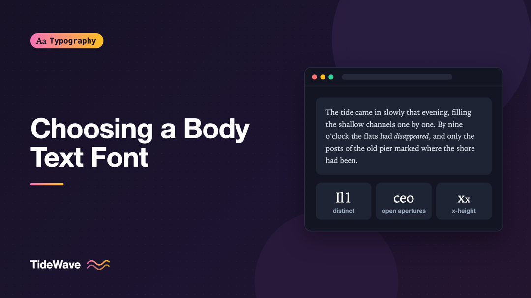
Choosing a Body Text Font for Long-Form Reading
- Maria
- Typography
- 23 Oct, 2026
A font that looks stunning in a specimen can be exhausting after ten minutes of reading. Specimens show a few large words and a pangram. A long-form
Continue Reading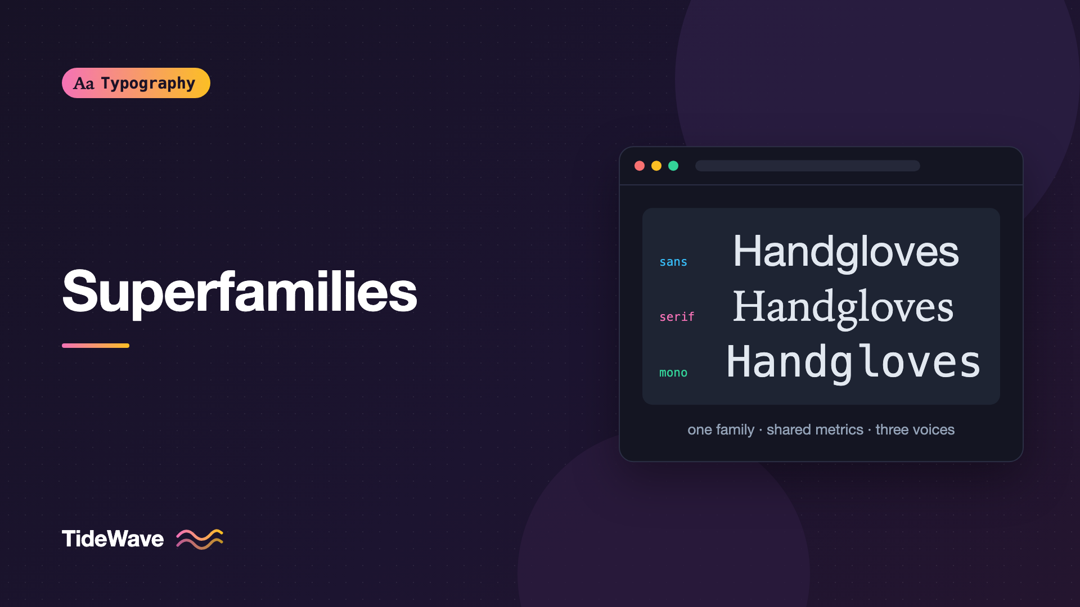
Superfamilies: Building a Whole Design System from One Type Family
- Maria
- Typography
- 23 Oct, 2026
Most design systems need more than one kind of type. Marketing pages want an editorial serif for long reads. The product UI needs a clean sans for la
Continue Reading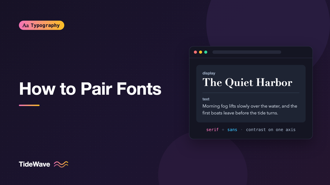
How to Pair Fonts: Rules for Combining Typefaces That Work
- Maria
- Typography
- 23 Oct, 2026
You've found a headline font you love. It has personality, it fits the brand, and it looks great at 64px. Then you try it for body text and it falls
Continue Reading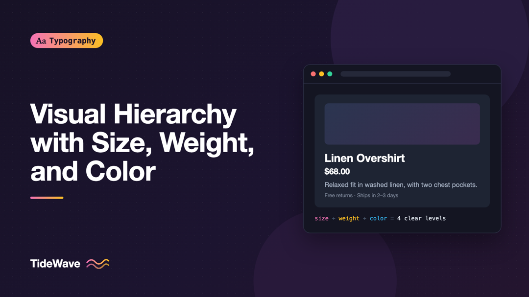
Creating Visual Hierarchy with Size, Weight, and Color
- Maria
- Typography
- 23 Oct, 2026
Picture a product card where the name, price, rating, description, and button label are all 16px, regular weight, and dark gray. Every piece of infor
Continue Reading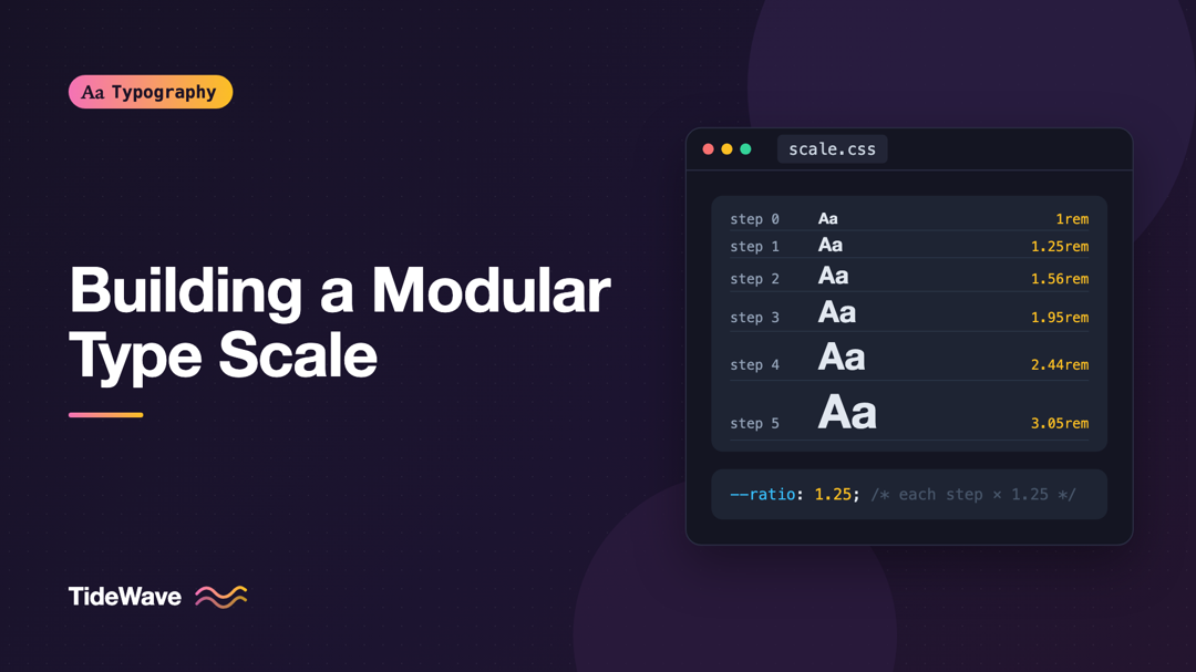
How to Build a Modular Type Scale for Consistent Hierarchy
- Maria
- Typography
- 23 Oct, 2026
Look through the CSS of a project that's been around for a few years and count the distinct font sizes. It's common to find a dozen or more: 13px, 14
Continue Reading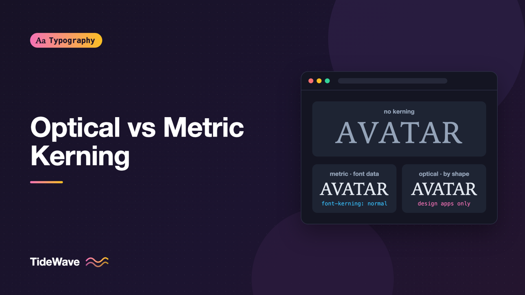
Optical Kerning vs Metric Kerning: Which Should You Use?
- Maria
- Typography
- 23 Oct, 2026
Set the word "AVATAR" in a large headline and look at the gaps. Between the A and the V, the diagonals lean toward each other and leave a wide we
Continue Reading