Blog
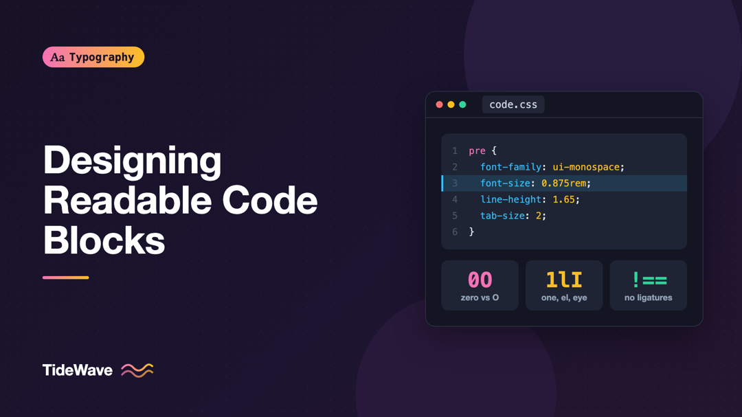
Designing Readable Code Blocks: Fonts, Sizes, and Spacing for Developers
- Maria
- Typography
- 23 Oct, 2026
Developers spend hours tuning the font, size, and theme in their editor, then publish documentation with code blocks set in 12-pixel Courier, cramped
Continue Reading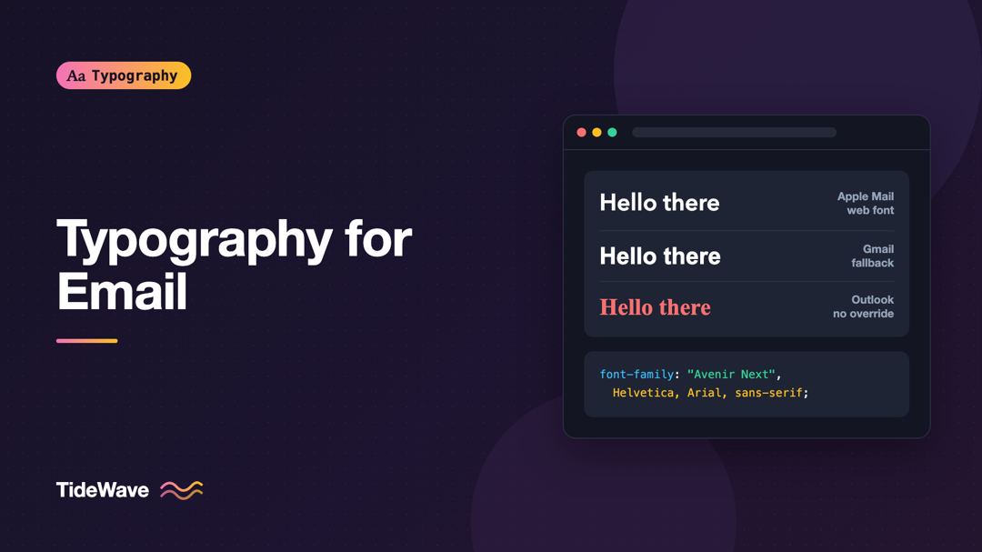
Typography for Email: Fonts That Survive Every Inbox
- Maria
- Typography
- 23 Oct, 2026
You design a newsletter with a lovely custom typeface, send a test to yourself, and it looks perfect in Apple Mail. Then a colleague forwards a scree
Continue Reading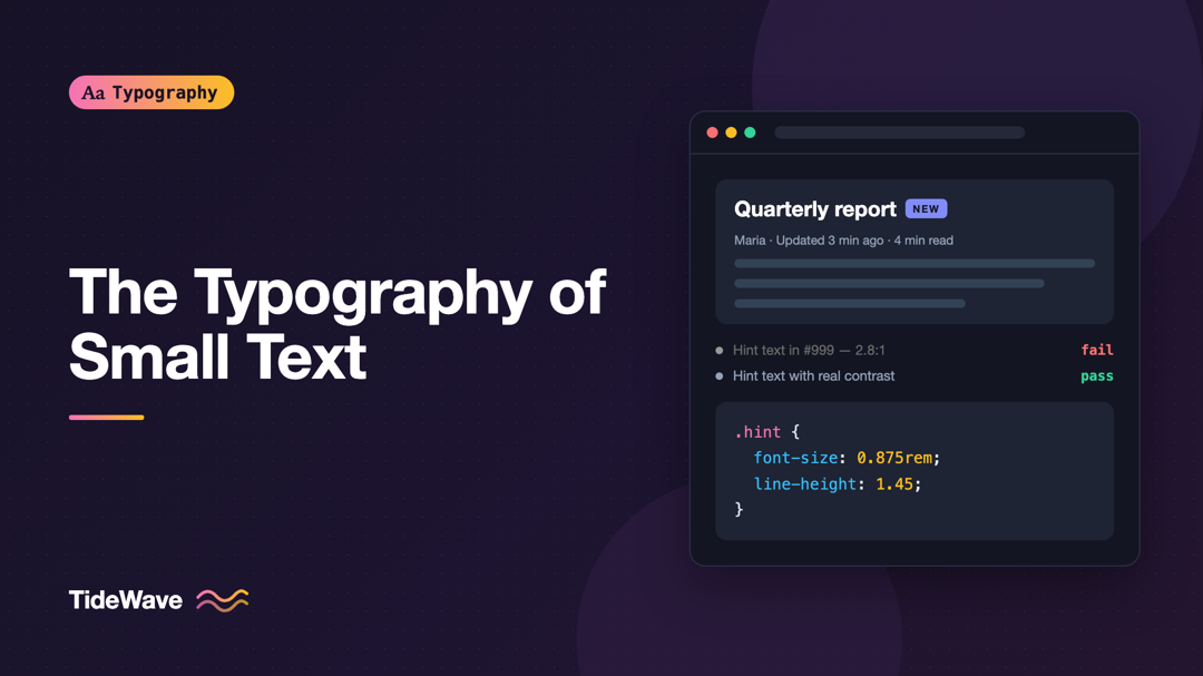
Writing and Styling Microcopy: The Typography of Small Text
- Maria
- Typography
- 23 Oct, 2026
Look at a sign-up form and count the pieces of text that aren't headings or body copy. "Must be at least 8 characters." "We'll never share your email
Continue Reading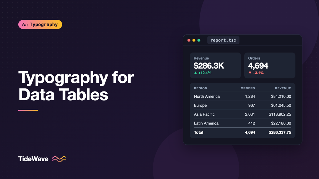
Typography for Data Tables and Dashboards
- Maria
- Typography
- 23 Oct, 2026
Open almost any admin panel and you'll find the same problems: numbers in a column that don't line up, a revenue figure that jitters every time it up
Continue Reading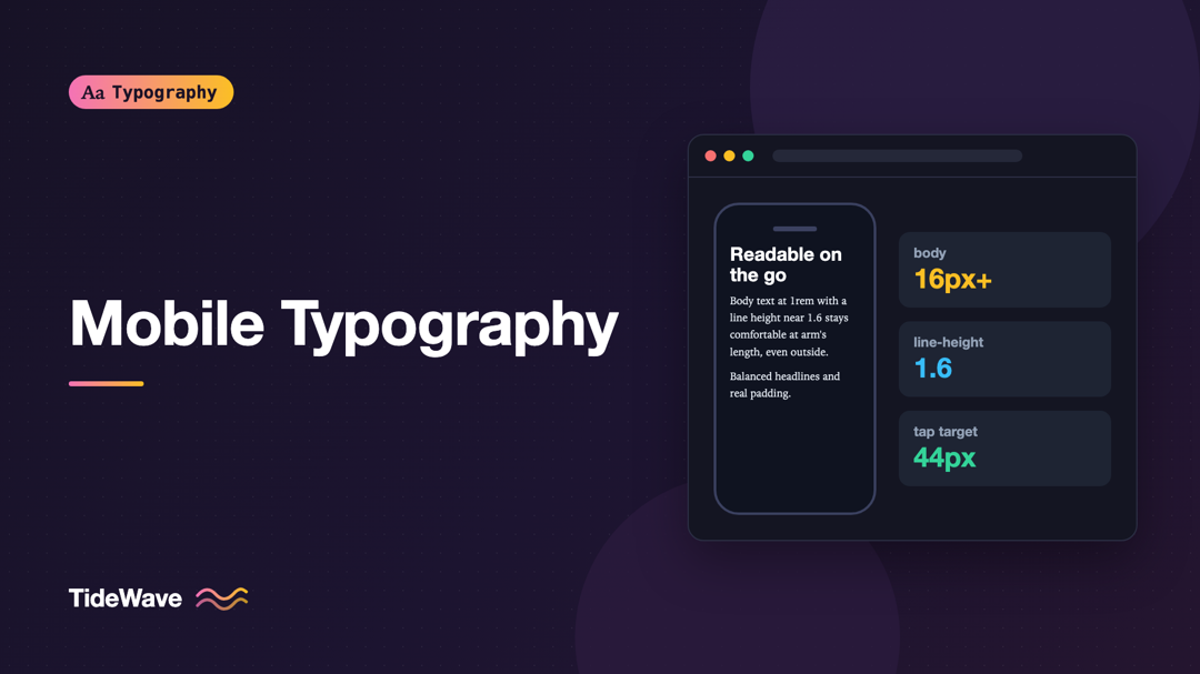
Mobile Typography: Designing Readable Text for Small Screens
- Maria
- Typography
- 23 Oct, 2026
You design a page on a 27-inch monitor, check it in the browser's device toolbar, and it looks fine. Then you open it on an actual phone on a sunny a
Continue Reading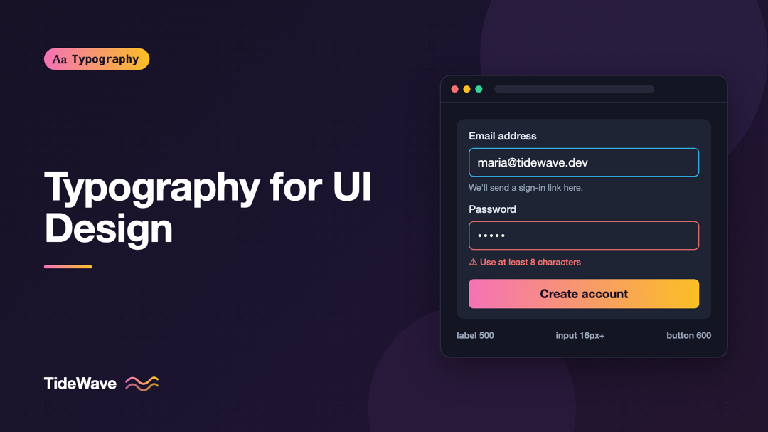
Typography for UI Design: Choosing Fonts for Buttons, Labels, and Forms
- Maria
- Typography
- 23 Oct, 2026
Most typography advice is written for paragraphs: line length, leading, rhythm, the feel of a long column of text. Then you open a settings screen or
Continue Reading