Blog
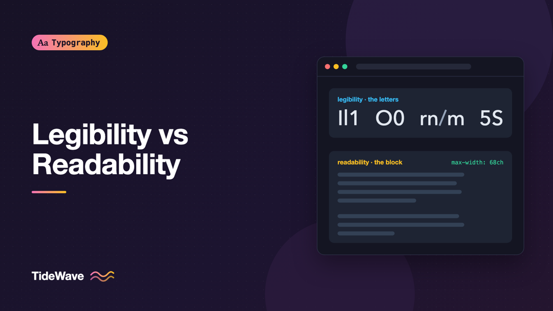
Legibility vs Readability: Two Different Goals in Typography
- Maria
- Typography
- 23 Oct, 2026
A designer picks a beautiful, highly legible sans-serif for a documentation site. Every letter is crisp and distinct. Yet users still complain the do
Continue Reading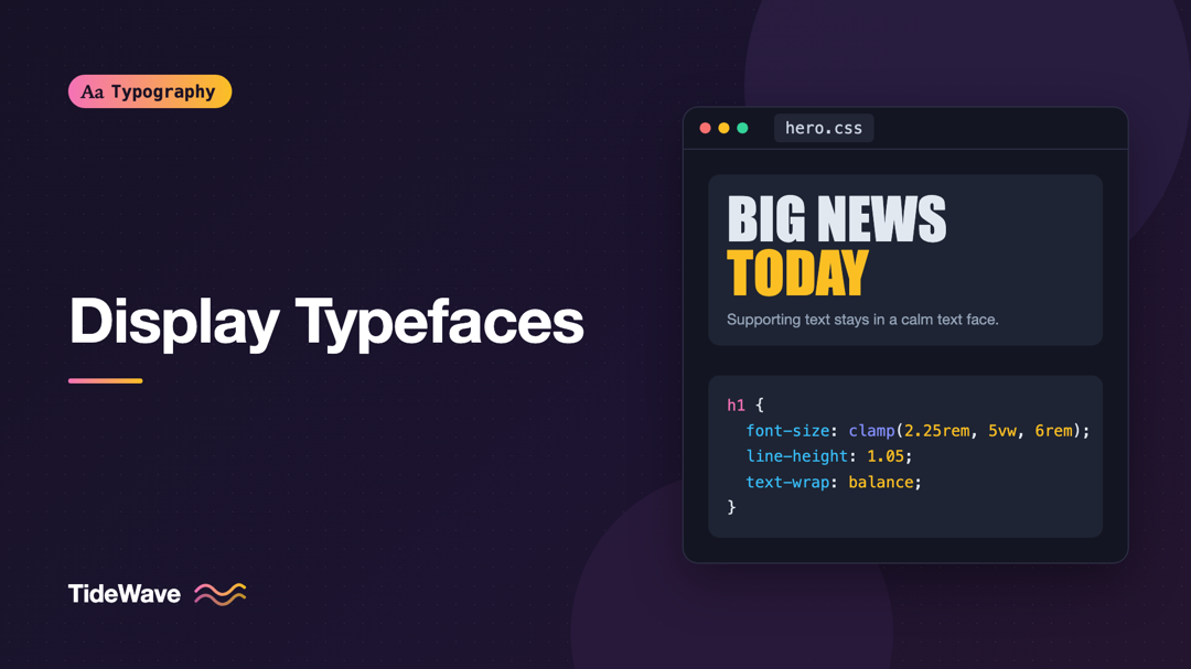
Display Typefaces: Making Headlines Without Sacrificing Clarity
- Maria
- Typography
- 23 Oct, 2026
The landing page mockup looks fantastic: a towering condensed headline, tightly spaced, in a typeface with real attitude. Then you build it. On a pho
Continue Reading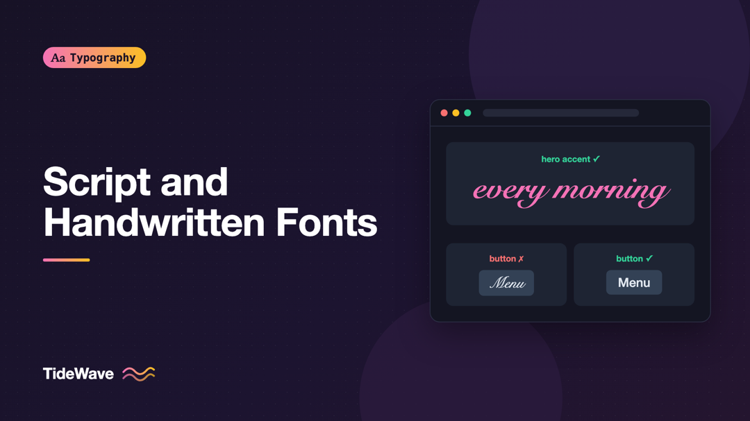
Script and Handwritten Fonts: How to Use Them Without Hurting Legibility
- Maria
- Typography
- 23 Oct, 2026
A wedding site, a bakery, a personal portfolio: some projects seem to call for a font that looks written by hand. You find a gorgeous brush script, s
Continue Reading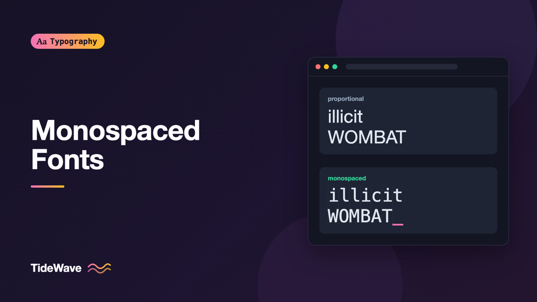
Monospaced Fonts: When Fixed-Width Type Is the Right Choice
- Maria
- Typography
- 23 Oct, 2026
You paste a code snippet into a proportional font and the indentation falls apart. A column of prices in your dashboard jiggles every time the number
Continue Reading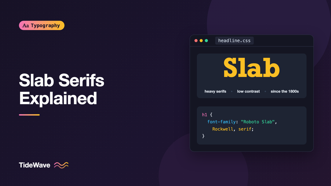
Slab Serifs Explained: History, Characteristics, and Modern Uses
- Maria
- Typography
- 23 Oct, 2026
You want a headline font that feels sturdy and confident, a bit editorial but not stiff. A Didone looks too fashion-magazine, a grotesque too corpora
Continue Reading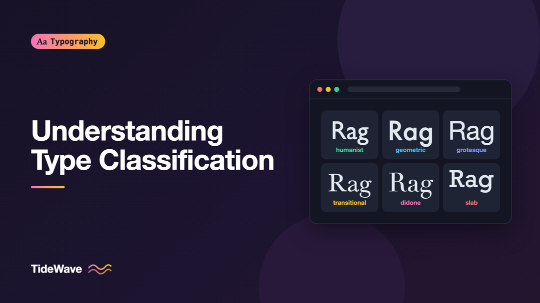
Understanding Type Classification: Humanist, Geometric, Grotesque, and Beyond
- Maria
- Typography
- 23 Oct, 2026
A client asks for a font that's "like Futura but warmer." Another wants "something more neutral than Helvetica." If you think of fonts as an endless
Continue Reading